Health & Wellness Marketplace Landing Page Template
Tonic is a masonry-layout landing page template built for curated health and wellness marketplaces. It pairs a Neo-Retro Ink and Paper visual identity with a Before/After card reveal mechanic that shows raw ingredients first, then finished products on hover. Every card links directly to a product page, and a persistent mobile bar guides visitors toward a guided kit-building quiz.
by Rocket studio
Quick summary
Tonic is a single-page wellness marketplace template with a masonry product grid, a still-life lifestyle header, and a Before/After card-flip interaction. The Ink and Paper color system, anchored by aged parchment and fountain-pen black, gives every section the weight of a trusted apothecary journal. It is designed to earn trust before it asks for a click.
Who this template is for
This template suits anyone running a practitioner-vetted wellness marketplace or a curated health and wellness product shop. It speaks directly to sellers whose products carry a story and whose shoppers want proof of provenance before they buy.
- Wellness brands selling adaptogenic tinctures, small-batch oils, and herbal apothecary products
- Acupuncturists and holistic practitioners looking to showcase a retail shelf online
- Independent founders building a health and wellness e-commerce destination for discerning, ingredient-conscious shoppers
What problem this template solves
Most generic e-commerce templates flatten every product into the same grid with no story and no trust signal. Wellness shoppers, especially those who have outgrown mass retail, need to understand where a product comes from and who vouches for it before they will add it to a cart.
- No way to show ingredient origin or practitioner endorsement inside a standard product card
- Mobile shoppers browsing late at night need clear guidance toward a starting point, not an overwhelming catalogue
- Generic layouts do not reflect the warmth and authority that niche health and wellness brands spend years building
What you get with this template
You get a fully structured, single-page masonry landing page that guides visitors from curiosity to conversion through layered visual storytelling. Every component is grounded in the brief and ready to be adapted to your product range.
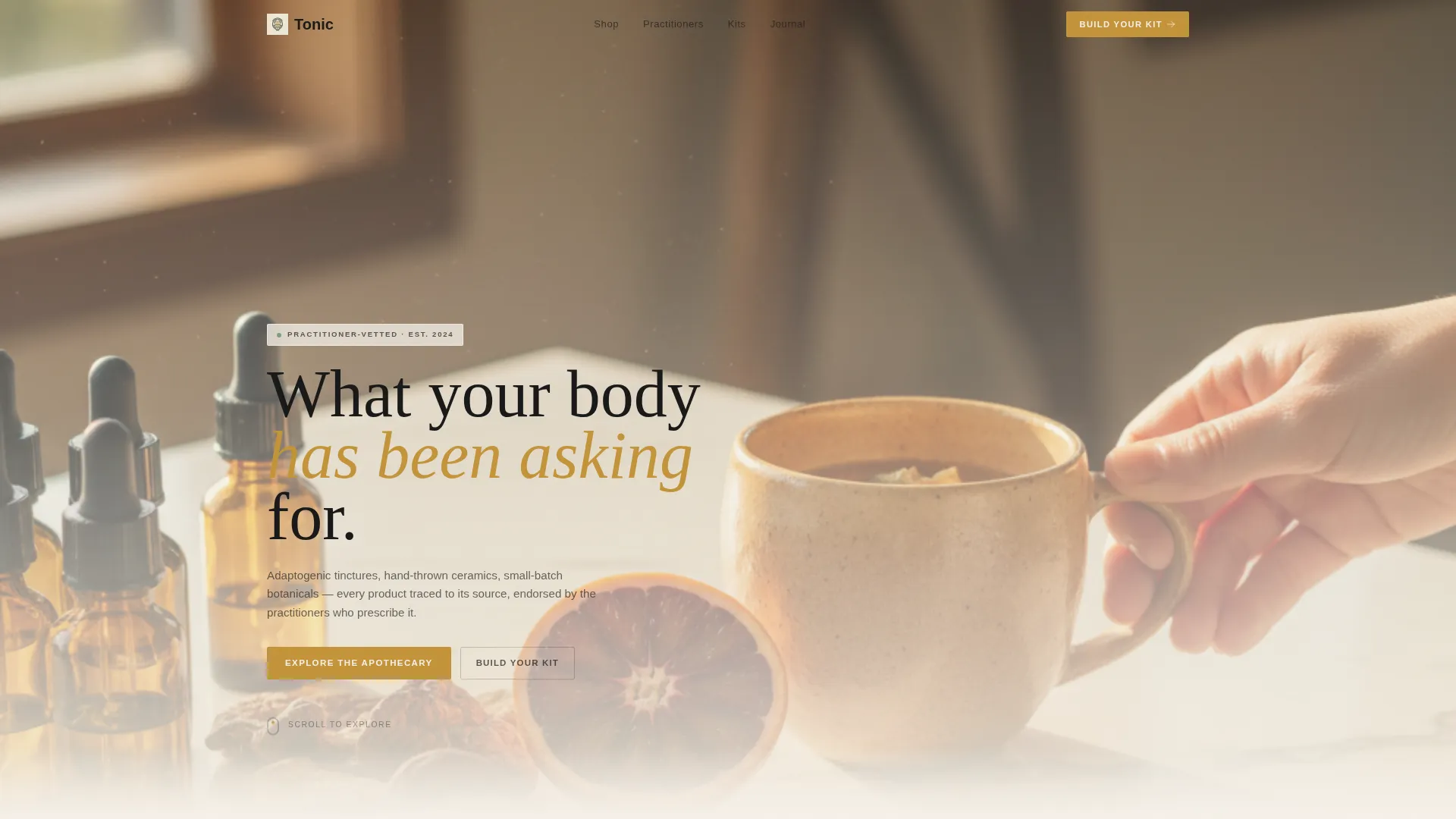
- A dramatic lifestyle header with a serif headline, a still-life composition, and warm directional light
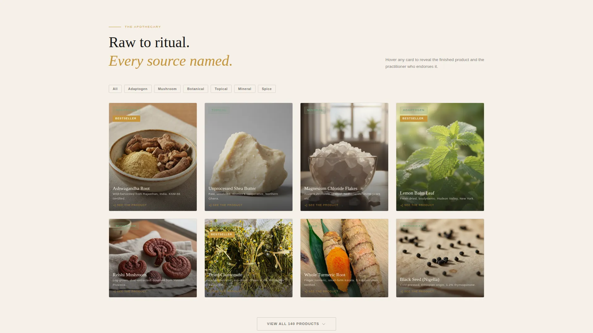
- A masonry product grid with Before/After card-flip interactions, raw-ingredient visuals, and practitioner endorsement reveals
- A persistent mobile bottom bar linking to a guided kit-building quiz, plus amber call-to-action buttons on every card
Feature list
A brief description of the core capabilities built into this template follows below.
Before/After Masonry Card Grid
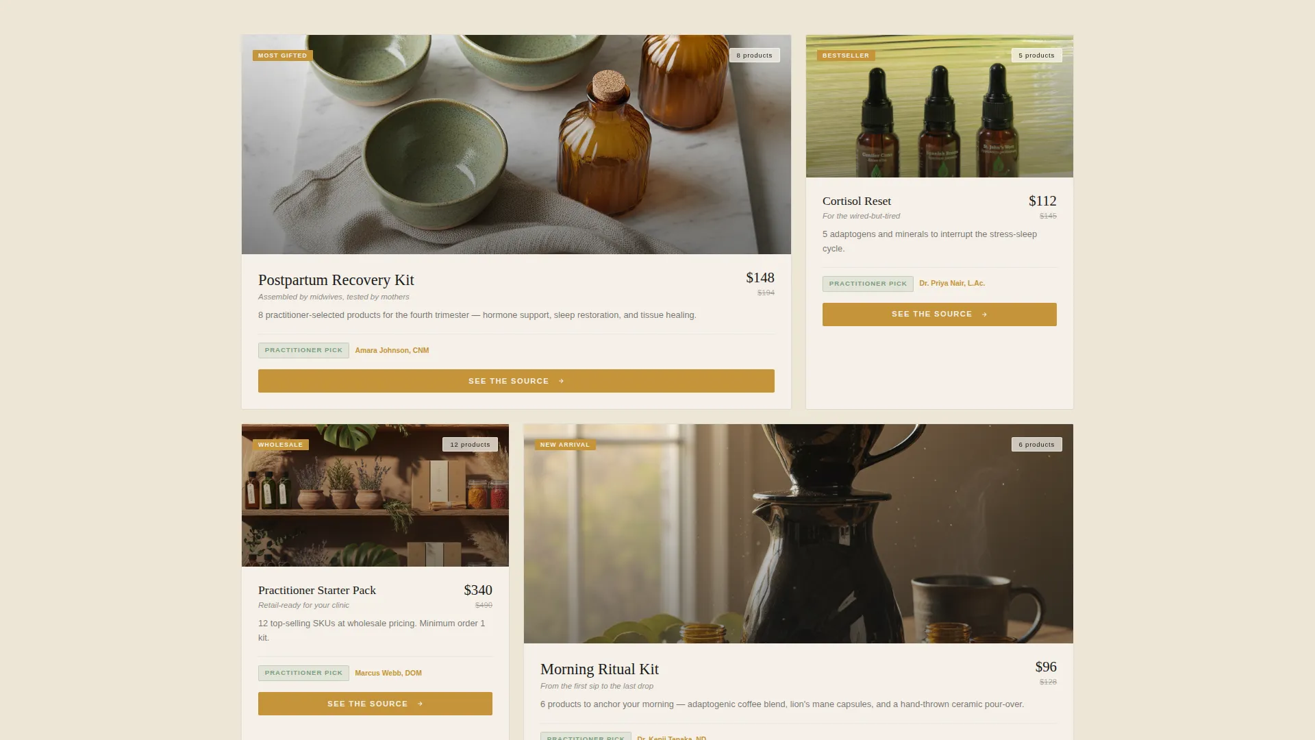
Each card in the masonry grid displays the raw ingredient on first view. On hover or tap, the card flips to show the finished packaged product alongside a one-line practitioner endorsement. The grid deepens as the visitor scrolls, moving from single ingredients to curated kits with progressively larger cards.
Lifestyle Header with Serif Headline
The header section is framed as a still-life painting on a marble countertop. Amber dropper bottles, a half-peeled blood orange, dried reishi, and a human hand mid-reach set the scene. A serif headline in fountain-pen black fades in over the image, giving the page an immediate editorial character.
Amber Call-to-Action on Every Card
Every masonry card carries a warm amber button labelled "See the Source." This button routes directly to the individual product page. Placing the conversion trigger on the card itself means each product in the grid is its own active conversion surface.
Persistent Mobile Bottom Bar
On mobile viewports, a fixed bottom bar stays visible as the visitor scrolls. It holds a secondary call-to-action reading "Build Your Kit, Start with 3," linking to a guided quiz. This gives late-night browsers a low-friction entry point without interrupting the browsing flow.
Neo-Retro Ink and Paper Visual Identity
The color palette draws on aged parchment, fountain-pen black, faded medicinal amber, and muted eucalyptus. Parchment dominates backgrounds, ink handles all body text and card borders, amber marks bestsellers and star ratings, and eucalyptus appears only on hover states and category tags.
Provenance-First Narrative Structure
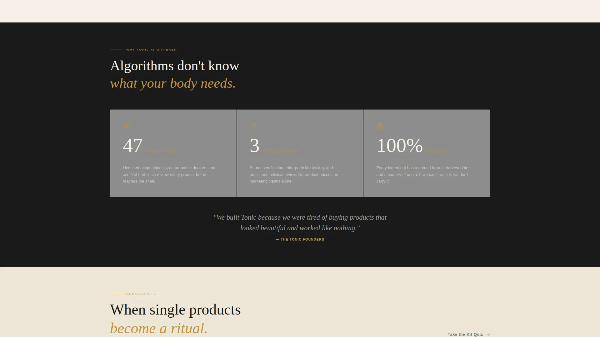
The page is structured so that ingredient origin and practitioner name appear before any purchase prompt. The scrolling sequence moves from individual raw ingredients to bundled kits, building trust and mental commitment with every row the visitor passes.
Page sections overview
| Section | Purpose |
|---|---|
| Lifestyle Header | Establish brand atmosphere and introduce the headline |
| Masonry Product Grid | Showcase individual products with Before/After card interactions |
| Ingredient-to-Kit Progression | Guide the visitor from single ingredients toward curated bundles |
| Practitioner Endorsement Reveals | Build trust by attributing products to named practitioners on card flip |
| Amber Card calls to action | Convert each product card into a direct link to the product page |
| Mobile Bottom Bar | Give mobile visitors a persistent entry point to the kit-building quiz |
Design & branding system
The visual system takes its cues from a 1920s pharmacist's label reimagined through a Bauhaus lens. Every color decision is deliberate and restrained, making each accent feel earned rather than decorative.
- Aged parchment (#F5F0E8) as the dominant background, fountain-pen black (#1A1A1A) for all body text and card borders, and faded medicinal amber (#C4943A) reserved for bestseller badges and star ratings
- Muted eucalyptus (#7A9E7E) appears exclusively on hover states and category tags, rewarding interaction rather than shouting for attention
- Serif typefaces carry the headline and editorial weight, giving the layout the authority of a well-produced print publication
Mobile & speed optimization
The template is built with small-screen wellness shoppers in mind. The mobile experience is structured to support browsers who are making considered purchase decisions in low-attention moments.
- The masonry grid reflows cleanly for single-column mobile viewing without losing the Before/After card-flip interaction
- The persistent bottom bar keeps the "Build Your Kit" quiz link visible at all times on mobile, removing the need to scroll back to find a starting point
- Card-level call-to-action buttons remain large and tappable on touch screens, keeping every product accessible without pinching or zooming
How this template helps you convert
The page earns trust through information layering before it asks for a click. Conversion is treated as a natural outcome of a well-told product story rather than a forced interruption.
- The Before/After card reveal shows ingredient origin and a practitioner endorsement before the purchase prompt appears, so the visitor already has a reason to trust the product by the time they see the button.
- The amber "See the Source" button on every card means the visitor never has to navigate away from the grid to find a product, reducing the steps between interest and click-through.
- The mobile bottom bar converts the quiz entry point into a persistent anchor, catching visitors who are not yet ready to pick a specific product but are willing to be guided.
Other information about this template
This template is designed for health and wellness e-commerce stores where product storytelling and practitioner credibility are central to the brand. It suits curated catalogue models where every item carries a sourcing narrative.
- The Neo-Retro theme and Ink and Paper color system are intentional differentiators for brands that want to stand apart from clinical white wellness aesthetics
- The Overlap/Layered template style means card elements and section transitions can be arranged with depth, adding visual interest without requiring custom illustration
- The guided quiz linked from the mobile bottom bar supports an upsell and upgrade flow, nudging shoppers toward higher-value bundle purchases rather than single-product orders
- The creative direction is anchored in accumulation: each scroll row adds weight to the visitor's mental cart by building a coherent wellness ritual rather than presenting isolated products
Theme
Neo-Retro
Creative direction
Before/After Reveal
Color system
Cloud Canvas
Style
Overlap/Layered
Direction
Upsell/Upgrade
Page Sections
Before/after Masonry Card Grid
Lifestyle Header with Serif Headline
Amber Call-to-action on Every Card
Persistent Mobile Bottom Bar
Neo-retro Ink and Paper Color System
Provenance-first Narrative Structure
Related questions
Who is this landing page template built for?
Can I adapt the masonry grid to my own product range?
What makes the Before/After card interaction useful for wellness products?
Does the mobile bottom bar stay visible while scrolling?
Is this template suitable for a single brand or a multi-vendor marketplace?



