Motorcycle Mechanic Quote Landing Page Template
Torque is a comparison-table landing page built for motorcycle mechanics. It leads with an animated stats dashboard that earns trust before the visitor reads a single service line. Structured service tiers, hover-reveal micro-interactions, and a persistent quote call to action guide every visitor toward a two-hour quote request, with a secondary path for riders who aren't sure what's wrong yet.
by Rocket studio
Quick summary
Torque is a single-page, click-through template for a motorcycle mechanic's quote request service. It opens with live-feel counter animations, then walks visitors through specialist comparison tables covering engine diagnostics, suspension, electrical faults, and tyre and brake packages. Every section ends with a clear call to action pushing visitors into a guided quote builder.
Who this template is for
This template suits motorcycle mechanics who handle a wide range of work and want to present their services with authority. It works particularly well for shops serving mixed client bases, from individual riders to commercial fleets.
- Independent motorcycle workshops offering tiered repair and service packages
- Mechanic businesses serving commuter riders, weekend enthusiasts, and courier fleets
- Shops that want a transparent, no-hidden-costs quote flow instead of a traditional contact form
What problem this template solves
Most motorcycle service pages bury their pricing and scope behind vague descriptions. Riders arrive unsure whether a shop can handle their specific problem, and they leave without booking. This template removes that uncertainty.
- Comparison tables show exactly what each service tier covers, so visitors know what they're paying for before they click
- The stats header establishes volume and reliability before any service detail appears
- A secondary diagnostic intake path catches riders who can't name the problem yet, reducing drop-off
What you get with this template
The template delivers a complete, single-page quote-request landing page structured around comparison tables and conversion-focused design. Every component is built from the source brief with a defined purpose.
- An animated stats dashboard header with three live-feel counters and a weekly availability line
- Expert Panel comparison tables organised by specialist area, with hover micro-interactions revealing tier details
- A persistent mobile bottom bar and section-exit calls to action all pointing to the same quote builder entry point
Feature list
This template includes a focused set of purpose-built components. Each one serves the conversion goal without adding visual noise.
Animated Stats Dashboard Header
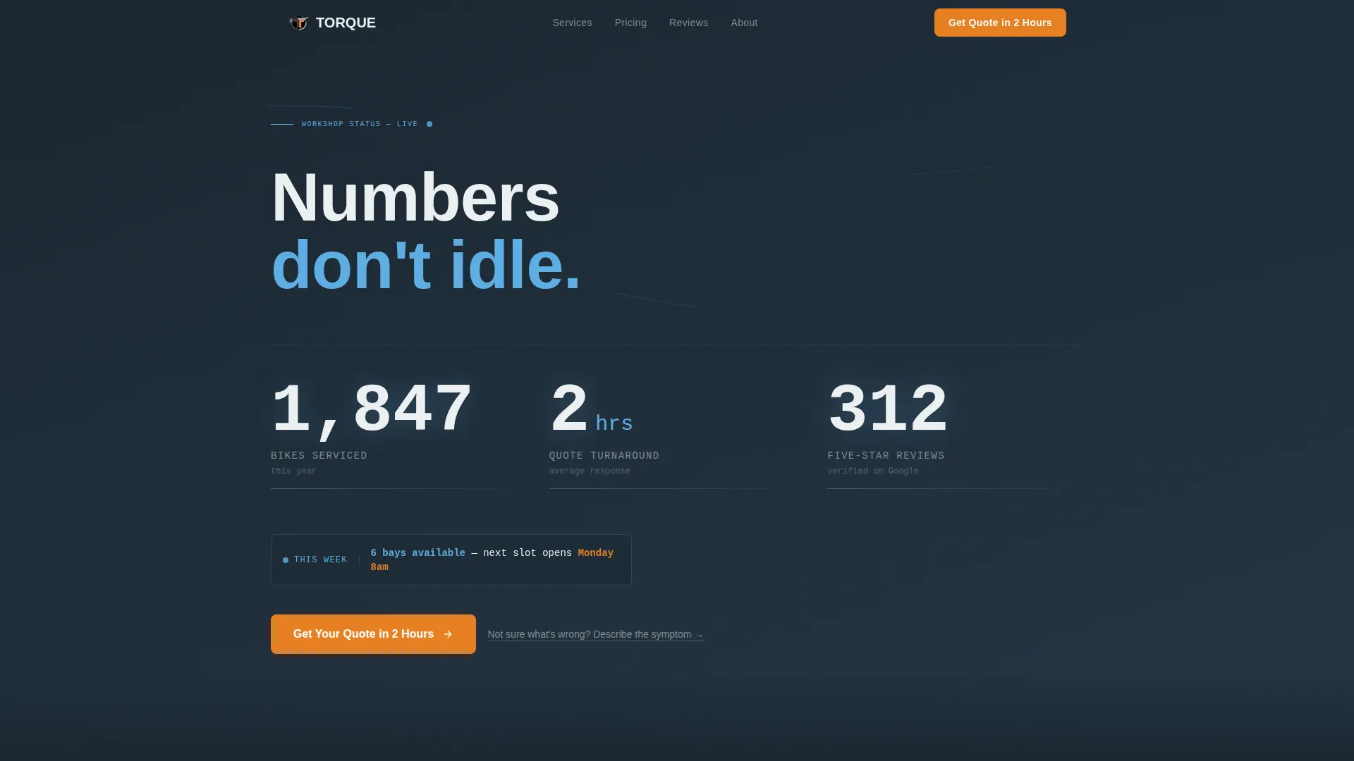
Three oversized counters animate on page load, showing bikes serviced this year, average quote turnaround in hours, and five-star review count. Each number ticks upward against deep workshop charcoal. A single line in sky blue below the counters displays the current week's booking availability. There is no hero image, the numbers carry the credibility.
Expert Panel Comparison Tables
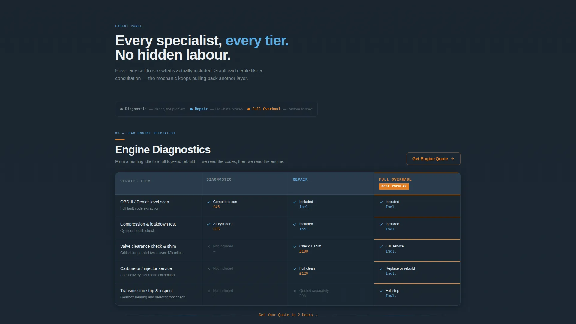
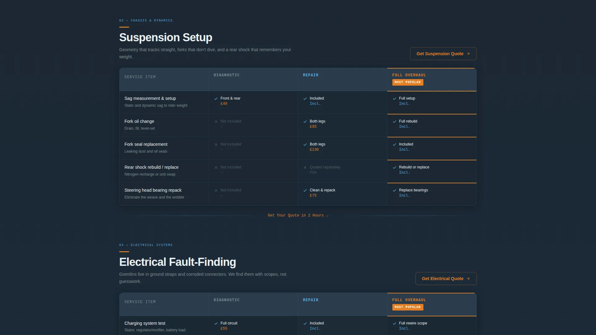
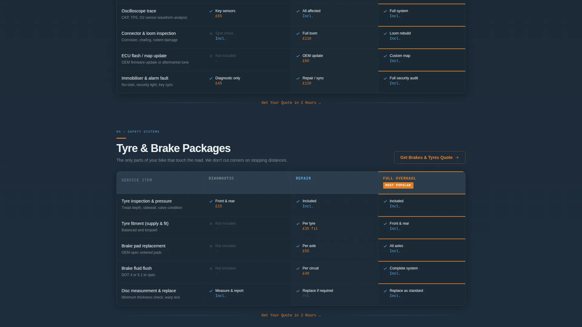
Each specialist area gets its own comparison table section: engine diagnostics, suspension setup, electrical fault-finding, and tyre and brake packages. Service tiers run across the columns, with deeper intervention revealed at each level. This structure lets visitors self-identify their need and understand the scope of work at a glance.
Hover Micro-Interactions on Table Rows
Moving a cursor over any table row surfaces the included items for that tier. This keeps the page clean at rest but rewards engagement with the detail visitors need to feel confident before clicking through.
Persistent Quote call to action Bar
On mobile, a bottom bar reading "Get Your Quote in 2 Hours" stays fixed as the visitor scrolls. On desktop, the same call to action repeats at the exit point of every comparison table section. No form lives on this page; every call to action click leads to a separate guided quote builder.
Diagnostic Intake Secondary Path
A secondary text link, "Not sure what's wrong? Describe the symptom," appears alongside the primary call to action. It routes uncertain visitors to a diagnostic intake flow rather than letting them leave without a next step.
Executive Suite Visual System
The color palette and layout follow a precise, boardroom-composed visual identity. Workshop charcoal, tool-steel gray, open-sky blue, clean-lift white, and signal orange work together across card backgrounds, table cells, and interactive elements to make the page feel authoritative without being cold.
Page sections overview
| Section | Purpose |
|---|---|
| Stats Dashboard Header | Opens with animated counters and live booking availability to establish credibility immediately |
| Engine Diagnostics Table | Presents diagnostic service tiers with hover-reveal inclusions |
| Suspension Setup Table | Compares suspension service levels across price tiers |
| Electrical Fault Table | Shows electrical fault-finding scope at each service level |
| Tyre and Brake Table | Lays out tyre and brake package options side by side |
| Persistent Quote Bar | Keeps the primary call to action visible on mobile throughout the scroll |
| Section-Exit calls to action | Repeats the quote call to action after each comparison table to capture intent at peak engagement |
| Secondary Diagnostic Link | Provides an alternative entry point for riders describing symptoms |
Design & branding system
The visual identity is built around an Executive Suite theme with a Slate and Sky color system. The palette is designed to feel precise and composed, not sterile, mechanical authority expressed through clean surfaces.
- Core colors: workshop charcoal (#2C3E50) for backgrounds, tool-steel gray (#7F8C8D) for secondary text, open-sky blue (#5DADE2) for highlights and availability lines, and clean-lift white (#ECF0F1) for card and table cell backgrounds
- Signal orange (#E67E22) marks every interactive element and priority badge, making calls to action and key labels immediately recognisable
- The overall effect is described in the brief as a precision torque wrench in a velvet-lined case, mechanical in purpose, composed in presentation
Mobile & speed optimization
The template is structured with mobile conversion as a first-class concern. The persistent bottom bar call to action is a direct response to how riders browse on their phones between jobs or at the roadside.
- The fixed mobile call to action bar keeps the quote entry point visible at all times, removing the need to scroll back to act
- Comparison tables are structured for vertical readability, so tier information stays clear on smaller screens
- The stats header uses animated counters rather than heavy imagery, keeping the visual impact strong without relying on large files
How this template helps you convert
Conversion is built into the page architecture, not added as an afterthought. Every structural decision reduces friction between arrival and quote request.
- The stats dashboard header earns trust before the visitor reads a single service description, using volume and speed metrics to remove doubt early
- Transparent comparison tables eliminate the anxiety of hidden costs, so visitors arrive at the call to action already confident in the scope and value
- The dual call to action strategy (primary quote flow plus secondary diagnostic intake) ensures that both ready-to-book visitors and uncertain ones have a clear, low-pressure next step
Other information about this template
This template is designed as a click-through landing page, meaning it does not host a quote form directly. The page's job is to qualify and warm the visitor, then hand them off to a separate guided quote builder. This keeps the landing page focused and fast to scan.
- The template is categorised under Professional Services, Motorcycle Mechanic Business, making it a strong fit for independent workshops and multi-bay garages alike
- The Corporate Precision theme and Stats-First creative direction mean the page communicates volume and expertise without relying on photography or lifestyle content
- The Single Column Flow layout keeps the reading path linear and unambiguous, guiding every visitor from the stats header down through the comparison tables to the call to action
Theme
Corporate Precision
Creative direction
Stats-First Impact
Color system
Cloud Canvas
Style
Single Column Flow
Direction
Partnership/B2B
Page Sections
Animated Stats Dashboard Header
Expert Panel Comparison Tables
Hover Micro-interactions
Persistent Mobile Call to Action Bar
Diagnostic Intake Secondary Path
Executive Suite Color System
Related questions
Does this template include a quote request form?
Can I use this template if I only offer one or two service areas?
Why does the stats header work without a hero image?
Who is the secondary diagnostic text link designed for?
Is this template suitable for fleet managers as well as individual riders?



