Torque - Reliable Garagedoor Landing Page Template
Torque is a split-screen landing page template built for Boston garage door repair services. It pairs high-contrast case study storytelling with a bold Monochrome Steel palette and two persistent calls to action. The layout guides urgent homeowners, property managers, and real estate agents from problem recognition to a same-day service call or a downloadable door diagnosis guide.
by Rocket studio
Quick summary
Torque is a single-page, split-screen landing page template designed for a Boston-area garage door repair business. It uses a Case Study Narrative structure to build trust fast, a Monochrome Steel color system to signal reliability, and two layered calls to action that catch both urgent callers and research-minded homeowners.
Who this template is for
This template is purpose-built for small garage door repair operations serving dense urban and suburban markets. It speaks directly to the people who need a fix today, not a quote next week.
- Homeowners locked out by a broken spring, an off-track panel, or a stripped opener gear
- Property managers handling tenant complaints across multiple addresses in zip codes like 02100 through 02200
- Real estate agents who need a damaged door repaired before a weekend open house
What problem this template solves
Most service business pages lead with a generic headline and a buried phone number. Visitors arrive stressed, scan for proof that the business is real and fast, and leave when they find neither. This template solves that gap directly.
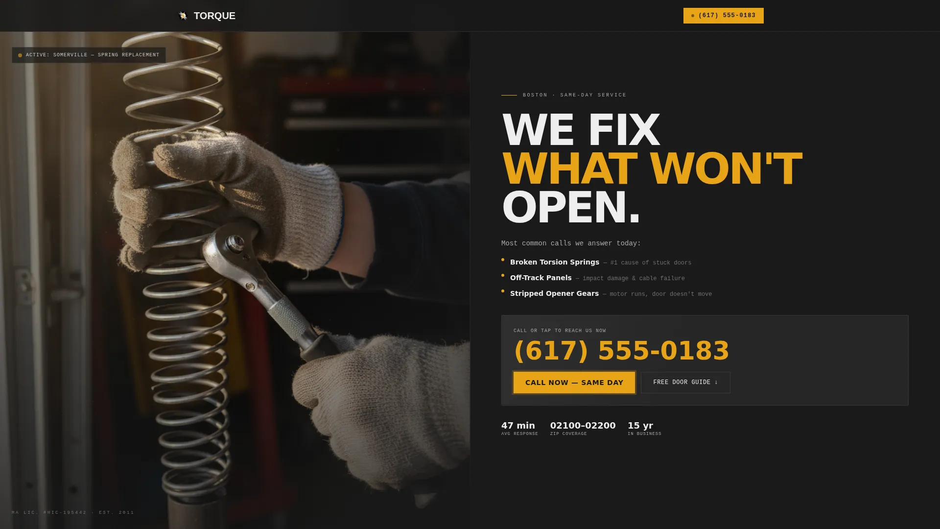
- It puts the phone number front and center in the hero so a panicked homeowner can tap it without scrolling
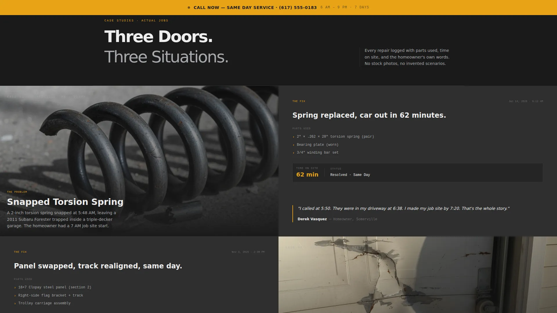
- It replaces vague testimonials with real repair stories that name parts, log time on site, and quote the actual customer
- It offers a downloadable door diagnosis guide that earns trust before asking for a call, capturing emails from visitors who are still deciding
What you get with this template
The template delivers a complete, single-page layout structured around credibility and urgency. Every section has a defined job, and no space is wasted on decoration.
- A half-page photo and text hero split with a high-contrast technician image and an immediately tappable phone number
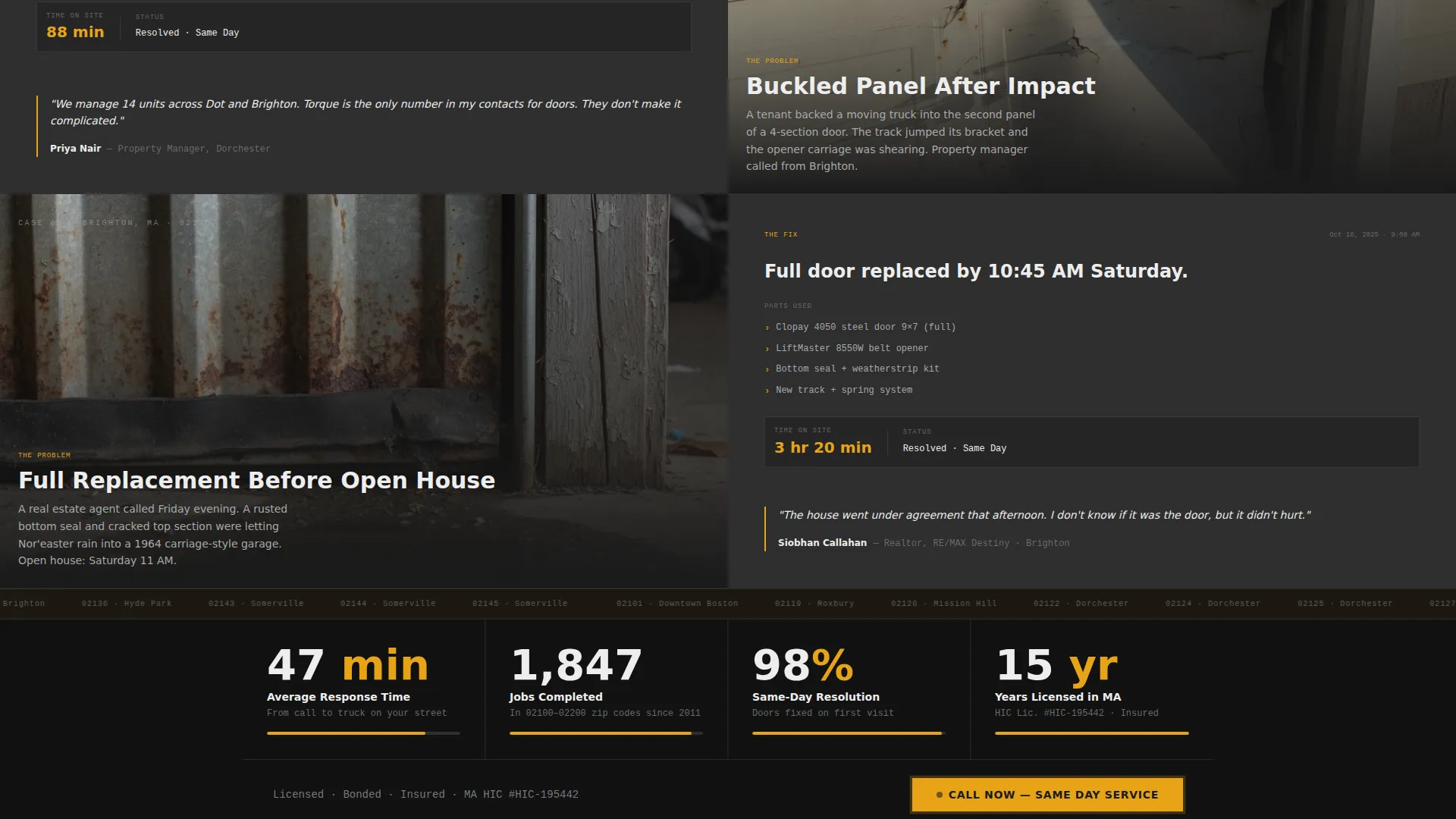
- Scrollable case study sections, each formatted as a 50/50 split showing the problem on the left and the resolution on the right
- Stat bars between case studies displaying response times, jobs completed, and years of licensing
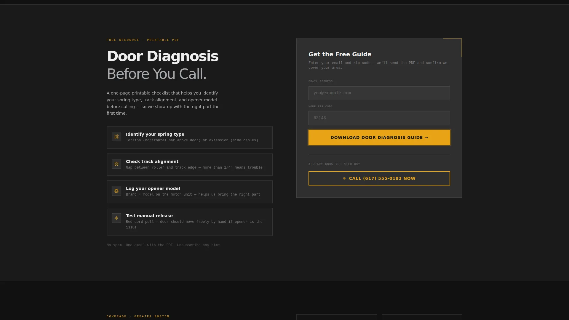
- A gated content block with an email and zip code field to deliver the printable door diagnosis guide
- A persistent amber "Call Now" button anchored to the bottom of every section for visitors who already know what they need
Feature list
This template is built around five practical capabilities, each tied directly to a specific visitor behavior or business goal.
Split-Screen Case Study Sections
Each repair story occupies a full-width 50/50 split. The left panel shows a problem photo, a buckled panel, a snapped cable, a rusted seal. The right panel names the parts replaced, logs the time on site, and includes a single homeowner quote. Stories escalate from simple fixes to full-door replacements, building credibility as the visitor scrolls.
Persistent Amber Call-to-Action Bar
A secondary call to action in safety-stripe amber (#E8A317) stays anchored to the bottom of every section. It displays a click-to-call phone number and the label "Call Now, Same Day Service." This bar is always visible, so a visitor who decides mid-scroll never has to hunt for a way to reach the business.
Gated Door Diagnosis Guide Block
The primary call to action is a downloadable checklist that teaches homeowners how to identify spring type, track alignment, and opener model before calling. It is gated behind a simple email and zip code field. This gives the business a useful lead capture mechanism without feeling like a hard sell.
Stat Bars Between Case Studies
Short stat bars slide in between repair stories. They display response times, total jobs completed in the local service area, and years of active licensing. These numbers give the business quantifiable authority without requiring a separate "About" page.
Service Utility Visual System
The layout uses forge black (#1A1A1A), brushed aluminum (#A8A9AD), and galvanized panel white (#EDEDED) as the structural palette. Amber (#E8A317) is reserved strictly for calls to action and urgent callouts. The result is a page that feels organized and load-bearing, not decorative.
Page sections overview
| Section | Purpose |
|---|---|
| Hero Split Header | Introduce the service and surface the phone number immediately |
| Case Study One | Show a simple repair with photo, parts, time, and quote |
| Stat Bar One | Display response time and local job count |
| Case Study Two | Escalate to a more complex repair scenario |
| Stat Bar Two | Show years of licensing and zip code coverage |
| Case Study Three | Present a full-door replacement story |
| Diagnosis Guide Block | Gate the printable checklist behind email and zip code |
| Persistent call to action Bar | Keep same-day call option visible throughout the page |
Design & branding system
The visual identity follows a Service Utility theme. Every color choice carries a specific functional meaning, and nothing is added purely for aesthetics.
- Forge black (#1A1A1A) and galvanized panel white (#EDEDED) form the structural contrast layer, keeping sections legible and heavy-feeling
- Brushed aluminum (#A8A9AD) is used for secondary text, borders, and supporting details that should recede without disappearing
- Safety-stripe amber (#E8A317) appears only on calls to action and urgent callouts, functioning like a warning light that draws the eye without competing with content
Mobile & speed optimization
The 50/50 split layout is designed to restack cleanly on smaller screens. Urgency-driven elements remain prominent regardless of device.
- The phone number in the hero is sized for tap targets, not just reading, so a visitor on a phone screen can call without pinching or zooming
- The persistent amber call-to-action bar stays fixed at the bottom edge on mobile, keeping the call option accessible at every scroll position
- Case study panels restack vertically on narrow viewports so the problem photo always appears above its corresponding resolution text
How this template helps you convert
The conversion strategy is layered. It serves two visitor types at the same time: the person who needs help right now, and the person who is still evaluating their options.
- The hero phone number and persistent amber bar convert urgent visitors the moment they arrive, before they read a single word of copy
- The case study narrative builds trust for cautious visitors by showing real repairs with specific details, turning skepticism into confidence as they scroll
- The gated diagnosis guide captures email addresses from research-phase visitors, giving the business a follow-up opportunity with people who are not yet ready to call
Other information about this template
This template is built specifically for the Boston local services market. It reflects the operational reality of a two-truck repair business fielding early-morning emergency calls across dense neighborhoods like Somerville, Dorchester, and Brighton.
- The zip code field in the lead capture block is intentional, it lets the business qualify leads by service area before following up
- The case study structure works equally well for a solo operator or a small crew because it focuses on specific jobs, not company size
- The template style is Split Screen (50/50) with a Half-Page Photo and Text header concept, suited to image-forward service businesses
- The creative direction is Case Study Narrative, which means the page earns trust through accumulated evidence rather than generic claims
- The content and resource landing page direction means the page has two conversion paths: an immediate call and a gated content download
Theme
Service Utility
Creative direction
Case Study Narrative
Color system
Monochrome Steel
Style
Split Screen (50/50)
Direction
Content/Resource
Page Sections
Split-screen Case Study Layout
Persistent Amber Call-to-action Bar
Gated Door Diagnosis Guide
Stat Bars Between Case Studies
Service Utility Color System
High-contrast Hero Split Header
Related questions
Can I use this template for a garage door service outside of Boston?
How does the gated door diagnosis guide work in this template?
Can I add or remove case study sections?
Why is the phone number so prominent in the hero section?
What are the two conversion paths in this template?



