Urologist Condition & Treatment Library Landing Page
Tract is a hub-and-spoke urologist landing page template designed to turn anxious symptom searches into booked consultations. It pairs plain-language condition guides with interactive self-assessment checklists, a warm portrait-centered hero, and a progressive consultation form. Built for patient education and lead generation, it covers six urological topic areas in one calm, clearly structured page.
by Rocket studio
Quick summary
Tract is a single-page urologist condition and treatment library template. It organizes six urological topics into anchor-navigated spoke sections, each with a self-assessment checklist, plain-language condition guides, and a lead-capture consultation form. The design feels warm and unhurried, built specifically for patients who need clarity before they pick up the phone.
Who this template is for
This template is built for urologists and urology practices that want to educate patients before the first visit. It works especially well for practices serving a broad patient mix across multiple condition areas.
- Urologists building a patient-facing education hub with a consultation booking flow
- Practices serving men over fifty, women with recurring urinary tract infections, and parents navigating pediatric diagnoses
- Healthcare content teams that want a structured, condition-by-condition library inside a single landing page
What problem this template solves
Patients researching urological symptoms online often land on clinical databases or generic health articles that raise more questions than they answer. That gap between anxious searching and confident appointment booking is exactly what this template addresses.
- Visitors arrive with vague, sometimes embarrassing symptoms and no clear starting point
- Existing resources use medical terminology without plain-language translations, leaving patients more confused
- Practices lose potential patients who never convert because no easy, low-commitment next step is offered
What you get with this template
Tract delivers a complete, content-ready landing page structure with interactive components built around the patient journey. Every section is purposefully sequenced from self-recognition through education to action.
- A portrait-centered hero section with an anchor navigation bar linking to six condition spoke sections
- Six spoke sections each containing a toggle-based symptom checklist, condition guides, a treatment pathway summary, and a call to action
- A progressive-disclosure consultation form, a credentials and trust section, a testimonials block, and a linear single-row footer
Feature list
Portrait-Centered Hero with Anchor Navigation
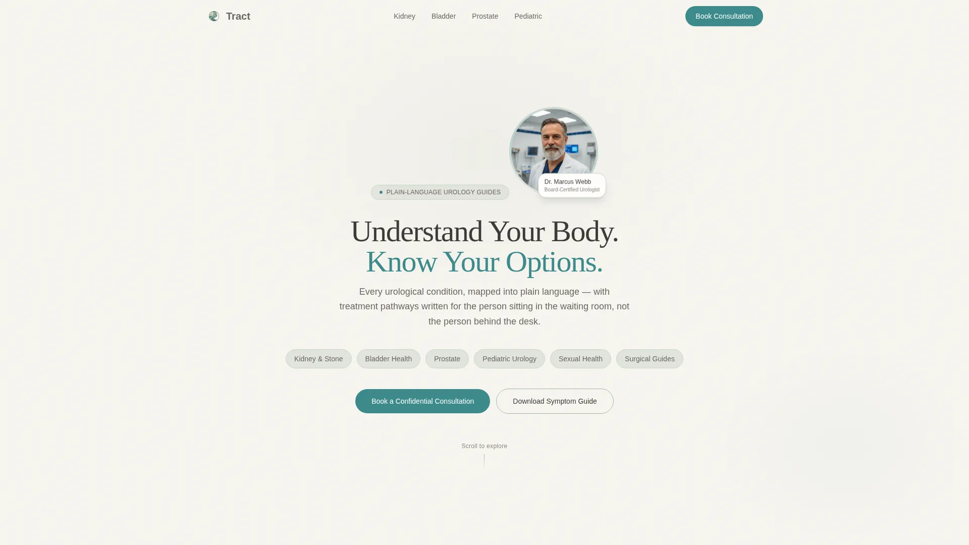
The hero leads with a warm shoulders-up photograph of the urologist set against a neutral linen backdrop. A headline arcs above the portrait and a persistent anchor navigation bar sits below it. The nav uses pill-shaped buttons in sage that highlight to teal on hover, linking directly to each of the six spoke sections: Kidney and Stone, Bladder Health, Prostate, Pediatric Urology, Sexual Health, and Surgical Guides.
Interactive Symptom Checklists with Relevance Scoring
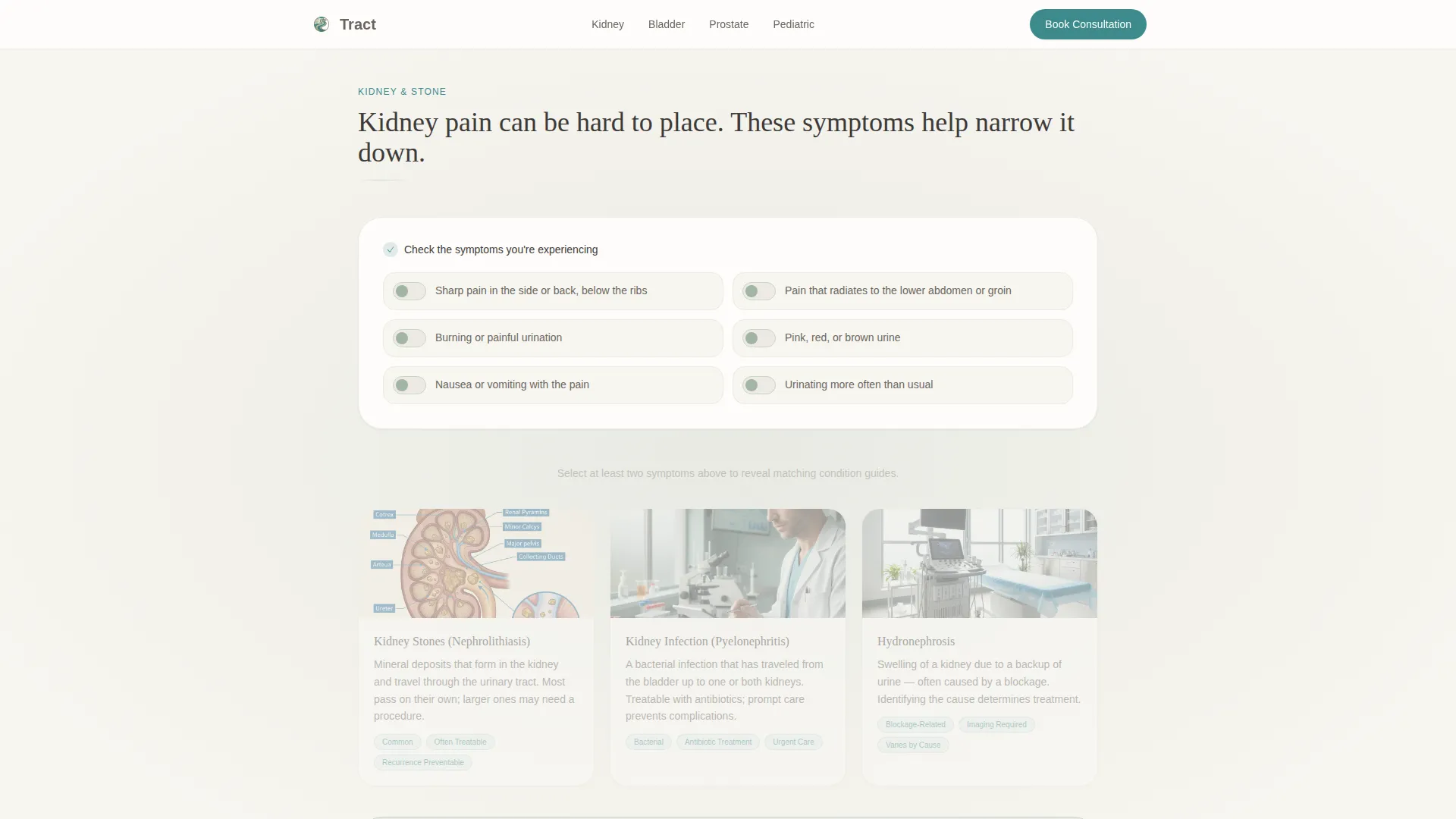
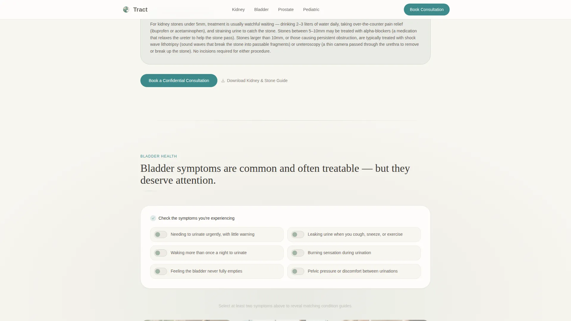
Each spoke section opens with a self-assessment checklist rendered as soft toggle switches. As visitors check off their symptoms, the template reveals a personalized relevance score and highlights the condition guides most relevant to their input. This turns passive reading into an active, guided experience that keeps visitors engaged.
Condition Guides with Plain-Language Treatment Pathways
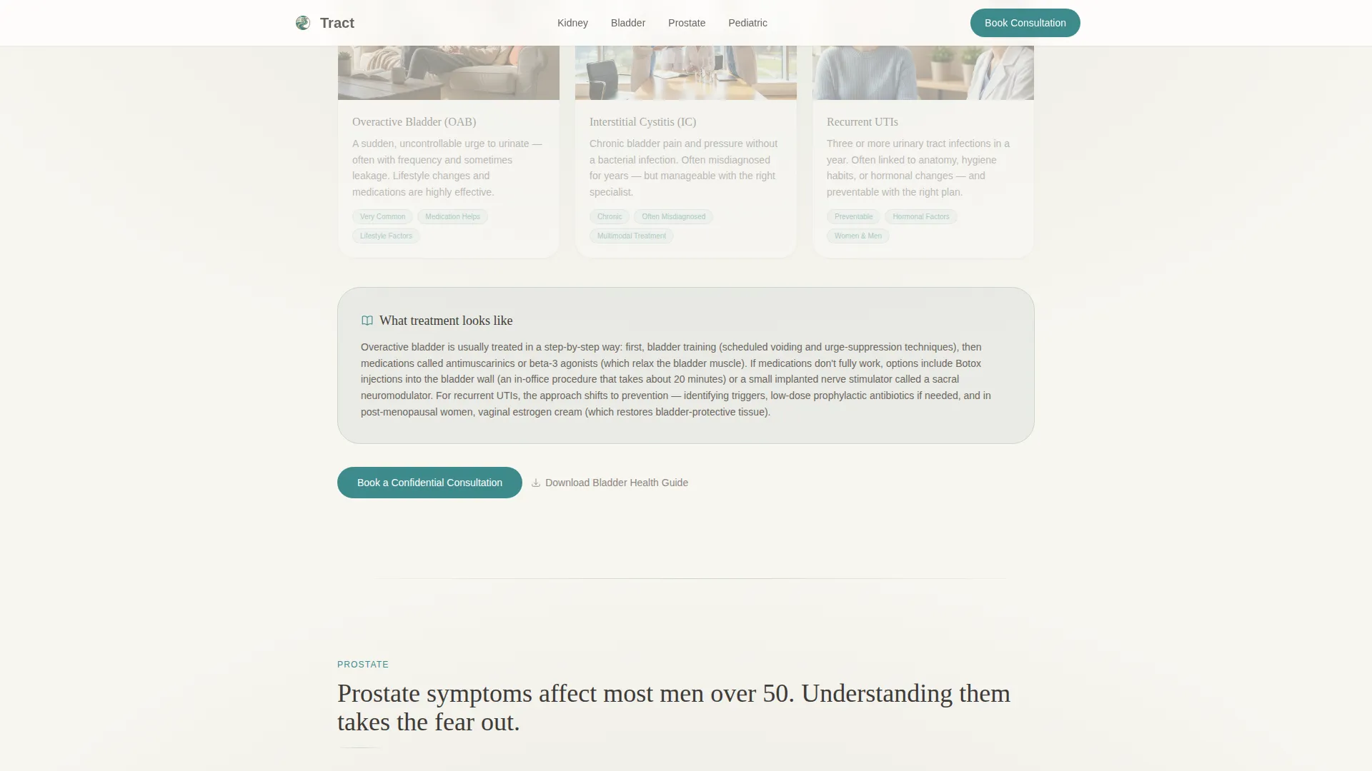
Every spoke section contains condition guides written without unexplained medical terminology. Each guide ends with a short "What treatment looks like" paragraph that walks patients through the process in calm, clear language. The rhythm moves from identification to education to a confident next step.
Progressive Disclosure Consultation Form
The primary conversion form uses progressive disclosure to reduce friction. The first field asks "What brings you in?" as a condition-category dropdown. The visitor then selects a preferred contact method, either phone or secure message, before entering their name and availability. This staged approach feels conversational rather than clinical.
Gated Symptom Guide Download
A secondary conversion path offers a downloadable symptom guide as a portable document format file. It requires only an email address, giving the late-night visitor a low-commitment way to engage before they are ready to call. This path runs parallel to the primary consultation booking flow.
Credentials, Trust, and Testimonials Block
A dedicated trust section presents the urologist's biography, credentials, and patient volume statistics. Below it, three patient testimonials share specific condition outcomes in first-person language. Together these blocks give new visitors the social proof they need to feel confident booking a consultation.
Page sections overview
| Section | Purpose |
|---|---|
| Hero Portrait | Establishes trust, presents anchor nav, introduces headline |
| Anchor Navigation Bar | Lets visitors jump directly to their condition area |
| Kidney and Stone | Checklist, condition guides, treatment pathway, call to action |
| Bladder Health | Checklist, condition guides, treatment pathway, call to action |
| Prostate | Checklist, condition guides, treatment pathway, call to action |
| Pediatric Urology | Checklist, condition guides, treatment pathway, call to action |
| Sexual Health | Checklist, condition guides, treatment pathway, call to action |
| Surgical Guides | Checklist, condition guides, treatment pathway, call to action |
| Credentials and Trust | Doctor bio, credentials, patient volume statistics |
| Patient Testimonials | Three specific outcome stories for social proof |
| Consultation Form | Progressive disclosure booking form |
| Footer | Linear single-row links and contact details |
Design & branding system
The visual identity follows an Organic Flow theme built around the Cloud Canvas color system. Every design choice is calibrated to feel calm and approachable, not clinical or alarming.
- Color palette: soft cumulus white (#F7F5F0) as the primary background, muted sage (#A3B5A6) for section dividers and category cards, warm pebble gray (#6B6560) for body text, and a single reassuring teal (#3D8B8B) reserved for interactive elements and anchor navigation highlights
- Typography: Fraunces serif for headlines to add warmth and authority, DM Sans for body text to keep reading fast and comfortable
- Spacing and edges: generous whitespace throughout, sage washes behind condition category blocks with feathered rather than sharp edges, giving each section room to breathe
Mobile & speed optimization
The template is built mobile-first because the primary use case is a patient searching from a phone late at night. Every interactive element and conversion path is optimized for that context.
- The "Book a Confidential Consultation" call to action is pinned to the bottom of the viewport on mobile so it is always reachable without scrolling back to the top
- Spoke sections use lazy loading so the initial page load stays fast even with six content-heavy condition areas
- Scroll-reveal animations and toggle interactions are set to medium intensity, keeping the experience lively without slowing down the page on lower-powered devices
How this template helps you convert
Tract is structured as a patient journey, not a brochure. Every section moves visitors one step closer to booking or sharing their contact details.
- The self-assessment checklists create immediate personal relevance. When a visitor sees their own symptoms reflected back with a relevance score, they feel understood and stay on the page longer.
- The dual conversion paths serve two types of visitors at once. Visitors ready to act can book a confidential consultation directly. Visitors who need more time can download a symptom guide with just an email address, entering a lower-stakes relationship with the practice.
Other information about this template
Tract is a purpose-built template for urology practices that need more than a standard healthcare website. A few additional details worth knowing before you get started:
- The template style is Hub and Spoke with Anchor Navigation, making it easy to expand or contract the number of spoke sections as your content library grows
- The creative direction is Checklist and Audit, meaning the interactive symptom checklists are central to the page experience rather than decorative
- The header concept is Portrait-Centered, so having a high-quality, warm photograph of the urologist is important to achieving the full intended effect
- The landing page direction is Lead Generation, with every section designed to funnel visitors toward either the consultation form or the symptom guide download
- The template is localized for English (United States) with no currency fields and no language-switching components included
- Animation intensity is set to medium, with scroll reveals and toggle interactions built in; overly aggressive motion is intentionally avoided to keep the experience calm
Theme
Organic Flow
Creative direction
Checklist & Audit
Color system
Cloud Canvas
Style
Hub & Spoke (Anchor Nav)
Direction
Lead Generation
Page Sections
Portrait-centered Hero with Anchor Nav
Toggle-based Symptom Checklists
Plain-language Condition Guides
Progressive Disclosure Booking Form
Gated Symptom Guide Download
Credentials and Social Proof Block
Related questions
Can I customize the six spoke sections for my specific condition areas?
What content do I need to provide to fill out the template?
Is this template suitable for a solo urologist or a group practice?
Does the symptom checklist collect or store visitor data?
Can the symptom guide download form be linked to an email platform?



