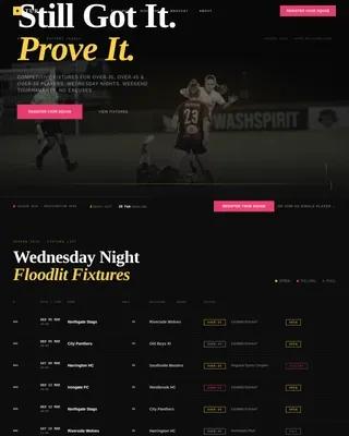
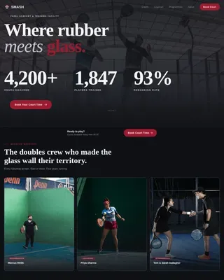
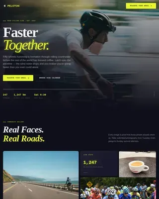
Cycling & Running Club Booking Website Template
The Shred mountain bike club landing page template is designed for trail crews ready to turn website visitors into booked riders. Built on a bento grid layout with a full-screen video hero, live-style stat tiles, ride preview cards, and a sticky booking bar, this dark and charged landing page makes it easy for mountain bike clubs to fill spots and grow their community fast.
by Rocket studio
Quick summary
This landing page template is purpose-built for mountain bike clubs that run regular group rides and need a fast, clear path from first impression to booked spot. The design pairs high-energy visuals with hard ride data so that every visitor can self-qualify, explore upcoming routes, and claim a seat in seconds. It is dark, charged, and built for action.
Who this template is for
This template is designed for mountain bike clubs and trail communities that organize structured weekly rides across mountain terrain. It is the perfect fit if your club maintains singletrack, tracks active riders, and needs a landing page that earns trust and drives bookings without requiring a developer.
- Weekend warriors who ride two to four times per month and want to find a crew that matches their pace and progress
- After-work escape artists and trail parents with tight windows who need to see ride duration, difficulty, and open spots at a glance
- Club organizers and team leads who want to set up a polished, high-converting page without building from scratch
What problem this template solves
Many adventure pages are designed as mood boards instead of decision tools. They look beautiful but leave visitors without a clear structure to understand what they are signing up for, who else is going, or what to do next. Users who need confidence early never reach the booking section, so the page loses qualified intent that was already hard to earn.
This template solves that gap by leading with data and letting visuals support decisions rather than replace them.
- Ride-curious visitors land on a page that immediately shows distance, elevation, active rider count, and available spots, so they can determine fit without heavy scrolling
- The booking flow is designed to reduce friction: a sticky bar, a four-week calendar, capacity indicators, and a low-commitment free ride gate all work together to guide users from browse to booked
- Club teams can update ride cards, swap stats, and make seasonal changes quickly without breaking the page structure or brand consistency
What you get with this template
This template gives mountain bike clubs a complete, ready-to-launch landing page designed around the full booking journey. Every section has one clear purpose, and the layout is built so attention flows naturally from the hero through the stats, ride previews, crew profiles, and into the booking modal.
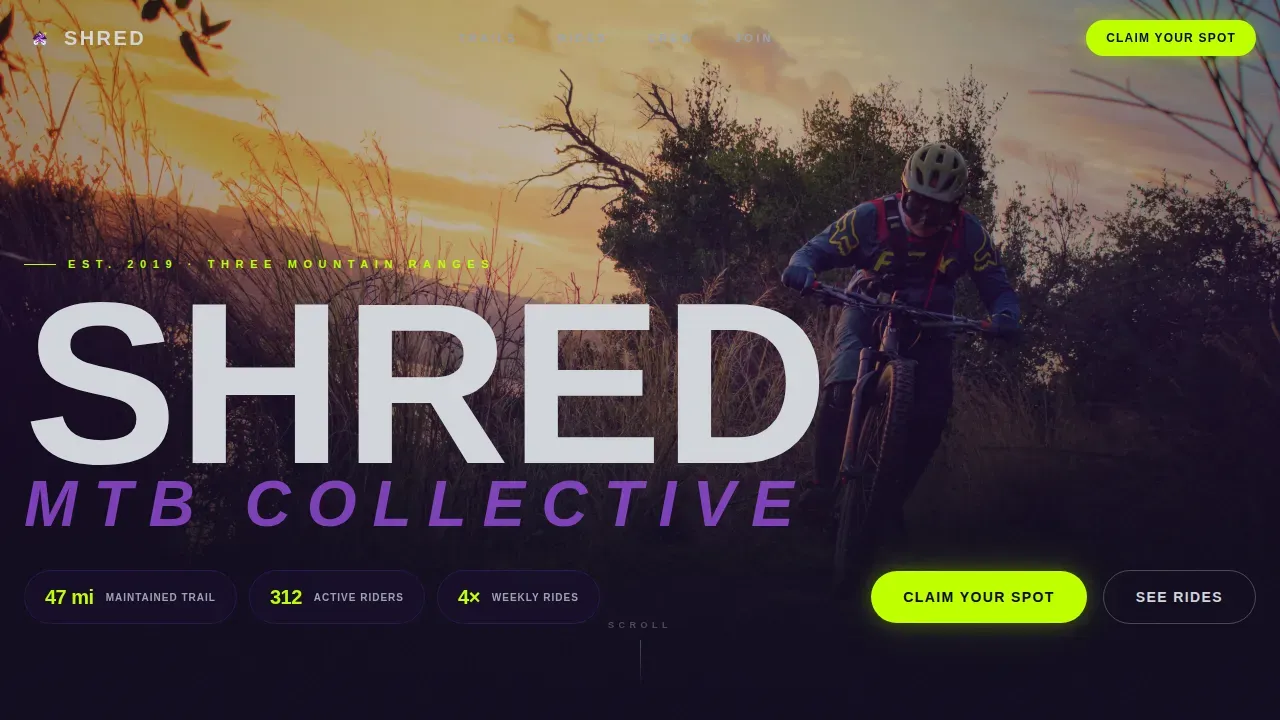
- A full-screen video hero with oversized condensed headline type, floating stat pills, and a sticky call-to-action bar that appears after the first scroll
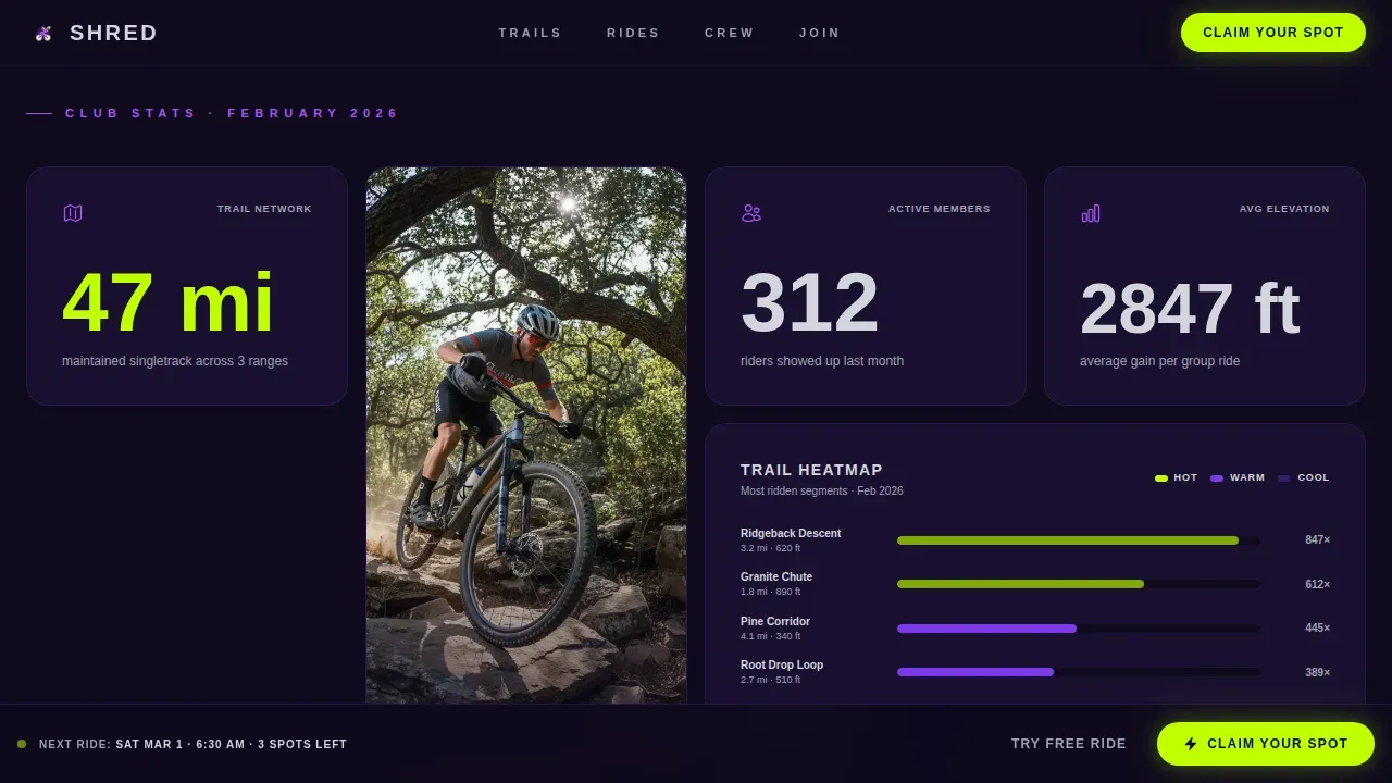
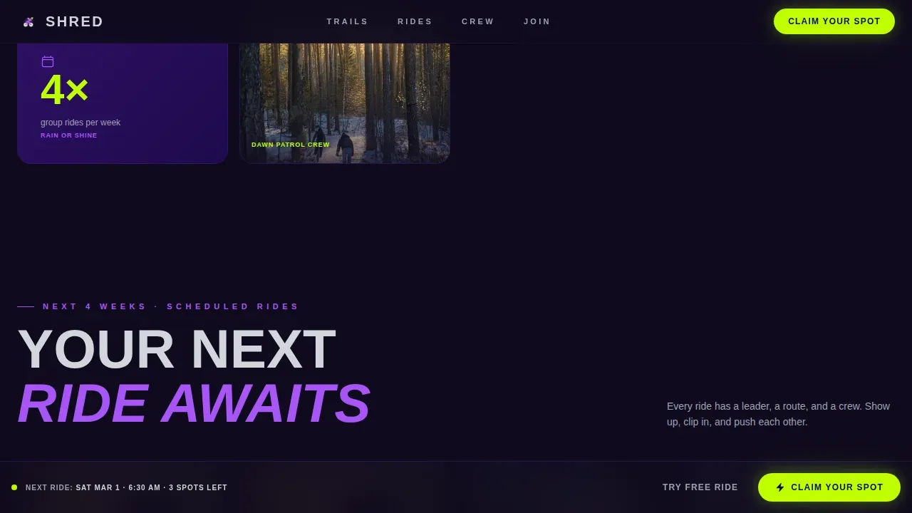
- An asymmetric bento grid with stat tiles covering 47 miles of maintained trail, 312 active riders, four weekly group rides, and average elevation gain of 2,847 feet, interspersed with action photography tiles and a live-style heatmap of the most-ridden segments
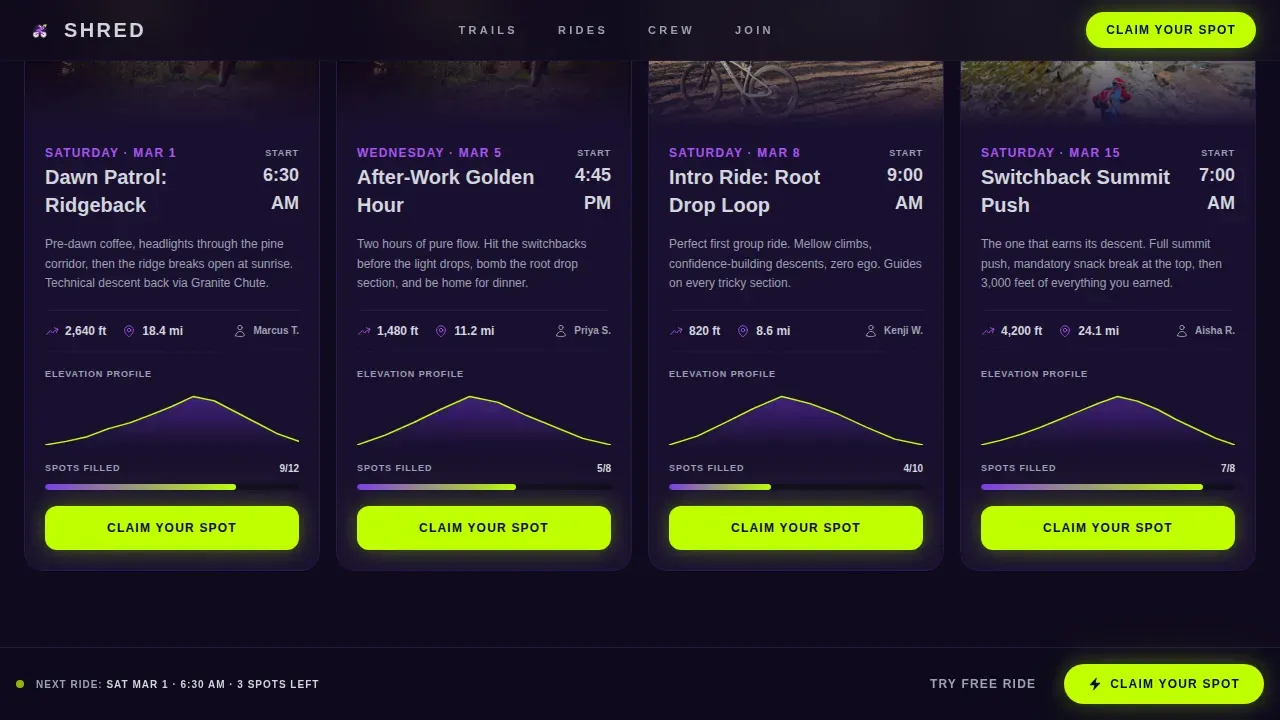
- Ride preview cards for the next four scheduled rides, each showing distance, elevation profile, difficulty rating, and real-time capacity indicators so riders can select the right route before they book
Feature list
This template is designed around six core capabilities that work together to move mountain bike club visitors from discovery to confirmed booking.
Full-Screen Video Hero with Stat Pills
The hero section fills the screen with drone and first-person trail footage. The club name lands in oversized condensed type three seconds in, punched out of the footage in granite gray. Floating stat pills give visitors immediate proof of club scale: miles of trail, active riders, and weekly ride frequency appear before any scroll, setting confidence from the first moment.
Asymmetric Bento Grid Stats Section
The bento grid drops immediately after the hero and hits with numbers before narrative. Stat tiles vary in size across the grid, some spanning two columns for emphasis, creating visual patterns that guide the eye naturally. Action photography tiles and a live-style heatmap of the most-ridden mountain segments are woven into the grid, so the page tells a story with data and imagery working together.
Ride Preview Cards with Capacity Indicators
Each ride card shows the route name, distance, elevation profile rendered as a mini trail map, difficulty rating, and a real-time capacity indicator such as eight of twelve spots filled. This detail-rich format lets riders assess the next day's dawn patrol or a weekend climb at a glance, building booking confidence without requiring a separate page to explore the schedule.
Sticky Booking Bar and Ride Calendar
A sticky bottom bar appears after the first scroll and anchors the primary call to action throughout the page. Tapping it opens a booking modal with a four-week ride calendar. Each ride entry shows capacity, and the booking form asks for name, experience level (beginner, intermediate, or send it), and bike type. This clear, step-by-step flow makes it easy for new and returning riders to commit.
Free Ride Email Gate for New Visitors
A secondary conversion path targets non-members who are not yet ready to book a paid ride. A single-field email gate unlocks the next open introductory group ride. This low-friction entry point is designed to grow the club's audience by allowing curious riders to experience the community before committing to a full membership.
Crew Profile Section with Member Archetypes
Three member archetype cards represent the weekend warrior, the after-work escape artist, and the trail parent. Each profile gives new visitors a fast way to see themselves in the club, building the kind of social proof and community storytelling that supports conversion. Members reading their own story on the page feel seen; new visitors understand exactly who they will be riding with.
Page sections overview
| Section | Purpose |
|---|---|
| Full-Screen Video Hero | Set the mountain terrain mood and anchor club identity with oversized type and stat pills |
| Stats Bento Grid | Deliver trust-building ride data and social proof before visitors scroll to narrative |
| Ride Preview Cards | Show upcoming routes with duration, difficulty, elevation, and open capacity |
| Crew Profile Cards | Help visitors self-identify with member archetypes and understand who rides with the club |
| Booking Modal and Calendar | Guide users through spot selection, experience level input, and ride confirmation |
| Free Ride Email Gate | Capture non-member leads with a low-commitment entry path to an intro group ride |
| Footer | Close the page with a clean linear layout and supporting navigation |
Design & branding system
The Adventure Terrain visual identity is built around a purple mountain twilight palette that feels dark, charged, and alive at the edges. The color system is designed to create strong contrast at every action point, ensuring that calls to action are impossible to miss and that the overall page feels immersive without sacrificing clarity.
- Deep trail-shadow indigo (#2E1065) forms the page background, electric violet (#7C3AED) anchors primary user interface elements, exposed granite gray (#D1D5DB) surfaces card backgrounds, and high-vis lime (#BFFF00) is reserved exclusively for call-to-action buttons and live data callouts
- Typography is set in Barlow Condensed for all headlines, creating that punchy, trail-sign energy, paired with DM Sans for body copy to keep longer descriptions easy to read
- High-contrast visuals including full-screen video and action photography tiles are designed to answer decision questions, not just create atmosphere, so every image earns its place on the page
Mobile & speed optimization
Mobile experience is not just a usability detail for mountain bike clubs. Riders book from trail parking lots, phone in hand, with thirty seconds to spare before the group rolls out. This template is designed mobile-first, with touch-friendly button sizes, a layout that reflows cleanly across screen sizes, and GPU-accelerated animations that keep interactions smooth on mid-range devices.
- The video hero includes a poster-image fallback so the page loads fast on slower mobile connections without breaking the visual concept
- The sticky booking bar is positioned and sized for one-thumb access on mobile screens, ensuring the primary call to action is always within easy reach
- GSAP ScrollTrigger animations and staggered bento reveals are built to run on GPU-accelerated transforms only, protecting frame rate on mobile during scroll
How this template helps you convert
Adventure brands operate in a high-emotion category, but conversion still depends on clarity. This template is built for fast confidence, combining emotional storytelling with a practical decision architecture that moves users from inspiration to action without pressure.
- Trust is made visible early: the hero stat pills, the bento grid data, and the capacity indicators all place proof near the top of the page, so visitors understand the club's scale and credibility before they reach a single call to action. Pages that convert well place credibility cues near top claims, then reinforce them again near itinerary and offer decisions, and this template follows that pattern precisely.
- The booking path is clear and low-risk: the sticky bar keeps the primary action in reach at all times, the four-week calendar shows exactly what riders are signing up for, and the free ride gate gives hesitant visitors a no-commitment first step. Clear next-step transparency is more effective than urgency language for most adventure audiences, and the template reflects that approach.
Other information about this template
This template sits in the Sports and Recreation category, specifically the Cycling and Running Club subcategory, with a Mountain Bike Club niche focus. It is a strong source of inspiration for any club or trail organization that wants to launch fast, test their booking flow, and iterate based on real rider feedback.
- The page structure is designed to support frequent seasonal changes, allowing club teams to swap ride cards, update stats, and refresh photography without rebuilding the layout, which is important for clubs running year-round schedules across mountain terrain
- Trail difficulty descriptions in the ride cards can reference the IMBA 5-tier system, focusing on Blue, Black, and Double Black Diamond ratings, so riders understand intensity before they select a route
- A gear checklist noting required equipment such as hydration packs, gloves, and helmets can be added to the booking modal or a dedicated section to protect riders and communicate club safety protocols clearly
- The template is designed to support member testimonials and reviews, giving clubs a simple way to build credibility by letting current riders share their story alongside the stat tiles
- This template is an ideal example of how to build a high-performing mountain bike club landing page that balances emotional nature photography and video with the specific logistics riders need to make fast booking decisions
Theme
Adventure Terrain
Creative direction
Stats-First Impact
Color system
Electric Indigo
Style
Bento Grid
Direction
Booking/Scheduling
Page Sections
Full-screen Video Hero with Floating Stats
Asymmetric Bento Grid with Live-style Heatmap
Ride Preview Cards with Elevation Profiles
Sticky Booking Bar and Four-week Calendar
Free Ride Email Gate for Non-members
Crew Profile Archetype Cards
Related questions
Can I customize the ride stats and trail data shown in the bento grid?
Does the booking form support different experience levels?
How does the free ride email gate work?
Is the template designed to handle seasonal schedule changes easily?
What should I include to help new riders feel confident before booking?