Expert Home Staging Landing Page Template
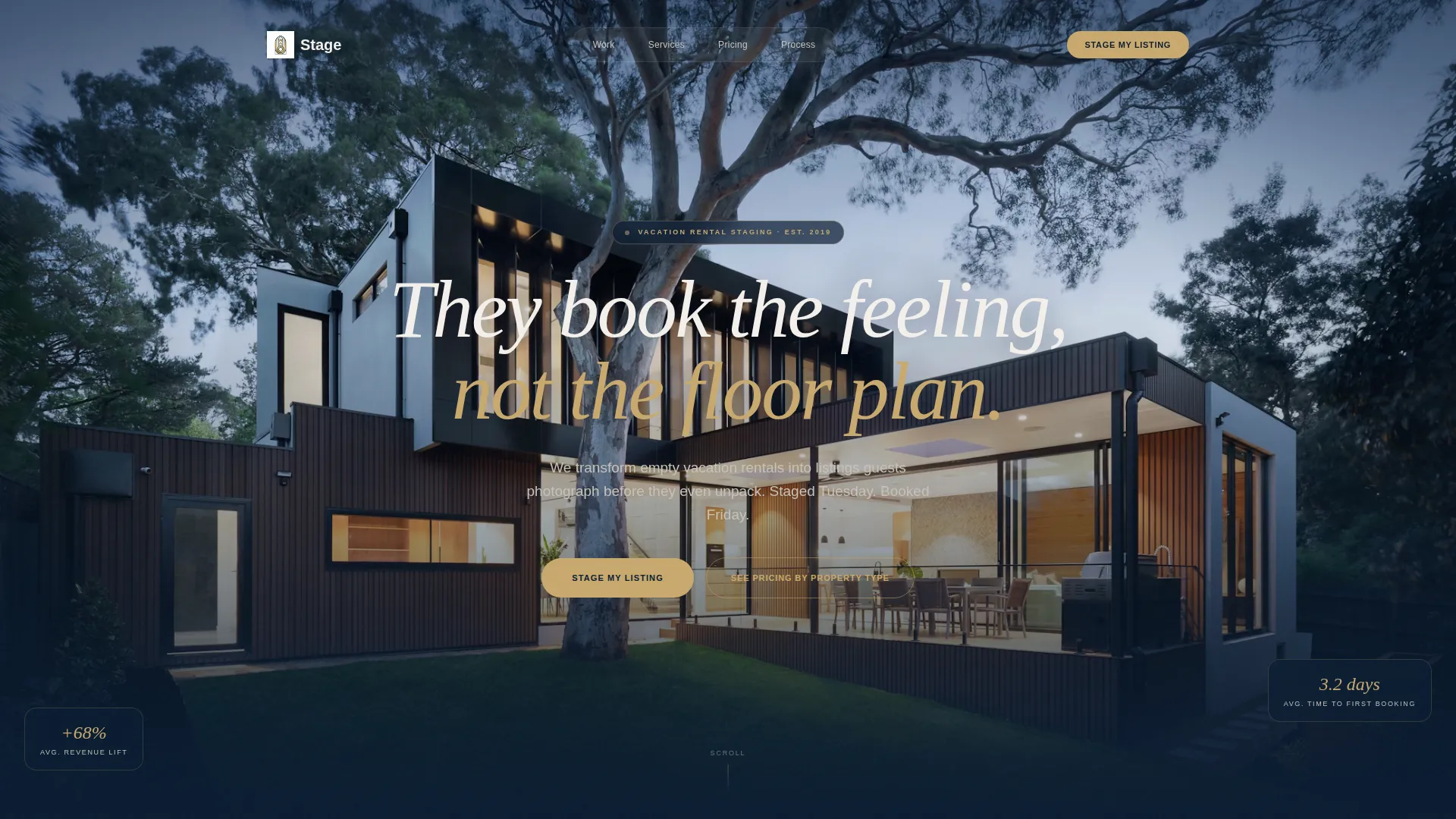
Atelier is a single-page landing page template built for vacation home staging services. It features a full-screen video header, an asymmetric 60/40 gallery grid, tiered pricing cards, and a streamlined checkout flow. The dark navy visual identity and brass accent details create an atmosphere of quiet luxury that turns property transformations into compelling booking proof.
by Rocket studio
Quick summary
Atelier is a boutique vacation home staging landing page template. It pairs a cinematic full-screen video header with a scrolling gallery of before-and-after property transformations. Three tiered pricing cards drive direct sales, and a persistent mobile call-to-action keeps the booking path always visible. The design feels like a high-end editorial feature, not a services directory.
Who this template is for
This template is built for professionals who stage vacation rentals and need a page that closes the sale on first impression. It speaks directly to service providers in coastal, mountain, and desert markets who work with property owners expecting fast results.
- Boutique staging teams serving Airbnb superhosts managing three to twelve properties
- Hospitality groups launching new listings in mountain and beach markets
- Vacation property staging businesses targeting real estate investors who need listings earning quickly
What problem this template solves
Empty vacation rentals lose bookings not because of location but because of presentation. Most staging services rely on referrals and basic portfolio pages that do nothing to justify the investment. This template closes that gap by making the transformation proof impossible to ignore.
- Visitors arrive skeptical; the gallery walk converts visual evidence into purchase confidence
- Property owners need to see the return before they commit; brass-numeral rate-increase callouts make that case immediately
- Mobile visitors need a frictionless path to book; the persistent bottom bar keeps the primary call-to-action always reachable
What you get with this template
You get a complete, conversion-focused landing page built around visual storytelling and direct sales. Every section is purpose-built to move a property owner from curious visitor to paying client.
- A full-screen slow-motion video header with an embedded headline at the midpoint of the walk-through
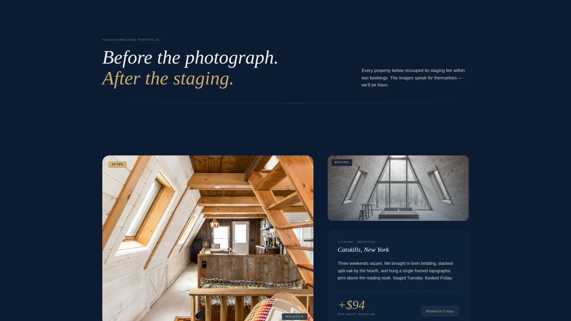
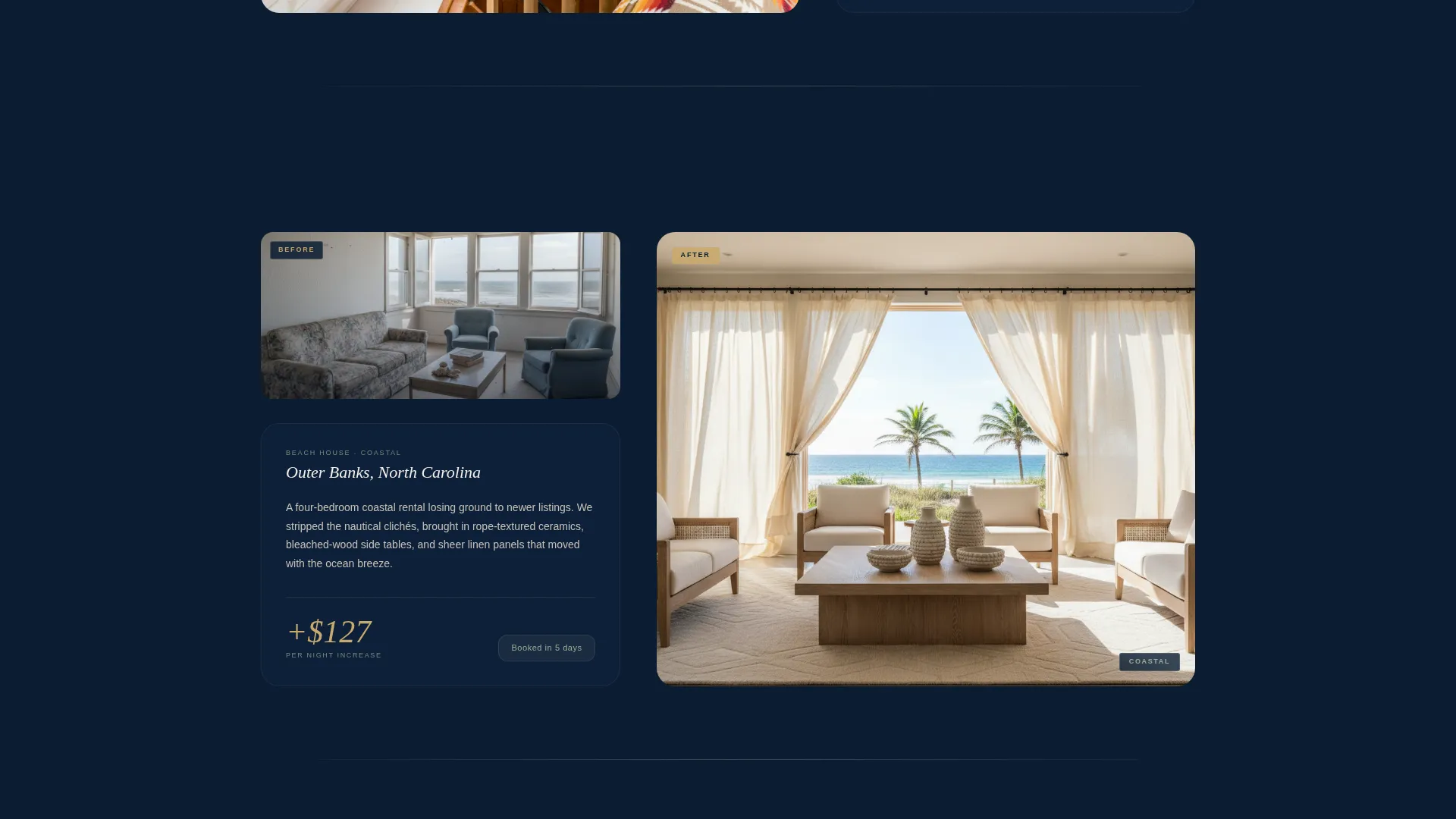
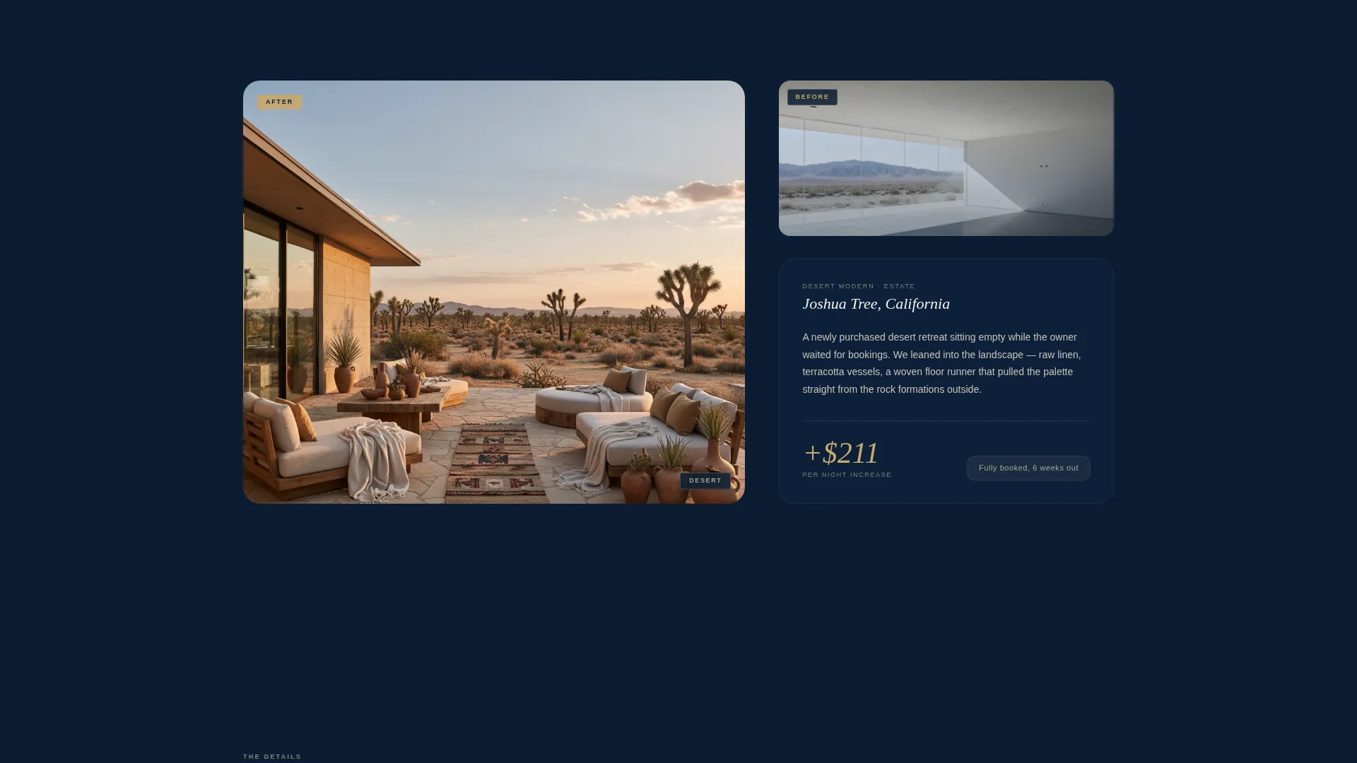
- An asymmetric 60/40 gallery grid displaying staged transformations with gallery-placard-style narrative captions and nightly rate increase figures
- Three tiered staging package cards with a checkout flow including property type selector, square footage range, preferred date, and photo upload
Feature list
This template is built around a small number of deliberately chosen components. Each one is designed to earn attention and guide visitors toward a booking decision.
Full-Screen Video Header
The header plays a single uncut steadicam walk-through of a freshly staged lakehouse. Ambient sound replaces music. The headline appears in chalk white at the midpoint of the footage, keeping the visual story uninterrupted.
Asymmetric 60/40 Gallery Grid
Each scroll section pairs a large hero image of the staged space with a narrower column holding the before photo, a short narrative caption written in gallery-placard style, and a brass-numeral nightly rate increase. Properties rotate between coastal, mountain, and desert to demonstrate range.
Detail Vignette Closing Grid
The final scroll section slows the pace with close-up images of staging details: a turned-down bed corner, a stack of firewood, a hand-thrown mug on a windowsill. This section reinforces the craftsmanship argument that makes the purchase feel justified.
Tiered Pricing Cards
Three cards sit against the navy background presenting Weekend Refresh, Full Transformation, and Portfolio Launch packages. The layout separates casual inquirers from multi-property owners and gives each visitor a clear entry point.
Streamlined Checkout Flow
Clicking the primary call-to-action opens a focused intake sequence: property type selector, square footage range, preferred staging date, and a photo upload field for the current state of the space. A secondary mid-scroll path anchors comparison shoppers before they reach pricing.
Persistent Mobile Call-to-Action Bar
On mobile, the Stage My Listing button locks to the bottom of the screen throughout the scroll. Visitors never have to scroll back up to take action.
Page sections overview
| Section | Purpose |
|---|---|
| Full-Screen Video Header | Opens with a cinematic walk-through and sets the editorial tone |
| Hero Headline Overlay | Delivers the brand positioning line mid-footage in chalk white |
| Primary call to action Placement | Drives immediate action directly beneath the header video |
| Gallery Walk Sections | Presents staged property transformations as curated exhibition rooms |
| Rate Increase Callouts | Shows brass-numeral nightly rate gains to justify the staging fee |
| Detail Vignette Grid | Closes the gallery sequence with close-up craft and texture shots |
| Tiered Pricing Cards | Displays three package options against the navy background |
| Checkout Intake Flow | Guides buyers through property type, size, date, and photo upload |
| Secondary Pricing Path | Anchors mid-scroll for visitors comparing by property type |
| Persistent Mobile Bar | Keeps the primary call-to-action locked to the mobile bottom bar |
Design & branding system
The visual identity follows an Atelier Studio theme built on a navy authority palette. Every color choice is intentional: the combination reads like a designer's mood board rather than a typical service page.
- Deep maritime navy (#0B1D33) dominates backgrounds; chalk white (#F4F0EB) handles all body text and breathing space; warm brass (#C9A96E) activates buttons and hover states
- Muted sage (#7A8B7A) appears in dividers and tags as a secondary accent, keeping the palette grounded without competing with brass
- Typography and spacing are disciplined and tactile, creating a sense of quiet authority that signals premium positioning without stating it directly
Mobile & speed optimization
The template is structured to keep the mobile experience as intentional as the desktop version. The most critical conversion element never disappears from view.
- The persistent bottom bar locks the Stage My Listing button to the bottom of the screen on all mobile viewports
- The asymmetric grid reflows cleanly for smaller screens, maintaining the visual hierarchy between hero images and narrative caption columns
- The checkout intake flow is designed as a streamlined step-by-step sequence, reducing friction for mobile visitors completing a purchase
How this template helps you convert
The page earns the purchase by front-loading transformation proof. Every design decision is ordered to reduce doubt and increase commitment before the visitor reaches the pricing section.
- The video header creates immediate emotional resonance; visitors feel the quality of the staging before reading a single claim
- The gallery walk delivers repeated visual evidence with quantified outcomes, making the return on investment argument visual and specific
- The tiered pricing structure separates buyer intent into three clear paths, reducing hesitation and guiding each visitor to the package that fits their situation
Other information about this template
This template is purpose-built for the vacation home staging niche within the broader real estate and property services market. It is designed as a single landing page with a direct sales flow rather than a multi-page service website.
- The template suits boutique staging operators who want a standalone page rather than a full site build
- The Gallery Walk creative direction is especially effective for vacation rental staging businesses that serve multiple market types, such as coastal, mountain, and desert properties
- The dark immersive theme and card grid modular structure allow individual sections to be updated as new staging projects are completed
- The checkout flow supports a click-through purchase path, making it suitable for teams ready to accept direct bookings without a separate consultation step
Theme
Dark Immersive
Creative direction
Immersive Visual
Color system
Cloud Canvas
Style
Card Grid (Modular)
Direction
Click-Through
Page Sections
Full-screen Cinematic Video Header
Asymmetric 60/40 Gallery Grid
Detail Vignette Closing Grid
Tiered Staging Package Cards
Streamlined Direct Checkout Flow
Persistent Mobile Call-to-action Bar
Related questions
What kind of business is this template designed for?
Can I update the gallery sections with my own staging projects?
How does the direct checkout flow work for new clients?
Does this template support multiple service tiers?
Is this a single-page template or does it include multiple pages?



