Hospitality Consulting Landing Page Template
Transformedge is a Corporate Precision landing page built for hospitality digital transformation consultancies. It pairs a Giant Headline Left layout with a Charcoal and Amber color system to deliver a stats-first editorial experience. Every scroll position opens with a metric before a narrative, building undeniable proof that moves hotel GMs, F&B directors, and hospitality CFOs toward a single high-intent click.
by Rocket studio
Quick summary
Transformedge is an editorial landing page template designed for hospitality consulting firms that lead with data. The layout follows a Stats-First Impact direction, opening with bold financial callouts and case study metrics before introducing any narrative. The result feels less like a service page and more like a strategy brief that earns trust before it asks for anything.
Who this template is for
This template is built for consultancies that transform hotel, resort, and restaurant group operations through technology and process redesign. It suits professionals who need their page to communicate precision, credibility, and measurable outcomes at a glance.
- Hotel and resort technology consultants presenting operational transformation services
- Hospitality CFO and F&B advisory firms that lead with financial proof and hard metrics
- Consulting practices targeting hotel GMs, F&B directors, and hospitality finance leaders
What problem this template solves
Hospitality consulting firms often struggle to communicate complex, high-value services on a single page. Generic service layouts bury the proof that sophisticated buyers need to see immediately. This template replaces that with a structured editorial rhythm that puts numbers first.
- Eliminates the gap between a consultancy's credibility and how its web page reads to skeptical buyers
- Removes reliance on form-heavy pages by guiding visitors toward a single high-intent click instead
What you get with this template
You get a fully designed, editorial-style landing page that functions like a printed strategy report. Every section earns its place by stacking proof, metrics, and named outcomes in a deliberate sequence.
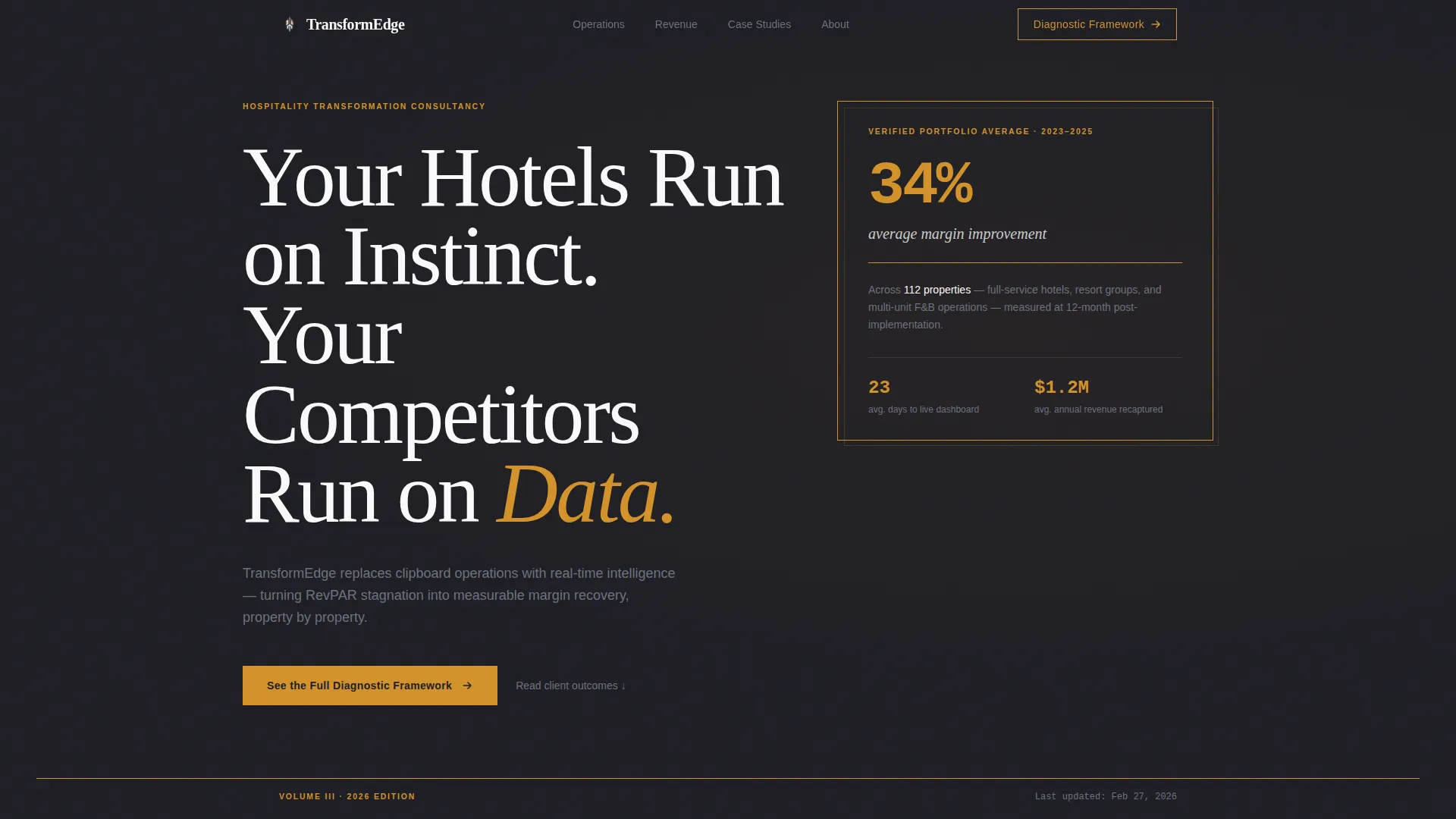
- A Giant Headline Left hero section with an oversized financial callout in a thin-ruled typographic box
- Stats-first section layouts pairing lead metrics with case study narratives and executive pull quotes
- A persistent amber call-to-action button that surfaces after 60 percent scroll depth, plus an inline text link after the second case study
Feature list
This template is built around a deliberate set of design and layout features that serve the hospitality consulting use case specifically.
Stats-First Section Architecture
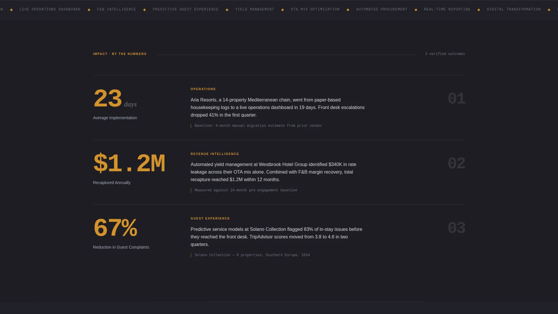
Each scroll position opens with a prominent metric before any narrative copy begins. This trains the reader to expect proof at every turn, building cumulative trust across the full page.
Giant Headline Left Hero
The hero section sets flush-left display type at an outsized scale. A single financial callout floats in a thin-ruled box to the right, typeset like an excerpt from a financial report. No competing imagery dilutes the message.
Editorial Pull Quote Blocks
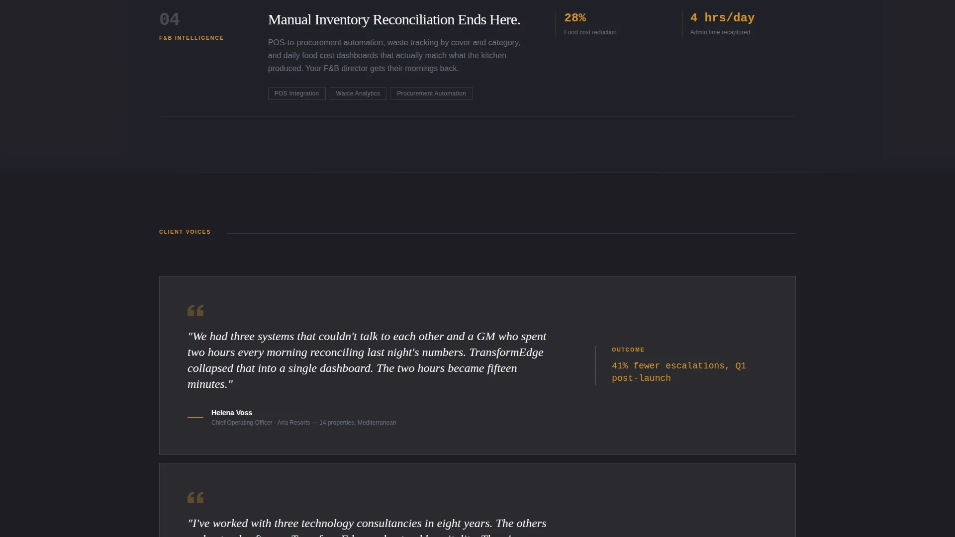
Oversized serif italic pull quotes sit inside bright white card surfaces. These quote blocks break the data density with breathing room, creating the rhythm of a magazine spread rather than a marketing page.
Small-Cap Chapter Labels
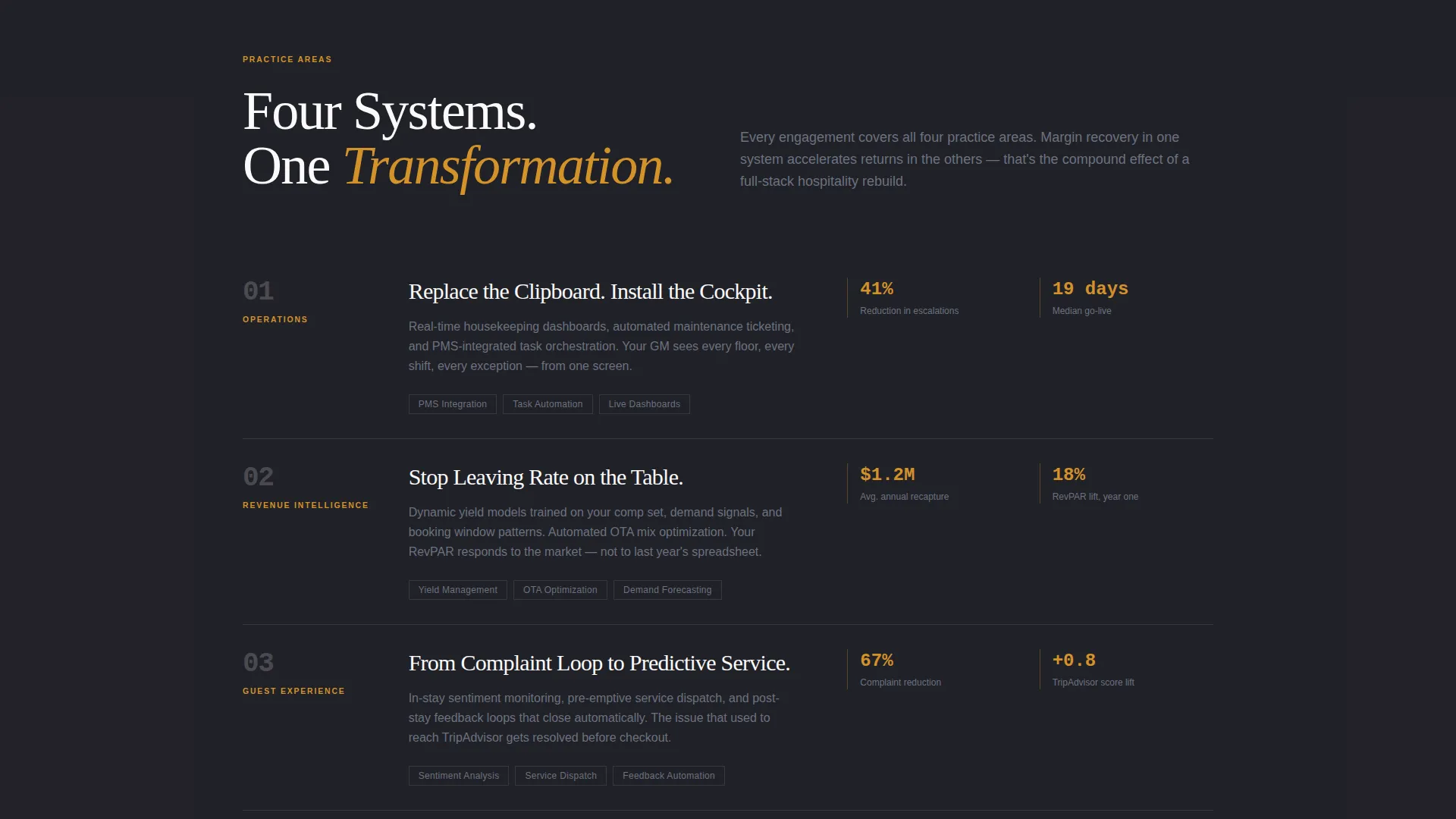
Section labels such as OPERATIONS, GUEST EXPERIENCE, and REVENUE INTELLIGENCE appear in small caps. They let readers orient themselves the way chapter headings do in a printed strategy deck.
Dual-Mode Call to Action
The primary call to action appears first as a text link embedded naturally in the editorial flow after the second case study. It then resurfaces as a persistent amber button fixed in the bottom-right corner after the visitor scrolls past 60 percent of the page.
Charcoal and Amber Color System
Deep charcoal forms the dominant background. Warm amber is used exclusively for data highlights, stat figures, and hover states. Cool slate handles body copy. Bright white surfaces card blocks and pull quotes. The palette is disciplined and purposeful throughout.
Page sections overview
| Section | Purpose |
|---|---|
| Hero Headline Block | Deliver the core value proposition with an oversized display headline and financial callout |
| Amber Rule Divider | Signal editorial rhythm and chapter transition after the hero fold |
| Stats Impact Row | Open the first scroll position with lead metrics before case narrative |
| Case Study One | Present named property outcomes with data-led storytelling |
| Pull Quote Block | Break data density with an executive voice and breathing room |
| Stats Impact Row Two | Lead the second section with a key financial figure before narrative |
| Case Study Two | Deliver a second named outcome with supporting breakdown |
| Inline call to action Link | Embed the primary call to action naturally within editorial flow |
| Small-Cap Sections | Organize OPERATIONS, GUEST EXPERIENCE, and REVENUE INTELLIGENCE chapters |
| Data Card Grid | Alternate dense metric cards with generous white space |
| Persistent call to action Button | Surface the amber call-to-action button after 60 percent scroll depth |
Design & branding system
The visual identity follows a Corporate Precision theme that communicates authority without decoration. Every color and typographic choice serves a specific function, and no element appears purely for aesthetic reasons.
- Deep charcoal (#1E1E24) dominates the background; warm amber (#D4922A) appears only on data highlights, stat figures, and hover states; cool slate (#6B7280) handles body and secondary copy; bright white (#FAFAFA) surfaces card blocks and pull quotes
- Display type is flush-left and oversized in the hero; serif italic is reserved for pull quotes; small-cap labels organize section chapters with editorial clarity
Mobile & speed optimization
The template is designed with a layout hierarchy that translates cleanly from wide editorial spreads to narrower viewports. The Stats-First structure remains legible and impactful regardless of screen width.
- The Giant Headline Left composition and financial callout box restack gracefully at smaller breakpoints without losing typographic weight
- Data cards and pull quote blocks maintain their alternating rhythm on mobile, preserving the editorial pacing that drives scroll depth
How this template helps you convert
This template is structured to remove buying friction without introducing a form. It builds trust through stacked proof and delivers one clear action at the right moment.
- The stats-first layout means every new section opens with a named metric, making credibility cumulative and near-impossible to dismiss by the time the visitor reaches mid-page
- The dual-mode call to action places the primary click first as a natural editorial text link, then reinforces it as a persistent button after deep scroll, matching the visitor's own research momentum rather than interrupting it
Other information about this template
This template is a strong fit for hospitality digital transformation consultancy practices that need a page reflecting the sophistication of their client base. It is especially suited for firms whose buyers arrive informed and skeptical, expecting proof before conversation.
- The no-form page design intentionally removes friction; the click leads to a detailed methodology page with embedded scheduling, keeping the conversion path clean
- The template style is Editorial/Magazine, making it distinct from standard service or agency templates in the same category
- The amber accent color follows a strict usage rule: it never appears in large blocks, functioning instead like gold ink on a spine, present only where it signals importance
Theme
Corporate Precision
Creative direction
Stats-First Impact
Color system
Charcoal & Amber
Style
Editorial/Magazine
Direction
Click-Through
Page Sections
Stats-first Section Architecture
Giant Headline Left Hero
Editorial Pull Quote Blocks
Dual-mode Call to Action
Small-cap Chapter Labels
Charcoal and Amber Color System
Related questions
Who is this landing page template designed for?
Does this template include a contact form?
Can I update the case study metrics and property details with my own data?
What makes the call-to-action structure different in this template?
Is this template suited for a single-service consultancy or a broader practice?



