Credible Logistics Landing Page Template
Freight is a full-width immersive landing page template built for logistics pay-per-click agencies. It follows a case study narrative structure, guiding visitors through a real freight engagement from problem to result. The Ink and Paper visual theme, floating Polaroid-style header, and dual conversion paths make it purpose-built for VP-level logistics buyers who demand proof before they act.
by Rocket studio
Quick summary
Freight is a single-page, full-width landing page template for paid search agencies specialising in logistics. It pairs a case study narrative scroll with an Ink and Paper visual identity to build credibility fast. Every section earns the next with a specific number, a specific tactic, and a specific result, ending in two clear conversion paths for high-intent visitors.
Who this template is for
This template is built for paid search agencies that serve the freight and logistics sector. It speaks directly to the VP-level buyer who has already been burned by generalist agencies unfamiliar with freight economics.
- Logistics pay-per-click agencies presenting campaign results to third-party logistics firms
- Regional less-than-truckload carriers and cold chain operators evaluating a new agency partner
- Agency marketing leads who need a credibility-first landing page that converts with proof, not promises
What problem this template solves
Most agency landing pages list services and stop there. Freight clients, especially at the VP level, need to see documented proof before they share budget information with anyone. Generic templates cannot carry that weight.
- Visitor trust breaks down when claims lack supporting data, screenshots, or real dollar figures
- Seasonal volatility and rising cost-per-acquisition make logistics buyers unusually skeptical of surface-level pitches
- A single conversion path forces either commitment or exit, losing mid-funnel visitors who need a softer first step
What you get with this template
You get a complete, conversion-structured landing page laid out as a scrollable case study. Each visual and copy block works together to move the right visitor toward one of two clear actions.
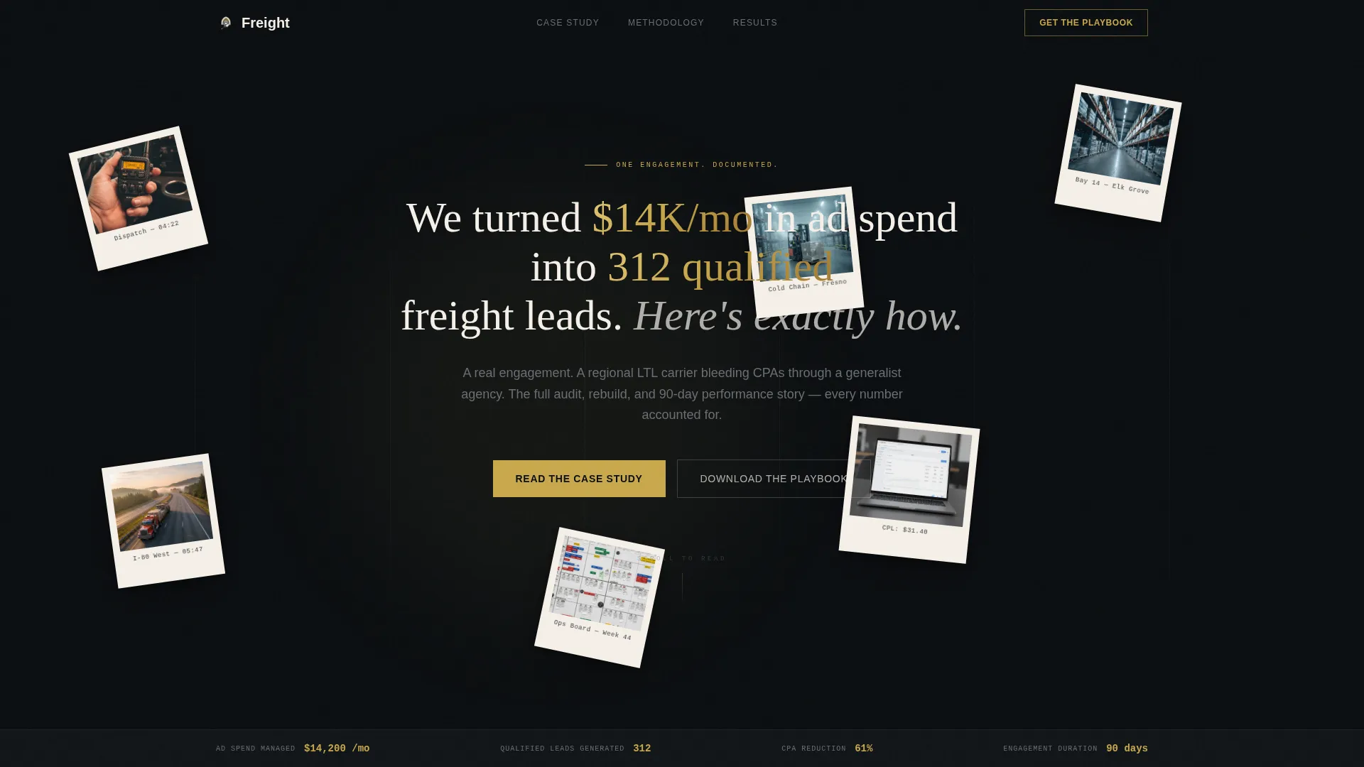
- A Floating Photos header section with five to six Polaroid-style cards drifting over an obsidian background, each carrying a candid logistics image
- A full case study narrative flow covering client problem, audit findings, campaign architecture, performance curve, and client pull quote
- A dual conversion system featuring a mid-page playbook download form and a persistent secondary audit booking button
Feature list
This template is a highly specific, narrative-driven landing page. Here are the key functional and visual components delivered.
Floating Polaroid Header
Five or six slightly rotated, shadow-cast Polaroid-style photo cards drift over a deep obsidian field. Subtle cursor-driven parallax animates the cards as visitors arrive, and a gold-ink headline materialises between them. The opening moment immediately signals that this agency operates inside the industry, not outside it.
Case Study Narrative Scroll
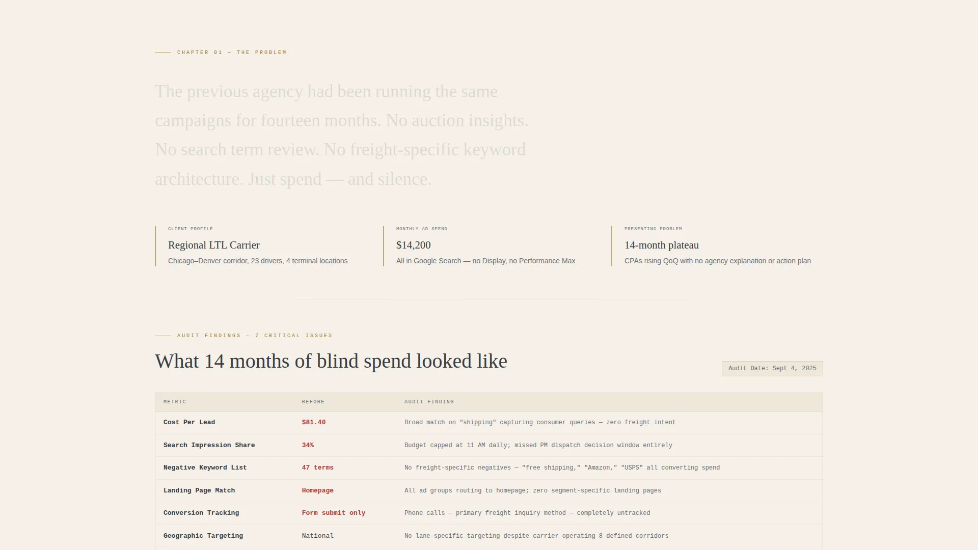
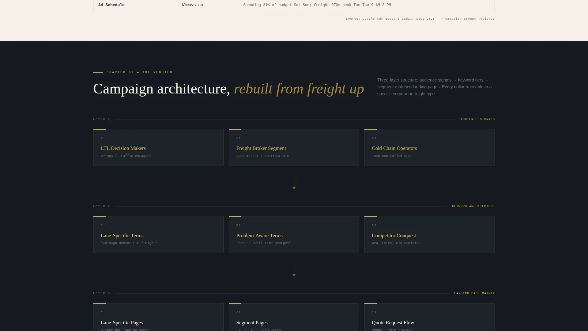
The page is structured as chapters in a single real freight engagement. Each chapter covers one stage: the client's problem, audit findings presented in ink-on-cream data tables, rebuilt campaign architecture diagrammed like a route map, and a week-by-week performance curve rising in gold against obsidian. Visitors turn pages rather than scan bullet lists.
Ink-on-Cream Data Tables
Audit findings and campaign metrics are displayed in styled data tables using the manifest cream panel surface. Every row carries a specific number or tactic finding. The tables feel like a shipping manifest rather than a generic slide deck, which is exactly the right register for a logistics-literate buyer.
Dual Conversion Path System
The primary conversion is a playbook download form placed at the credibility peak mid-case-study and repeated after the final result. The form collects work email, company name, and monthly ad spend via a four-option selector. A persistent gold-outlined secondary button anchored to the bottom-right corner offers a free freight pay-per-click audit for visitors who skip the download.
Viewport-Filling Pull Quote
The client's own words appear in a pull quote large enough to fill the viewport. This is the emotional peak of the narrative before the final conversion section. It gives proof of outcome in the client's voice, which no agency statistic can fully replicate.
Gold Performance Curve Chart
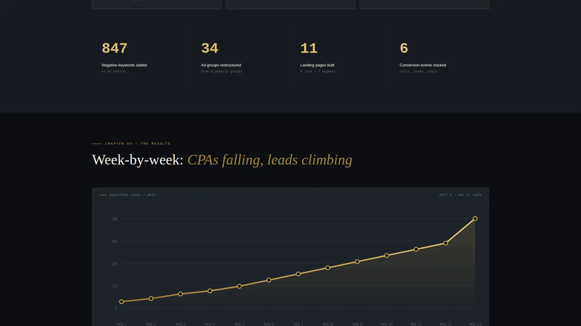
A week-by-week performance chart visualises cost-per-lead improvement over the campaign period. The rising line is rendered in ledger gold against an obsidian background, making the positive trajectory immediately readable at a glance without requiring the visitor to interpret raw numbers.
Page sections overview
| Section | Purpose |
|---|---|
| Floating Photos Header | Open with proof-forward visual authority and a specific results headline |
| Client Problem Chapter | Establish the seasonal volume and cost-per-acquisition crisis the campaign solved |
| Audit Findings Tables | Present ink-on-cream data tables showing what the prior agency missed |
| Campaign Architecture Diagram | Show the rebuilt route-map-style campaign structure visually |
| Performance Curve Chart | Display the week-by-week cost-per-lead improvement in gold on obsidian |
| Mid-Page Playbook Form | Capture leads at credibility peak with a three-field download form |
| Client Pull Quote | Deliver the emotional proof point in the client's own words |
| Final Results Section | Summarise the key outcome numbers before the closing conversion block |
| Closing Playbook Form | Repeat the download offer after the last result for high-intent visitors |
| Persistent Audit Button | Keep a secondary conversion path visible throughout the full scroll |
Design & branding system
The template uses an Ink and Paper theme expressed through an Obsidian and Gold color system. Every palette choice reinforces the idea of authority, precision, and heavyweight commitment, like a long-term freight contract signed with a fountain pen on cotton stock.
- Deep obsidian black (#0B0E11) covers primary backgrounds, the header field, and the performance chart canvas
- Manifest cream (#F5F0E8) surfaces content panels, card backgrounds, and data table sections for a tactile paper-like contrast
- Ledger gold (#C9A84C) marks data highlights, interactive accents, the performance curve line, and the secondary audit button outline
- Dock graphite (#3A3D42) carries all body text and secondary frame elements, keeping readability high without breaking the dark palette
Mobile & speed optimization
The full-width immersive layout is designed to scale clearly from desktop to smaller screens. Polaroid cards, data tables, and the performance chart are all laid out to remain legible and well-spaced on mobile viewports.
- The floating card header and parallax motion are structured to adapt gracefully to touch-based navigation
- Data tables and the campaign architecture diagram reflow cleanly so every data point stays readable without horizontal scrolling
- The persistent audit button remains anchored and accessible at the bottom-right corner across all screen sizes
How this template helps you convert
The entire page is engineered around earning the conversion rather than asking for it upfront. Every section builds the evidence stack that makes the call to action feel like the obvious next step.
- The case study narrative front-loads credibility with specific numbers, documented tactics, and screenshot-backed claims, so by the time the playbook form appears mid-page, visitors already trust the methodology enough to share their work email and ad spend range.
- The dual conversion system serves two distinct visitor types at once: the high-intent buyer ready to download and qualify, and the cautious mid-funnel visitor who needs a lower-commitment entry point through the persistent free audit button.
Other information about this template
This template fits naturally into a broader agency marketing toolkit. A few additional details worth knowing before you start building.
- The template is part of a portfolio and agency category designed for logistics marketing and agency use cases
- The Ink and Paper theme and Obsidian and Gold color system are paired specifically to the freight and logistics niche, not a generic dark theme
- The four-option monthly ad spend selector on the form acts as a built-in lead qualification layer, surfacing budget range before any sales conversation begins
- The case study narrative direction means this template works best when the agency has one strong, well-documented freight client win to anchor the story
Theme
Ink & Paper
Creative direction
Case Study Narrative
Color system
Obsidian & Gold
Style
Full-Width Immersive
Direction
Content/Resource
Page Sections
Floating Polaroid Header with Parallax
Chapter-by-chapter Case Study Scroll
Ink-on-cream Audit Data Tables
Dual Conversion Path System
Viewport-filling Client Pull Quote
Gold Performance Curve Visualisation
Related questions
Does this template work if I do not yet have a documented case study?
Can I use both conversion paths on the page at the same time?
Who is this landing page designed for?
Can the ad spend options on the form be edited?
What makes this different from a standard agency landing page template?



