Metro Landing Page Template | Scroll Reveal Design
Transit is a scroll reveal landing page template built for metro and subway system modernization campaigns. It uses a Before/After Slider header, animated Comparison Journey sections, and a Carbon Fiber color system to carry procurement officers, transportation directors, and consulting engineers from legacy infrastructure toward a clearly quantified case for capital investment.
by Rocket studio
Quick summary
Transit is a single-page scroll reveal template designed for metro and subway system stakeholders. It opens with a station-level Before/After Slider, then walks visitors through animated performance comparisons across signaling, rolling stock, passenger flow, and energy recovery. Every section quantifies the gap between aging infrastructure and upgraded operations, building toward a single high-trust click.
Who this template is for
This template is built for organizations and professionals who need to present a rigorous, data-backed case for public transit investment. The content structure and visual tone are matched to technically informed decision-makers.
- Transit authority procurement officers evaluating signaling and platform upgrades
- City transportation directors preparing capital budget presentations for council review
- Consulting engineers specifying station components for infrastructure projects years from delivery
What problem this template solves
Most transit modernization pitches rely on general claims and static slide decks. Decision-makers in public infrastructure expect specificity, not aspiration. This template solves the credibility gap by turning performance data into a scrollable, animated argument.
- Legacy versus upgraded metrics sit side by side, making the cost of inaction visible
- The progressive scroll structure keeps technically demanding visitors engaged through quantified improvement
- The click-through architecture routes visitors to a gated document without asking for form input on the page
What you get with this template
You get a fully structured, single-page landing page built around a Comparison Journey creative direction. The layout is designed to move a technically informed visitor from initial recognition to a confident click in one uninterrupted scroll.
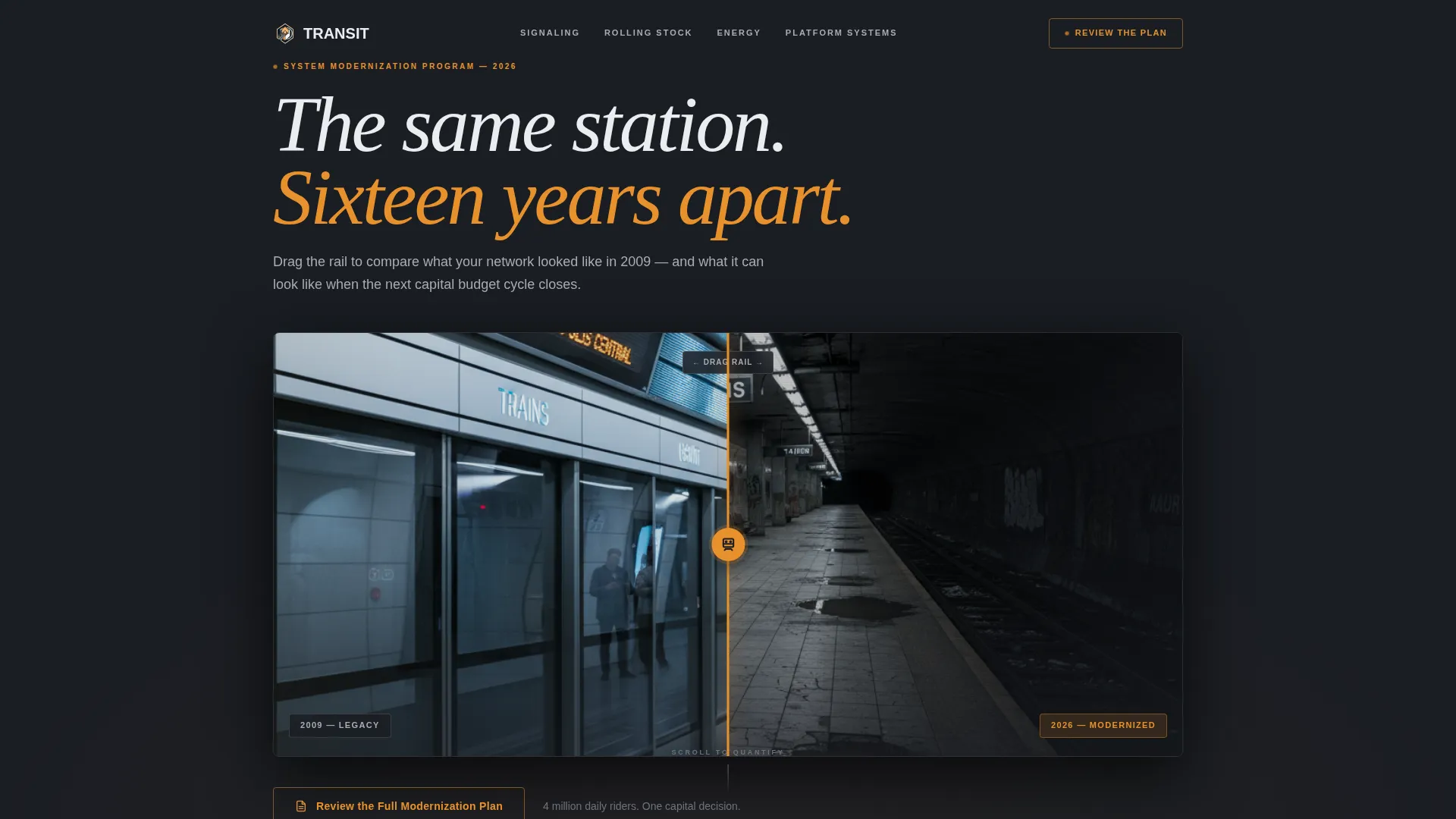
- A Before/After Slider header with a rail-styled handle and contrasting station visuals from two eras
- Four animated comparison sections covering signaling, rolling stock, passenger flow, and energy recovery
- A three-stage call to action system that evolves from ghost-outlined to full amber to a persistent bottom bar
Feature list
This section covers the core components delivered inside the Transit template and what each one does in practice.
Before/After Station Slider
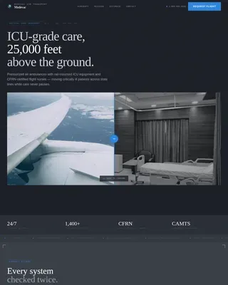
The header opens with a split-view slider comparing the same station angle across two time periods. The left side shows a 2009-era platform with analog signage, cracked tile, and flickering fluorescent light. The right side reveals the modernized version: LED wayfinding, sealed platform edge doors, and glowing real-time arrival boards. The slider handle is styled as a vertical rail with a train icon grip, making the interaction feel native to the subject matter.
Scroll-Triggered Comparison Journey
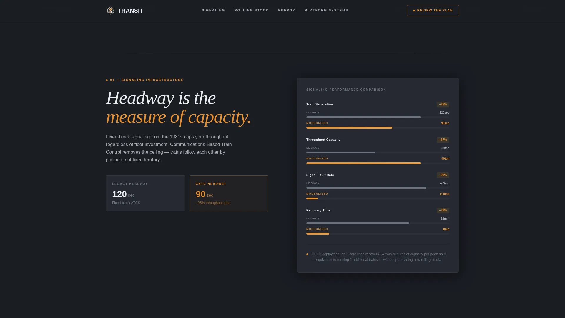
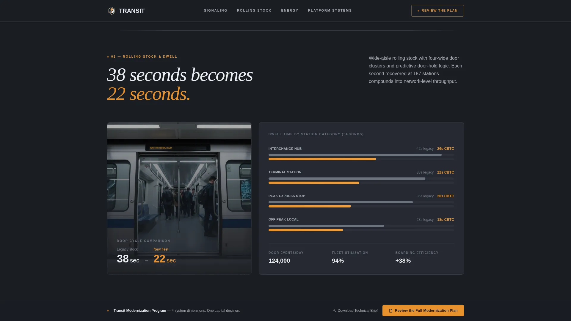
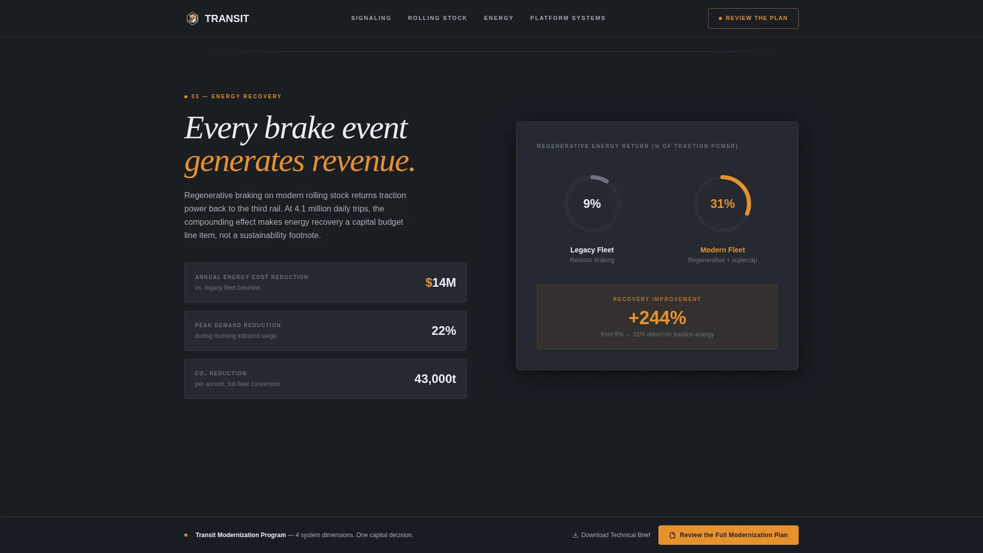
As the visitor scrolls, each section enters the viewport and animates its data into view. Dwell times drop from 38 seconds to 22. Headway intervals compress from 120 seconds to 90. Energy regeneration percentages climb across the energy recovery section. Each reveal is timed to the scroll position, so the data lands with deliberate weight rather than appearing all at once.
Three-Stage call to action Progression
The primary call to action, "Review the Full Modernization Plan," appears three times in three distinct states. It starts as a ghost-outlined button after the header comparison. It solidifies into a full amber fill after the third data section. It then anchors as a persistent bottom bar with a secondary line reading "Download the Technical Brief." No form appears on the page; the click routes to a gated document environment.
Carbon Fiber Color System
The visual palette is built around deep graphite (#1A1D23) as the primary background, rail silver (#A8ADB5) for secondary surfaces and dividers, and signal white (#EAEDF1) for body text and data labels. Emergency amber (#E8912D) is reserved exclusively for calls to action and live metric callouts, so every warm point of light on screen carries intent.
Animated Performance Metrics
Each comparison section introduces a system dimension and then animates its key performance numbers as the section enters view. The animation does not simply display data; it sequences improvement so that the gap between legacy and upgraded performance feels earned and cumulative by the time the visitor reaches the call to action.
Progressive Reveal Architecture
The entire page is built on a scroll reveal structure. Sections do not load passively; they appear with mechanical certainty as the visitor moves down the page. This pacing mirrors the subject matter and keeps technically demanding readers oriented through a dense set of infrastructure arguments.
Page sections overview
| Section | Purpose |
|---|---|
| Before/After Slider | Establish visual contrast between legacy and modernized station conditions |
| Signaling Comparison | Animate headway interval reduction from 120 to 90 seconds |
| Rolling Stock Metrics | Show dwell time improvement from 38 seconds to 22 |
| Passenger Flow Data | Quantify throughput gains from platform and boarding upgrades |
| Energy Recovery Section | Display regeneration percentage gains from upgraded systems |
| Ghost call to action Block | Introduce the primary call to action in outline form post-header |
| Amber call to action Block | Solidify the call to action after three data sections have landed |
| Persistent Bottom Bar | Anchor final call to action with secondary "Download the Technical Brief" line |
Design & branding system
The design language draws from the interior of a modern operations control center. Every visual decision is deliberate and dark, with light reserved for data and action.
- Color system: deep graphite (#1A1D23) background, rail silver (#A8ADB5) dividers, signal white (#EAEDF1) text, emergency amber (#E8912D) for calls to action and metric callouts only
- Typography and layout carry a Corporate Precision theme: structured, data-forward, and stripped of decorative noise
- The slider handle, rail-styled vertical divider, and train icon grip reinforce the subject matter at the interaction level
Mobile & speed optimization
The scroll reveal architecture is built to perform on the devices that technical professionals actually carry into procurement meetings and site visits.
- Progressive section reveals are triggered by viewport entry, keeping the page responsive on both desktop and mobile screen sizes
- The single-page structure reduces navigation complexity and keeps load focused on one continuous scroll path
- Amber accent usage is intentionally minimal, so the visual hierarchy stays clear even on smaller screens with limited contrast range
How this template helps you convert
Transit is not a brochure. Every structural decision pushes a technically informed visitor toward a single, high-confidence click.
- The Before/After Slider creates immediate recognition: the visitor sees their own system's condition reflected in the legacy side, which makes the modernized view feel like a solution rather than a sale.
- Each animated comparison section adds weight to the argument incrementally, so by the time the full amber call to action appears, three rounds of quantified evidence have already done the persuasion work.
- The persistent bottom bar with "Download the Technical Brief" gives procurement-minded visitors a low-friction exit that still routes them into the gated document environment.
Other information about this template
This template is part of the Automotive and Transport category and sits within the Public Transit and Infrastructure subcategory, targeting the Metro and Subway System niche specifically. It carries a Corporate Precision theme and is built on a Scroll Reveal (Progressive) template style with a Comparison Journey creative direction.
- The header concept is a Before/After Slider, and the landing page direction is Click-Through
- The Carbon Fiber color system is a named design system within this template collection, not a generic dark theme
- The template is designed for single-page use and is not structured as a multi-page website
- No form fields appear on the page; conversion happens through outbound click to a gated document environment
- The Intersection Match Score for this template's category, subcategory, and niche alignment is 13
Theme
Corporate Precision
Creative direction
Comparison Journey
Color system
Carbon Fiber
Style
Scroll Reveal (Progressive)
Direction
Click-Through
Page Sections
Before/after Station Slider
Scroll-triggered Comparison Journey
Three-stage Call to Action Progression
Carbon Fiber Color System
Animated Performance Metrics
Progressive Reveal Architecture
Related questions
Who is the primary audience for this template?
Does this template include a contact form?
Can I update the animated performance metrics with my own data?
What does the three-stage call to action system mean in practice?