Public Transportation Professional Website Template
The Transit landing page template is built for regional rail and commuter transport services that carry thousands of people daily. It uses a cinematic split-screen layout, animated route maps, and a scroll-driven storytelling structure to move visitors from curiosity to click. Every section proves the network's value in hard numbers before asking for action.
by Rocket studio
Quick summary
This is a single-page landing page template designed for regional rail and commuter transport authorities. It delivers a 50/50 split-screen layout, an animated SVG route map, and a scroll-driven narrative that turns ridership data into a compelling case for rail. The template guides people from headline to trip planner click without a single on-page form.
Who this template is for
This landing page template serves public transit teams that need to reach diverse rider groups and civic decision-makers at once. It fits organizations that run diesel or electric train services across suburbs, river valleys, and satellite towns connected to a city center.
- Daily pass-holders who need fast route confirmation and fare savings proof
- Weekend riders and trail-goers looking for schedule details and zone maps
- Municipal planners and transit advocates who need emissions data and downloadable rider guides
What problem this template solves
Most transit pages overwhelm visitors with nested menus and buried timetables. People arrive with urgent, specific intent and leave before finding what they need. This landing page template solves that by leading with the value proposition and placing customer-focused tools above the fold.
- Riders cannot quickly check their next train arrival or compare fares against driving costs
- Planners struggle to find emissions and ridership information without digging through dense pages
- Transport authorities lose potential regular commuters because the case for rail is never clearly made
What you get with this template
This page template delivers a structured, section-led layout that escalates the argument for rail from personal convenience to civic legacy. Every component is prompt-defined and purposeful.
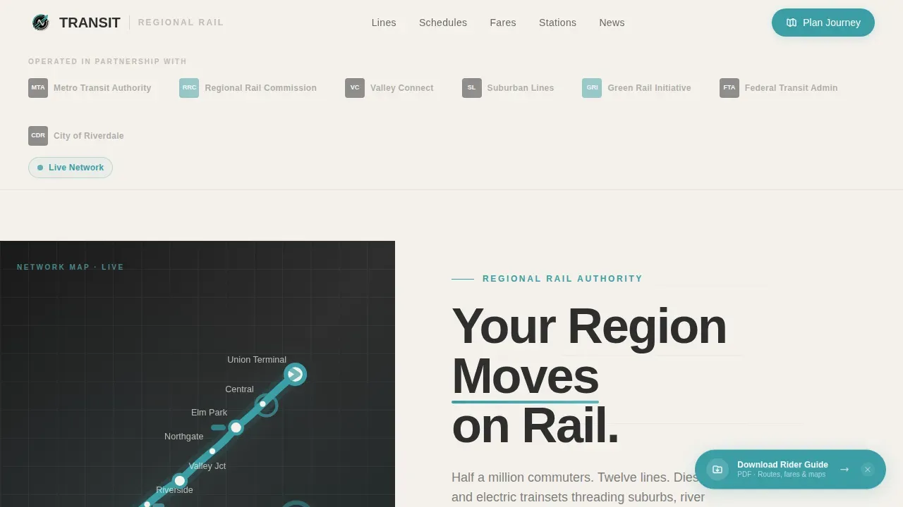
- A Logo Bar opening with transit authority marks, municipal crests, and regional connectivity badges
- An animated SVG route map with pulsing teal dots tracing live consist positions on the left split panel
- Three paired data-and-story sections covering time savings, economics, and climate impact
- Contextually updated calls to action that repeat after every second section
- A floating "Download the Rider Guide" pill for planners and advocates in the lower-right corner
- A Station Ticker marquee and a Linear Single-Row footer rounding out the full page structure
Feature list
This landing page template ships with six fully designed components that work together to build trust and drive clicks.
Split-Screen Hero with Animated Route Map
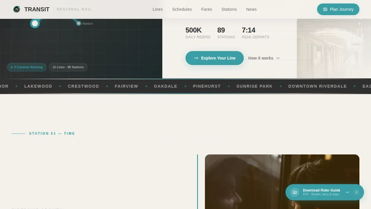
The 50/50 hero splits an animated SVG route map on the left from a bold headline and animated line drawing on the right. Pulsing teal dots trace train positions across the map, giving riders an immediate visual understanding of network scale and reach across the city corridor.
Scroll-Driven Story Sections
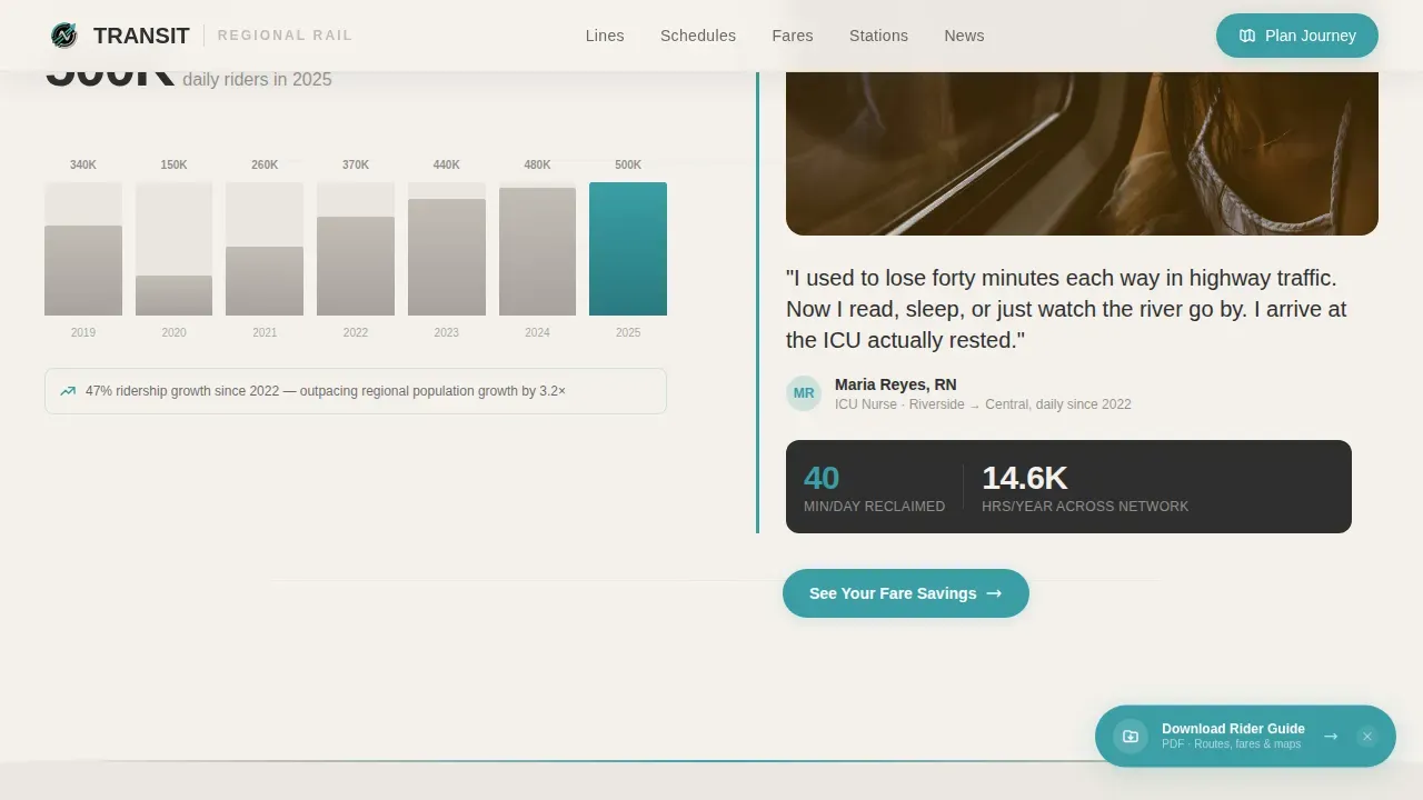
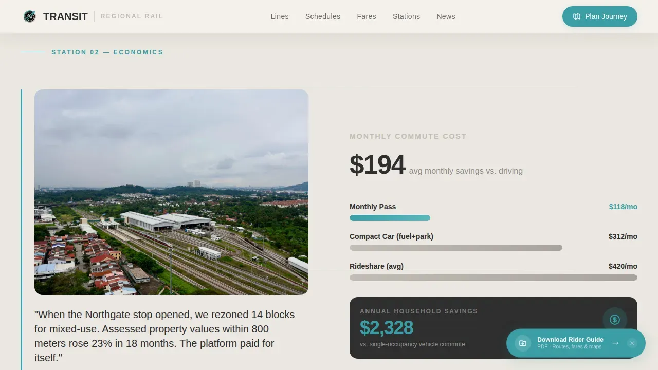
Each section pairs a left-panel data visualization with a right-panel human story. The scroll physically mimics a journey along the rail corridor, with parallax track lines reinforcing forward motion. This creative direction turns transport statistics into lived experience, helping people understand the system's real-world value.
Contextual Call-to-Action System
The primary call to action, "Explore Your Line," appears first beneath the header and updates contextually after every second section. Labels shift to "See Your Fare Savings" and "Find Your Station," matching where visitors are in their decision. No form is required; every click routes directly to an interactive trip planner.
Station Ticker Marquee
An infinite marquee of station names runs between sections, reinforcing the network's geographic breadth. This design element builds confidence that the transit system serves the rider's city, suburb, or connecting metro area without requiring them to check a separate map.
Floating Rider Guide Download
A teal pill button floats in the lower-right corner throughout the scroll. It offers a PDF rider guide for planners and community advocates who want full details. This secondary call to action stays visible without interrupting the primary conversion flow.
Logo Bar Authority Header
The page opens with a horizontal bar of transit authority marks, municipal partner crests, and regional connectivity badges. This branding element establishes institutional trust before any copy appears, a proven ways to reduce visitor skepticism early in the page journey.
Page sections overview
| Section | Purpose |
|---|---|
| Logo Bar Header | Establishes institutional trust with transit authority marks and partner crests |
| Split-Screen Hero | Pairs animated route map with bold headline and line-draw animation |
| Station Ticker Marquee | Reinforces network scale through an infinite scroll of station names |
| Time Saved Section | Ridership growth curve left, nurse commuter story right, fare savings call to action |
| Economics Section | Fare versus. highway cost comparison left, county rezoning story right |
| Climate Legacy Section | Emissions-per-passenger chart left, carbon tonnage story right, station finder call to action |
| Single-Row Footer | Closes the page with a clean linear layout |
Design & branding system
The Cloud Canvas color system shapes every visual decision in this template. The palette feels like a morning commute under high clouds: calm, navigational, and quietly authoritative. Consistent branding across all sections reinforces the transport authority's identity at every touchpoint.
- Overcast white (#F4F1EC) primary background, platform concrete (#C2BDB5) accent, schedule-board charcoal (#2E2E2E) for type
- Wayfinding teal (#3A9EA5) on all interactive elements, calls to action, pulsing map dots, and the floating pill button
- Plus Jakarta Sans typeface in transit-weight grotesque, chosen for high-contrast legibility and large, readable heading sizes
Mobile & speed optimization
The template starts as a desktop-first split-screen experience and stacks responsively for mobile. Designing for mobile matters because many riders check train schedules on their phones, often with specific, time-sensitive intent. A fast-loading, clear layout reduces friction and keeps people moving toward the trip planner.
- Responsive stack layout collapses the 50/50 split into a single-column flow for smaller screens
- Large tap targets and thumb-friendly navigation keep the mobile ride smooth and accessible
- Server Components handle static sections while Client Components manage GSAP animations, keeping the page efficient
How this template helps you convert
This landing page template is built around a click-through direction that earns each action before asking for it. The page proves value in hard numbers first, then presents the call to action at the right moment.
- The hero and Logo Bar establish credibility immediately, so visitors trust the source before reading a single data point about the transit network.
- Each paired section adds a layer of proof, from time savings to economics to climate legacy, escalating the stakes station by station until clicking "Find Your Station" feels like the obvious next step.
- The floating Rider Guide pill captures planners and advocates who want full details, creating a parallel conversion path without disrupting the primary commuter journey.
Other information about this template
This template lives in the Government & Public category under the Public Transportation subcategory, with a niche focus on Regional Rail and Commuter services. It is a strong starting point for any transit designer or civic communication team building a landing page for a metro, commuter rail, or regional train line. The template can be adapted for multiple city networks by swapping route map details, station names, and branding assets.
- The Educational Guide theme and Movement & Cause creative direction make this template well-suited for sharing with community stakeholders and city council audiences
- Transit branding should stay consistent across all pages and platforms; this template's Cloud Canvas system makes it easy to set a unified visual identity and check it against existing authority guidelines
- User feedback gathered after launch can inform future changes to calls to action, map details, and section ordering
- The template is powered by GSAP ScrollTrigger for animations, giving a designer full creative control over scroll pacing and motion
Theme
Educational Guide
Creative direction
Movement & Cause
Color system
Cloud Canvas
Style
Split Screen (50/50)
Direction
Click-Through
Page Sections
Split-screen Hero with Route Map
Scroll-driven Data and Story Pairing
Contextual Call-to-action System
Institutional Logo Bar
Station Ticker Marquee
Floating Rider Guide Pill
Related questions
Can I update the route map to match my real train network?
Does this template include a trip planner or ticketing system?
Is this template suitable for a city with multiple metro lines?
Who should use the floating Rider Guide download?
Can the calls to action be changed after launch?