Transport — Authoritative Relocation Guide Landing Page Template
The Haul moving company landing page is a single-page editorial template built for Sydney removalists who compete on transparency. Bold stats dominate the hero section, an expert panel builds authority, and a 12-line-item comparison table does the persuading. The result is a high converting landing page that turns comparison shoppers into quote requests without a single form field on the page itself.
by Rocket studio
Quick summary
Haul is a modern landing page template for a Sydney moving company that leads with trust. Massive editorial numerals replace hero images. Three expert voices frame a detailed comparison table. A persistent call to action in safety orange closes the loop. Every section earns its place, exactly like every item earns its place on a well-packed truck.
Who this template is for
This moving company landing page template is built for removalist businesses that want to convert comparison-shopping visitors into qualified leads. It suits companies that compete on quality and transparency rather than price alone. The target audience spans residential and corporate movers who need a page that speaks to multiple buyer types at once.
- Residential moving companies serving Sydney suburbs like Surry Hills, Epping, and the Northern Beaches
- Corporate relocation managers and businesses coordinating executive moves between CBD locations
- Digital marketers and agency teams running Google Ads campaigns for removalist clients who need a dedicated moving landing page
What problem this template solves
Most moving company landing page designs bury the value proposition under generic imagery and vague promises. Comparison-shopping visitors arrive already skeptical, and a cluttered page loses them before they reach the call to action. This template solves that problem by leading with verified numbers and letting a structured comparison page do the persuading.
- Visitors cannot quickly grasp which mover is better without a clear side by side comparison of key line items like insurance caps, staircase fees, and GPS tracking
- Generic pages fail to build trust because they lack social proof, credible expert voices, and transparent pricing signals
- A moving company without a focused moving landing page for paid traffic wastes ad spend by sending Google Ads clicks to an unfocused website
What you get with this template
You get a complete, single-page moving company landing page structured around an editorial magazine visual layout. Every section is purpose-built to move a visitor from first impression to quote request. The page handles lead generation without placing a form on the landing page itself, the comparison table builds enough confidence that clicking "Get Your Moving Quote" feels natural.
- A stats-led hero section with three bold editorial numerals, each separated by a thin gunmetal rule, creating an immediate and confident first impression
- A three-expert authority panel feeding directly into a 12-line-item competitor comparison table that helps visitors make informed decisions
- A persistent mobile call to action bar, suburb coverage signal, and three suburb-specific customer testimonials that build trust at every scroll depth
Feature list
This modern landing page template packages several key elements into one cohesive editorial design. Below are the key features included in the template.
Editorial Stats Hero Section
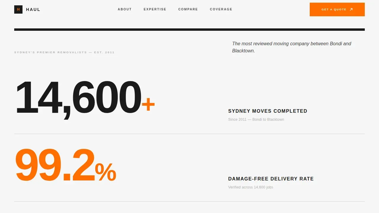
The hero section replaces photography with enormous typeset numerals, "14,600+ Sydney Moves," "99.2% Damage-Free," and "38-Minute Average Load Time." Each figure is set in forge-black at display scale against clean-sheet white. A thin gunmetal rule separates each stat. A single italic line of body copy closes the block. The main headline approach here is the data itself, which communicates the value proposition before a visitor reads a word of copy.
Expert Authority Panel
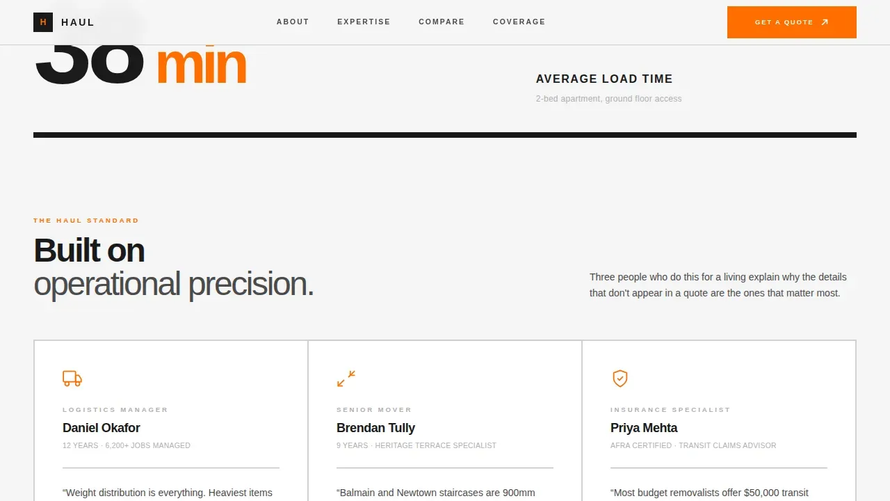
Three editorial expert cards appear below the hero section. A logistics manager explains weight-distribution packing science. A senior mover covers staircase technique for heritage terraces. An insurance specialist breaks down coverage differences between competitor tiers. Each card feeds context directly into the comparison table below, so visitors arrive at the table already educated. This approach helps engage visitors and supports informed decision making throughout the page.
12-Line-Item Comparison Table
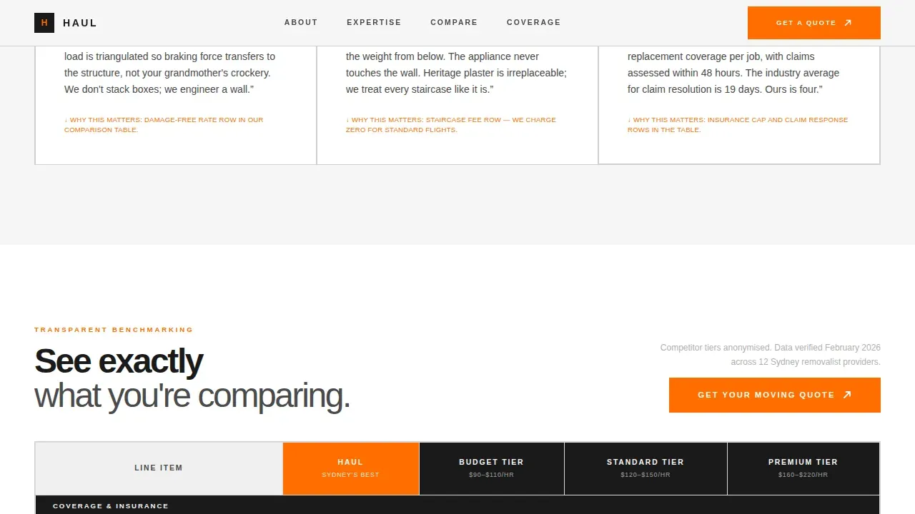
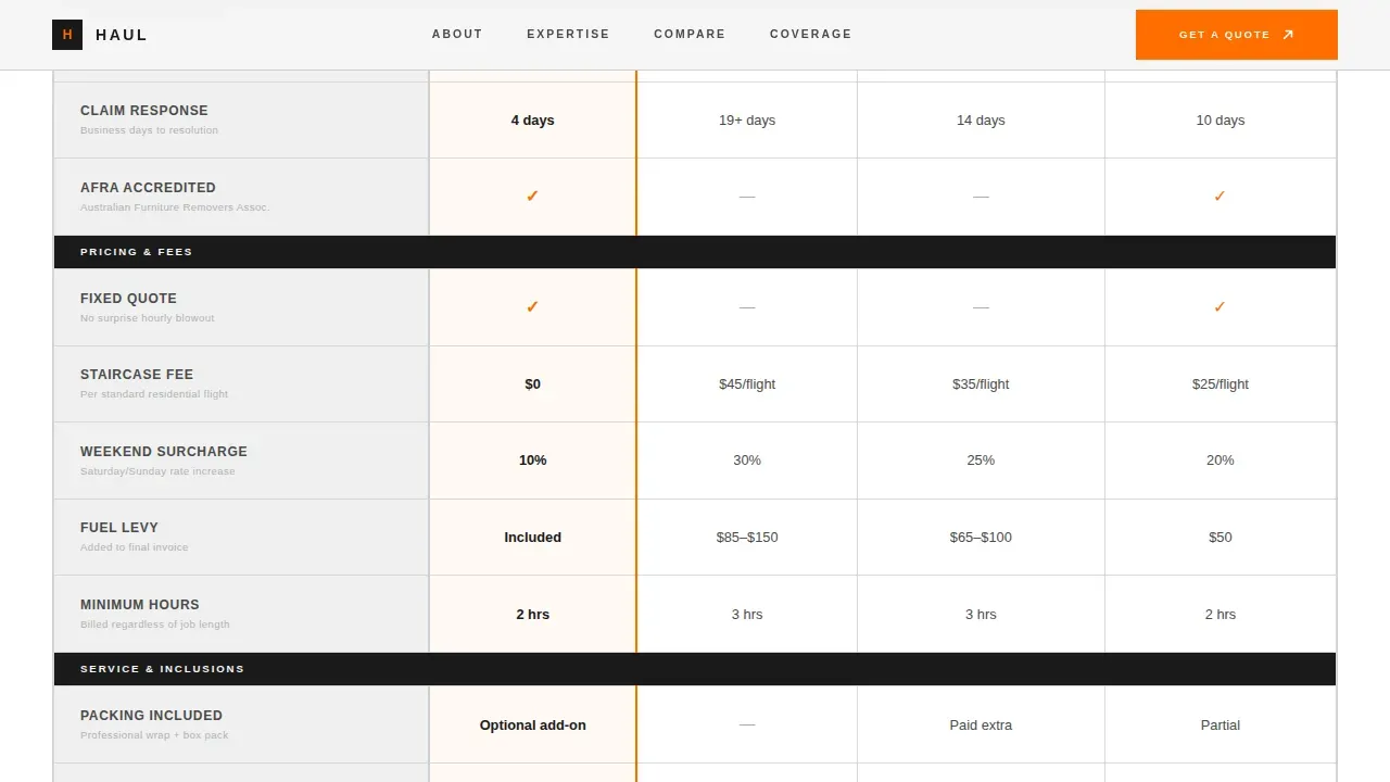
The centrepiece of the page is a structured comparison table benchmarking the company against three anonymised competitor tiers. Line items include insurance cap, packing inclusion, staircase fees, weekend surcharges, GPS tracking, and seven more. A call to action button in high-vis safety orange sits at the table header so visitors can act at peak confidence. The table uses hover states on comparison cells to improve interactivity. This is the clearest possible side by side comparison in the moving company category.
Social Proof Testimonials
Three real-feel customer testimonials are placed after the comparison table. Each quote is attributed to a named suburb, Surry Hills, the Northern Beaches, and the CBD, matching the exact situations the target audience recognises. Customer testimonials featuring location context act as trust signals that reinforce the data already presented. Incorporating social proof at this point in the scroll is essential for converting prospects who are still weighing their options.
Persistent Mobile Call to Action Bar
On mobile devices, a sticky bottom bar keeps the primary call to action visible at all times. Visitors on smaller screens never have to scroll back to find the quote button. This supports mobile optimization across the full page and ensures the page converts on mobile devices just as effectively as on desktop. The call to action routes to a dedicated quote form on a separate page, keeping the landing page itself clean and focused.
Coverage Signal and Footer
A suburb coverage section reassures visitors that their area is serviced before they commit to clicking. A secondary text link, "See Our Sydney Coverage Map," catches visitors still in the decision making process. The footer follows a linear single-row pattern, keeping the visual layout clean and uncluttered. This final section completes the conversion journey without adding noise.
Page sections overview
| Section | Purpose |
|---|---|
| Editorial Stats Hero | Establish authority with bold numerals and italic tagline |
| Expert Authority Panel | Build credibility through three specialist voice cards |
| Comparison Table | Show 12-line competitor breakdown with orange call to action |
| Testimonials Block | Reinforce social proof with suburb-specific customer quotes |
| Coverage and Call to Action | Confirm service area and present final quote prompt |
| Linear Footer | Close the page with minimal, single-row footer pattern |
Design & branding system
The design follows an Editorial Magazine theme built on a Monochrome Steel colour palette. The visual identity is ink-heavy and confident, no pastels, no decorative softness. Every colour and typographic choice earns its place on the page the same way every item earns its place on the truck.
- Forge-black (#1A1A1A) as the primary type colour, brushed gunmetal (#4A4A4A) for secondary text, loading-dock concrete (#B0B0B0) for rules and dividers, and clean-sheet white (#F5F5F5) as the page background
- High-vis safety orange (#FF6D00) reserved exclusively for call to action buttons and interactive highlights, making every call to action unmissable
- Plus Jakarta Sans at weight 900 for display stats and weight 300 for body copy, creating a stark typographic contrast that feels like a premium architecture or logistics magazine
Mobile & speed optimization
The template is built desktop-first for its editorial layout but includes specific mobile optimization decisions. The persistent sticky call to action bar is the most critical mobile feature, visitors on mobile devices never lose access to the primary conversion button. Mobile optimization is essential for a moving company landing page because a significant share of users search for movers on phones, especially on moving day itself.
- A sticky bottom bar keeps the "Get Your Moving Quote" call to action visible on smaller screens throughout the full scroll
- Server Components handle static content sections to keep JavaScript minimal, which supports fast page loads and reduces the risk of users bouncing before the comparison table loads
- Scroll-triggered stat reveals, staggered table row animations, and fade-in-up expert cards are set at medium intensity to engage visitors without slowing the page
How this template helps you convert
A competitor comparison landing page converts between 3% and 10% depending on how well it is built. This template is designed to push toward the upper end by removing friction at every decision point. Clear and compelling calls-to-action are essential for guiding visitors toward taking desired actions, and this page places them strategically at three points.
- The editorial stats hero section creates an immediate, confident first impression that keeps visitors on the page. The concise headline approach, numbers as the headline, communicates value instantly, so visitors do not need to search for the value proposition.
- The expert panel and 12-item comparison table educate visitors so thoroughly that the decision making process is effectively complete before the call to action is clicked. A visitor who understands why GPS tracking, insurance caps, and staircase fees matter is a visitor who is ready to convert.
- The persistent mobile call to action bar, suburb-specific customer testimonials, and coverage signal combine to remove the last remaining hesitations. Optimizing landing pages for lead generation works best when social proof, trust signals, and a frictionless path to a free quote all appear before the visitor has to think twice.
Other information about this template
This section covers additional context useful for teams evaluating, customising, or running traffic to this template.
- The template is designed as a dedicated landing page for Google Ads campaigns in the moving industry. A landing page built specifically for paid traffic converts far better than sending Google Ads clicks to a general website, because the page has a single focused goal: lead generation.
- A/B testing different elements, such as the main headline stat order, the call to action copy, or the comparison table row sequence, can help identify what resonates best with visitors and improve conversion rates over time. Regular feedback loops between ad performance and page data make this template a long-term asset rather than a one-time build.
- The comparison table educates visitors rather than simply listing features. Honesty and transparency are fundamental for creating loyal customers in the moving industry, where reviews and word-of-mouth drive long-term sales.
- Successful moving company landing page examples studied in the industry, including Piece Of Cake Moving & Storage, Meritorious Relocation, Zero Max Moving And Storage, Eagle Van Lines Moving & Storage, Vazpower Removals & Storage, BOND'S Moving Services, UPack, A1 Removalists Sydney, and San Carlos Moving Company, share common patterns: clear social proof, strong call to action placement, and mobile optimization. This template incorporates all of those patterns.
- The platforms stack for this template uses Server Components for static content and minimal JavaScript for interactive elements such as table row highlights and the sticky mobile bar. Two platforms benefit most from this approach: teams building on React-based frameworks and digital marketers who need fast-loading pages that can drive traffic from paid search without performance penalties.
- White-glove handling, GPS tracking for real-time cargo monitoring, and high-value insurance coverage are among the services that moving companies using this template can showcase inside the comparison table. Specialised movers who provide climate-controlled transport or custom rigging for complex items will find the 12-line-item format gives them enough space to communicate that depth.
- Case studies and videos of actual moves can be embedded or linked from the expert panel cards to add further depth. Engaging visuals such as team photos and short videos of packing technique enhance the user friendly design without requiring a full redesign of the page structure. The visual layout is flexible enough to support those additions while keeping the editorial feel intact.
- The page includes detailed information about coverage as a deliberate conversion lever. Visitors who are unsure whether their suburb is serviced would otherwise leave without converting. The secondary "See Our Sydney Coverage Map" link retains those prospects and keeps them moving through the page.
Theme
Editorial Magazine
Creative direction
Expert Panel
Color system
Monochrome Steel
Style
Comparison Table
Direction
Click-Through
Page Sections
Editorial Stats Hero Section
Three-expert Authority Panel
Line-item Comparison Table
Suburb-specific Customer Testimonials
Persistent Mobile Call to Action Bar
Coverage Signal and Footer
Related questions
What type of moving company is this landing page template designed for?
Does the landing page include a quote form?
How does the 12-line comparison table work?
Is this template suitable for Google Ads campaigns?
How does mobile optimization work in this template?



