Switzerland Travel Professional Website Template
Traverse is a masonry-style landing page template built for Switzerland budget travel guides. It uses a Neo-Retro visual identity with a Northern Lights color palette, a seasonal scroll narrative, and a single click-through goal: the full downloadable guide. Every card, section, and call-to-action works together to turn curious visitors into engaged readers.
by Rocket studio
Quick summary
Traverse is a single-page masonry landing page template designed for budget Switzerland travel content. It guides visitors through a seasonal scroll experience, from winter Glühwein tips to autumn vineyard walks, while funneling every click toward one destination: a free downloadable guide. The design is bold, editorial, and built to make budget travel feel genuinely exciting.
Who this template is for
This template suits creators and publishers who want to turn a Switzerland budget travel guide into a high-converting landing page. The audience it speaks to is specific, and so is the fit.
- Gap-year backpackers, young couples planning a debt-free honeymoon, and remote workers navigating expensive Swiss cities
- Travel bloggers, content creators, and independent publishers selling or giving away a downloadable Switzerland guide
- Anyone who needs a visually rich, single-page layout that earns a click without a complicated build
What problem this template solves
Most budget travel landing pages feel either too flat or too cluttered. Traverse solves the gap between editorial richness and focused conversion by making every design choice serve a purpose.
- Visitors scroll through genuinely useful tips but only see part of the picture, making the full guide feel like the logical next step
- A single conversion goal replaces the confusion of multiple competing links and menus
- The seasonal structure gives even simple content a narrative shape that keeps readers engaged from top to bottom
What you get with this template
You get a fully designed, single-page masonry landing page layout ready to be customized with your own content and branding. Every section is pre-planned and pre-styled.
- A full-viewport portrait header, four seasonal masonry clusters, a floating call-to-action pill, and a full-width email capture block at the bottom
- A complete Neo-Retro visual system including typeface direction, a four-color Northern Lights palette, and interactive green highlight states
- A click-through layout structured around one primary goal: getting visitors to unlock the free downloadable guide
Feature list
This template delivers several intentional design and structural features. Each one is described below.
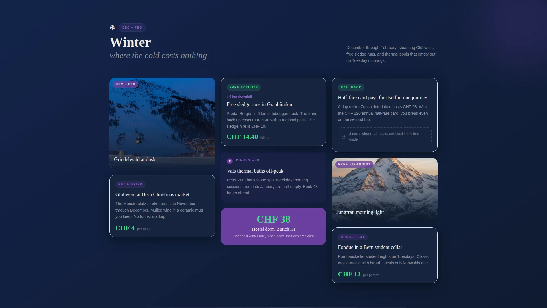
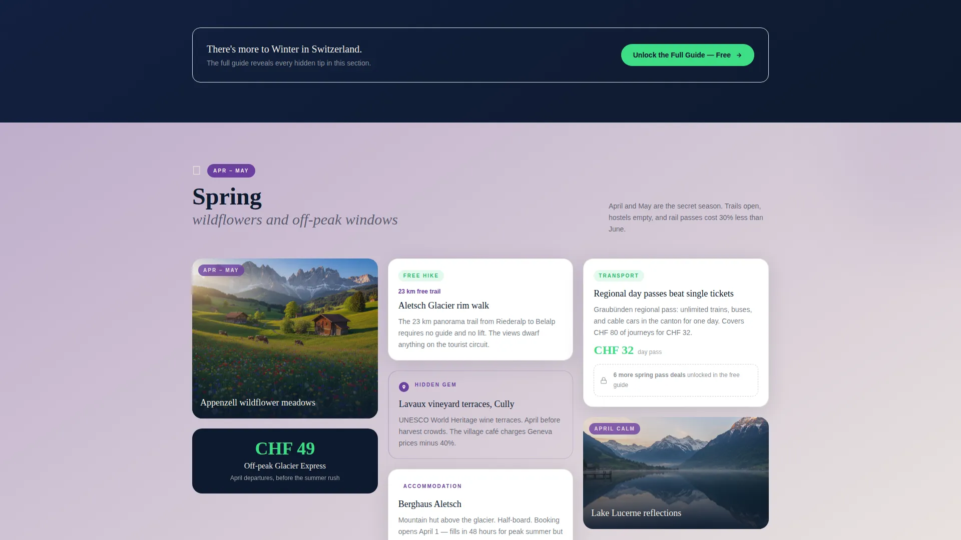
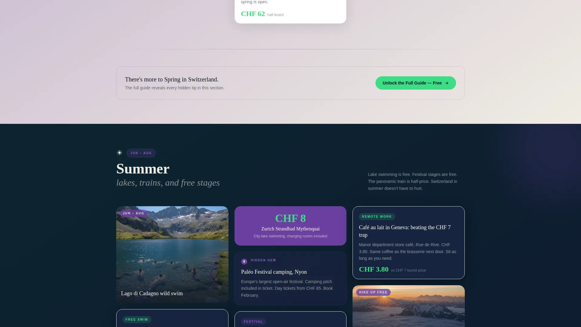
Masonry Grid Layout
The page uses a masonry card structure where panels of varying heights stack together in dense, visually interesting clusters. Each seasonal section is its own masonry group, holding budget tips, price comparisons, photo moments, and hidden-gem pins in one cohesive block.
Seasonal Scroll Narrative
The page is divided into four seasonal sections: winter, spring, summer, and autumn. As visitors scroll, the color temperature of each cluster shifts, moving from cool blues in winter to warm golds in summer and back. This rhythm makes the page feel alive and gives the content a natural, calendar-like progression.
Multi-Placement Call-to-Action System
The primary call-to-action, "Unlock the Full Guide, Free," appears in three distinct placements. It first appears as a floating pill after the header scroll, then as an embedded prompt at the close of each seasonal section, and finally as a full-width block with an email field and a reassurance line at the very bottom of the page.
Intentional Content Teasing
Every masonry card is designed to show enough to create genuine curiosity. A card might read "11 free thermal springs" but display only three examples. This intentional incompleteness makes the full downloadable guide feel like the obvious and rewarding next step.
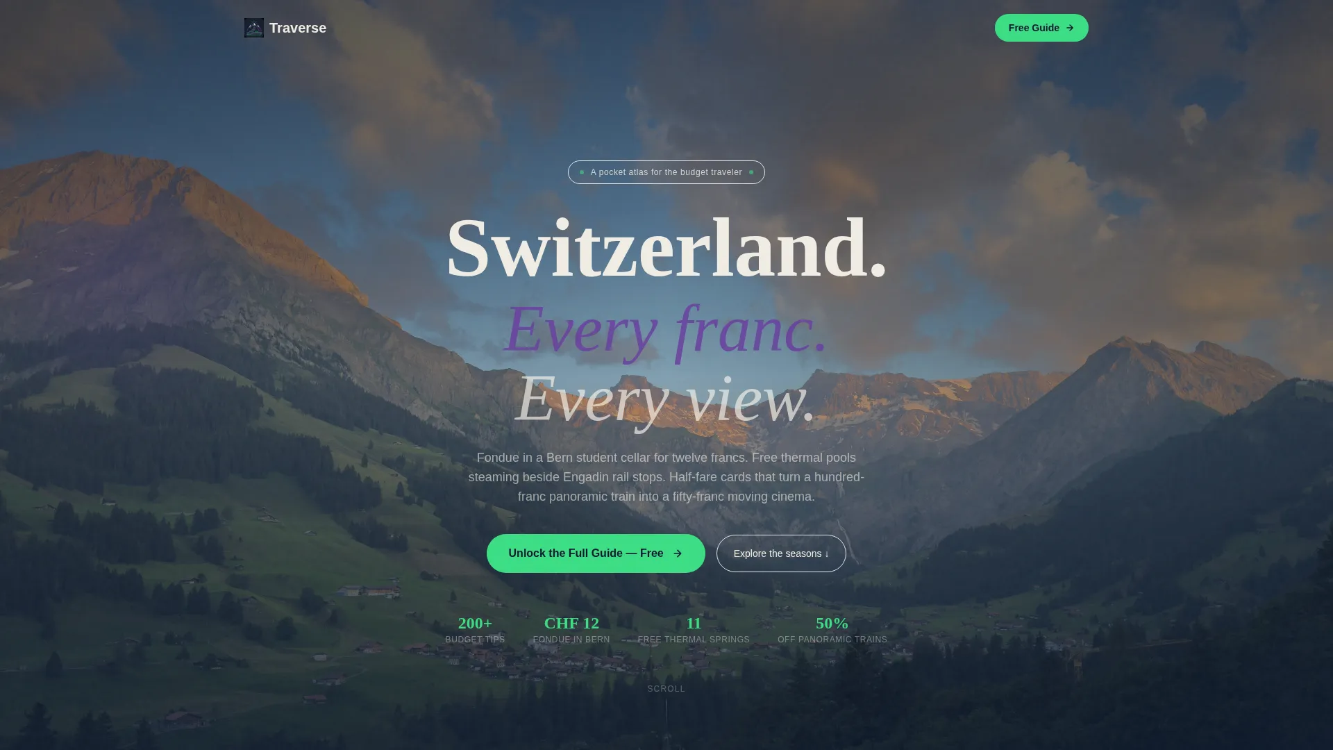
Full-Viewport Portrait Header
The header fills the full screen height with a tall, narrow vertical composition. It is framed like a portal through a train doorway, with a solo traveler looking out at the Lauterbrunnen valley. A hand-lettered headline in a rounded retro typeface anchors the visual from the first moment.
Northern Lights Color System
The four-color palette of aurora violet, glacier midnight, alpine snow, and signal green is applied with strict role discipline. Backgrounds alternate between dark and light zones; violet anchors headers and tags; green appears only on buttons and hover states, making every interactive element feel purposeful and distinct.
Page sections overview
| Section | Purpose |
|---|---|
| Full-Viewport Header | Introduces the guide with a cinematic train-door portrait and hand-lettered headline |
| Floating call to action Pill | Surfaces the download prompt immediately after the header scroll |
| Winter Masonry Cluster | Covers cold-season budget tips including Glühwein costs and free sledge runs |
| Spring Masonry Cluster | Highlights wildflower hikes and off-peak rail deals |
| Summer Masonry Cluster | Features lake swimming spots and festival camping options |
| Autumn Masonry Cluster | Closes the seasonal journey with vineyard walks and shoulder-season hostel rates |
| Email Capture Block | Full-width section with a single email field and a reassurance line to close the conversion |
Design & branding system
The visual identity is Neo-Retro, combining the warmth of vintage Swiss travel posters with the electric saturation of aurora borealis lighting. Every color, type choice, and interactive state has a defined role.
- Aurora violet (#6B3FA0) anchors headers and category tags; glacier midnight (#0E1A2E) sets the backdrop for immersive photo sections; alpine snow (#F0ECE3) fills itinerary text blocks with a creamy, aged-paper warmth
- Signal green (#3DDC84) appears exclusively on buttons and hover states, making every clickable element feel like a train door sliding open
- A rounded retro typeface carries the hand-lettered headline in the hero section, reinforcing the vintage poster aesthetic throughout the page
Mobile & speed optimization
The masonry layout is designed to stack and reflow gracefully across screen sizes. The tall portrait header and card-based structure translate naturally to mobile viewports.
- Varying card heights in the masonry clusters create visual interest without requiring heavy assets that slow load time
- The floating call-to-action pill remains accessible on small screens without blocking the content behind it
- Alternating dark and light background zones reduce visual fatigue on mobile and keep the scroll experience comfortable
How this template helps you convert
Traverse is built around a single conversion goal, and every layout decision reinforces that goal without being pushy.
- The seasonal scroll structure keeps visitors reading longer by making the page feel like a story rather than a sales funnel, so they arrive at each call-to-action already engaged
- The intentional teasing mechanic, where cards show partial tips and hint at more, makes the free guide feel like a genuine reward rather than a marketing offer
- The three-placement call-to-action system means visitors see the prompt at the right moment whether they engage quickly, browse slowly, or scroll straight to the bottom
Other information about this template
Traverse is a single template layout within the Travel and Hospitality category, built specifically for the Switzerland budget travel niche. It is designed to work as a standalone landing page without requiring any additional pages or complex navigation.
- The template is suitable for personal travel blogs, independent newsletter creators, and small travel media publishers who want a polished, editorial look without a custom build
- The reassurance line at the email capture block, "No spam. Just cheap trains and big mountains," is baked into the design to reduce sign-up hesitation
- The template style follows a Masonry/Pinterest structure, which suits content-rich niches where visual variety and editorial density signal authority and depth
Theme
Neo-Retro
Creative direction
Seasonal/Moment
Color system
Northern Lights
Style
Masonry/Pinterest
Direction
Click-Through
Page Sections
Masonry Grid Card Layout
Four-season Scroll Structure
Three-placement Call to Action System
Intentional Tip Teasing
Full-viewport Portrait Header
Northern Lights Color System
Related questions
What type of content works best in this template?
Can I adapt this template for a different travel destination?
How many call-to-action placements does this template include?
Do I need design experience to set this template up?
Why is the masonry layout a good fit for a budget travel guide?


