Travel Consulting Reviews Website Template
Traverse is an editorial landing page template built for a one-person travel strategy advisory firm. It uses a Monochrome Steel visual identity, a testimonial mosaic layout, and a content-first structure to serve high-net-worth clients navigating visa sequences, residency timelines, and passport portfolio planning across multiple jurisdictions.
by Rocket studio
Quick summary
Traverse is a single-page editorial template designed for a confidential travel architecture consultancy. It opens with a giant platinum headline, unfolds into a mosaic of redacted client case studies, and closes with a dual-call to action bottom bar. The design feels like a stamped dossier, calm and precise, built to earn the trust of serious multi-jurisdictional clients.
Who this template is for
This template was built for a specific kind of advisor. If your work sits at the intersection of travel strategy, tax exposure, and residency planning, this page reflects that seriousness without apology.
- Solo advisory practices offering visa stacking, residency-by-investment, or passport portfolio consulting
- Travel compliance consultants serving seven-figure remote founders and dual nationals
- One-person firms that need to project institutional authority without a large team behind them
What problem this template solves
Most consulting pages undersell the complexity of what multi-jurisdictional advisors actually do. A generic services page cannot communicate the urgency a client feels when a dependent visa cliff is approaching or a residency program is expiring.
- Clients arrive skeptical and overwhelmed; the template uses real case fragments to prove the problem is already understood
- Advisors lose leads because their page cannot reflect the analytical depth of their actual work
- A mismatched visual identity erodes trust before a single word is read
What you get with this template
You get a fully structured editorial landing page that carries the tone and visual weight of a confidential briefing document. Every section has a defined role in moving the visitor from recognition to action.
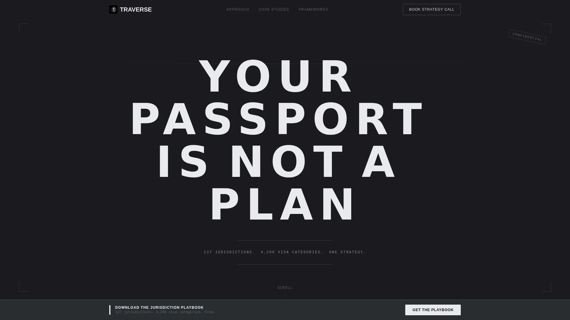
- A giant tracked-out headline section with a slow fade-in entrance and a single supporting data line below the fold
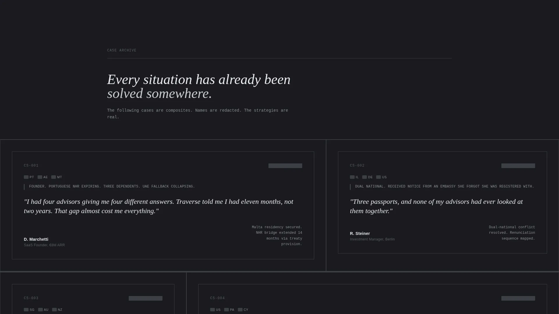
- An asymmetric testimonial mosaic with redacted case study tiles, jurisdiction flag icons, and oversized italic pull-quotes
- A fixed bottom bar with a primary lead capture form and a secondary strategy call qualifier form
Feature list
This template is built around a small number of deliberate design and content decisions. Each one serves the specific trust-building needs of a confidential advisory practice.
Giant Centered Headline Entry
The viewport opens on a single enormous sentence set in cold platinum against matte black. Tracked-out sans-serif lettering and a word-by-word fade-in give the headline the weight of a legal opinion. Nothing competes with it inside the first scroll.
Redacted Case Study Mosaic
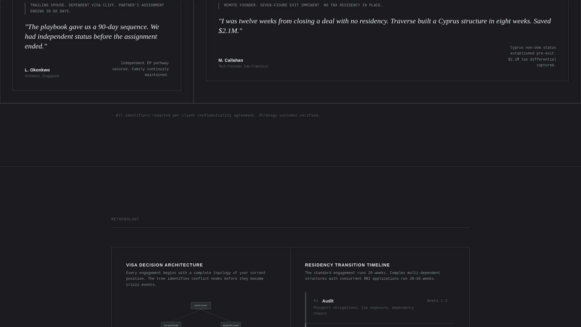
Client stories are arranged in asymmetric grid blocks styled like an investigative magazine feature. Each tile includes a monochrome jurisdiction flag icon, a one-line situation summary, and the client's own words in oversized italic pull-quotes. The format signals depth without revealing identifying details.
Analytical Framework Diagrams
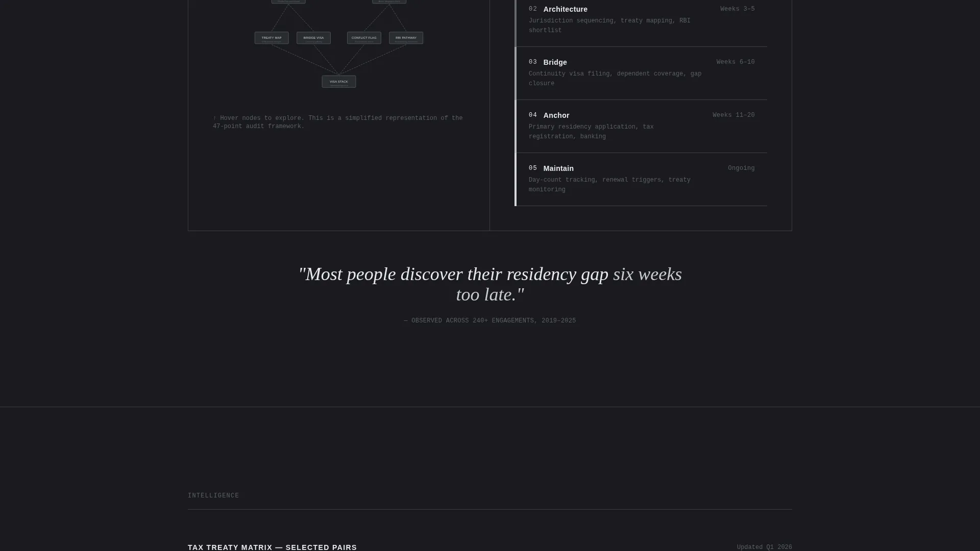
Between mosaic clusters, the consultant's frameworks appear as steel-toned diagrams. These include visa decision trees, residency timelines, and tax treaty maps. They give the scroll a rhythm that alternates human urgency with systematic calm.
Dual-Path Conversion Bar
A fixed bottom bar anchors the primary call to action throughout the scroll. Visitors can download the Jurisdiction Playbook by submitting an email and primary passport country. A secondary path offers a strategy call gated behind a short qualifier form.
Strategy Call Qualifier Form
The booking path asks for current residency, number of passports held, and one open-field question: "What's keeping you up at night?" This filters for serious prospects and frames the consultation as a premium, prepared engagement.
Single-Pixel Section Dividers
Gunmetal single-pixel rules separate each content cluster. White space is treated as purposeful silence rather than filler. The result is a page that feels edited and deliberate at every scroll depth.
Page sections overview
| Section | Purpose |
|---|---|
| Headline viewport | Opens with oversized platinum type and a fade-in entrance |
| Data line subhead | Delivers a single supporting stat line below the fold |
| Testimonial mosaic | Presents redacted client case studies in asymmetric grid blocks |
| Framework diagrams | Shows visa trees, residency timelines, and tax treaty maps |
| Playbook capture bar | Fixed bottom bar with email and passport country fields |
| Strategy call form | Qualifier gate for booking a one-on-one advisory session |
Design & branding system
The Monochrome Steel color system is built to feel like the surface of a titanium briefcase. There is no warmth, no ornament, and no decorative texture. Every color decision reinforces authority.
- Gunmetal base (#3B3F45) for backgrounds and section containers, with polished chrome (#C8CDD3) for body text on matte black (#1A1A1E) surfaces
- Cold platinum (#E8EAED) reserved for pull-quotes, the hero headline, and interactive hover states
- Single-pixel gunmetal rules as section dividers, with white space treated as intentional redaction rather than empty area
Mobile & speed optimization
The editorial layout is structured so that the asymmetric mosaic grid and framework diagrams reflow cleanly at smaller viewport sizes. The fixed bottom bar remains accessible throughout the scroll on all screen sizes.
- Mosaic grid blocks stack into a readable single-column sequence on narrow screens
- Fixed conversion bar stays anchored at the bottom of the viewport regardless of scroll position
- Framework diagrams are laid out to remain legible when scaled down to mobile width
How this template helps you convert
The page earns the click by giving away real analytical depth before asking for anything. Visitors do not feel sold to; they feel informed, and then they feel behind.
- The redacted case study format makes visitors recognize their own situation inside someone else's story, creating an immediate sense of relevance and urgency
- The analytical diagrams between mosaic clusters demonstrate the consultant's systematic thinking, making the Jurisdiction Playbook feel like a logical and necessary next step
- The dual-path conversion bar meets visitors at two different commitment levels, capturing both the research-stage lead and the decision-ready prospect in a single scroll
Other information about this template
This template belongs to the Editorial and Magazine template style category. It is designed for use as a content and resource hub landing page, meaning the primary goal is lead capture through value-first content delivery.
- The template style is classified as Editorial and Magazine, matching the investigative longform aesthetic of the mosaic layout
- The landing page direction is Content and Resource hub, where the free Jurisdiction Playbook download serves as the primary lead magnet
- The theme follows an Educational Guide model, using diagrams and case fragments to demonstrate expertise before requesting contact details
- The header concept is Data Storytelling, delivered through the sub-headline stat line ("137 jurisdictions. 4,200 visa categories. One strategy.") that frames the advisor's scope immediately
Theme
Educational Guide
Creative direction
Stats-First Impact
Color system
Navy Authority
Style
Editorial/Magazine
Direction
Content/Resource
Page Sections
Giant Fade-in Headline Section
Redacted Client Case Study Mosaic
Analytical Framework Diagram Sections
Fixed Dual-path Conversion Bar
Monochrome Steel Visual Identity
Related questions
Who is this landing page template designed for?
Can I adapt the case study tiles to my own client stories?
What are the two conversion paths included in this template?
Does the template include editable framework diagram components?
Is this template suitable for a multi-advisor firm?



