Expert Visa Consulting Landing Page Template
Passage is an editorial-style immigration consultant landing page built for trust and clarity. It uses a Navy Authority color system, documentary photography, and a case study narrative structure to walk visitors through real resolved cases. Each scroll section builds confidence before routing visitors to a dedicated eligibility intake page.
by Rocket studio
Quick summary
Passage is a single-page, editorial-style template for immigration consultants. It pairs documentary photography with a case study narrative layout to turn complex visa journeys into clear, confidence-building stories. The design uses deep navy, courthouse marble, and muted gold to feel institutional yet approachable. Every section earns the visitor's trust before inviting a single click.
Who this template is for
This template is built for immigration consultants and law-adjacent advisory practices that handle complex, multi-category caseloads. It suits practitioners who want their web presence to feel like a credible office, not a generic service directory.
- Consultants managing H-1B transfers, family sponsorships, and intracompany visa categories
- Practices serving location-specific audiences who value geographic authority and local processing context
- Advisors who want to lead with resolved case evidence rather than a generic service list
What problem this template solves
Most immigration service pages feel either too clinical or too promotional. Visitors arrive anxious about deadlines and document requirements, and they leave without confidence. Passage solves this by replacing abstract service claims with structured, narrative case studies that show how real obstacles were resolved.
- Visitors struggling to trust a consultant they have never met need proof before they commit
- Complex visa categories like family reunification or denied H-1B appeals require more than a bullet-point service menu
- A generic contact form on a cold page creates friction; this template lowers that barrier by routing to a dedicated intake step instead
What you get with this template
Passage delivers a full editorial landing page layout structured around the Case Study Narrative creative direction. Every design choice supports the consultancy's goal: prove competence first, then invite the conversation.
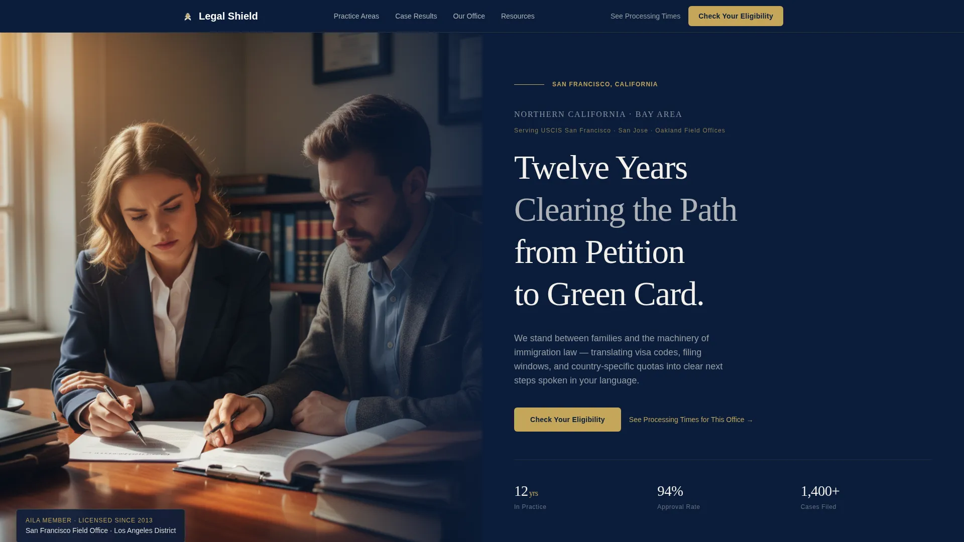
- A half-page header composition pairing a documentary-style photograph with large serif location type and a bold headline
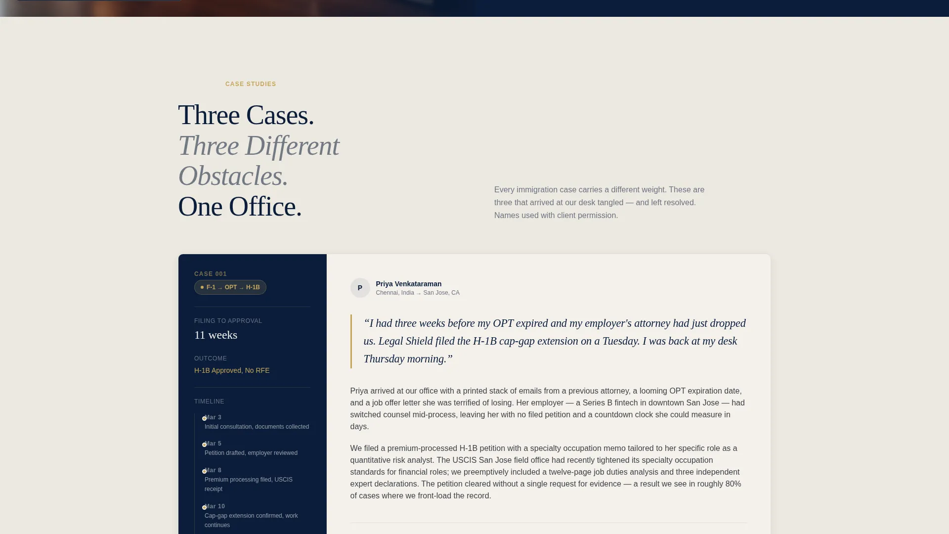
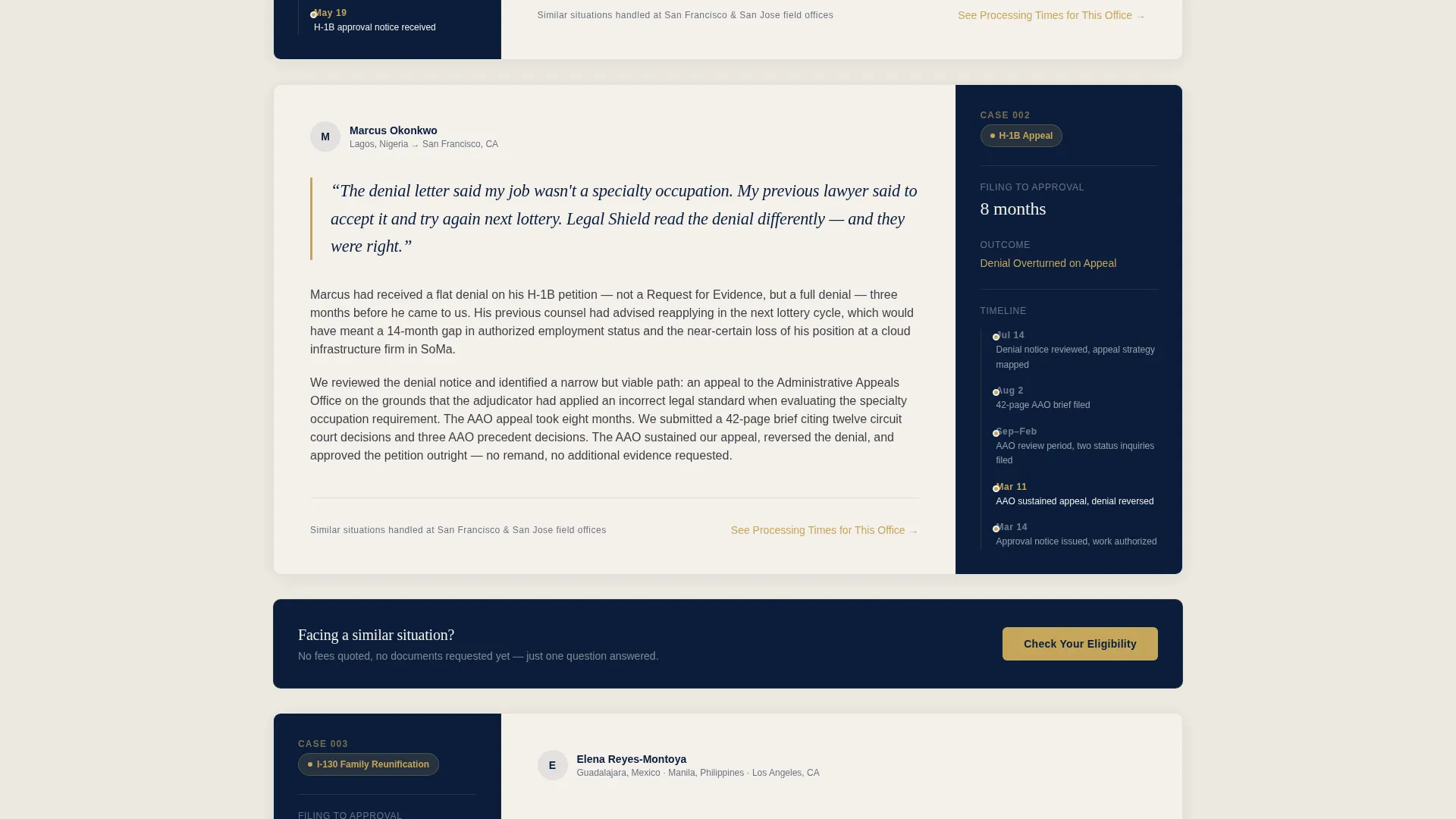
- A scroll-driven case study section with pull-quote cards, visa category pill badges, timeline sidebars, and plain-language narrative paragraphs
- A Click-Through conversion system with a fixed mobile bottom bar and inline desktop call-to-action buttons that route to a dedicated intake page
Feature list
This section outlines the built-in design and layout capabilities that come with the Passage template.
Half-Page Documentary Header
The header splits into two zones. The left side holds a documentary-style photograph showing a consultant and client seated across a real desk, with documents spread between them and soft window light. The right side presents the location name in large serif type, a jurisdictions descriptor line, and a bold experience headline. The composition signals a real office and real hands-on expertise from the first scroll position.
Case Study Narrative Sections
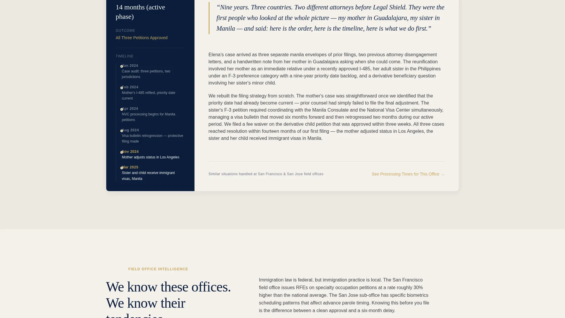
Each scroll section is a self-contained story modeled on a magazine feature. A pull-quote leads, followed by a gold-accented visa category pill badge, a timeline sidebar showing filing-to-approval duration, and two plain-language paragraphs explaining the obstacle and its resolution. Cases escalate in complexity, from a straightforward student visa transition to a multi-country family reunification spanning nearly a decade.
Geographic Authority Editorial Blocks
Between case studies, full editorial-width paragraphs provide location-grounded context. These blocks cover the service area's specific field office nuances, local court tendencies, and processing-time benchmarks. A secondary text link, "See Processing Times for This Office," appears near each location detail, offering immediate informational value before the visitor commits.
Fixed Mobile Call-to-Action Bar
On mobile screens, the primary call-to-action, "Check Your Eligibility," appears as a persistent bottom bar. It stays visible as the visitor scrolls through case studies, removing the need to hunt for a contact point. Tapping routes to a dedicated intake page, keeping the landing page itself free of embedded forms.
Inline Desktop Call-to-Action Buttons
On desktop, the same "Check Your Eligibility" call-to-action appears as a gold-on-navy inline button after every second case study. The placement follows the trust-building sequence: the visitor reads resolved cases, absorbs geographic authority paragraphs, and then encounters the invitation at a natural pause point.
Navy Authority Color and Typography System
The palette uses deep briefcase navy for section backgrounds and the header bar, courthouse marble for content wells and testimonial cards, muted gold for crests, divider rules, and active call-to-action states, and cool charcoal for long-form body text. Large serif type anchors headlines and location names, while the overall system feels like the embossed cover of a passport held under a brass desk lamp.
Page sections overview
| Section | Purpose |
|---|---|
| Documentary Header | Establish location authority and consultant credibility immediately |
| Primary Case Study | Show a resolved straightforward visa transition with narrative detail |
| Geographic Authority Block | Ground the page in local field office and processing context |
| Secondary Case Study | Present a denied petition reopened on appeal to build deeper trust |
| Inline call to action Button | Invite the first eligibility click after proven competence |
| Editorial Authority Block | Add processing-time benchmarks and jurisdiction-specific nuance |
| Complex Case Study | Demonstrate multi-country family reunification expertise |
| Processing Times Link | Offer immediate informational value before visitor commitment |
| Mobile Fixed Bar | Keep the eligibility call to action visible throughout the scroll journey |
Design & branding system
The Passage template uses the Navy Authority color system to communicate institutional credibility with enough warmth for personal confidence. Every color has a single assigned role, keeping the palette disciplined and the visual hierarchy clear.
- Deep briefcase navy anchors every section background and the header bar, projecting authority and stability
- Courthouse marble breathes across content wells and testimonial cards, keeping long-form reading comfortable
- Muted gold appears only on crests, divider rules, and active call-to-action states, making interactive moments feel considered rather than loud
- Cool charcoal handles all body text, ensuring legibility across the marble and navy surfaces throughout the page
Mobile & speed optimization
The Passage template is designed so that the full case study narrative experience works just as well on a phone screen as it does on a wide desktop monitor. The layout adapts without losing the editorial structure that builds trust.
- The fixed bottom bar keeps the primary call-to-action reachable throughout the scroll journey on mobile devices
- The half-page header composition reflows cleanly so the documentary photograph and serif headline stack without cropping the key visual elements
- Case study sidebars, pill badges, and pull-quote cards adjust to single-column reading width while maintaining their narrative sequence
How this template helps you convert
Passage is built around a specific conversion philosophy: prove competence through resolved cases before asking the visitor to do anything. The Click-Through landing page direction means the page never demands a form fill on the first visit.
- Each case study section builds a layer of trust, so by the time a visitor reaches a call-to-action button, they already have evidence that this consultancy resolves cases like theirs
- The secondary "See Processing Times for This Office" text link near every location detail gives visitors immediate, low-commitment value, reducing anxiety before the eligibility step
- Routing the primary call-to-action to a dedicated intake page rather than an on-page form keeps the experience clean and positions the next step as a conversation, not a data collection event
Other information about this template
Passage is categorized under Professional Services, specifically within the Immigration Consultant Online Presence subcategory. It is designed for the Immigration Consultant Service Area and Location Page niche, making it suitable for practices that need both credibility and geographic specificity on a single page.
- The template style is Editorial and Magazine, meaning the layout borrows structure and pacing from long-form journalism rather than conventional service-page conventions
- The Legal Shield theme anchors the visual identity, combining institutional weight with the personal warmth needed for sensitive, high-stakes advisory services
- The Case Study Narrative creative direction is the organizing principle for all content blocks, ensuring the page tells resolved stories rather than listing abstract capabilities
- The template is offered through the Framer template marketplace, making it available for direct use and customization within the Framer design and publishing environment
Theme
Legal Shield
Creative direction
Case Study Narrative
Color system
Navy Authority
Style
Editorial/Magazine
Direction
Click-Through
Page Sections
Half-page Documentary Header
Escalating Case Study Sections
Geographic Authority Editorial Blocks
Click-through Conversion System
Navy Authority Color System
Related questions
Does this template include a contact form on the page?
Can I replace the case study content with my own client stories?
Is this template suitable for a practice serving multiple locations?
What does the secondary text link near location details do?
Where does the Check Your Eligibility button lead?



