Spain Travel Specialist Professional Website Template
Travesa is a masonry-style landing page template built for boutique Spain luxury travel agencies. It pairs a Neo-Retro visual identity with an atmosphere-first scroll experience, driving visitors toward event registration for a curated virtual salon. The mood-led layout, staggered image grid, and magenta call-to-action buttons make every section feel intentional and cinematic.
by Rocket studio
Quick summary
Travesa is a single-page masonry landing page template designed for Spain luxury travel agencies. It blends a Northern Lights color palette with Neo-Retro styling to create an immersive, atmosphere-first experience. The page guides visitors toward two conversion paths: event registration for a virtual salon, and a gated downloadable PDF for prospects still in the dreaming stage.
Who this template is for
This template is built for boutique travel brands that sell curated, high-touch experiences rather than standard tour packages. It suits agencies whose clients expect something rare, personal, and deeply felt.
- Boutique Spain luxury travel agencies seeking a visually distinctive landing page
- Executive retreat planners and anniversary travel specialists who need to communicate exclusivity
- Multi-generational travel curators whose offer goes far beyond a standard itinerary
What problem this template solves
Generic travel landing pages struggle to communicate feeling. They list destinations and prices, but they rarely make a visitor stop scrolling and actually want to be there. Travesa solves that gap.
- Commodity travel pages fail to translate lived sensations into layout and visual rhythm
- Standard form-first designs push visitors toward conversion before trust is built
- Most templates cannot hold the attention of an already well-traveled, discerning audience
What you get with this template
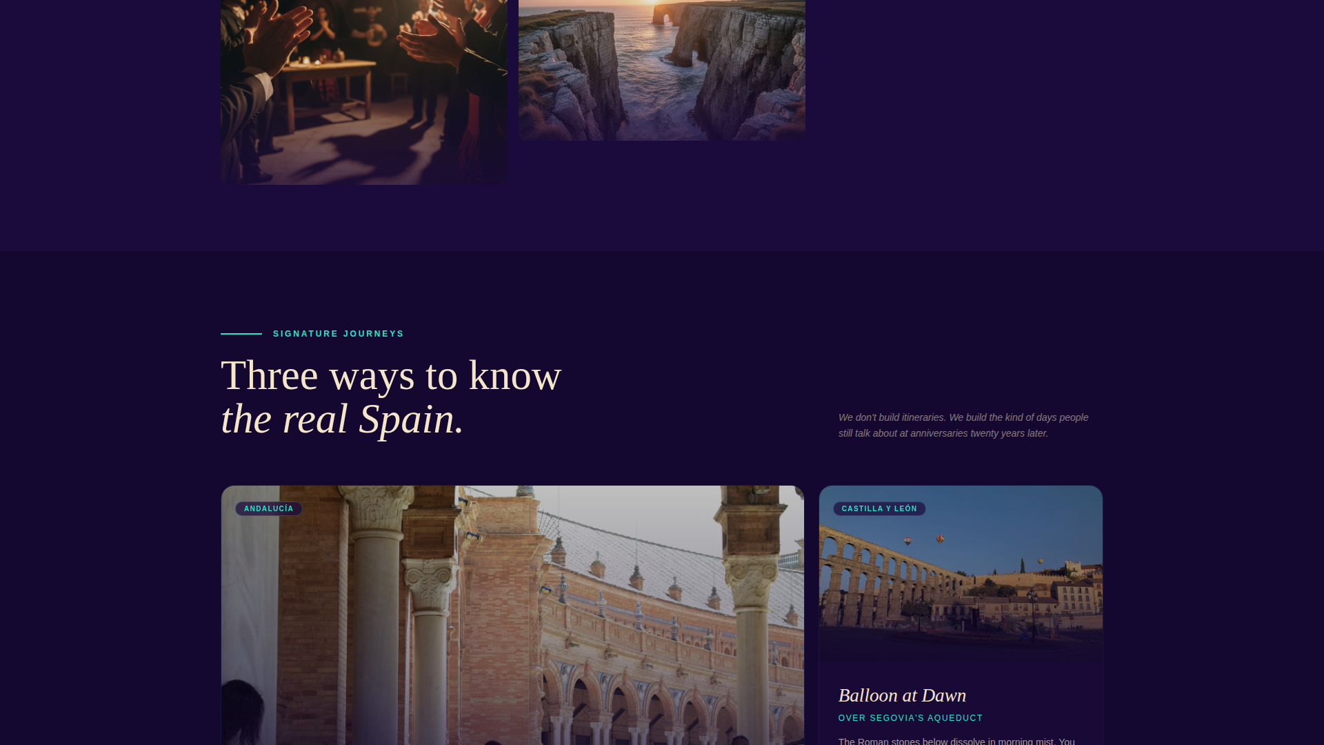
You get a complete, ready-to-customize masonry landing page structured around mood, atmosphere, and a clear dual-conversion flow. Every section has a defined purpose and a distinct visual role.
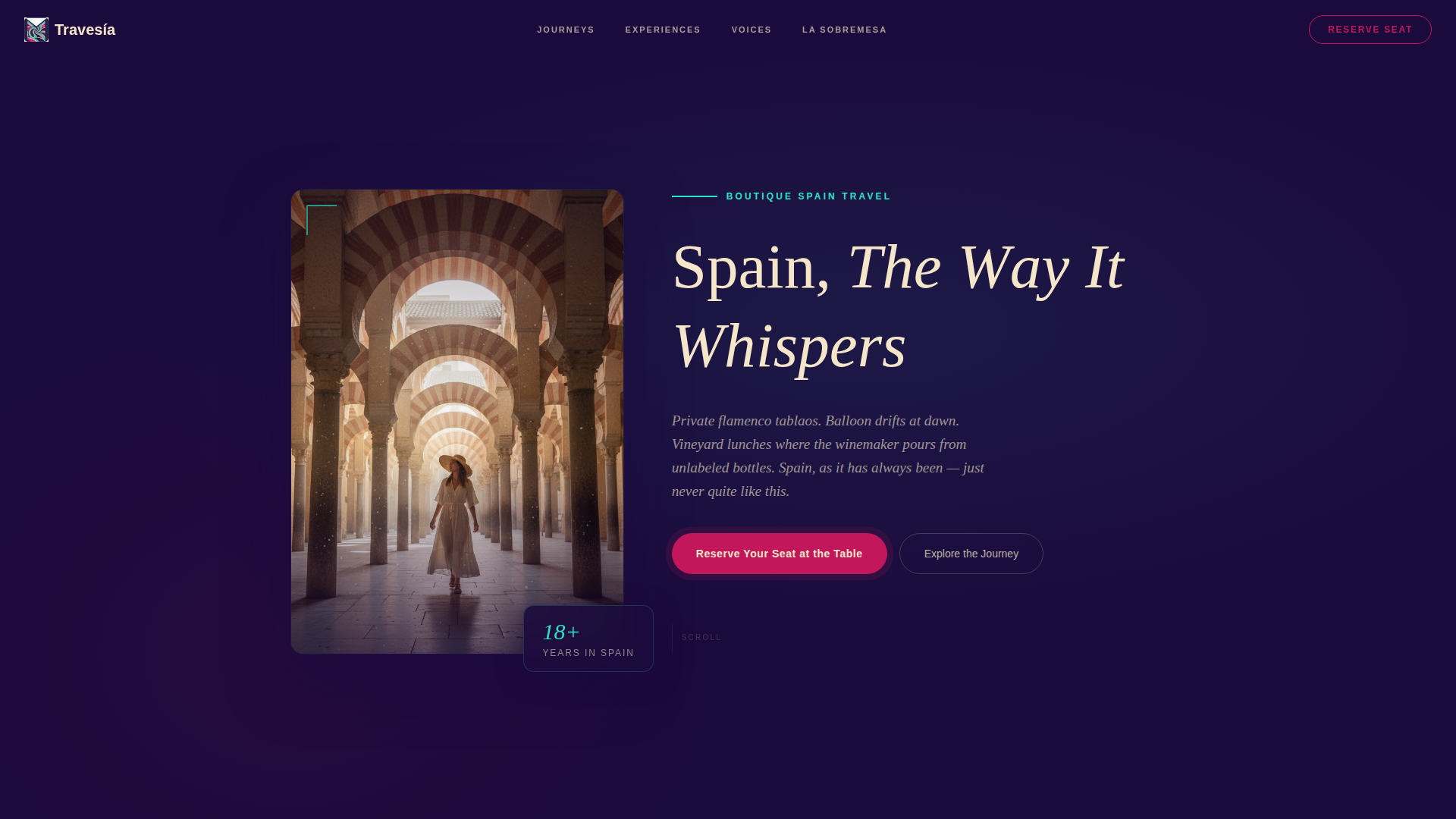
- A tall vertical header with a letter-by-letter animated headline in cream on indigo
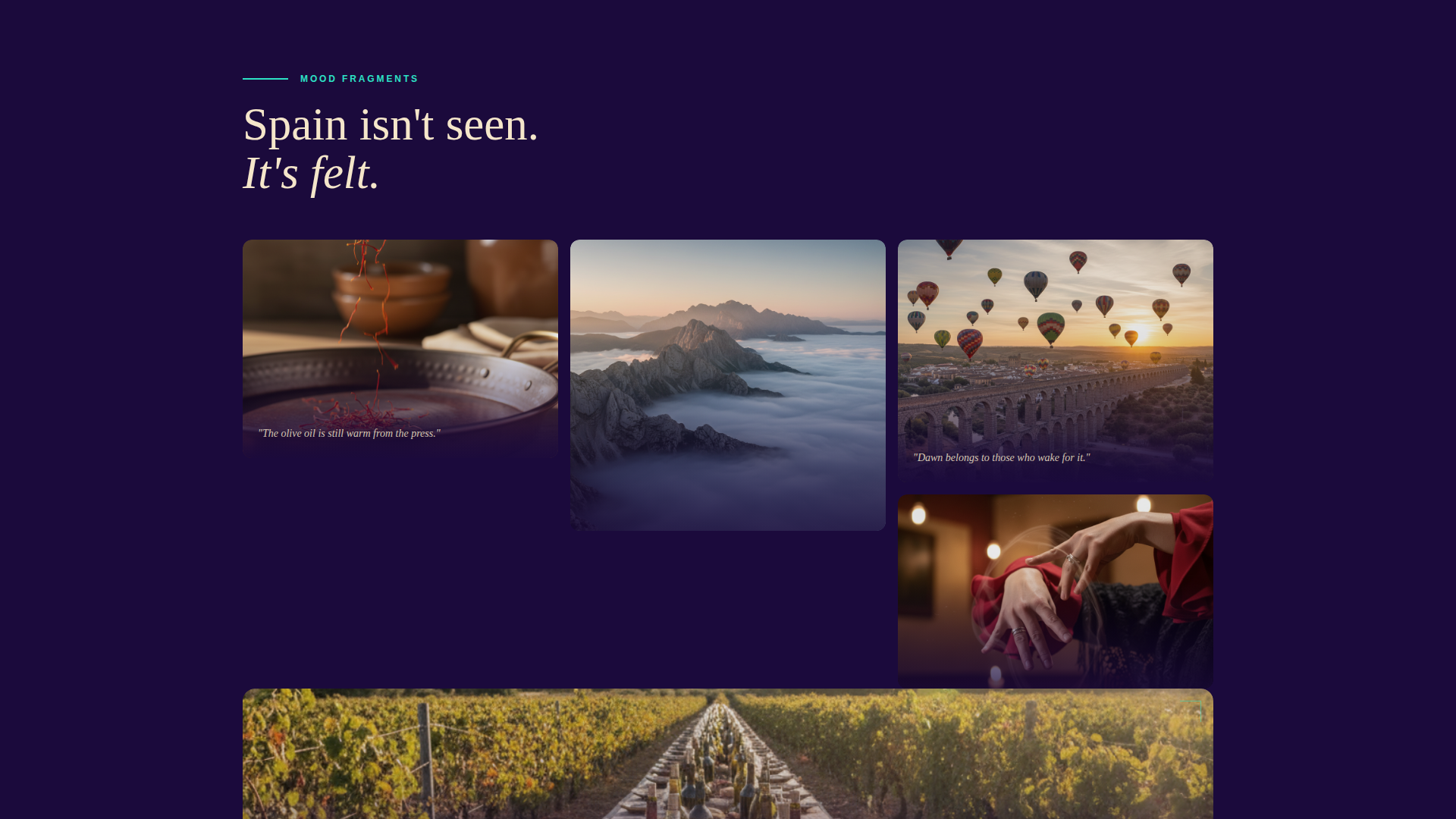
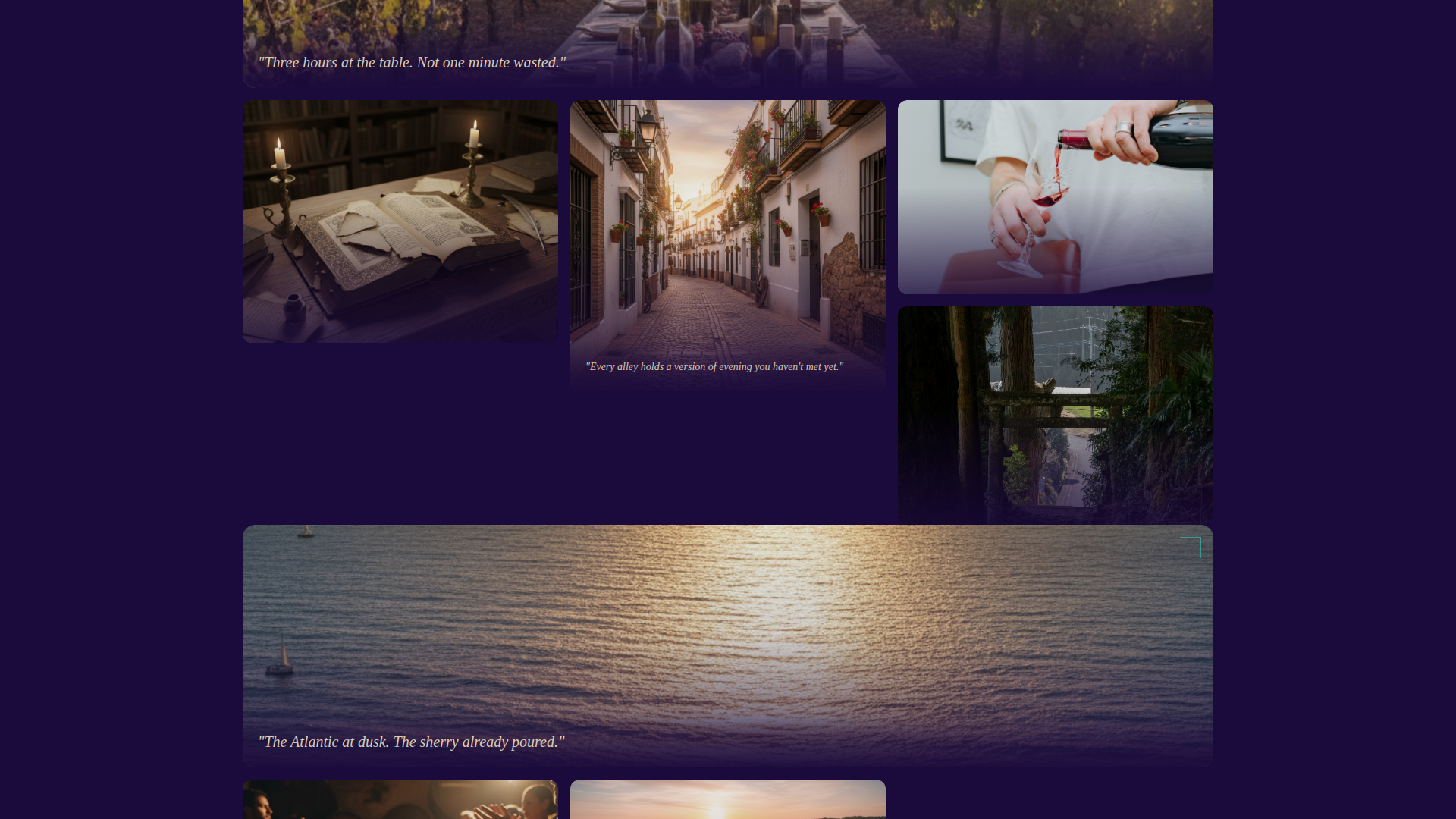
- A breathing masonry image grid with staggered fade-in tiles, italic mood captions, and full-width rhythm breaks
- A dual call-to-action system: event registration for "La Sobremesa" salon and a gated PDF download
Feature list
This template delivers a carefully scoped set of design and interaction features, all drawn from the creative brief and built to serve a luxury travel audience.
Letter-by-Letter Headline Animation
The header headline, "Spain, The Way It Whispers," types itself onto the screen character by character, as if written by candlelight. This single animation sets the editorial pace for the entire page without requiring any secondary effects.
Masonry Image Grid with Staggered Fade-Ins
Tiles load at offset intervals, creating a sense of organic discovery rather than a rigid layout. Occasional full-width tiles break the grid rhythm deliberately, functioning like a musical rest to draw the visitor deeper into the experience.
Floating and Pinned Magenta call to action Buttons
The primary call-to-action button, "Reserve Your Seat at the Table," appears as a floating element after the third scroll fold. It reappears pinned at the final full-width tile, keeping the conversion path visible without interrupting the mood.
Evocative Registration Form
The event registration form collects first name, email, and a single dropdown field titled "Which Spain calls to you?" The dropdown options, such as "The Coast at Midnight" and "The Table, Always the Table," extend the brand voice directly into the form interaction.
Gated PDF Download Path
A secondary conversion path offers a downloadable PDF, "Our Private Spain: 12 Journeys You Won't Find Elsewhere," gated behind an email field only. This catches visitors who are not yet ready to register but are willing to engage at a lighter commitment level.
Mood Caption Overlay System
Selected masonry tiles carry a single sentence in italic cream text, such as "The olive oil is still warm from the press." Other tiles remain image-only. This selective captioning keeps the grid from feeling like a brochure while reinforcing the sensory brand voice.
Page sections overview
| Section | Purpose |
|---|---|
| Vertical Portrait Header | Establishes mood and brand voice with an animated headline and a Mezquita arch photograph |
| Masonry Mood Grid | Delivers atmosphere through staggered image tiles, mood captions, and full-width rhythm breaks |
| Floating call to action Button | Keeps the primary conversion action visible after the third scroll fold |
| Event Registration Form | Collects name, email, and evocative dropdown to register for the La Sobremesa virtual salon |
| PDF Download Gate | Captures email from visitors not ready to commit, offering a curated Spain journey guide |
| Final Full-Width Tile | Anchors the page close with a pinned call to action and a visual full stop |
Design & branding system
The visual identity follows a Neo-Retro theme that references 1960s Iberia Airlines poster design, then electrifies it with a Northern Lights color system. The result feels like glamorous nostalgia lit from within.
- Deep aurora indigo (#1B0A3C) anchors backgrounds and navigation; vintage postcard cream (#F5E6CA) carries text blocks and card surfaces
- Shimmering celestial teal (#2DE2C6) traces section dividers and scroll-triggered highlights throughout the grid
- Charged magenta (#C2185B) appears only on call-to-action buttons and hover states, so every pulse of color signals exactly where to act
Mobile & speed optimization
The vertical portrait header is composed to crop cleanly on mobile screens, preserving the central figure and losing nothing essential from the frame. The masonry grid adapts its column count to fit narrower viewports without breaking the staggered load sequence.
- The tall header image towers on desktop with generous indigo margins and collapses gracefully to a tight mobile crop
- Tile fade-in timing is staggered by design, meaning the layout feels intentional rather than slow at any screen size
- The floating call to action button remains accessible on mobile without overlapping critical content areas
How this template helps you convert
The page is structured around two distinct visitor types: those ready to act and those still in discovery mode. Both are served without either path feeling like a hard sell.
- The floating magenta button appears after enough scroll depth to let mood and imagery build desire first, then places the registration action exactly when curiosity peaks.
- The gated PDF download gives hesitant visitors a low-friction reason to share their email, creating a second conversion layer that works alongside the primary event registration goal.
Other information about this template
Travesa is part of a broader Neo-Retro template family that pairs atmospheric creative direction with practical conversion architecture. A few additional details worth noting before you customize and launch.
- The template style is Masonry/Pinterest, meaning the grid layout is inherently suited to visual storytelling brands with rich image libraries
- The "La Sobremesa" salon concept is built into the registration form structure, but the dropdown options and PDF title are fully editable to match your own event or lead magnet
- The Northern Lights color system is applied systematically: each color has a single defined role, making brand consistency straightforward to maintain during customization
- The template theme references the visual language of mid-century travel poster design, which may resonate with audiences who appreciate craftsmanship and considered aesthetics
Theme
Neo-Retro
Creative direction
Atmosphere & Mood
Color system
Northern Lights
Style
Masonry/Pinterest
Direction
Event Registration
Page Sections
Letter-by-letter Headline Animation
Masonry Grid with Staggered Fade-ins
Floating and Pinned Magenta Call to Action
Evocative Registration Form
Gated PDF Download Path
Mood Caption Overlay System
Related questions
Can I change the event registration form fields?
Do I need a large photo library to use this template?
Who is this template designed for?
Can the floating call to action button text be customized?
Is the PDF download section pre-connected to an email platform?