Tire Shop Marketing Cost Calculator Website Template
Tread is a single-page landing page template built for tire shop Facebook ad services. It uses a case study narrative layout with alternating sections, a data-first header, and an Ink & Paper color system. The design guides independent shop owners from skepticism to action through accumulated proof, ending with a lead-capture form and a secondary calculator call to action.
by Rocket studio
Quick summary
Tread is a precision-built landing page template for tire shop Facebook advertising services. It opens with press credibility and a hard spending number, then walks visitors through real shop case studies in a zigzag layout. The page earns trust through data, not promises, and converts through a PDF playbook download form backed by a secondary bay-count calculator link.
Who this template is for
This template is built for Facebook ad agencies and freelance marketers who specialize in tire shop clients. It speaks directly to independent tire shop owners running two-to-eight bay operations who have wasted money on boosted posts and want a better path to filling slow bays.
- Tire shop marketing consultants who need a polished proof-of-results page
- Ad agencies pitching Facebook ad services to independent tire shop owners
- Freelancers building authority in the automotive service niche
What problem this template solves
Independent tire shop owners are a skeptical audience. They have seen boosted posts bring in window-shoppers instead of paying customers, and they need concrete proof before trusting a new ad service. Generic marketing pages do not answer their real question: does this actually fill bays on a slow Tuesday?
- Lack of credibility signals that speak to shop operators, not general business owners
- No clear proof that Facebook ads produce real appointment volume at a known cost
- Weak calls to action that gate value before earning the visitor's trust
What you get with this template
You get a fully structured single-page layout built around data storytelling and case study proof. Every section is designed to advance the visitor's confidence, from the press mentions bar at the top to the playbook download form at the bottom.
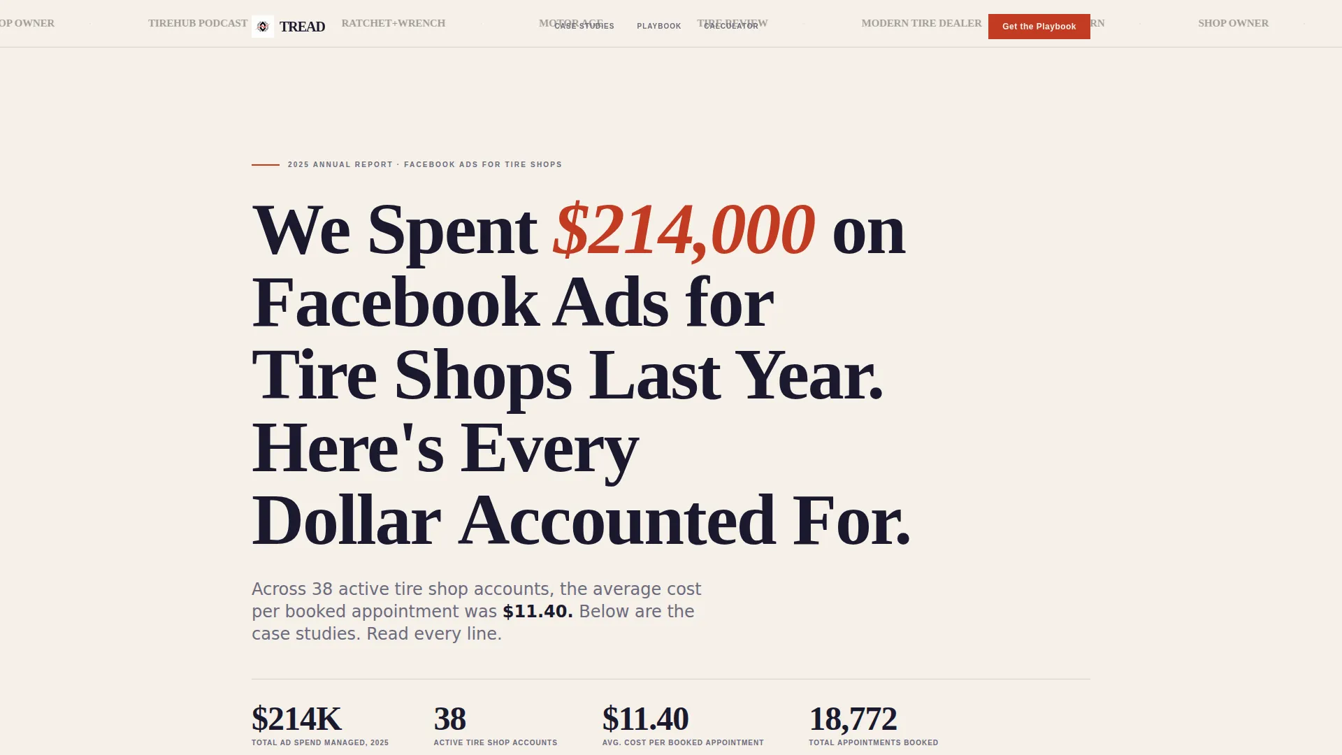
- A press mentions bar, bold data headline, and cost-per-appointment subhead in the header
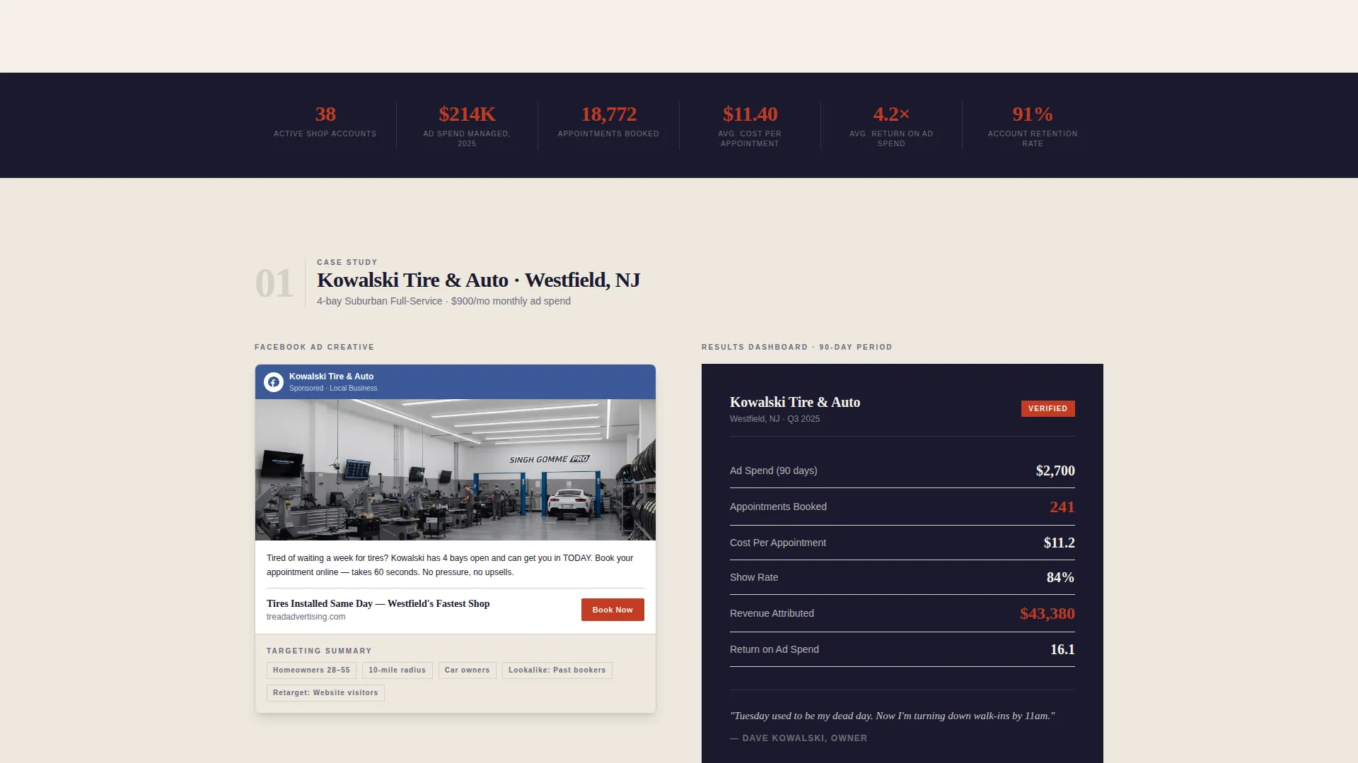
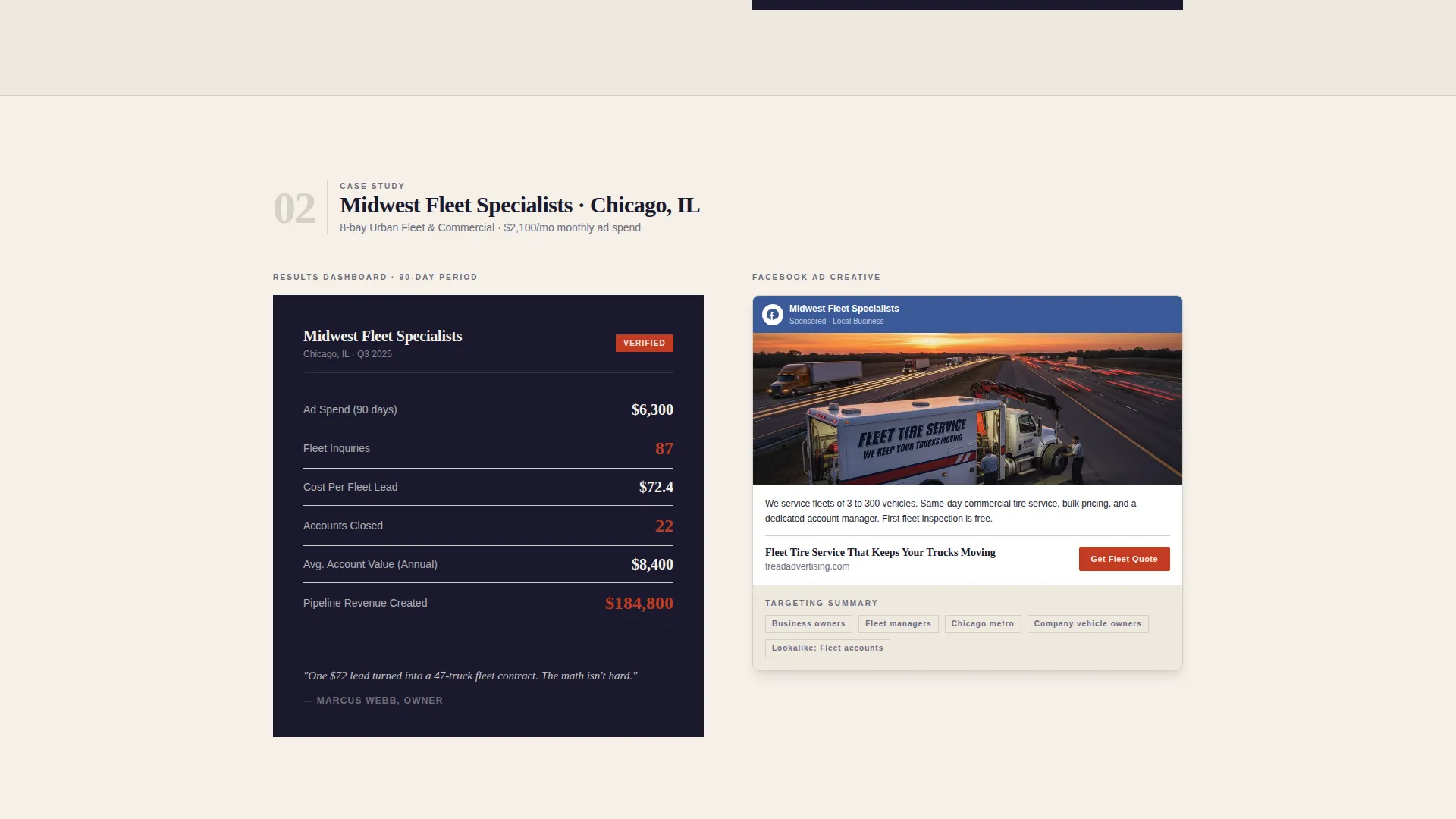
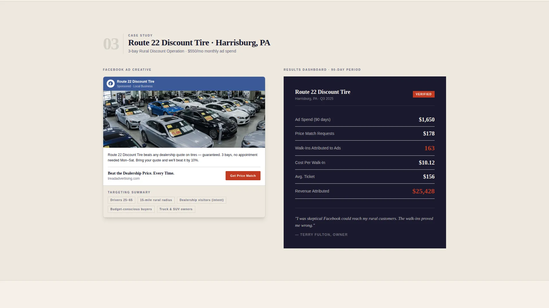
- Alternating zigzag case study sections showing ad creative summaries and results dashboards
- A lead capture form (shop name, zip code, email) and a secondary calculator call to action
Feature list
This section covers the core built-in components that make the Tread landing page work as a conversion tool.
Press Mentions Authority Bar
The header opens with a row of trade publication and podcast logos rendered in desaturated grayscale against the cream background. This sets immediate credibility before the visitor reads a single word of body copy.
Data-First Hero Headline
No hero image is used. Instead, a bold serif headline states a precise total ad spend figure, followed by a single-line subhead naming the average cost-per-appointment. The specificity of the number replaces visual decoration.
Zigzag Case Study Sections
Each alternating section introduces a real tire shop by name and city. The left side shows the Facebook ad creative and targeting summary; the right side shows a results dashboard with appointment counts, cost-per-lead, and attributed revenue. The layout cycles through different shop profiles to build a pattern of proof.
Lead Capture Download Form
The primary call to action is a form that collects shop name first, then zip code, then email. Asking for shop name first signals that this resource is built for operators. The form delivers the Tire Shop Ad Playbook PDF.
Secondary Bay-Count Calculator Link
After the final case study, a secondary call to action links to a simple calculator. Visitors can estimate what their own bay count could support in appointment volume, turning passive reading into active self-qualification.
Ink & Paper Visual System
The template uses a four-color palette: deep manuscript black, warm newsprint cream, ledger-line gray, and red-pen red. Red is reserved exclusively for key metrics and call to action elements, keeping emphasis meaningful throughout the scroll.
Page sections overview
| Section | Purpose |
|---|---|
| Press Mentions Bar | Establishes trade credibility at first glance |
| Data Hero Header | Anchors authority with a precise spend figure |
| Case Study One | Introduces first shop proof with ad and results |
| Case Study Two | Reinforces pattern with a second shop profile |
| Case Study Three | Adds variety with a different shop type |
| Case Study Four | Completes proof accumulation before the form |
| Playbook Download Form | Captures shop name, zip code, and email |
| Bay-Count Calculator call to action | Converts readers into self-qualified prospects |
Design & branding system
The visual identity follows a Corporate Precision theme anchored in an Ink & Paper color system. The overall feel is a freshly printed financial newspaper: authoritative, unhurried, and confident. Every design decision signals that the numbers do the talking.
- Cream (#F5F0E8) dominates the background; black (#1A1A2E) carries all body text with weight
- Ledger-line gray (#D4D0C8) separates sections like ruled lines on accounting paper
- Red-pen markup (#C23B22) appears only on key metrics and call to action elements to preserve its impact
Mobile & speed optimization
The alternating zigzag layout is designed to restack cleanly on smaller screens, keeping case study content readable without horizontal scrolling. The minimal asset approach, using no hero image and grayscale logos in the press bar, keeps the page visually light.
- No hero image means the above-the-fold area loads on text and color alone
- Grayscale press logos reduce image weight compared to full-color asset libraries
- Section-by-section layout structure supports a logical single-column reflow on mobile
How this template helps you convert
The page is built as a content and resource destination. It gives away specific data throughout the scroll so that the playbook download feels like a natural next step, not a forced gate.
- The press bar and data headline establish authority in the first viewport, reducing the bounce impulse before the visitor scrolls.
- Four case studies with distinct shop profiles accumulate proof progressively, so by the final section the visitor is asking "what would my numbers look like" rather than "does this work."
- The form asks for shop name first, which primes the visitor to self-identify as an operator and increases completion intent before reaching the email field.
Other information about this template
Tread is categorized under Professional Services and Tire Shop Marketing. It is designed as a lead generation landing page with an Editorial Magazine theme and a Data Storytelling header concept. The template style follows a Sidebar Companion approach adapted into a full zigzag layout for this use case.
- The creative direction is grounded in Team and People signals, reflected in the named real shop case studies
- The intersection niche context is Tire Shop Coupon and Discount Page, meaning the template can also support discount-led offer framing if needed
- The Ink and Paper color system is consistent with the matched intersection fields and reinforces the editorial, proof-driven tone throughout
Theme
Editorial Magazine
Creative direction
Team & People
Color system
Ink & Paper
Style
Sidebar Companion
Direction
Lead Generation
Page Sections
Press Mentions Authority Bar
Data-first Hero Headline
Zigzag Case Study Layout
Lead Capture Download Form
Secondary Calculator Call to Action
Ink and Paper Color System
Related questions
Can I replace the case study data with my own client results?
Does the template include the PDF playbook or the bay-count calculator?
Is this template a good fit for a tire shop running its own ads?
How many case study sections are included in the template?
Can the Ink and Paper color palette be changed to fit a different brand?



