Parkinson's Disease Specialist Clinic Landing Page
Tremor is a single-column landing page template built for Parkinson's disease specialist clinics. It guides anxious visitors through an interactive symptom checklist and treatment audit, then moves them naturally toward booking an assessment. The warm, gradient-soft design and calm serif typography feel as unhurried as the care it represents.
by Rocket studio
Quick summary
Tremor is a Parkinson's disease specialist clinic landing page designed to convert worried visitors into booked appointments. A guided symptom checklist, an honest treatment audit, and a three-field booking form work together in a single-column scroll. The palette is warm and soft, and every section is built to lower anxiety rather than raise it.
Who this template is for
This template is made for neurology clinics and Parkinson's disease specialists who need a patient-facing landing page that builds trust quickly. It suits practices serving a wide range of patients at different stages of their diagnosis journey.
- Recently diagnosed adults who are still processing what a progressive diagnosis means for their daily life
- Long-term patients whose current medication plan has stopped holding and who need a second opinion or a medication review
- Adult children searching late at night for a clinic that treats the whole picture: sleep, gait, voice, mood, and tremor
What problem this template solves
Most medical landing pages either overwhelm visitors with clinical detail or offer nothing beyond a phone number. Patients dealing with Parkinson's symptoms arrive carrying fear and uncertainty. They need a page that meets them where they are, not one that makes them work for reassurance.
- Visitors leave generic clinic pages without booking because nothing on the page acknowledges their specific worry
- Patients with complex, long-term Parkinson's care needs cannot tell at a glance whether a clinic understands their situation
- Adult children searching on behalf of a parent need a clear, calm path to action without having to read through dense medical prose
What you get with this template
You get a complete, ready-to-customize single-column landing page focused on appointment booking for a Parkinson's disease specialist clinic. Every section is purposeful and ordered to guide the visitor steadily toward one action.
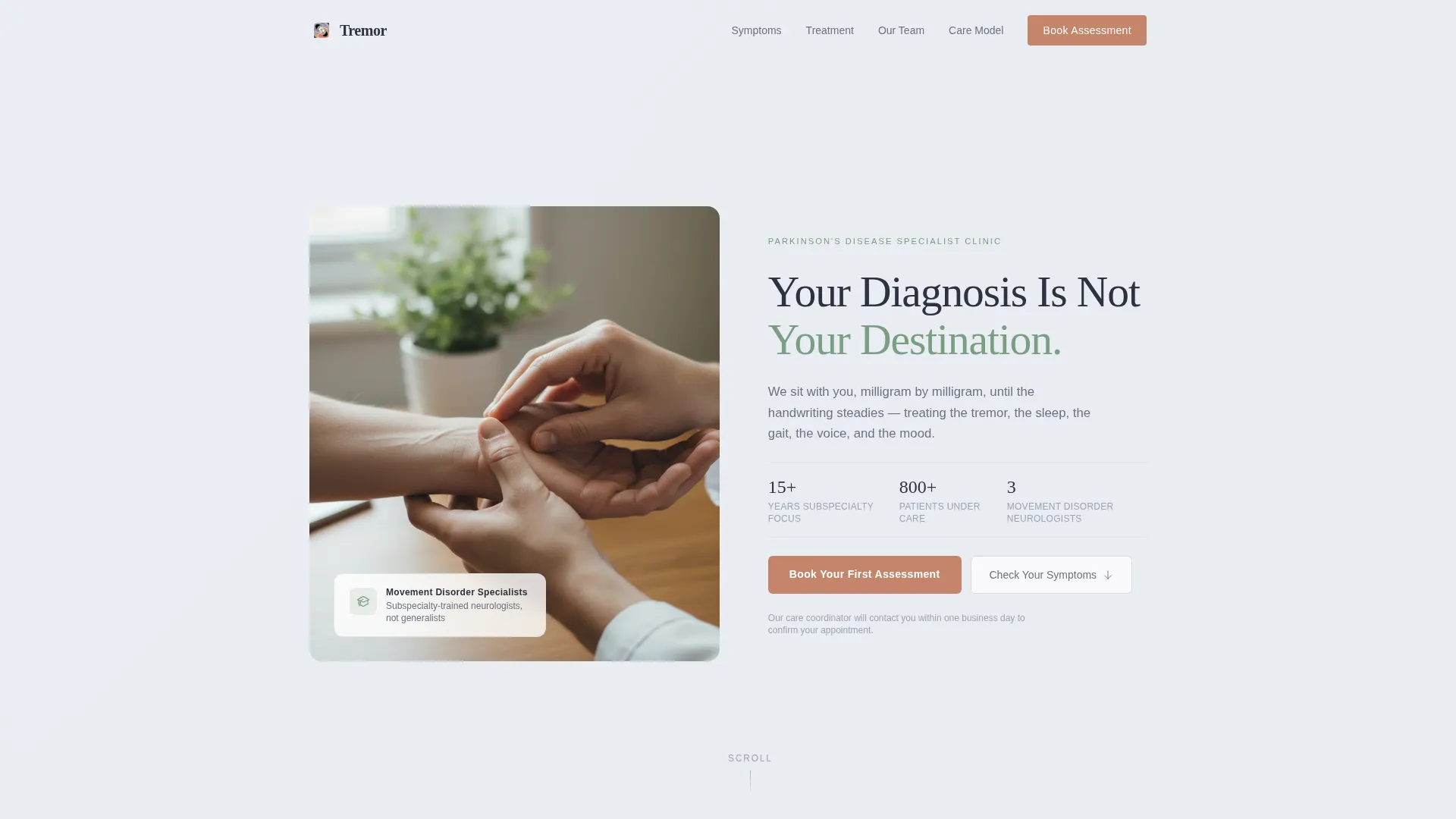
- A split hero section with a clinician hands photograph, a calm serif headline, and a visible terracotta booking button above the fold
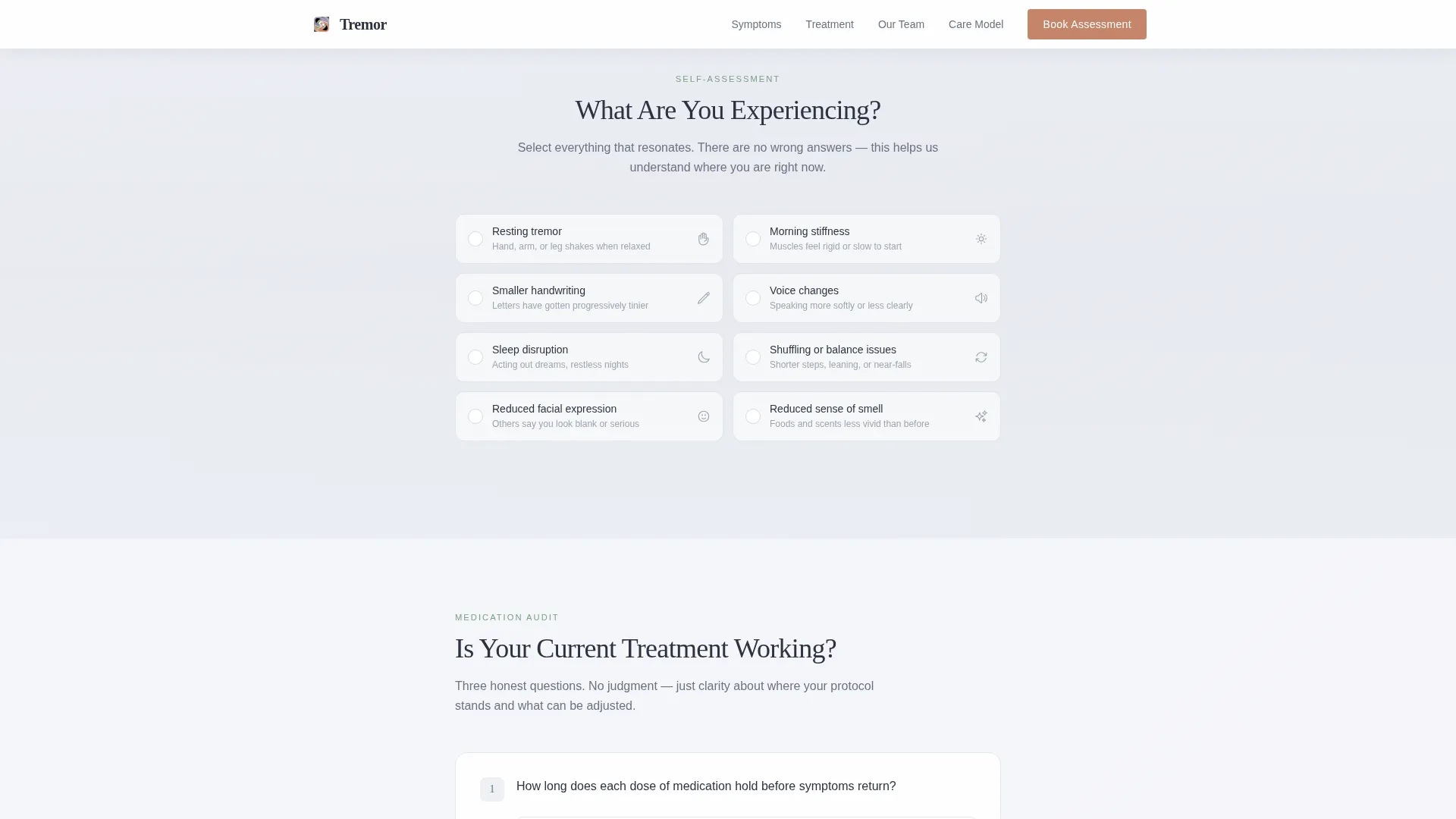
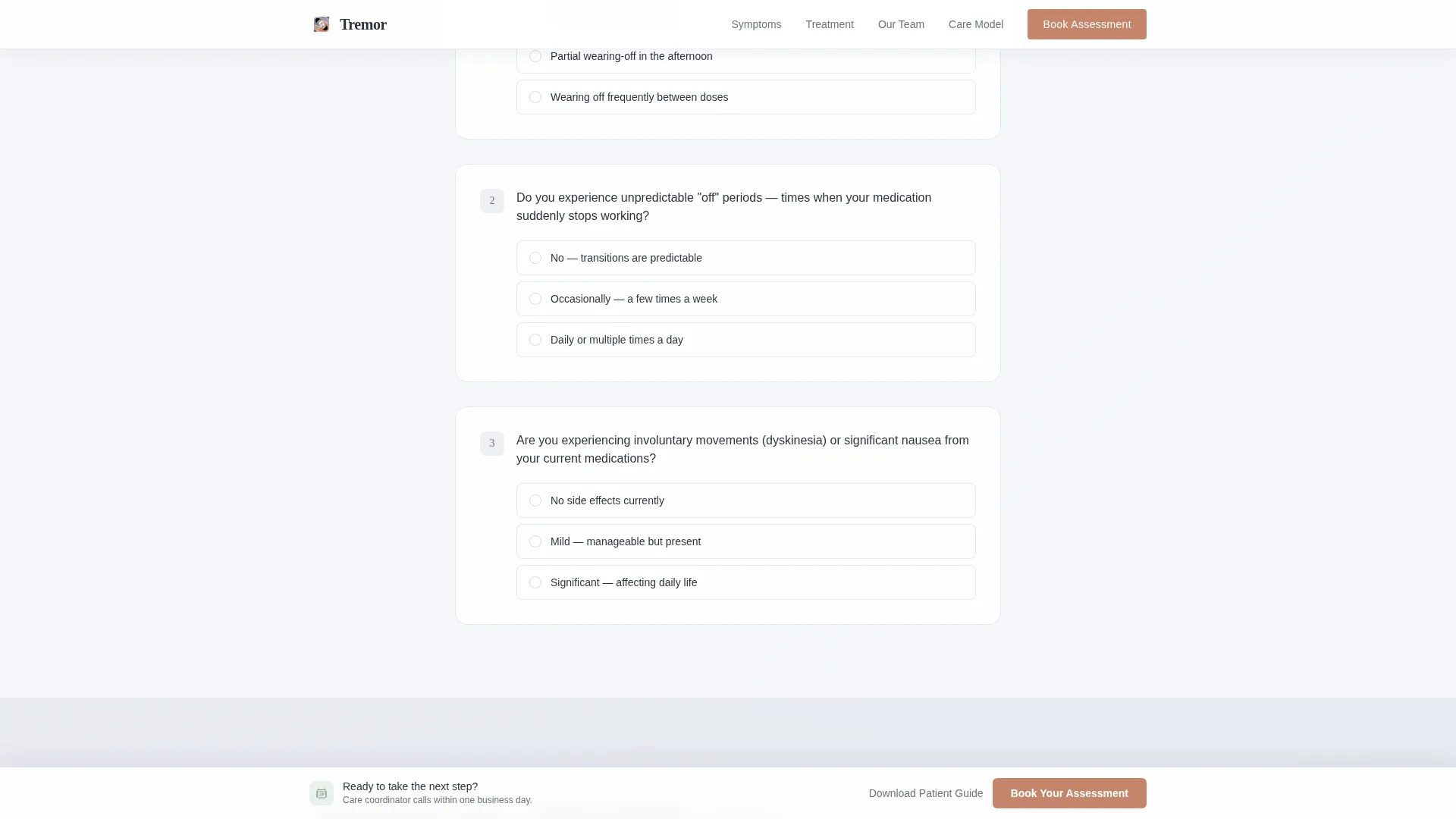
- An interactive "What Are You Experiencing?" symptom checklist and a three-question treatment audit that build a personal profile for each visitor
- A three-field booking form plus a secondary email capture path for visitors who want to download the new patient guide before committing
Feature list
This template is built around a small number of carefully considered components. Each one has a defined job in the visitor's journey from uncertainty to appointment.
Interactive Symptom Checklist
The "What Are You Experiencing?" section presents common Parkinson's symptoms as tappable checklist items. Selected items highlight in soft sage, quietly building a visual profile as the visitor scrolls. Each completed checklist resolves into a brief, reassuring paragraph written by the clinical team.
Honest Treatment Audit
Three direct questions ask about medication timing, on/off fluctuations, and side effects. The audit does not escalate fear. Instead, each completed answer resolves into a calm explanation of what these patterns mean and what can be adjusted. This section is especially useful for long-term patients whose current protocol has plateaued.
Persistent Bottom Booking Bar
After the visitor scrolls past the checklist, a persistent bottom bar appears with the primary call to action. The bar stays visible as the visitor continues reading, keeping the booking path available without interrupting the scroll experience.
Split Hero with Photo and Headline
The header is a half-page composition. A clinician's hands photograph shot at shallow depth of field sits on the left. On the right, a calm Fraunces serif headline reads "Your Diagnosis Is Not Your Destination," followed by one sentence of body text and the terracotta booking button.
Three-Field Booking Form
The booking form asks only three things: type of visit, preferred day range, and a phone number. A note below the phone field confirms that the care coordinator will call within one business day. This keeps the form low-friction and reassuring rather than clinical and demanding.
Secondary Email Capture Path
A "Download Our New Patient Guide" option offers a PDF for visitors not yet ready to call. The guide walks through the first appointment, what to bring, and what questions to ask. This path captures an email address without pushing the visitor to commit before they feel ready.
Page sections overview
| Section | Purpose |
|---|---|
| Hero Split | Introduce the clinic with a photograph, a reassuring headline, and the primary booking button |
| Symptom Checklist | Let visitors identify and self-select their current Parkinson's symptoms interactively |
| Treatment Audit | Help long-term patients honestly assess whether their current medication plan is working |
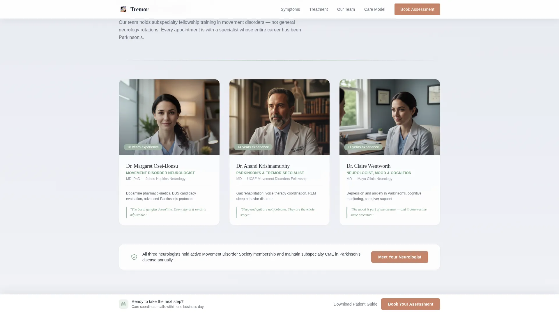
| Clinical Team | Display neurologist profiles with subspecialty credentials and years of experience |
| Booking Form | Capture visit type, preferred schedule, and phone number in three low-friction fields |
| New Patient Guide | Offer a PDF download as a secondary path for visitors not yet ready to book |
| Footer | Provide clinic contact details and essential links in a clean single-row layout |
Design & branding system
The visual identity uses a Soft Gradient theme built on the Cloud Canvas color system. Every surface is warm and light-absorbing, nothing sharp or cold. The palette evokes the first hour after sunrise in a garden where dew is still on the leaves.
- Colors: morning mist white (#F7F8FA) for backgrounds, pale lavender-gray (#D6D9E0) for secondary surfaces, soft sage (#A3B9A8) for section dividers and iconography, and warm terracotta (#C4856A) reserved exclusively for buttons and progress indicators
- Typography: Fraunces serif for all headlines, giving the page an unhurried, trustworthy voice; DM Sans for body copy, keeping paragraphs clean and easy to read at any size
- Gradients drift between mist white and lavender in barely perceptible transitions, sage anchors the checklist highlights and icons, and terracotta appears only where the page asks for action
Mobile & speed optimization
This template is designed mobile-first because a significant portion of the target audience arrives on a phone at odd hours, often in a state of worry. The single-column layout adapts cleanly to small screens without reordering content.
- The interactive checklist and audit questions are built as touch-friendly tap targets, easy to use on a phone screen without pinching or zooming
- The persistent booking bar sits at the bottom of the mobile viewport, always reachable with one thumb after the visitor passes the checklist
- Server Component architecture handles the static page structure, while Client Components manage the interactive checklist, audit, and form to keep the experience responsive
How this template helps you convert
The page is designed to move a hesitant, anxious visitor toward booking through a sequence of small, low-pressure steps. Each section reduces uncertainty before asking for a commitment.
- The symptom checklist and treatment audit give visitors a reason to engage before they are asked to book, building a sense of personal relevance and clinical understanding that generic clinic pages cannot match.
- The persistent terracotta booking bar keeps the primary call to action visible throughout the scroll without interrupting the reading experience, so the path to booking is always one tap away.
- The secondary "Download Our New Patient Guide" email capture ensures that visitors who leave without booking still receive a touchpoint, with the PDF walking them through exactly what the first appointment involves.
Other information about this template
This template is part of a broader collection of health and medical landing page templates designed for specialist clinics. A few additional details worth knowing before you customize:
- The booking form fields are ordered deliberately: visit type comes first to help visitors self-identify, schedule preference comes second to reduce the sense of commitment, and phone number comes last once trust has been built through the earlier sections
- Neurologist profile cards in the clinical team section support subspecialty credentials and years of experience, giving the page social proof grounded in clinical authority rather than patient-review stars
- The footer follows a linear single-row pattern, keeping the bottom of the page clean and uncluttered so the persistent booking bar remains the dominant element at scroll end
- The template localization is set for United States audiences: 12-hour time format, MM/DD/YYYY date format, and United States dollar currency where applicable
- Animation is set to medium intensity, using fade-up on scroll for content blocks and interactive state transitions for checklist and audit items, keeping the page feeling alive without being distracting
Theme
Soft Gradient
Creative direction
Checklist & Audit
Color system
Cloud Canvas
Style
Single Column Flow
Direction
Booking/Scheduling
Page Sections
Interactive Symptom Checklist
Honest Treatment Audit
Three-field Booking Form
Persistent Bottom Booking Bar
Secondary Email Capture Path
Split Hero with Photograph
Related questions
Can I customize the symptom checklist items for my clinic's specific focus?
Does the template support both new patients and returning patients seeking a medication review?
What happens when a visitor chooses to download the new patient guide instead of booking?
Is the persistent booking bar visible on mobile screens?
Can a clinic without an online scheduling system still use this template?



