Parkinson's Disease Digital Therapy Landing Page
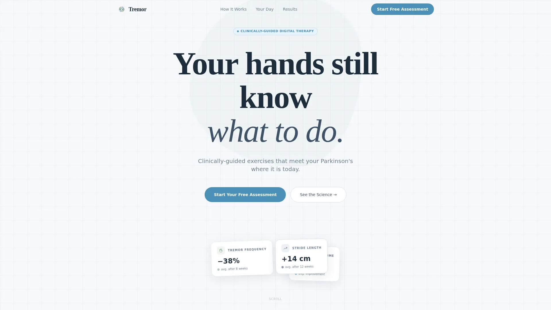
Tremor is a Parkinson's disease digital therapy landing page template built for lead generation. It uses a centered serif headline, a side-by-side comparison table, a science section, a day-in-the-life walkthrough, and anonymized progress charts. The design runs on glacial white with sage accents and cerulean calls to action, creating a calm, trust-first experience for patients and caregivers.
by Rocket studio
Quick summary
Tremor is a single-page lead generation template for a Parkinson's disease digital therapy app. It guides visitors through a Problem-to-Solution arc, opening with a warm serif headline and unfolding into a comparison table, cited science, a morning routine walkthrough, and progress charts. Two primary calls to action collect assessment leads. A secondary path lets visitors forward a clinician summary to their neurologist.
Who this template is for
This template is built for digital health teams and developers launching a Parkinson's disease therapy product. It speaks directly to patients and caregivers, not clinical administrators, and it earns trust through honesty before offering hope.
- Newly diagnosed patients who are still processing their diagnosis and looking for a sense of agency
- Long-term patients whose daily routines are shaped by medication timing and symptom management
- Caregiving spouses and family members researching options late at night on a mobile phone
What problem this template solves
Most medical landing pages overwhelm visitors with dense text, rushed claims, and anxious layouts. Someone researching Parkinson's care at two in the morning needs the opposite: breathing room, honest framing, and a clear next step that feels safe.
- Patients land on pages that either oversell cures or bury the practical details they actually need
- Caregivers struggle to find a resource they can confidently share with a neurologist
- Generic health templates lack the emotional tone and structural flow required for a sensitive chronic-illness audience
What you get with this template
You get a fully structured, single-page lead generation layout designed around the specific emotional and practical needs of a Parkinson's disease audience. Every section has a defined purpose and a deliberate place in the conversion arc.
- A hero section with a giant centered serif headline and vast whitespace that sets a calm, unhurried tone
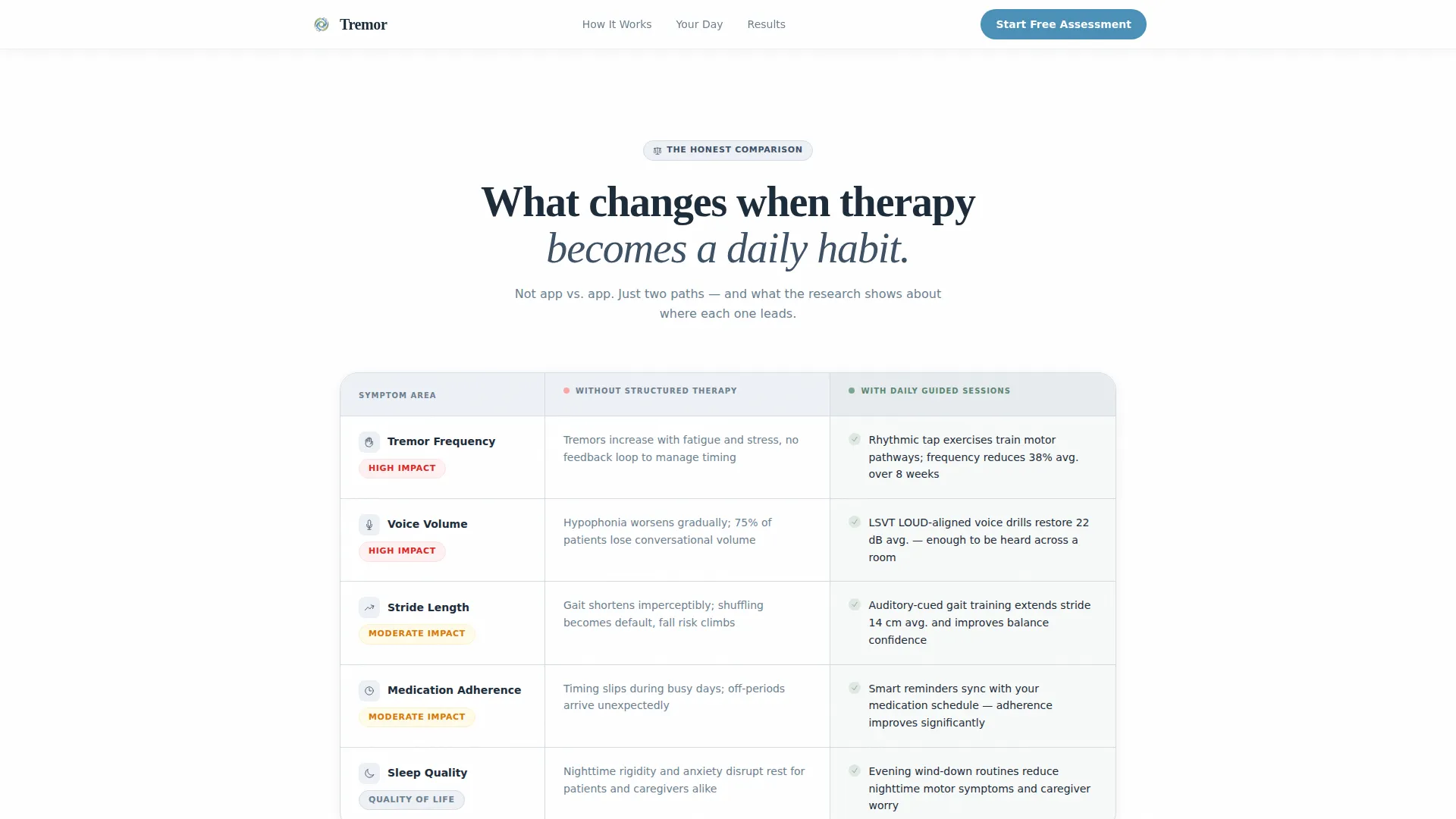
- A five-row comparison table, a science section with cited study references, a day-in-the-life walkthrough, and anonymized progress charts
- A dual call-to-action system with a three-step assessment form and a secondary neurologist email path
Feature list
This template delivers six purposefully designed components that work together to build trust and guide visitors toward a free assessment.
Centered Hero Headline
The hero opens with a large warm serif headline set in generous letter-spacing on a pure white field. A fog-gray subline sits below it. No competing imagery. The whitespace is the design, and it signals immediately that this page is different from every anxious medical page the visitor has seen before.
Side-by-Side Comparison Table
The comparison table sets "Without structured therapy" against "With daily guided sessions" across five real symptom categories: tremor frequency, voice volume, stride length, and medication adherence. Each row delivers quiet, specific evidence. Hover states add interactivity without distraction.
Science and Evidence Section
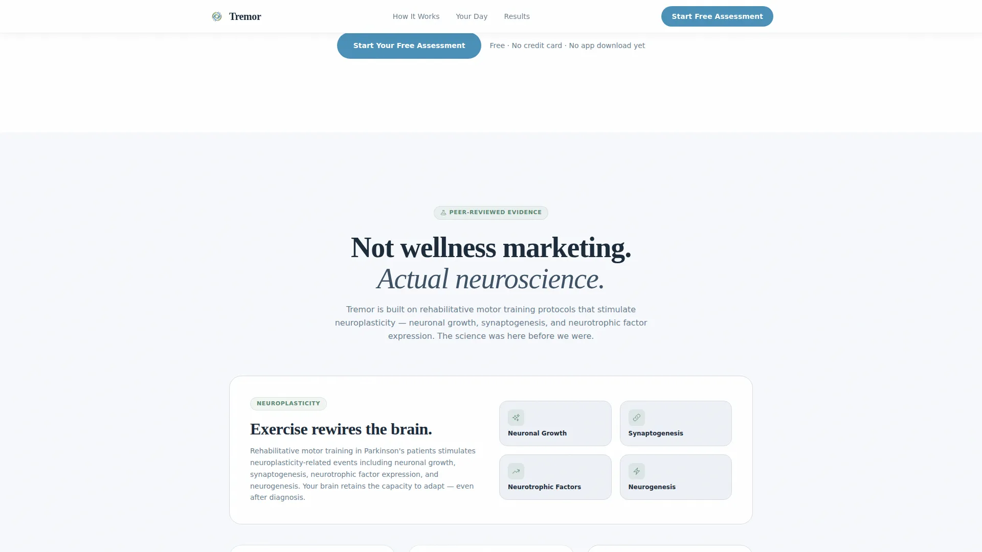
A dedicated section references peer-reviewed studies and neuroplasticity evidence, including established clinical therapy frameworks. Claims are grounded in citations, not buzzwords. This section converts skeptical readers into informed prospects before they reach the call to action.
Day-in-the-Life Walkthrough
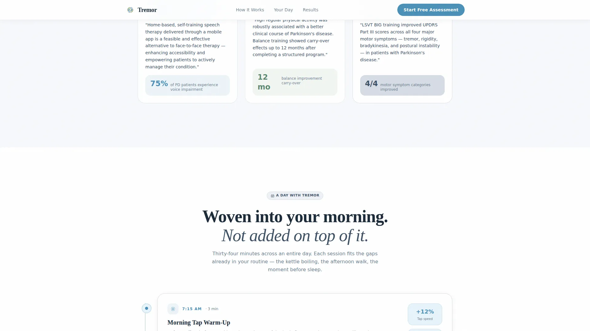
A narrative section shows the app woven into a morning routine, step by step. It makes the therapy feel practical and achievable rather than clinical and abstract. Readers see exactly when and how they would use the guided exercises in a real day.
Anonymized Progress Charts
Scroll-triggered chart line draws display anonymized upward-slope progress data across key symptom metrics. The charts slope gently and honestly. They accumulate evidence the way recovery accumulates: gradually, then unmistakably.
Three-Step Assessment Form and Neurologist Path
The primary call to action opens a three-step form: diagnosis stage, primary concern, then email address. No credit card required. A secondary single-field form lets visitors forward a clinician-facing summary directly to their neurologist, giving caregivers and patients a reason to bring the app up at their next appointment.
Page sections overview
| Section | Purpose |
|---|---|
| Hero Headline Area | Set calm tone and introduce the core value promise |
| Comparison Table | Show symptom improvement contrast with structured therapy |
| Primary call to action One | Capture assessment leads after comparison evidence |
| Science and Evidence | Build credibility with cited study references |
| Day-in-the-Life | Make daily therapy feel practical and achievable |
| Progress Charts Display | Show anonymized improvement data with honest slopes |
| Primary call to action Two | Second lead capture after progress chart evidence |
| Neurologist Email Path | Let visitors forward a clinician summary by email |
| Footer Row | Provide single-row navigation and essential links |
Design & branding system
The visual identity follows an Organic Flow theme built on an Arctic White color system. The palette feels clinical enough to trust and natural enough to comfort, like breathing cold mountain air beside a still lake.
- Colors: glacial white (#F7F9FC) dominates every background; living sage (#7BA68C) appears in illustrations and progress indicators; calm cerulean (#4A90B8) is reserved exclusively for buttons and active states
- Typography: Fraunces warm serif is used for headlines; DM Sans handles all body and interface text for clean, readable contrast
- Motion: scroll reveals, floating card pulses, chart line draws, and gentle transitions create a medium-animation experience without overwhelming a tired or emotionally sensitive visitor
Mobile & speed optimization
The template is built mobile-first, reflecting the reality that most patients and caregivers research late at night on a phone. Every layout decision prioritizes readability and comfort on a small screen.
- Server Components handle all static sections, while Client Components manage the assessment form, chart animations, and hover interactions
- Chart line draws and scroll-reveal animations are designed to run smoothly without blocking the page or delaying the primary content
- The three-step form is intentionally lightweight, collecting only diagnosis stage, primary concern, and email address to minimize friction on mobile
How this template helps you convert
The conversion strategy follows a deliberate Problem-to-Solution arc that earns trust before asking for anything. Every section moves the visitor one step closer to the free assessment without pressure.
- The comparison table places concrete, symptom-level evidence early in the scroll, so visitors understand the value proposition before they reach any call to action
- The science section and progress charts add layered credibility, turning emotional resonance from the hero into informed confidence by the time the second call to action appears
- The neurologist email path removes a key barrier for caregivers and newly diagnosed patients by giving them a professional, shareable resource they can bring to their next appointment
Other information about this template
This template is part of a Health and Medical category built specifically for the Parkinson's disease digital therapy niche. It is designed for US-centric English-language audiences, reflecting the more than one million Americans living with Parkinson's disease today.
- The template style is a Comparison Table layout with a lead generation direction, making it well suited for apps, digital health tools, and therapy programs that need to justify their value before asking for a sign-up
- The footer follows a linear single-row pattern, keeping the page clean and focused without secondary navigation distractions
- The creative direction is a Problem-to-Solution arc, which is particularly effective for chronic-illness audiences who arrive skeptical, emotionally fatigued, and in need of honest, accumulated proof
Theme
Organic Flow
Creative direction
Problem→Solution Arc
Color system
Arctic White
Style
Comparison Table
Direction
Lead Generation
Page Sections
Centered Hero with Warm Serif Headline
Five-row Symptom Comparison Table
Cited Science and Evidence Section
Day-in-the-life Routine Walkthrough
Scroll-triggered Progress Charts
Dual Call to Action with Neurologist Email Path
Related questions
Who is this template designed for?
What does the three-step assessment form collect?
Can visitors share the page content with their neurologist?
Is this template built for mobile visitors?
What sections does this landing page include?



