Parkinson's Disease Care Reviews Website Template
Tremor is a hub-and-spoke landing page template built for a Parkinson's disease wearable monitor. It uses a Forest Trust color palette, animated SVG line art, and a Testimonial Mosaic layout to guide patients, caregivers, and neurologists toward a downloadable Symptom Pattern Guide. The template earns trust through real human stories before it asks for anything.
by Rocket studio
Quick summary
Tremor is a single-page, anchor-navigated landing page template for a Parkinson's disease wearable device. It blends warm educational design with story-driven sections to build trust across three distinct audiences. The conversion goal is simple: a first name and email in exchange for a downloadable Symptom Pattern Guide. No pricing, no purchase flow.
Who this template is for
This template is built for MedTech teams, patient advocacy brands, and movement disorder clinics that need to communicate with confidence without overwhelming their audience. It speaks equally well to clinical professionals and to people sitting at a kitchen table trying to make sense of a new diagnosis.
- Newly diagnosed Parkinson's patients who need clarity, not complexity
- Caregiving spouses and family members looking for practical, actionable tools
- Movement disorder neurologists managing large patient caseloads in short appointment windows
What problem this template solves
Parkinson's disease is relentless between appointments, yet most clinical tools only capture what happens inside a fifteen-minute slot. Patients struggle to keep consistent symptom diaries. Caregivers carry anxiety that has nowhere to go. Neurologists make decisions on incomplete pictures. This template addresses all three of those gaps in a single, unhurried page experience.
- Standard health landing pages feel clinical and cold, pushing anxious visitors away before they read anything
- Symptom data is invisible without a structured way to present it to both patients and clinicians
- Trust is hard to establish quickly when the subject matter is as personal as a neurological diagnosis
What you get with this template
You get a fully structured, ready-to-customize landing page that leads with story and lands on evidence. Every section is designed to feel like a conversation, not a brochure. The template handles your content architecture so you can focus on the words and the people behind them.
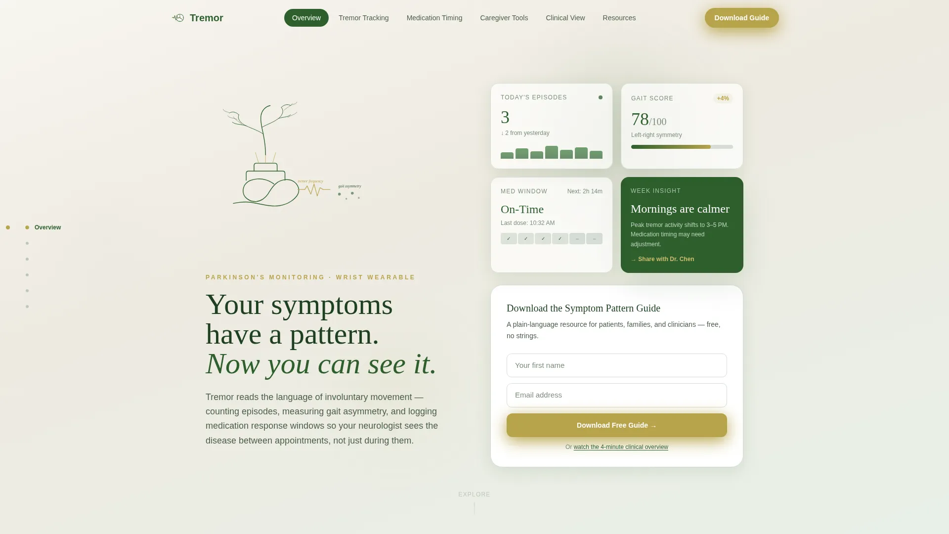
- A hero hub with animated SVG line art and a lightweight email capture call to action
- Four story-led spoke sections, each ending with a downloadable resource and its own call to action
- A persistent anchor navigation bar with active-section highlighting to guide every type of visitor
Feature list
This template is built around a small set of purposeful components. Each one earns its place.
Animated SVG Hero with Line Art
The hero opens with a four-second continuous line drawing that traces a human wrist, the wearable device, and branching neural pathways into a tree canopy. All drawn in canopy green on birch bark white, the animation is a visual metaphor for the connection between body and understanding. It resolves into a quiet headline before the call to action appears.
Hub and Spoke Anchor Navigation
A persistent side navigation bar anchors the page structure. Each spoke represents one core concept: tremor tracking, medication timing, caregiver tools, and clinical overview. The active section is highlighted in lichen gold so visitors always know where they are and can jump directly to the content most relevant to them.
Testimonial Mosaic Story Tiles
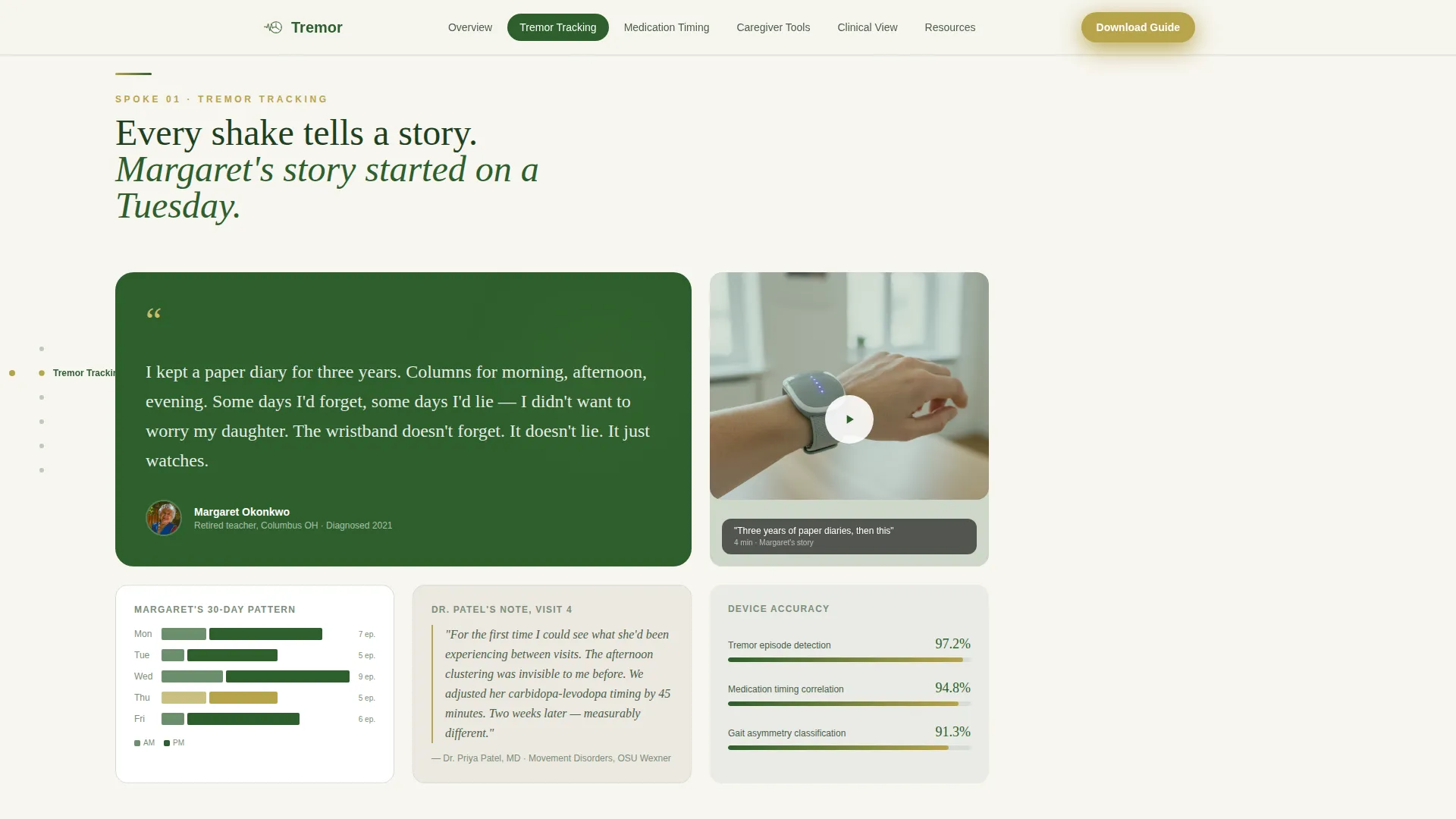
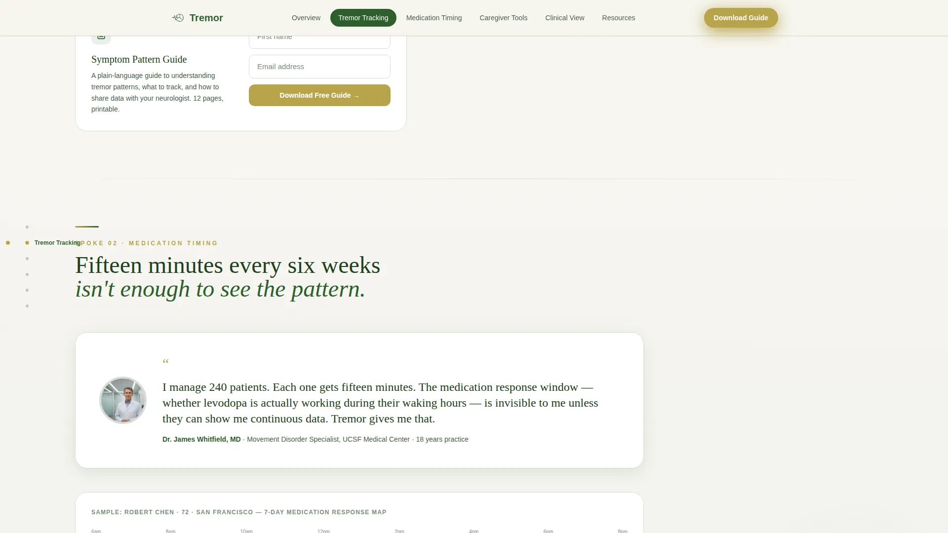
Each spoke opens with a real-person story tile. A retired teacher introduces tremor tracking. A neurologist's quote leads the medication timing section. A daughter's journal entry opens the caregiver dashboard spoke. Tiles assemble in a staggered, scroll-triggered pattern and mix pull quotes, short video thumbnails, handwritten-style annotations, and device readout data snapshots.
Downloadable Resource Calls to Action
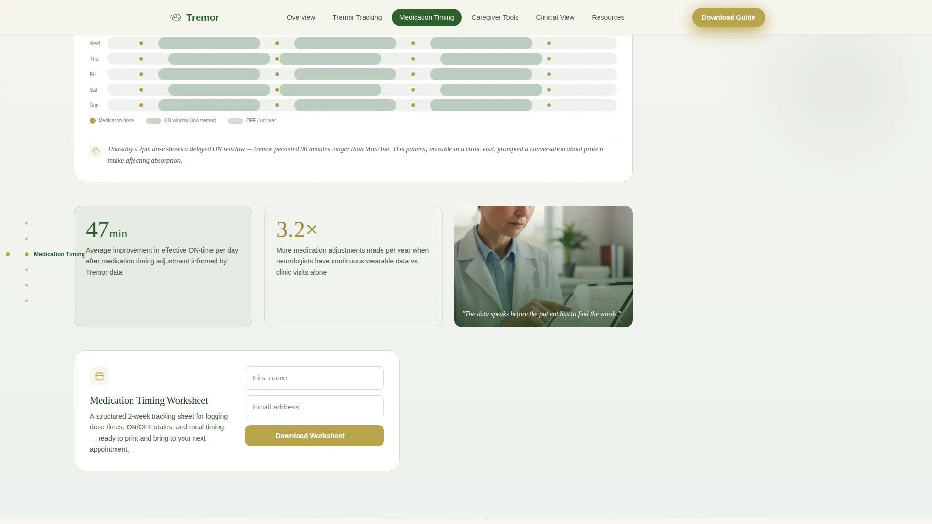
Every spoke ends with a contextually relevant downloadable resource. A medication timing worksheet follows the medication spoke. A caregiver night-check protocol closes the caregiver section. A printable neurologist visit prep sheet anchors the clinical overview spoke. Each download is gated behind the same lightweight first-name-and-email form used at the hub.
Email Capture Form with Dual Conversion Paths
The primary call to action, "Download the Symptom Pattern Guide," appears at the hub and at the base of every spoke. A secondary path offers access to a four-minute clinical overview video through the same minimal form. Both paths ask only for a first name and an email address, keeping the barrier low for anxious or time-pressed visitors.
Forest Trust Color and Typography System
Birch bark white dominates backgrounds. Canopy green anchors headings and the persistent navigation. Fog gray softens data cards and chart containers. Lichen gold draws attention to interactive elements without triggering clinical anxiety. DM Sans handles body text for clean readability, and Fraunces serif headings deliver warmth alongside authority.
Page sections overview
| Section | Purpose |
|---|---|
| Hero Hub | Introduces the device with animated line art and the primary email capture call to action |
| Tremor Tracking Spoke | Patient story mosaic paired with data visualization cards showing tremor episode logging |
| Medication Timing Spoke | Neurologist quote, timing chart, and a downloadable medication timing worksheet |
| Caregiver Dashboard Spoke | Journal entry tile and a downloadable night-check protocol for family caregivers |
| Clinical Overview Spoke | Specialist perspective on the device with a printable neurologist visit prep sheet |
| Footer | Horizontal flow layout with secondary navigation and brand grounding elements |
Design & branding system
The visual identity follows an Educational Guide theme built on the Forest Trust color system. Every design decision points toward calm, grounded authority. The palette was chosen to feel like a temperate forest after rain: oxygenated and alive without being loud.
- Colors: birch bark white (#F7F5F0) for backgrounds, canopy green (#2D5F2D) for headings and navigation, fog gray (#D6DDD6) for data cards and chart containers, lichen gold (#B8A44C) for interactive highlights and anchor markers
- Typography: DM Sans for all body text, Fraunces serif for headings to balance warmth with authority
- Animations: a four-second SVG path draw in the hero, scroll-triggered section reveals throughout, and staggered tile assemblies in each testimonial mosaic spoke
Mobile & speed optimization
The template is built desktop-first to serve neurologists and caregivers who most often access this type of content on larger screens. Full mobile support is included so patients on phones are never left behind. Static sections use Server Components and animated or interactive elements use Client Components to keep the experience smooth across devices.
- Desktop-first layout with responsive breakpoints for tablet and mobile viewports
- Server Components handle static content sections; Client Components manage the anchor navigation and scroll-triggered animations
- Accordion-style resource download interactions keep the mobile experience clean and tap-friendly
How this template helps you convert
Conversion here is not about pressure. It is about earning enough trust that a visitor willingly trades their name and email for something genuinely useful. The template's architecture moves visitors through that trust arc naturally.
- The animated hero and quiet headline create an immediate emotional connection before a single feature is mentioned, lowering the visitor's guard and increasing the chance they keep reading.
- Story-first spokes replace feature lists with lived experiences, giving patients, caregivers, and clinicians a mirror that reflects their own situation and builds confidence in the resource being offered.
- Every spoke ends with a downloadable resource that is directly relevant to the story just told, so the call to action feels like a natural next step rather than an interruption.
Other information about this template
This template is designed for the United States English market with no currency symbols or date displays. It is well suited to MedTech product launches, Parkinson's disease awareness campaigns, and continuing medical education resource hubs. The content and layout architecture can support brand positioning for wearable health monitoring devices in the broader movement disorder space.
- Template style: Hub and Spoke with persistent anchor navigation
- Theme: Educational Guide
- Creative direction: Testimonial Mosaic
- Header concept: animated SVG Line Art
- Conversion direction: Content and Resource lead generation
- Color system: Forest Trust
- Localization: English (US), no pricing, no purchase flow
Theme
Educational Guide
Creative direction
Testimonial Mosaic
Color system
Forest Trust
Style
Hub & Spoke (Anchor Nav)
Direction
Content/Resource
Page Sections
Animated SVG Hero Line Art
Hub and Spoke Anchor Navigation
Testimonial Mosaic Story Tiles
Spoke-level Downloadable Resources
Dual Conversion Path Email Capture
Forest Trust Design System
Related questions
Who is this landing page template designed for?
What is the conversion goal of this template?
Can I customize the story tiles and downloadable resources?
How does the anchor navigation work?
Is this template suitable for a brand serving multiple audience types?



