Parkinson's Disease Patient Education Landing Page Template
Tremor is a Parkinson's disease patient education landing page template built for digital health platforms. It combines a symptom-awareness calculator, FAQ-driven zigzag sections, and a personalized learning path assessment into one focused, trust-building experience. The Corporate Precision design uses Arctic White tones and a teal accent to feel clinical yet approachable for patients, caregivers, and concerned family members.
by Rocket studio
Quick summary
Tremor is a single-page landing page template for Parkinson's disease education platforms. It opens with an interactive symptom-awareness calculator and guides visitors through plain-language answers to the questions they actually search for at 2 a.m. The result is a calm, trust-earning experience that moves anxious readers toward a personalized content roadmap.
Who this template is for
This template is built for health educators, digital clinics, and patient advocacy organizations that need to communicate complex neurological information clearly. It serves anyone building a trusted online resource around Parkinson's disease care.
- Newly diagnosed patients seeking plain-language explanations of their diagnosis
- Caregiving spouses managing daily medication schedules and treatment decisions
- Adult children researching a parent's condition from a distance
What problem this template solves
Parkinson's disease information online is either too clinical or too vague. Patients walk away from neurologist appointments holding dense printouts they cannot decode. This template replaces that confusion with a structured, progressive learning experience.
- Medical jargon like dopamine agonists, Hoehn and Yahr staging, and deep brain stimulation candidacy gets translated into plain, actionable language
- Visitors do not know where to start, and the calculator tool removes that paralysis immediately
- Fear-driven late-night searching gets replaced by a calm, step-by-step content path
What you get with this template
You get a fully structured landing page with a working interactive calculator concept, four FAQ-driven zigzag content sections, a dual call-to-action setup, and a footer. Every section is designed to build clinical trust while staying readable for non-medical audiences.
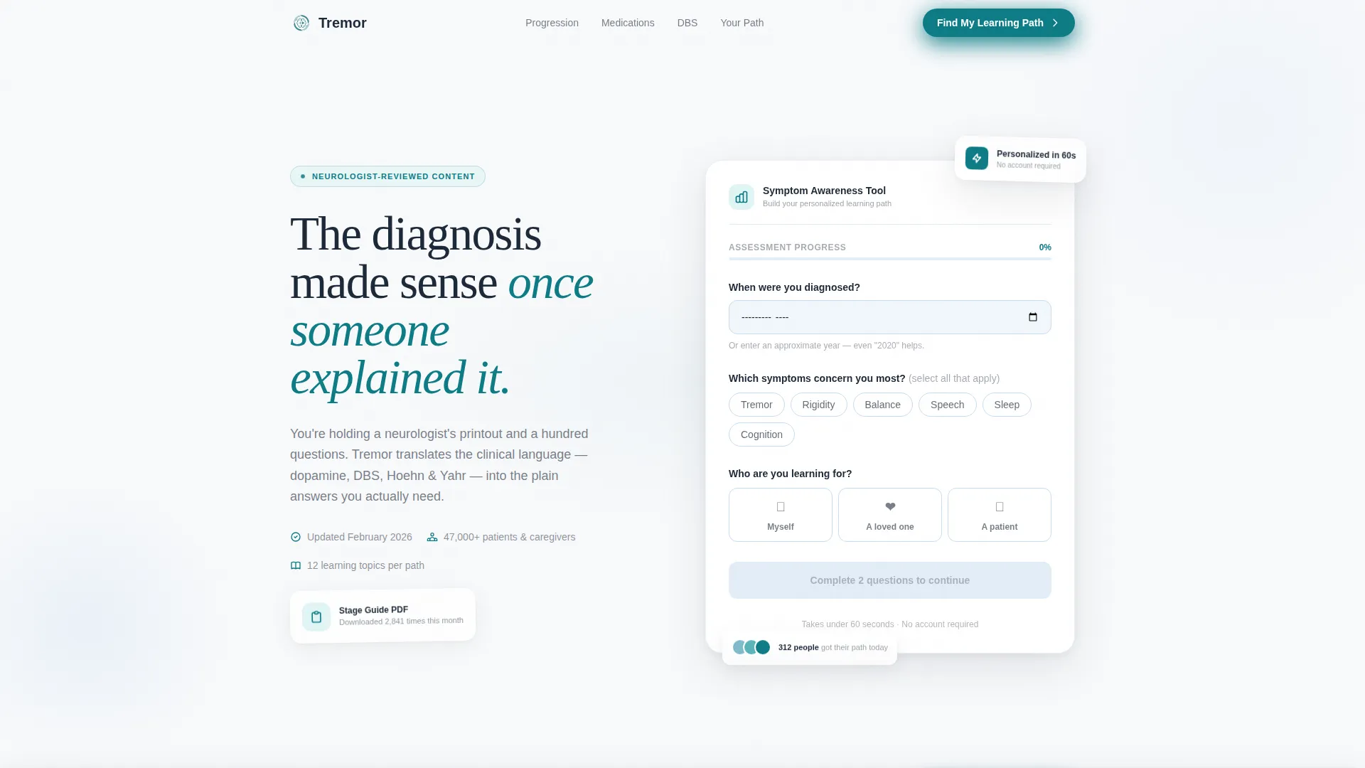
- A symptom-awareness calculator header with pill-shaped symptom toggles, three intake questions, and a teal progress bar
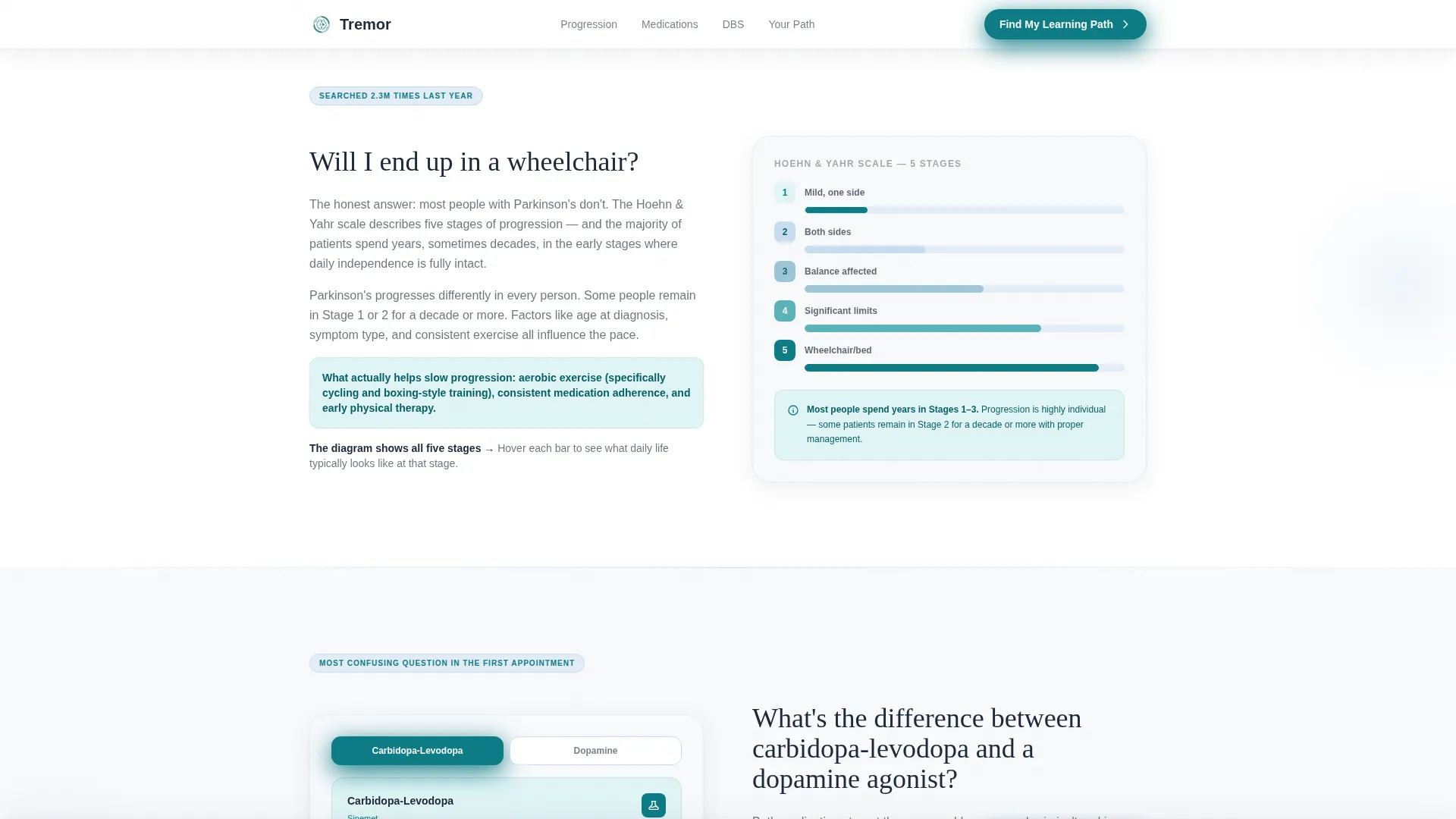
- Four alternating zigzag content sections, each answering one high-intent patient question with a visual element on the opposite side
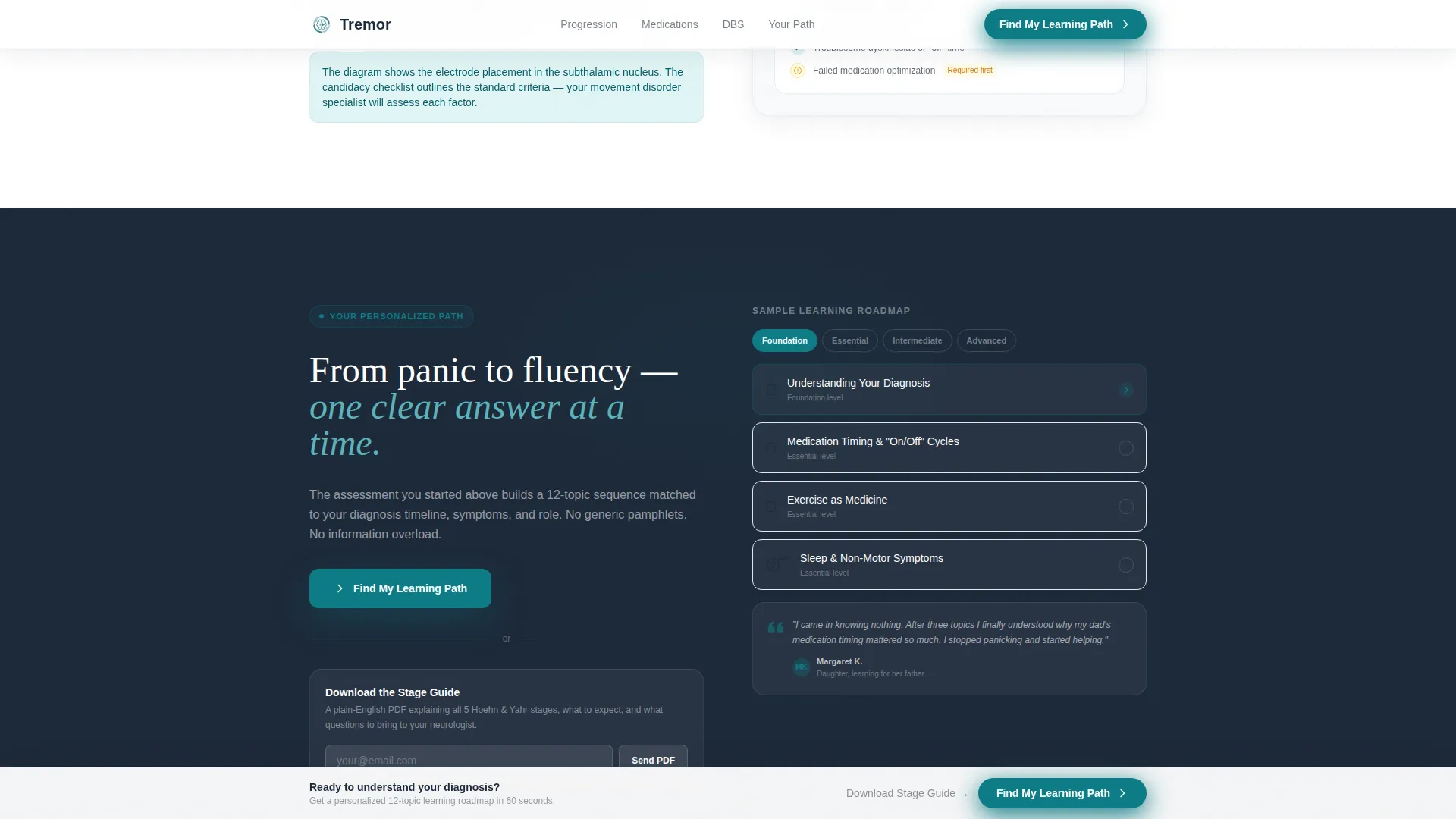
- A dual conversion path: a primary "Find My Learning Path" assessment and a secondary "Download the Stage Guide" email capture
Feature list
This section covers the core built-in capabilities that make the Tremor template work as a patient education tool.
Symptom Awareness Calculator Header
The header is the hook. It presents three visible questions: diagnosis timeline, symptom concern selection using pill-shaped toggles, and the visitor's relationship to the diagnosis. A thin teal progress bar sits at zero percent, ready to animate. No stock photography competes for attention.
FAQ-Driven Zigzag Layout
Each section below the header answers one burning patient question. The layout alternates the written answer and a supporting visual from left to right on each scroll. Sections deepen progressively in clinical complexity, mirroring a patient's journey from initial panic toward genuine fluency.
Progressive Quiz and Assessment Flow
The calculator feeds into a scored symptom-stage assessment that reveals questions as the visitor scrolls. It collects diagnosis timeline, current medication context, mobility status, and caregiver relationship, then delivers a personalized content roadmap.
Sticky Primary Call to Action
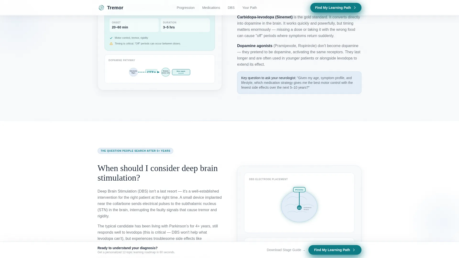
After the visitor scrolls past 40 percent of the page, a sticky bottom bar appears with the "Find My Learning Path" call to action in teal. This keeps the primary conversion goal visible without interrupting reading flow.
Dual Conversion Path Design
The template supports two conversion routes simultaneously. The primary path leads to the full personalized learning assessment. The secondary path offers a "Download the Stage Guide" option that captures an email address for visitors who are not yet ready for the full assessment.
Social Proof and Credibility Layer
The template includes designated areas for curated patient voice quotes, neurologist-reviewed credibility badges, and a stage guide download count indicator. These elements build the clinical trust that health education platforms require.
Page sections overview
| Section | Purpose |
|---|---|
| Symptom Calculator Header | Engages visitors immediately with a three-question intake tool and teal progress bar |
| Wheelchair Fear FAQ | Answers "Will I end up in a wheelchair?" with a plain-language response and an animated Hoehn and Yahr staging diagram |
| Medication Comparison FAQ | Explains the difference between carbidopa-levodopa and dopamine agonists using an annotated diagram |
| Deep Brain Stimulation FAQ | Addresses when to consider deep brain stimulation with a candidacy visual opposite the written answer |
| Learning Path Call to Action | Presents the primary assessment call to action and the secondary stage guide download path side by side |
| Footer | Delivers a clean horizontal flow layout with navigation, credibility signals, and contact links |
Design & branding system
The visual identity follows a Corporate Precision theme. Every color choice reinforces clinical trust while keeping the experience warm enough for emotionally vulnerable visitors to stay and engage.
- Arctic White (#F8F9FB) as the primary background, Glacier Blue (#E3EDF7) for supporting panels, Charcoal (#1D2939) for body text, and Teal (#0E7C86) reserved for interactive elements and progress indicators
- DM Sans for all body copy and interface labels, paired with Fraunces as the editorial serif typeface for section headings
- Medium animation intensity using CSS keyframes for the progress bar, floating cards, scroll-triggered section reveals, and pill toggle interactions
Mobile & speed optimization
The template is built desktop-first, reflecting the neurologist printout context where users sit down at a screen to decode their diagnosis. A strong mobile fallback supports late-night research sessions on phones.
- Interactive components including pill toggles, radio selections, and the sticky call-to-action bar are designed to work clearly on smaller screens
- Static content sections use a server-component-friendly structure, while the interactive calculator is isolated as a client component to keep initial load focused
- The zigzag layout collapses into a single-column stacked flow on mobile without losing section logic or reading order
How this template helps you convert
Every design and content decision in this template is oriented toward one outcome: turning an anxious visitor into an engaged learner who trusts your platform enough to share their information.
- The calculator header eliminates the "where do I start?" barrier by presenting three focused questions the moment a visitor arrives, making engagement feel low-effort and immediately relevant.
- The FAQ-driven zigzag sections systematically reduce fear by answering real patient questions in plain language, building credibility with each scroll and warming the visitor toward the final call to action.
- The dual conversion path means visitors who are not ready for the full assessment still have a low-commitment option, capturing an email through the stage guide download and keeping them in the funnel.
Other information about this template
This template is built with the Tremor component system in mind, using its accessible, composable building blocks to power the interactive calculator and progress indicators. The template style is Zigzag/Alternating, the header concept is a Calculator/Estimator, and the landing page direction is Quiz/Assessment. It sits within the Health and Medical category under the Parkinson's Disease Care subcategory.
- The date input for diagnosis timeline uses MM/YYYY format for USA localization with no currency display
- Interactivity level is high, with pill toggle states, radio selections, a live progress bar update, and a sticky call-to-action bar triggered at 40 percent scroll depth
- The footer follows a Vercel Horizontal Flow pattern, providing a clean close to the single-page experience
Theme
Corporate Precision
Creative direction
FAQ-Driven
Color system
Arctic White
Style
Zigzag/Alternating
Direction
Quiz/Assessment
Page Sections
Symptom Awareness Calculator Header
Faq-driven Zigzag Sections
Progressive Quiz Assessment Flow
Sticky Conversion Bar
Dual Conversion Path
Social Proof and Credibility Signals
Related questions
Can I customize the symptom pill toggles to match my own condition categories?
Does this template work for conditions other than Parkinson's disease?
How does the dual call-to-action path work in practice?
Is the sticky call-to-action bar included on mobile as well?
What design style does this template follow?



