Parkinson's Disease Telehealth Landing Page Template
Tremor is a single-column landing page template built for Parkinson's disease telehealth services. It opens with a scroll-triggered stats display, walks visitors through a four-step care process, and closes with a low-friction booking call to action. The design uses a calm Arctic White palette with teal reserved exclusively for action moments.
by Rocket studio
Quick summary
Tremor is a click-through landing page template designed for movement disorder telehealth practices. It leads with three stark access-barrier statistics, guides visitors through a four-step care walkthrough, and ends with a clear path to booking. The Arctic White color system keeps the experience calm, clinical, and trustworthy without feeling cold.
Who this template is for
This template is built for telehealth practices that specialize in Parkinson's disease and movement disorder care. It speaks directly to patients and the people supporting them through the process.
- Recently diagnosed adults who need clarity and reassurance before committing to an appointment
- Long-term Parkinson's patients managing ongoing medication adjustments remotely
- Adult children coordinating specialist care for a parent who lives in another city or state
What problem this template solves
Getting specialist care for Parkinson's disease often means long drives, long waits, and delayed medication changes. Patients and caregivers frequently abandon the process before booking because the path feels unclear or overwhelming.
- Visitors leave because they do not understand what a telehealth visit actually involves
- Access barriers like travel distance and wait times go unspoken, leaving doubt instead of confidence
- Insurance uncertainty stops people from clicking before they even read the details
What you get with this template
You get a fully structured, single-column landing page ready to present a telehealth practice with precision and warmth. Every section is purpose-built for patient trust and forward momentum.
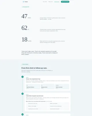
- A scroll-triggered stats header that frames the access problem with three real numerals
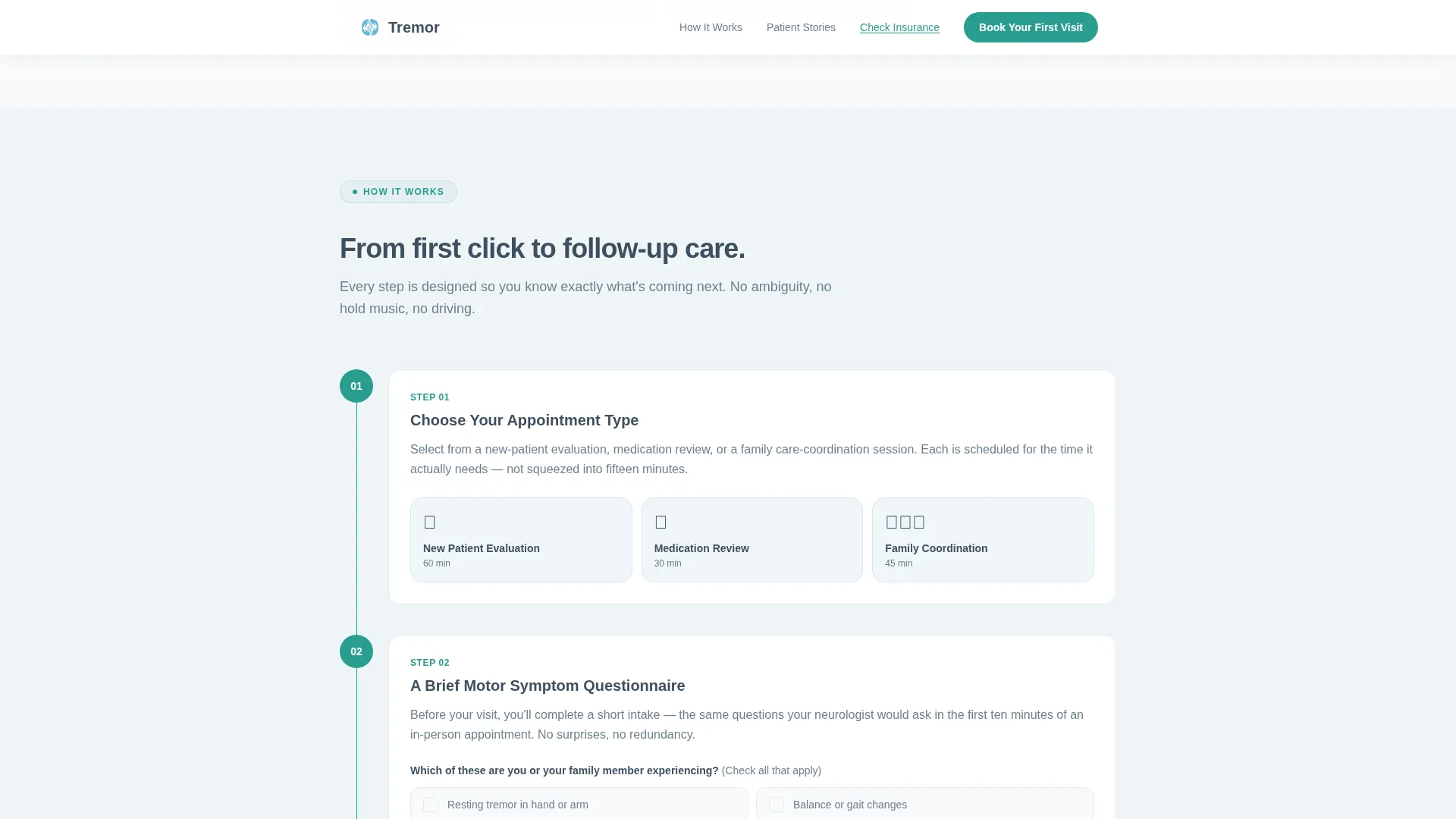
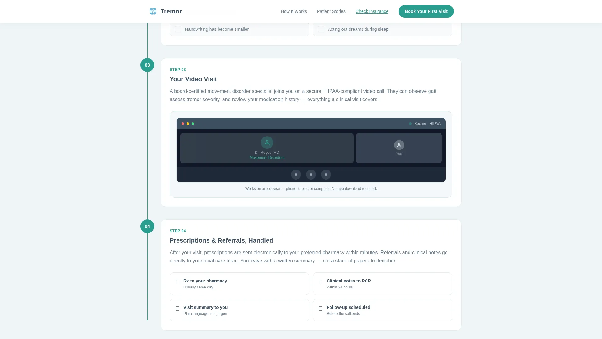
- A four-step visual process walkthrough connected by a teal vertical progress line
- An insurance lookup modal, testimonial section, and a sticky mobile booking bar
Feature list
This template includes six purpose-designed components. Each one removes a specific obstacle between a first-time visitor and a booked appointment.
Scroll-Triggered Stats Header
Three large display numerals open the page, each representing a real access barrier: average travel miles, percentage of patients delaying medication adjustments, and median specialist wait time in weeks. The numbers are typeset in light graphite at display scale using Fraunces, with a short explanatory line beneath each. No photography, no marketing language, just the quiet math of a broken system.
Four-Step Process Walkthrough
A numbered walkthrough guides visitors from choosing an appointment type through to prescription delivery. Each step is marked with a teal numbered circle, and a thin vertical progress line connects all four steps down the column. Visitors feel themselves moving through an actual care process rather than skimming a brochure.
Insurance Lookup Modal
A secondary text link labeled "Check If We Accept Your Insurance" opens a lightweight modal. The visitor enters only their carrier name and state. No account creation is required on the landing page, keeping the barrier to engagement extremely low.
Sticky Mobile Booking Bar
On mobile devices, a fixed bottom bar keeps the primary call to action visible at all times. The bar displays "Book Your First Visit" in teal and persists through scrolling, so the booking action is always one tap away regardless of where the visitor is on the page.
Asymmetric Testimonial Layout
Three specific patient stories are presented in an asymmetric bento-style layout. Each story is grounded in a real-sounding experience, reinforcing trust through peer voice rather than clinical credentials alone.
Specialist Credential Trust Signals
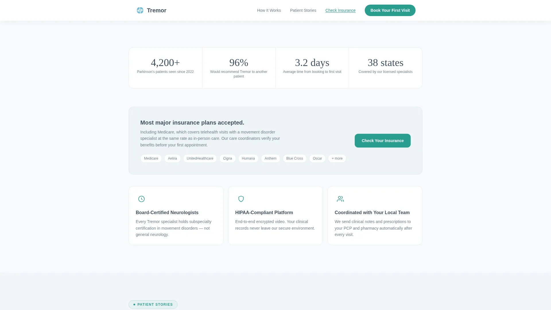
Metric trust signals and specialist credential callouts appear in the trust section alongside the insurance modal. These elements work together to reassure visitors that the practice is staffed by qualified movement disorder specialists.
Page sections overview
| Section | Purpose |
|---|---|
| Stats hero display | Opens with three access-barrier numerals to frame the problem immediately |
| Four-step walkthrough | Guides visitors through the full care process from booking to prescription |
| Trust and insurance | Builds confidence with credential signals and an insurance lookup modal |
| Patient testimonials | Reinforces credibility through three specific patient stories |
| Booking call to action | Full-width section plus a mobile sticky bar drives appointment scheduling |
| Footer row | Single linear row with essential links and practice information |
Design & branding system
The template uses a Medical Clarity visual theme. Every color choice serves a specific role: backgrounds, text, and actions never compete for attention.
- Arctic White base: clinical white (#F8FAFB) for page background, soft graphite (#3D4F5F) for all body text
- Glacier blue (#D6E8EE) washes alternate section backgrounds to create a calm, rhythmic scroll without visual noise
- Steady teal (#2A9D8F) appears only on buttons, progress indicators, and trust signals, reserving visual weight for action moments
Mobile & speed optimization
The template is designed mobile-first, reflecting the reality that patients and caregivers most often browse on a phone. Desktop layout is equally considered and polished.
- Scroll-reveal animations and staggered stat entries use medium-weight animation to guide attention without overwhelming slower devices
- Server Components handle all static sections, keeping JavaScript minimal and page interactions lightweight
- The sticky mobile call-to-action bar ensures the booking prompt is always reachable without scrolling back to the top
How this template helps you convert
Every design decision in this template is oriented toward a single outcome: moving a hesitant visitor to a confirmed appointment with a specialist.
- The stats header earns attention immediately by naming the exact problems patients already feel, building credibility before a single word of marketing copy appears.
- The step-by-step walkthrough dissolves uncertainty by showing the entire care process upfront, so clicking "Book Your First Visit" feels like a natural next step rather than a commitment into the unknown.
- The insurance modal and mobile sticky bar remove the two most common last-moment exit reasons: coverage doubt and losing the call to action on a small screen.
Other information about this template
This template is built using Plus Jakarta Sans for body text and interface elements, paired with Fraunces for display numerals. Typography was chosen to balance clinical precision with human warmth. The template is localized for English (United States) audiences, using USD currency and MM/DD/YYYY date formatting throughout. It is categorized under Health and Medical, specifically for Parkinson's disease care and telehealth services. The single-column flow structure ensures the reading experience is linear and focused, with no sidebars or competing visual paths.
- Typography pairing: Plus Jakarta Sans for body and interface, Fraunces for hero numerals
- Localization: English (US), USD, MM/DD/YYYY date format
- Template category: Health and Medical, Parkinson's Disease Telehealth Service
Theme
Medical Clarity
Creative direction
Step-by-Step Guide
Color system
Arctic White
Style
Single Column Flow
Direction
Click-Through
Page Sections
Scroll-triggered Stats Hero
Four-step Progress Walkthrough
Insurance Lookup Modal
Sticky Mobile Booking Bar
Asymmetric Testimonial Layout
Metric Trust Signal Section
Related questions
Can I use this template without a telehealth platform already set up?
Does the insurance lookup modal require a backend system?
Is the four-step walkthrough content editable?
Who created the patient testimonials shown in the template?
Can the Arctic White color system be adjusted to match a different brand?



