Emergency Physician Privacy Policy Website Template
Triage is a single-page landing page built for emergency medicine billing and insurance services. It uses an education-first, zigzag scrolling layout to walk physicians through denied claims, compliance gaps, credentialing delays, and undercoded visits, then presents concrete resolutions. The design is calm, clinical, and built to convert EM physicians into diagnostic intake leads.
by Rocket studio
Quick summary
Triage is a single-page landing page designed for emergency physician billing and insurance services. It guides EM attendings and independent ER physicians through four specific revenue pain points, pairs each with a data-backed resolution, and closes with a recovery-framed call to action. The layout earns trust before it asks for anything.
Who this template is for
This template is built for billing and revenue cycle services that work specifically with emergency medicine physicians. It speaks directly to the financial pressures EM providers face after residency and in independent practice.
- EM attendings roughly three years out of residency who are managing group contracts
- Independent physicians launching freestanding emergency rooms and navigating payer enrollment
- Veteran emergency medicine doctors watching collections erode while administrative overhead climbs
What problem this template solves
Emergency physicians are highly skilled clinicians, but revenue cycle management is a different discipline entirely. Most EM billing pain points go unaddressed for months before anyone quantifies the loss.
- Denied out-of-network claims and surprise billing compliance gaps drain revenue quietly
- Sluggish credentialing timelines delay payer enrollment and delay income
- Undercoded critical-care visits leave significant reimbursement on the table every single shift
What you get with this template
You get a fully structured single-page layout that moves a physician from problem awareness to action in one uninterrupted scroll. Every section is purposeful and nothing is filler.
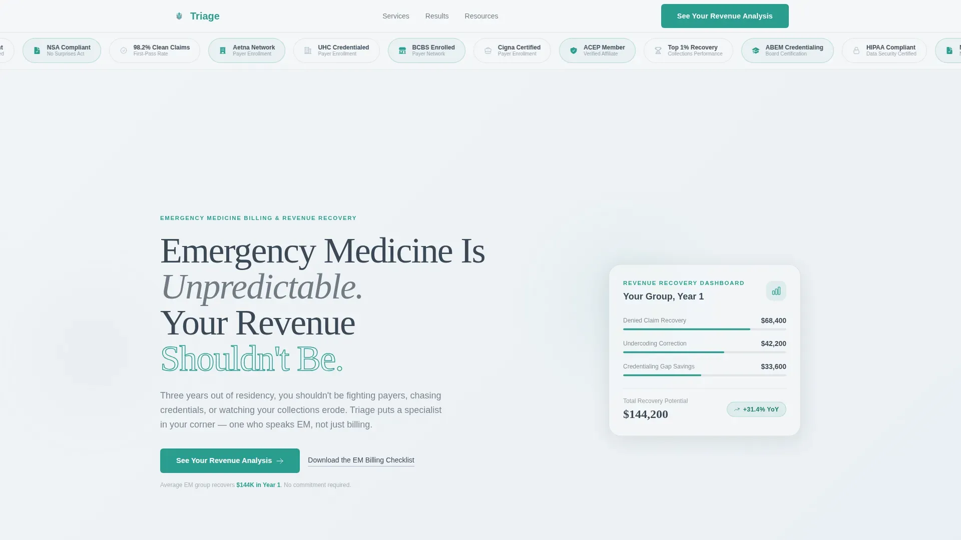
- A hero section with a credential badge ribbon, a revenue callout card, and a primary call to action
- Four zigzag panel pairs, each addressing one billing pain point and its concrete resolution
- A final reframe section presenting aggregate recovery stats and a dual call to action with a secondary email-capture link
Feature list
This template is built around six purposeful design and content decisions, each grounded in how emergency physicians actually make buying decisions.
Award Badge Ribbon Header
A horizontal ribbon of credential seals, affiliation marks, and payer-network logos opens the page. The badges appear in a staggered entrance animation and stay visible at the top of the viewport, establishing authority before the visitor reads a single word of body copy.
Zigzag Problem-to-Solution Panels
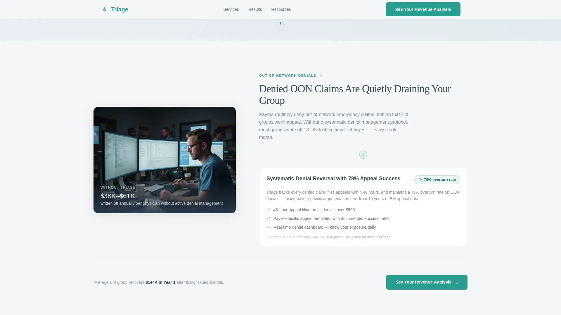
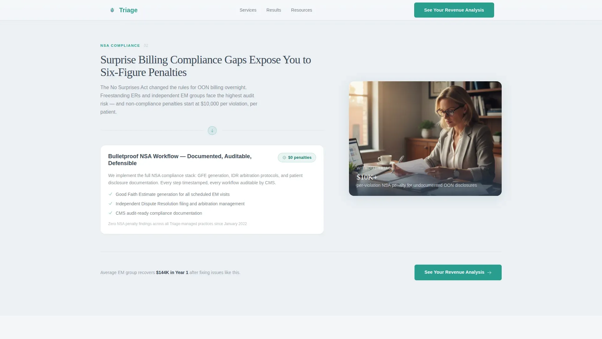
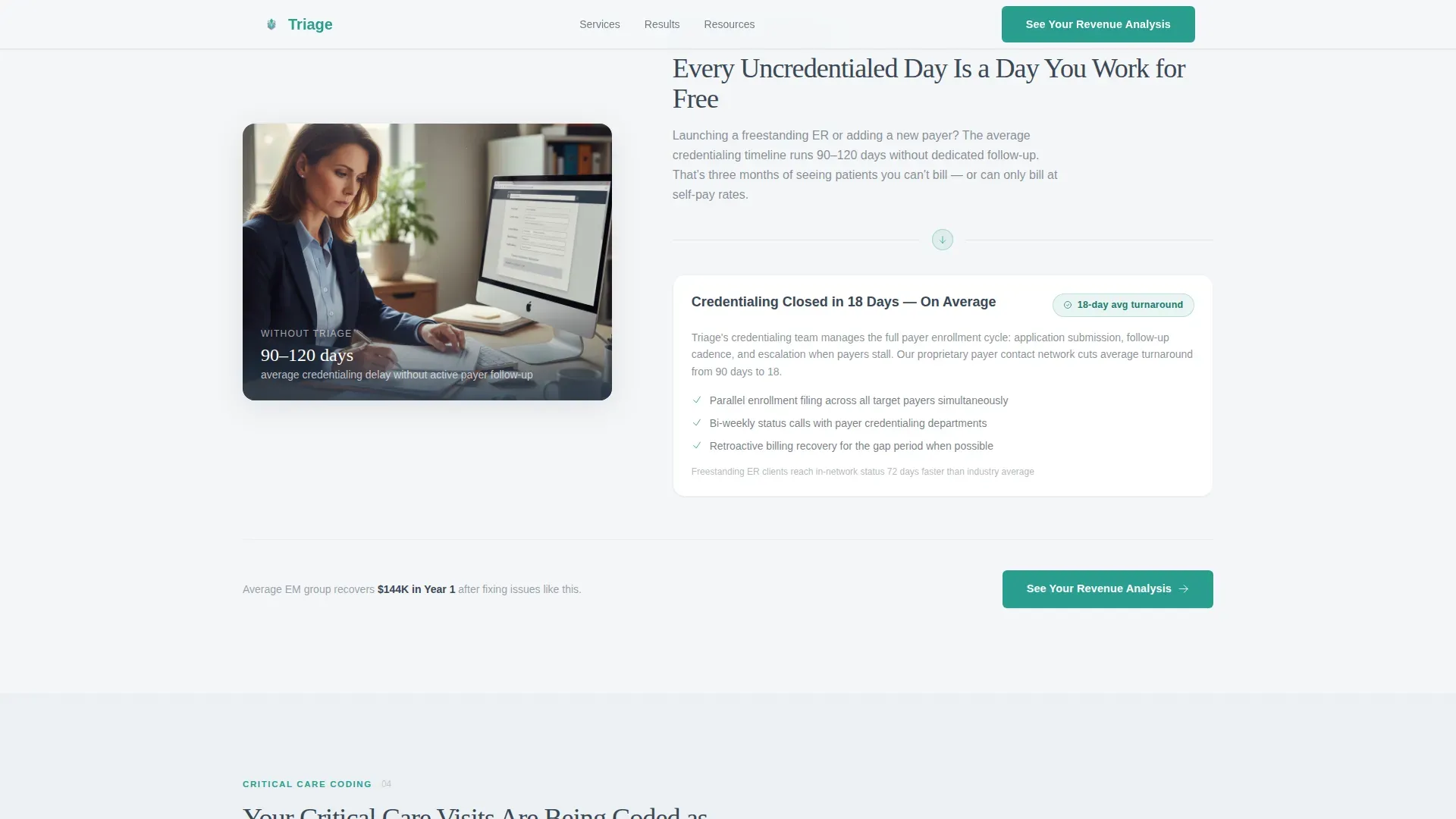
Four alternating left-right panel pairs each present one specific billing pain point on one side and its resolution on the other. Recovery metrics and turnaround windows are embedded directly in the resolution panels, so the financial argument is concrete and scannable.
Repeating Contextual Call to Action
The primary call to action, "See Your Revenue Analysis," appears first beneath the header and repeats in teal at the close of every zigzag pair. Each instance carries a one-line contextual nudge so the invitation never feels generic.
Secondary Email-Capture Link
A text link offering a downloadable EM billing checklist sits alongside the primary call to action. It gives physicians who are not ready to commit something of immediate value while entering them into a follow-up sequence.
Escalating Financial Stakes Narrative
Each zigzag pair is written to increase the perceived cost of inaction as the visitor scrolls. By the final panel, the cumulative revenue loss is clear enough that the closing reframe, "not an expense, a recovery," lands with real weight.
Soft Mist Design System
The color palette uses fog white, scrub-blue gray, quiet charcoal, and a single decisive teal. Backgrounds alternate between the two lightest tones across zigzag pairs. Charcoal carries all long-form text, and teal is reserved strictly for calls to action, progress indicators, and key data callouts.
Page sections overview
| Section | Purpose |
|---|---|
| Hero badge ribbon | Open with layered credential trust |
| Hero headline block | Deliver the core emotional hook |
| Revenue callout card | Surface the $144K Year 1 stat early |
| Primary call to action | Route visitor to diagnostic intake |
| Zigzag Pair 1 | Denied out-of-network claims |
| Zigzag Pair 2 | Surprise billing compliance gaps |
| Zigzag Pair 3 | Credentialing timeline delays |
| Zigzag Pair 4 | Undercoded critical-care visits |
| Final reframe section | Reposition service as a recovery |
| Dual call to action block | Primary action + email capture link |
| Footer | Linear single-row navigation row |
Design & branding system
The visual identity follows an Educational Guide theme. The goal is clinical calm, not clinical cold. Every design choice is meant to feel like morning light coming through frosted glass in a physician lounge.
- Fog white (#F4F6F8) and pale scrub-blue gray (#A8B8C8) alternate as section backgrounds across zigzag pairs
- Quiet charcoal (#3B4856) carries all body text and headlines so nothing competes for attention
- Decisive teal (#2A9D8F) is reserved exclusively for calls to action, progress indicators, and key data callouts; Fraunces serif handles display type and DM Sans handles body copy
Mobile & speed optimization
The template is built desktop-first, reflecting how EM physicians most often review service pages between shifts on workstations. Full mobile responsiveness is included so the layout holds on any device.
- Zigzag panels reflow to a stacked single-column layout on smaller screens without losing the problem-resolution pairing
- Scroll reveal animations and the badge ribbon entrance use native CSS scroll behavior to keep motion smooth across devices
How this template helps you convert
Every design and content decision in this template is built to move a physician from skepticism to action in a single scroll session.
- The credential badge ribbon and revenue callout card establish authority and financial relevance within the first viewport, so the visitor has a reason to keep reading before any copy asks them to act.
- Each zigzag pair deposits specific knowledge, recovery percentages, and turnaround windows before the call to action appears, so the physician feels informed rather than sold to.
- The dual call to action at the close gives two commitment levels: a direct intake link for physicians ready to act and a checklist download for those who need more time, capturing both segments without losing either.
Other information about this template
This template is categorized under Health and Medical, specifically the Emergency Physician Website subcategory, with a niche focus on emergency physician insurance and billing services. A few additional details worth knowing:
- The template style is Zigzag/Alternating with a Problem-to-Solution Arc as the creative direction
- The landing page direction is Click-Through, meaning every section is oriented toward routing visitors to a short diagnostic intake on a separate page rather than hosting a form inline
- Animation includes scroll reveals, a staggered badge entrance, and subtle parallax effects; interactivity includes hover states on zigzag panels and call to action micro-interactions
- The footer uses Pattern 1, a linear single-row layout
- The page is localized for English (United States), uses USD currency references, and is written within the context of the US healthcare system
Theme
Educational Guide
Creative direction
Problem→Solution Arc
Color system
Soft Mist
Style
Zigzag/Alternating
Direction
Click-Through
Page Sections
Award Badge Ribbon with Staggered Animation
Zigzag Alternating Problem-solution Layout
Repeating Contextual Call to Action
Secondary Email Capture Link
Escalating Revenue Stakes Narrative
Soft Mist Clinical Color System
Related questions
Who is this landing page template designed for?
What sections are included in this template?
Does this template include a contact form?
Can I adapt the recovery metrics and badge content to my own service?
What makes the design feel appropriate for physicians rather than a generic service page?



