Hospital & Health System Booking Website Template
Triage is a hub and spoke anchor navigation landing page built for children's hospitals. It guides anxious parents, grandparents, and caregivers through every step of a pediatric visit using interactive checklists and audit-style questions. The Medical Clarity design and Alpine Fresh color system create a calm, organized experience that turns uncertainty into action and earns the appointment click.
by Rocket studio
Quick summary
Triage is a single-page children's hospital landing page built around one goal: replace parental anxiety with organized confidence. A giant centered headline opens on a clean snowfield-white background. Six anchor-linked spoke sections then walk families through every concern they arrive with, one checkable step at a time.
Who this template is for
This template is designed for children's hospitals and pediatric health systems that need to convert anxious website visitors into scheduled appointments. It speaks directly to the people actually arriving on the page.
- Parents who have just received a specialist referral and need a clear next step
- Grandparents and extended caregivers driving from rural areas for a pediatric visit
- School nurses and care coordinators calling ahead on behalf of a child
What problem this template solves
Families visiting a pediatric hospital website are often overwhelmed before they even read a word. They arrive with questions they cannot organize and fears they cannot name. A dense, image-heavy page makes that worse.
- Parents feel lost when discharge papers, insurance questions, and surgery prep land all at once
- Generic hospital pages bury actionable guidance inside broad marketing copy
- Visitors leave without scheduling because no single page ever made them feel ready
What you get with this template
You get a structured, scroll-driven landing page that moves a family from confusion to readiness. Every section addresses a specific concern, and every section ends with a clear call to action.
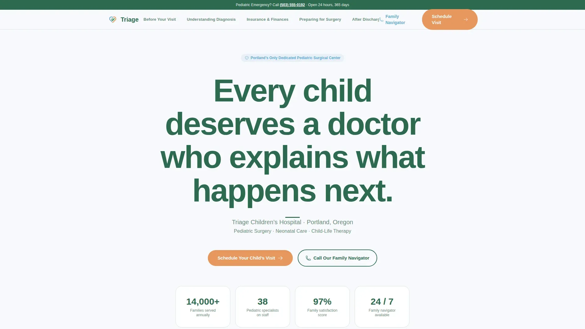
- A giant centered hero headline on a spacious snowfield-white background with an anchor navigation pill bar below it
- Six spoke sections covering pre-visit prep, diagnosis understanding, insurance navigation, surgery preparation, post-discharge care, and a linear single-row footer
- Interactive checklists with checkable items, smooth anchor scrolling, and a sticky navigation bar that stays accessible throughout the scroll
Feature list
A brief overview of what is built into this template before you explore each capability in detail.
Giant Centered Hero Headline
The hero opens with a single large headline centered on a clean snowfield-white field. No hero image competes for attention. A thin evergreen rule and one line of supporting text name the hospital and location. The emptiness is intentional and signals calm authority from the first second.
Hub and Spoke Anchor Navigation
A sticky pill-bar navigation sits below the hero and links directly to each spoke section. Visitors can jump to the concern most relevant to them without losing their place. Smooth scrolling keeps the transition calm and unhurried.
Interactive Checklist Sections
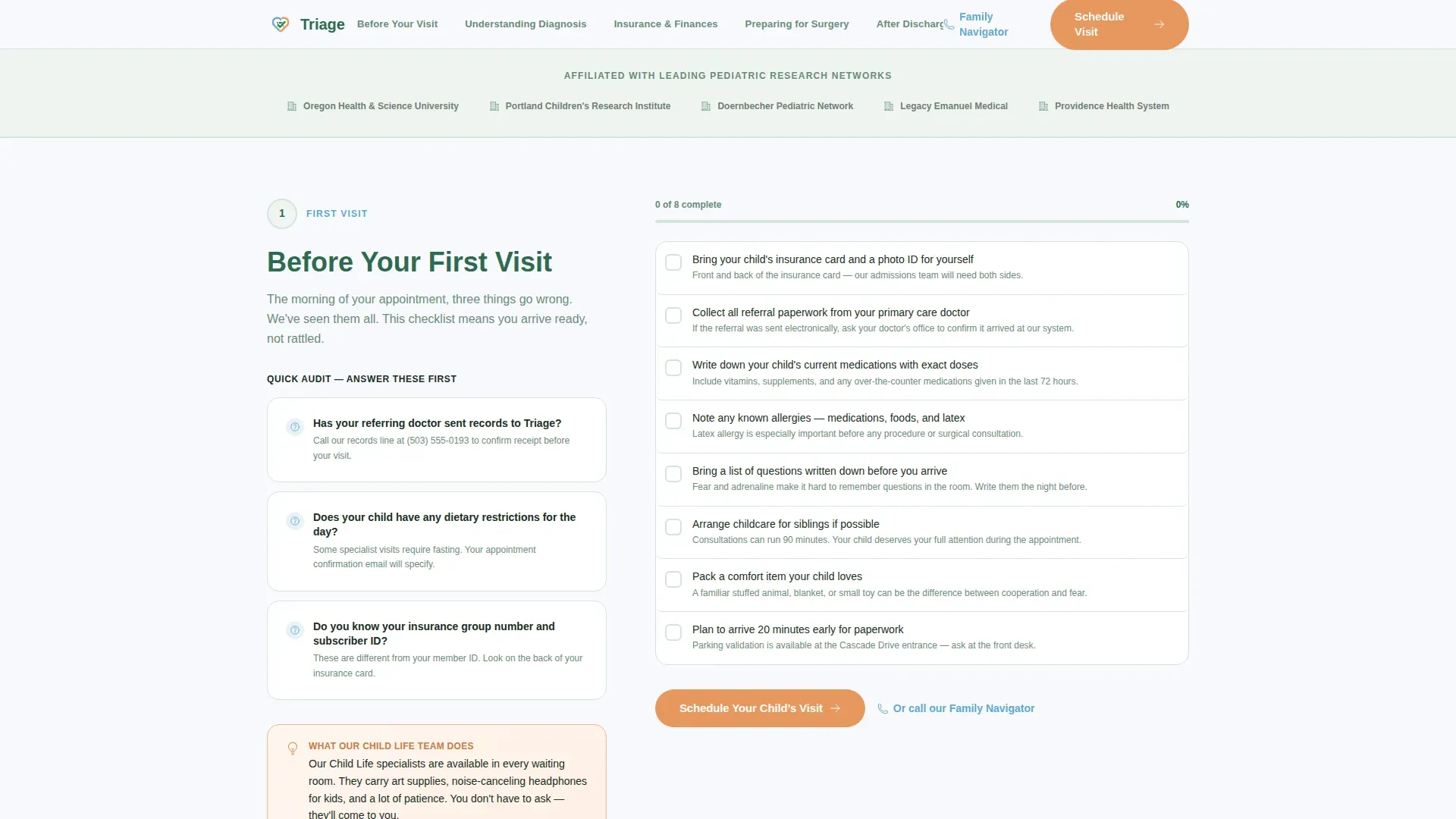
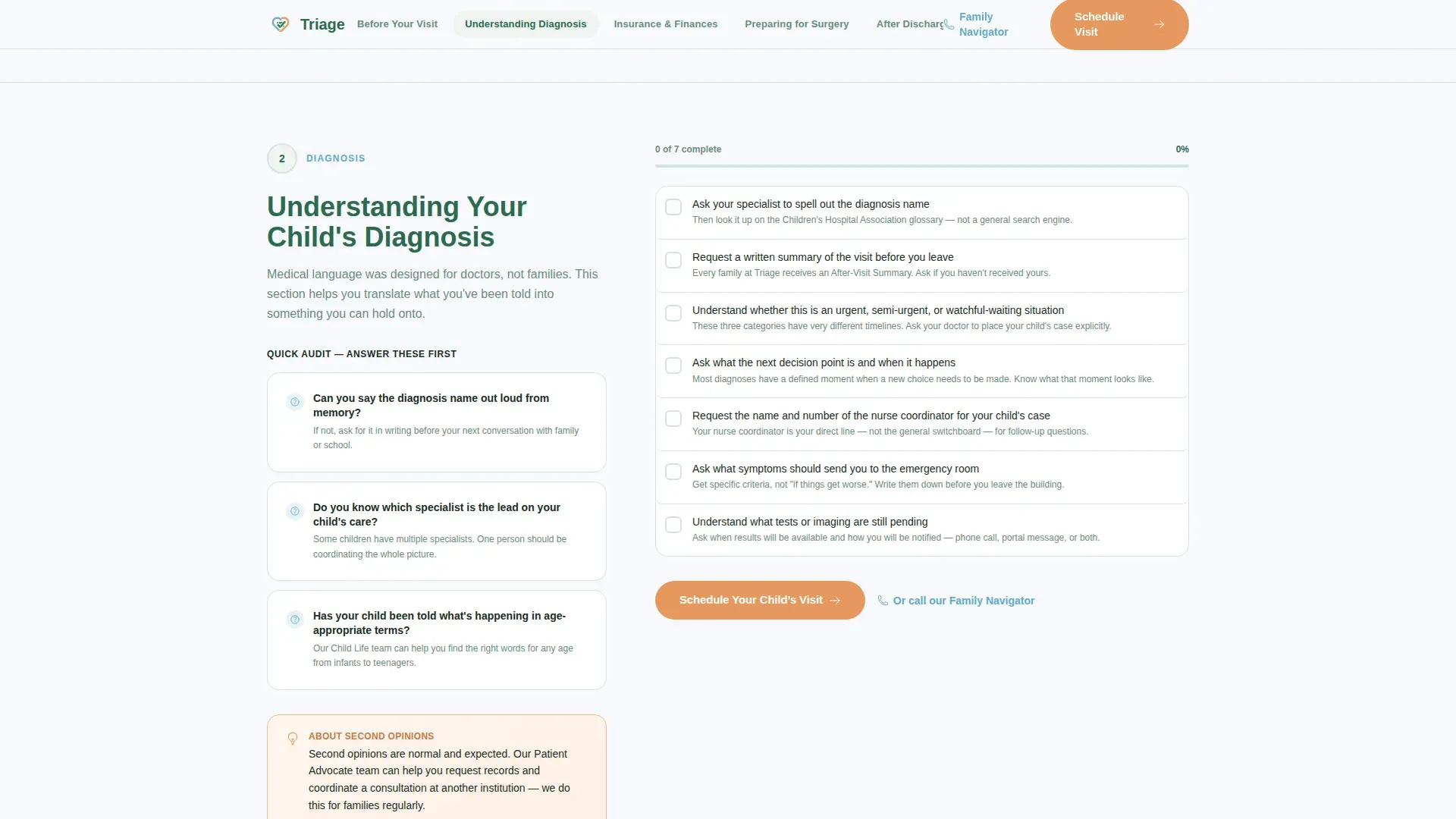
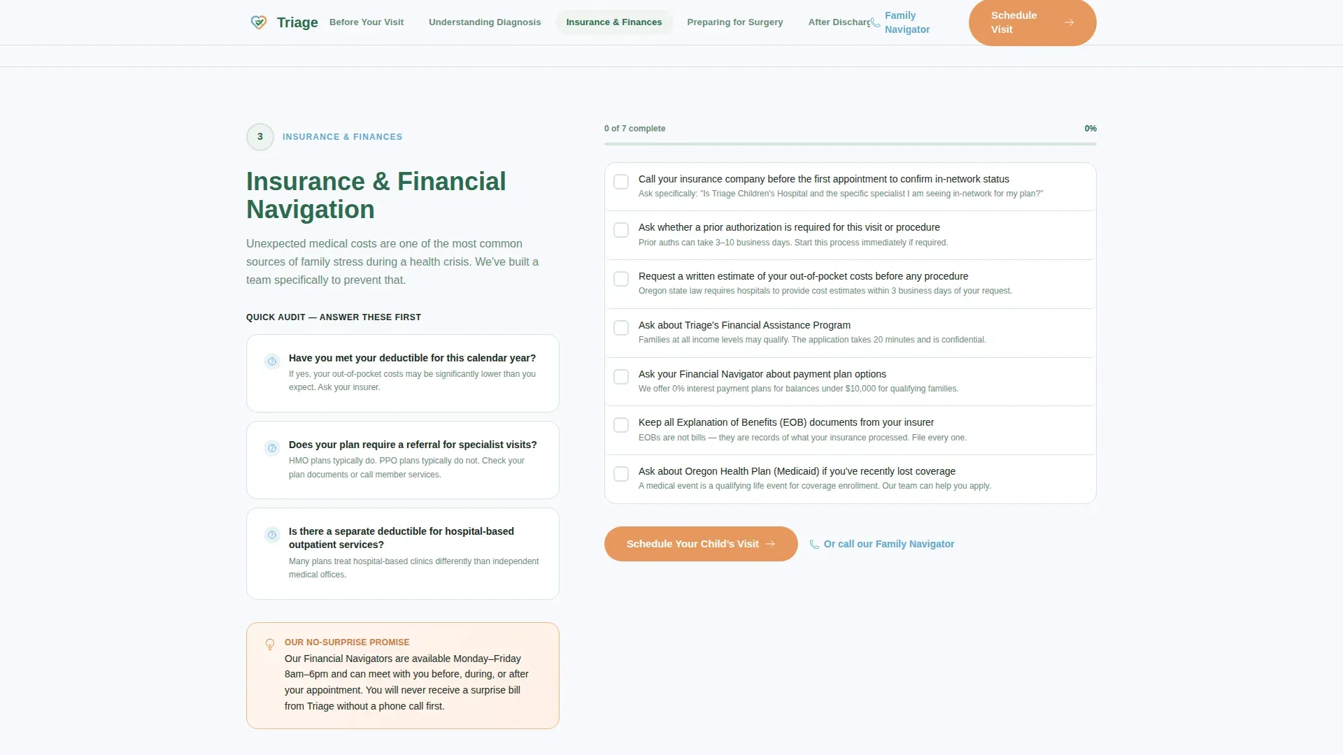
Each spoke section contains checkable step-by-step items and short audit-style questions. Parents can work through items like paperwork confirmation, fasting status, and referral readiness in real time. Checklist items fade in subtly as the visitor scrolls into view.
Dual Conversion Pathway
The primary call to action, "Schedule Your Child's Visit," appears in alpine wildflower at the top navigation and at the close of every spoke section. A secondary "Call Our Family Navigator" path with a direct phone link catches parents too stressed to tap through a scheduling flow.
Medical Clarity Visual System
The layout uses generous whitespace, a rounded DM Sans typeface, and a restrained four-color palette. Every design decision reinforces calm and legibility. Nothing competes with the content.
Page sections overview
| Section | Purpose |
|---|---|
| Hero Headline | Opens with a large, centered headline on a clean white background and introduces the anchor navigation pill bar |
| Before Your First Visit | Checklist spoke covering paperwork, timing, and what to bring |
| Understanding Your Diagnosis | Audit-style questions with plain-language explanations of a child's condition |
| Insurance & Financial Navigation | Step-by-step financial checklist with a Family Navigator call to action |
| Preparing for Surgery | Pre-operative checklist including fasting, paperwork, and childcare questions |
| After Discharge | Home care checklist covering warning signs and follow-up scheduling |
| Footer | Linear single-row footer with contact and navigation links |
Design & branding system
The Alpine Fresh color system keeps the page feeling like crisp mountain air. Every color choice has a specific role, and nothing is decorative for its own sake.
- Snowfield white (#F7F9FC) covers all backgrounds, evergreen (#2D6A4F) anchors headings and navigation, glacier stream blue (#5FA8D3) marks interactive elements and progress indicators
- Alpine wildflower (#E8985E) is reserved exclusively for calls to action and urgent callouts so they are never missed
- DM Sans, a rounded and generous sans-serif typeface, is used at all sizes for maximum readability on any screen
Mobile & speed optimization
This template is built mobile-first because parents are most likely on their phones in waiting rooms, hospital parking lots, and school pickup lines.
- The sticky anchor navigation collapses cleanly on small screens so families can jump between sections without scrolling back to the top
- Checklist items use minimal JavaScript so interactive elements stay responsive even on slower connections
- Server components handle all static content, keeping the JavaScript footprint small and the page load light
How this template helps you convert
The page earns the click before it ever asks for one. By the time a parent reaches a call to action, the checklist format has already shown them that this hospital thinks three steps ahead.
- The audit-style questions in each spoke section make parents feel organized and understood, which builds trust in the hospital before a single form is touched
- The dual call-to-action pathway removes friction for every visitor type, whether they are ready to schedule online or need to speak with someone first
Other information about this template
A few additional details worth knowing before you build with this template.
- The template is localized for United States English, with phone numbers in US format and times displayed in 12-hour format
- Animation intensity is set to low to medium, using smooth scroll and subtle fade-in effects that feel calm rather than flashy
- Social proof elements such as specialist credentials, years serving families, and patient volume statistics are built into the layout as placeholder blocks ready to be populated
- The template is categorized under Health and Medical, specifically Hospital and Health System, with a children's hospital niche focus
Theme
Medical Clarity
Creative direction
Checklist & Audit
Color system
Alpine Fresh
Style
Hub & Spoke (Anchor Nav)
Direction
Click-Through
Page Sections
Giant Centered Hero Headline
Hub and Spoke Anchor Navigation
Interactive Checklist Sections
Dual Conversion Call-to-action Pathway
Medical Clarity Visual System
Related questions
Does this template include a contact form or intake form?
Can visitors check off the checklist items interactively?
How many sections does this landing page include?
Is this template suitable for a hospital with multiple specialist departments?
What typeface does this template use?



