Multi-Specialty Hospital Comparison Landing Page Template
Triage is a multi-specialty hospital comparison landing page template built for healthcare providers who need to earn patient trust before the first appointment. It presents departments, procedure packages, and diagnostic panels side by side in expandable comparison tables, pairs them with a persistent insurance lookup bar, and closes every section with a clear booking call to action. Every detail is visible. Every question is answered before the click.
by Rocket studio
Quick summary
Triage is a focused, single-page template designed for multi-specialty hospitals that want to convert research-mode visitors into booked appointments. It uses structured comparison tables, an animated line-art hero, and a persistent insurance lookup bar to guide families, HR managers, and first-time parents from uncertainty to confident action. The page shows prices, wait times, and clinical pathways upfront so patients arrive decided, not confused.
Who this template is for
This template serves hospitals and healthcare providers who operate across multiple departments and need one cohesive page that answers every patient question before a phone call is made. It is equally suited to B2C patient acquisition and B2B corporate empanelment outreach.
- Adult family members researching care options for aging parents, such as cardiac or orthopedic procedures
- First-time parents who have received a referral and need to evaluate a specialty provider quickly
- Human resources managers vetting hospital empanelment for large employee workforces
What problem this template solves
Patients landing on generic hospital websites face a familiar frustration: departments are buried, prices are hidden, and the next step is always a phone call to find out what they could have read online. Creating high-performing healthcare landing pages requires balancing user needs, compliance, and clear communication. Generic templates fail because they ignore fundamental differences in patient journey and practice operations.
- Visitors cannot evaluate departments, procedures, or costs without calling the hospital first
- No single page communicates wait times, accreditation, and bundled pricing together
- Research-mode visitors leave before converting because the page never fully answers their questions
What you get with this template
This template delivers a complete, section-led medical landing page with five distinct content zones, each built around transparency and conversion. Every table, animation, and form element is defined in the source brief and reflects best practices in healthcare website design.
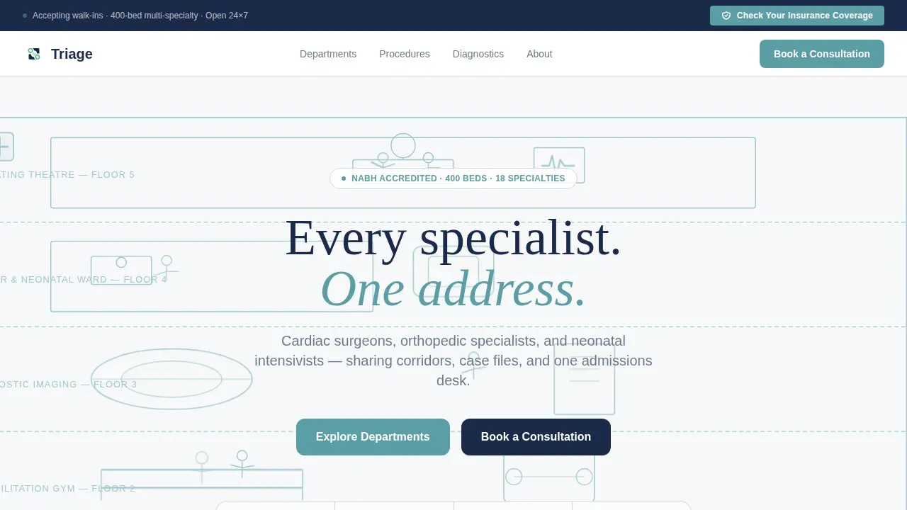
- An animated hero section with a teal line-art architectural cross-section, a CSS heartbeat pulse, and a persistent navy insurance lookup bar
- Three expandable comparison tables covering departments, procedure packages, and diagnostic panels with row-level clinical pathway detail
- A social proof section with patient testimonials, accreditation badges, and a final appointment booking call to action
Feature list
This template includes several core capabilities drawn directly from the project brief. Each one is designed to reduce friction, communicate value, and guide patients toward the desired action.
Expandable Department Comparison Table
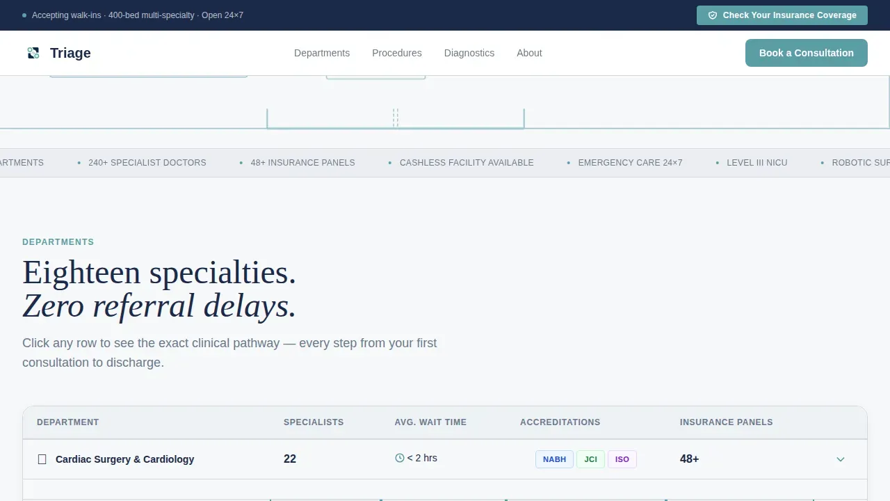
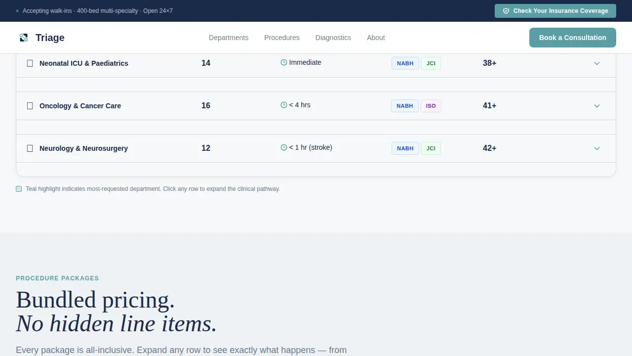
The first table places every specialty side by side. Columns display the number of specialists per department, average wait time, accreditation badges, and insurance panels accepted. Each row expands on click to reveal the full clinical pathway, from pre-consultation through discharge, so patients can evaluate the process before they commit.
Procedure Package Comparison Table
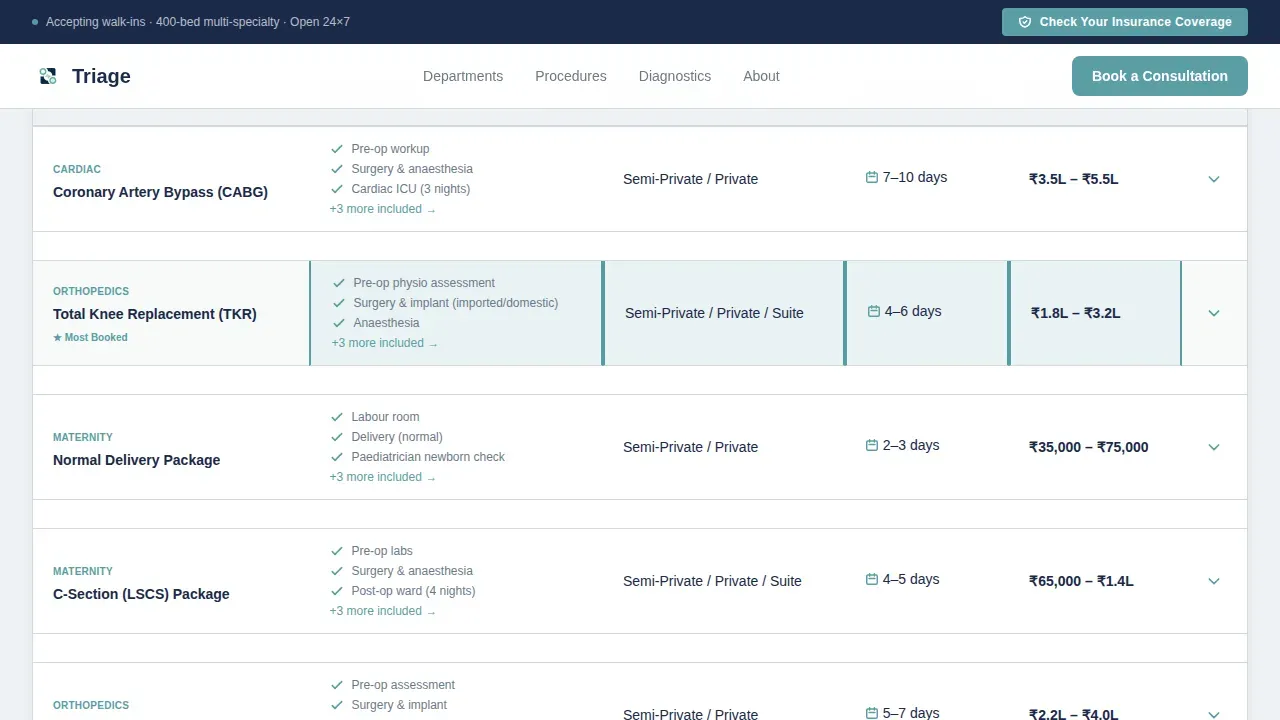
The second table compares bundled procedure packages for cardiac bypass, joint replacement, and maternity care. Each column shows inclusions, room category, estimated length of stay, and a bundled cost range in Indian Rupees. Patients can identify exactly what each package covers and make an informed comparison without contacting a doctor first.
Diagnostic Panel Table with Turnaround Times
The third table lists diagnostic panels alongside their turnaround hours. This section helps patients and referring providers quickly assess how fast a diagnosis can be confirmed, which is a critical factor in time-sensitive care decisions.
Persistent Insurance Lookup Bar
A slim navy bar sits at the top of the page throughout the entire scroll. It invites a lower-commitment click: the visitor enters their insurer name, policy type, and department needed, and the modal returns a yes or no answer in under three seconds. This warms the visitor before the main booking conversion and reduces the most common barrier to appointment scheduling.
Animated Line-Art Hero Header
The full-width header is an architectural cross-section of the hospital drawn in single-weight teal strokes on clinical white. Five floors are shown simultaneously, each populated with human figures mid-action. A CSS heartbeat monitor line pulses across the top, and elevator dots travel between floors. High quality images and motion work together to communicate scale and specialization instantly.
Social Proof and Accreditation Section
Patient testimonials are displayed in a masonry layout with photos. Accreditation badges and corporate empanelment logos appear alongside the testimonials. Trust signals like these help build credibility with prospective patients and HR decision-makers who need institutional reassurance before recommending a provider to others.
Page sections overview
| Section | Purpose |
|---|---|
| Hero with animation | Establish scale, specialty range, and brand tone immediately |
| Insurance lookup bar | Reduce commitment friction before the main conversion |
| Department comparison table | Let patients evaluate specialties, wait times, and accreditation side by side |
| Procedure packages table | Compare bundled costs, room types, and stay duration across key procedures |
| Diagnostic panels table | Display test panels with turnaround hours for fast clinical decisions |
| Social proof and call to action | Reinforce trust with testimonials, badges, and a final booking prompt |
| Footer | Linear single-row contact and navigation links |
Design & branding system
The visual identity follows a Corporate Precision theme using a Soft Mist color palette. The result feels like freshly laundered scrubs on a stainless-steel shelf: sterile without being cold, soft without being weak. This approach to healthcare website design communicates clinical authority while remaining approachable to patients who are already anxious.
- Navy (#1B2A4A) anchors all body text and primary buttons; teal (#5B9EA6) highlights department headers, active states, and the recommended comparison column; clinical white (#F7F8FA) dominates backgrounds at 70%; corridor gray (#D4D8DD) draws horizontal rules between comparison rows
- Typography pairs DM Sans for body text and interface labels with Fraunces, a serif display font, for headlines, creating a contrast between precision and warmth
- The line-art illustration style, single-weight teal strokes on white, carries the transparency theme through the visual layer, reinforcing the idea that this hospital hides nothing
Mobile & speed optimization
Over 45% of web traffic originates from mobile devices, making mobile optimization a critical requirement for any medical landing page serving families and HR managers on the go. This template is built desktop-first to serve HR managers on laptops and family researchers at home, with full mobile support layered on top.
- Large tappable buttons and clearly readable text ensure patients on smartphones can navigate, expand table rows, and reach the booking form without pinching or zooming
- The page is structured with load speed in mind: server components handle static content while client components manage interactive tables and the insurance modal, keeping the page responsive on mobile devices
- Easy navigation between sections is supported by a sticky navigation bar so users never lose their place when moving between the department table, procedure packages, and the final call to action
How this template helps you convert
A well-structured medical landing page earns the click before asking for it. This template applies that principle at every scroll depth. Patients do not click because they have been persuaded. They click because their questions are already answered.
- The persistent insurance lookup bar opens with a single low-commitment click, warms the visitor with a fast yes or no answer, and reduces the most common objection before the booking form appears
- Every comparison table ends with a teal "Book a Consultation" button that routes directly to the appointment scheduling system, so the desired action is always visible immediately after the visitor finishes comparing
- The expandable clinical pathway rows show the full patient journey, pre-op consultation, imaging, surgery, monitoring, and discharge, before any commitment is made, which builds trust and reduces the anxiety that causes visitors to leave without converting
Other information about this template
This template is built for the Indian healthcare market, with pricing displayed in INR and accreditation references aligned to standards familiar to Indian patients and administrators. It supports the kind of information architecture that multi-specialty hospital pages require: layered depth without cognitive overload.
- The page is designed to support marketing campaigns and ad campaigns targeting families, corporate HR teams, and referral-driven patients at different stages of the decision journey
- Privacy policies and HIPAA compliant forms are part of the broader design brief; forms are kept short and minimal to avoid overwhelming users, following best practice for healthcare landing pages
- Patient portals and contact pages can be linked from the footer, which uses a linear single-row pattern, giving new patients and returning visitors multiple contact methods without cluttering the main conversion flow
- The template supports SEO strategies by using a focused, single-topic structure: one page, one hospital, one clear value proposition that search engines can index cleanly and that drives more visitors from relevant queries
- Google Analytics event tracking and individual location pages can be connected to the template as the hospital scales to additional sites or location page variants
- Educational resources about specific treatment options and symptoms can be embedded within expandable table rows, turning each clinical pathway into a lead-generation resource for healthcare websites
- A web designer or developer working from this template will find the section structure, color tokens, and typography pairings clearly defined, reducing build time and avoiding the guesswork that comes with adapting generic medical website layouts
- MediPro by FramerDevs is one example of a collection offering specialty-specific templates for service comparison and patient booking, providing useful reference examples for teams evaluating healthcare landing page options in this category
Theme
Corporate Precision
Creative direction
Transparent Process
Color system
Soft Mist
Style
Comparison Table
Direction
Click-Through
Page Sections
Expandable Department Comparison Table
Procedure Package Comparison Table
Diagnostic Panel Table
Persistent Insurance Lookup Bar
Animated Line-art Hero Header
Social Proof and Accreditation Section
Related questions
Who is this landing page template designed for?
Can the comparison tables show real pricing and wait times?
Does the template include a way to check insurance coverage?
Is this template suitable for running healthcare ad campaigns?
How does this template build trust with hesitant patients?



