Emergency Aquarium Service Landing Page Template
Triage is a single-column lead generation landing page built for aquarium emergency service providers. It pairs urgent, trust-building copy with a structured diagnostic walkthrough to reassure panicked tank owners and capture leads fast. The Plum Executive color system and Educational Guide theme make the page feel authoritative yet approachable, turning dread into confidence before the first form field appears.
by Rocket studio
Quick summary
Triage is a single-column flow landing page designed for aquarium stores that offer emergency diagnostics, same-day house calls, and overnight stabilization. It blends urgent credibility with calm expertise, guiding distressed tank owners through a transparent diagnostic process before asking for their contact details. The layout earns trust through education, then converts through a progressive lead capture form.
Who this template is for
This template is built for aquarium service businesses that handle crisis situations as part of their core offering. If your shop takes calls after hours and dispatches help to struggling tanks, this page speaks directly to your clients' worst moments.
- Aquarium stores offering emergency diagnostics and same-day service calls
- Independent aquatic technicians who treat hobbyist, commercial, and breeder setups
- Aquarium service companies targeting high-value livestock owners and office display clients
What problem this template solves
When a tank crashes, the tank owner's first instinct is panic. A generic store page with business hours and a product catalog does nothing to convert that fear into a booked appointment. This template solves the trust gap between a terrified visitor and a paying client.
- Visitors land in crisis mode and leave without contacting anyone because the page feels irrelevant
- Emergency service businesses lose leads to competitors whose pages feel more urgent and competent
- Low-commitment visitors who are not yet in crisis have no easy entry point to start the relationship
What you get with this template
This template delivers a fully structured single-column landing page built around a transparent, step-by-step diagnostic narrative. Every section is designed to lower visitor anxiety while building confidence in the service provider's expertise.
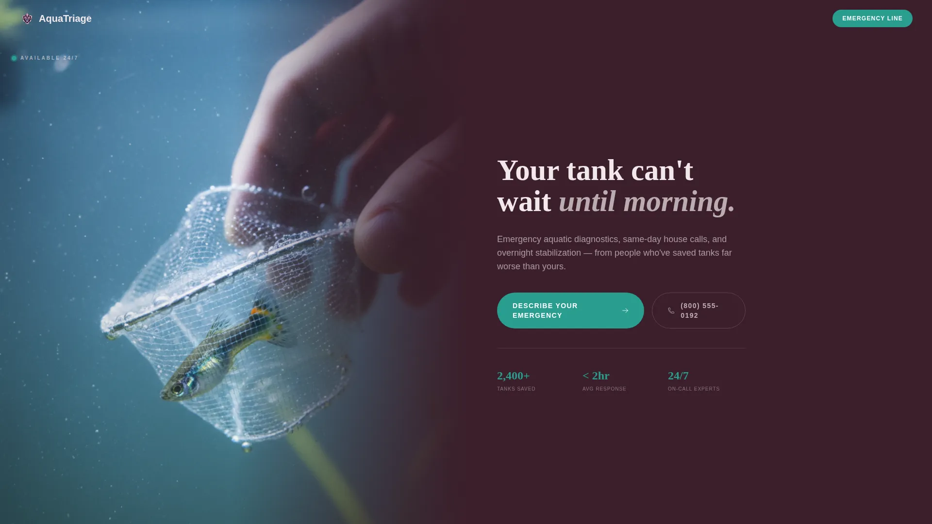
- A half-page photo and text header with a tank-level crisis photograph and a headline that speaks directly to urgency
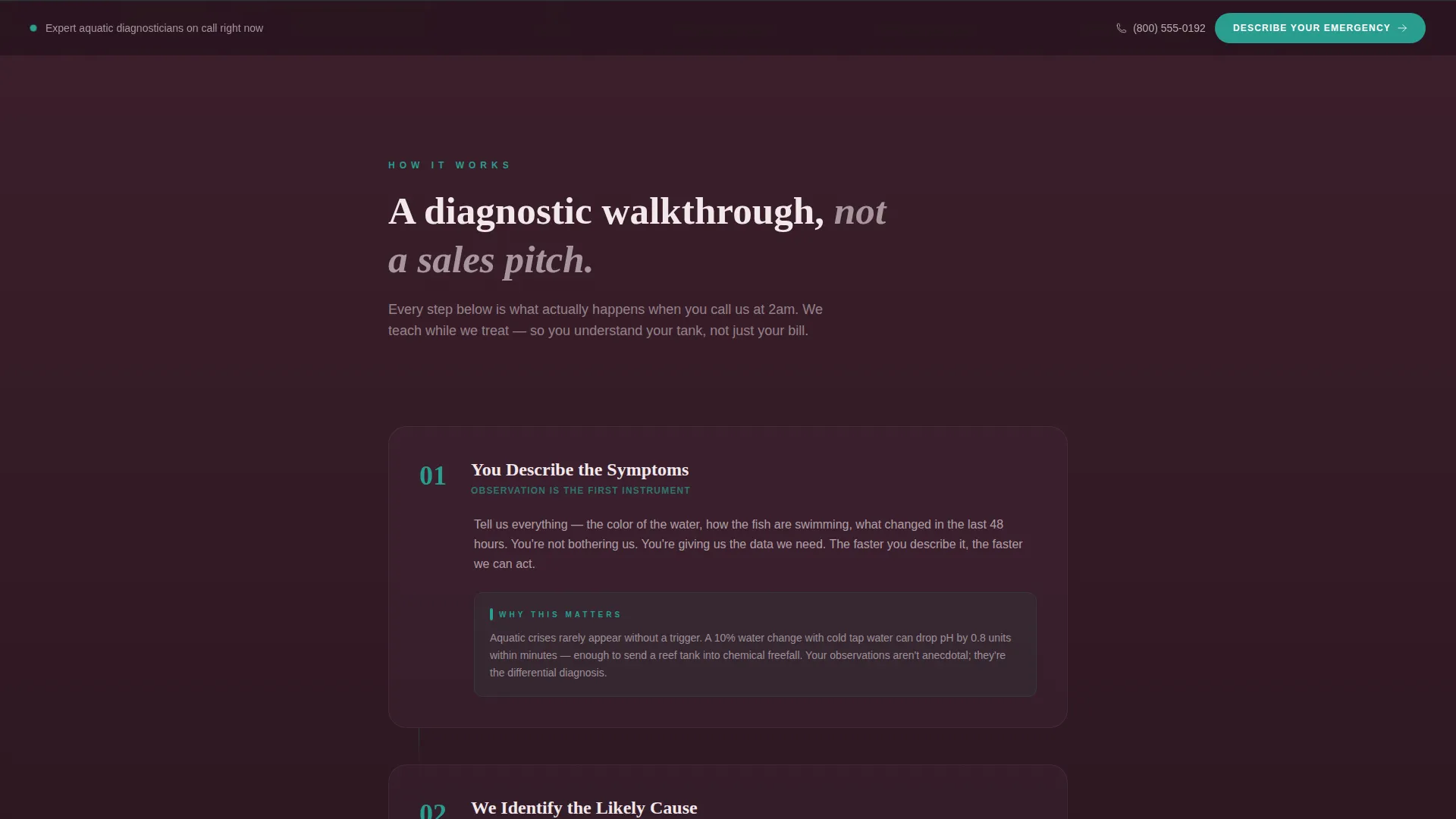
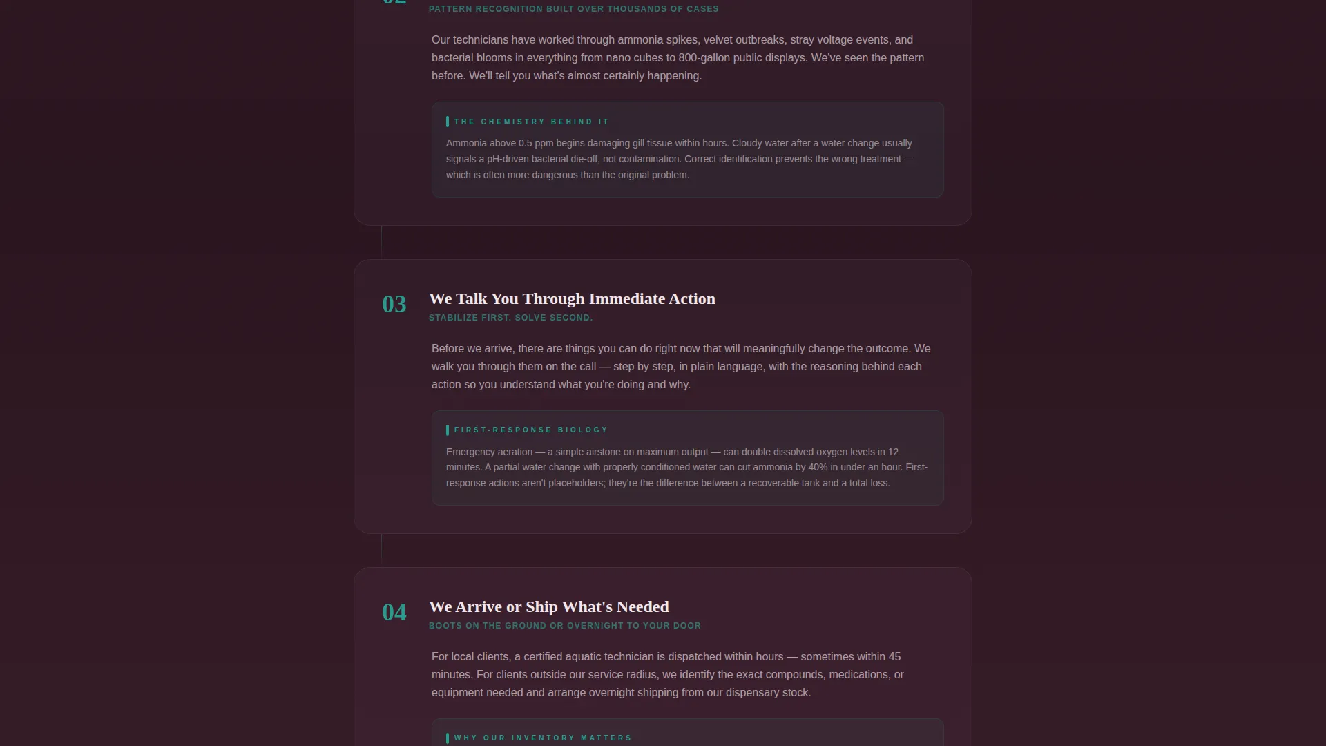
- A four-step diagnostic walkthrough with educational paragraphs explaining the chemistry and biology behind each action
- A progressive lead capture form and a lower-commitment secondary call to action for visitors who are not yet in emergency mode
Feature list
This template includes a focused set of design and content components drawn directly from the source brief.
Half-Page Split Header
The header splits into two halves. The left side displays a close-up tank-level photograph of a hand netting a distressed fish through hazy water. The right side carries the primary headline and supporting line in shell-pink on deep aubergine, immediately communicating urgency and expertise.
Four-Step Diagnostic Walkthrough
The page scrolls through four numbered clinical steps: describing symptoms, identifying the likely cause, talking through immediate action, and arranging arrival or shipment. Each step includes short educational paragraphs that explain the biology and chemistry behind every recommendation, making the service feel credible before any commitment is made.
Sticky and Full-Width call to action Placement
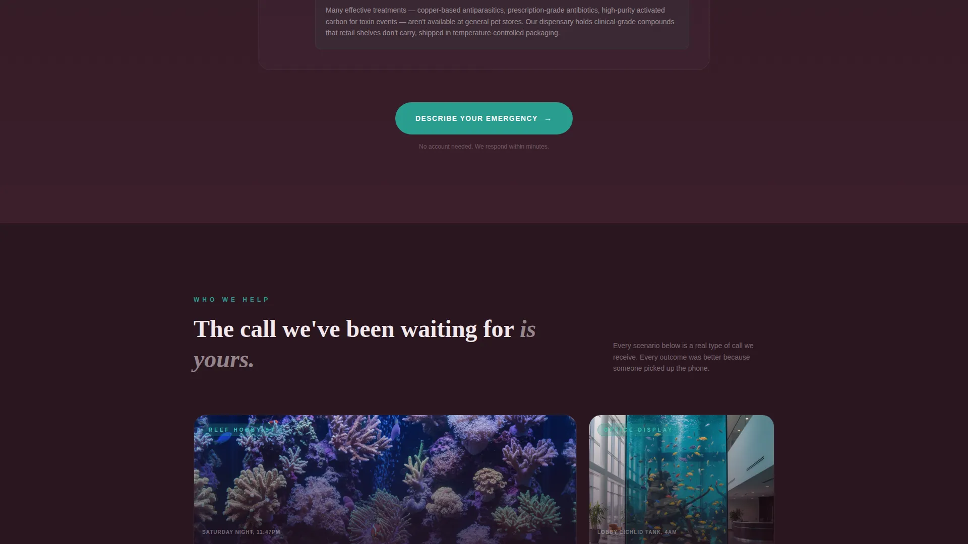
The primary call to action, labeled "Describe Your Emergency," appears first as a sticky bottom bar after the header scrolls past. It then reappears as a full-width section after the process walkthrough, catching visitors at peak readiness on two separate moments of intent.
Progressive Lead Capture Form
The form opens with a single free-text field asking what is happening in the tank right now. It then progressively reveals additional fields for tank size, livestock type, and a photo upload slot. This staged approach reduces friction and increases form completion.
Secondary Low-Commitment Path
A secondary call to action reads "Not an emergency yet? Book a free water test." This path captures visitors whose anxiety has not peaked, pulling them into the lead funnel at a lower commitment threshold and expanding the addressable audience of the page.
Medicinal Teal Diagnostic Numbering
Step numbers and all calls to action use medicinal teal exclusively. This color functions as a visual signal throughout the scroll, drawing the eye to action points and diagnostic milestones the way an indicator light draws attention on a healthy tank.
Page sections overview
| Section | Purpose |
|---|---|
| Split Photo Header | Establish urgency and authority immediately |
| Sticky call to action Bar | Keep primary action visible as visitor scrolls |
| Step 1: Describe Symptoms | Invite the visitor to articulate the problem |
| Step 2: Identify Cause | Demonstrate diagnostic depth and expertise |
| Step 3: Immediate Action | Provide value before any commitment is asked |
| Step 4: Arrive or Ship | Show the service delivery outcome clearly |
| Full-Width call to action Block | Convert visitors at peak confidence post-walkthrough |
| Progressive Lead Form | Capture emergency details with low initial friction |
| Secondary Booking Path | Catch lower-urgency visitors with a softer offer |
Design & branding system
The Plum Executive color system gives this template a tone that is simultaneously soft and serious. Deep aubergine grounds every section in authority, while the teal pulses through action points like a healthy tank indicator light.
- Deep aubergine (#3B1F2B) as the primary background, muted dusty orchid (#8E6585) for secondary panels, and pale shell-pink (#F2E8EB) for text containers
- Medicinal teal (#2A9D8F) reserved exclusively for calls to action and diagnostic step numbers to direct attention with precision
- The Educational Guide theme shapes the typography and layout toward clarity and calm, reinforcing expertise through structured, readable content blocks
Mobile & speed optimization
The single-column flow layout is inherently well-suited to mobile viewing. Every section stacks cleanly without requiring horizontal navigation or pinch-to-zoom reading, which matters when a visitor is holding a phone over a crashing tank.
- The sticky bottom bar call to action remains accessible on mobile without obstructing the diagnostic content above it
- Progressive form disclosure keeps the mobile input experience manageable by revealing one field group at a time
- The half-page split header adapts to a stacked presentation on smaller screens, keeping both the photograph and the headline visible and impactful
How this template helps you convert
This template earns the lead before asking for it. The educational walkthrough demonstrates competence so clearly that submitting the form feels like the logical next step rather than a leap of faith.
- The transparent diagnostic process builds trust section by section, reducing the psychological barrier between panic and contact by proving expertise through educational content rather than self-promotional claims
- The two-stage call to action placement, sticky bar and full-width block, captures visitors at two distinct moments of intent without interrupting the trust-building scroll
- The progressive form and secondary booking path together create a two-lane funnel that converts both emergency visitors and lower-urgency prospects into qualified leads
Other information about this template
This template belongs to the Professional Services category under the Aquarium Store Marketing subcategory. It is purpose-built for the aquarium store emergency service niche and carries an intersection match score of 13, reflecting a tight alignment between the template's structure and the target service context.
- The template style is Single Column Flow, which keeps the narrative linear and prevents decision fatigue during a high-stress visit
- The creative direction is Transparent Process, meaning the layout itself functions as a trust signal by showing exactly how the service works before the visitor commits
- The lead generation direction means every design and copy decision is oriented toward capturing a qualified contact, not toward general brand awareness or browsing behavior
Theme
Educational Guide
Creative direction
Transparent Process
Color system
Plum Executive
Style
Single Column Flow
Direction
Lead Generation
Page Sections
Half-page Split Header with Crisis Photography
Four-step Diagnostic Walkthrough
Dual-placement Emergency Call to Action
Progressive Lead Capture Form
Low-commitment Secondary Path
Medicinal Teal Diagnostic Step Numbers
Related questions
Can I adapt the diagnostic steps to match my actual service process?
Does the progressive form include a photo upload field?
Who is the secondary call to action designed to reach?
Is this template suitable for commercial aquarium clients, not just home hobbyists?
Can I use this template for a general aquarium retail store?



