Emergency Medicine Professional Website Template
Triage is a single-column landing page for an emergency medicine clinic. It leads with accreditation badges and a 7-minute median wait claim, then walks anxious visitors through real emergency scenarios with matched clinical responses. Every scroll section builds trust and ends with a streamlined three-field check-in form designed to convert fear into action.
by Rocket studio
Quick summary
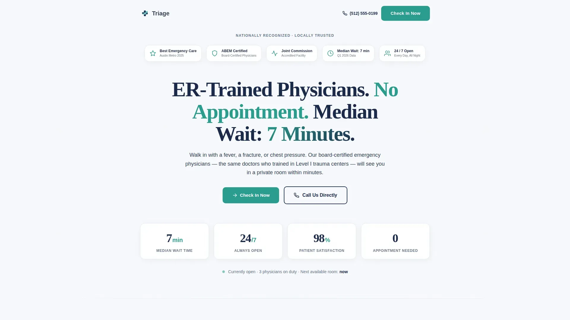
Triage is a lead-generation landing page built for an emergency medicine clinic. It opens with award badges and board-certification seals, then moves through a Problem-to-Solution arc that pairs patient scenarios with precise clinical capabilities. A three-field check-in form and tap-to-dial button give every visitor a fast, low-friction path to care.
Who this template is for
This template is built for emergency medicine clinics and urgent care centers that need to convert anxious, time-pressed visitors into booked check-ins. It works best for practices with board-certified physicians, on-site diagnostics, and a meaningful wait-time advantage over a traditional hospital emergency room.
- Clinic owners and practice managers launching or refreshing a patient-facing landing page
- Emergency medicine centers that want to highlight fast wait times, real credentials, and specific clinical capabilities
- Healthcare marketers targeting mobile users searching for immediate care late at night or during a workday emergency
What problem this template solves
Patients arriving at this page are scared. They are not browsing. They have a feverish child, a wrist that will not move, or chest pressure they cannot explain. Generic healthcare pages fail them because they lead with marketing language instead of clinical proof. This template fixes that by showing credentials before asking for anything.
- Visitors leave competing pages because trust is never established before the call to action appears
- Long or complicated intake forms create friction at exactly the moment a patient is most anxious
- Pages that ignore specific emergency scenarios force patients to wonder whether the clinic can actually handle their situation
What you get with this template
This template delivers a complete single-column landing page structured around the full patient journey from fear to check-in. Every section earns the next scroll rather than demanding it.
- A hero section with animated accreditation badges, a bold wait-time headline, and an immediate call-to-action button
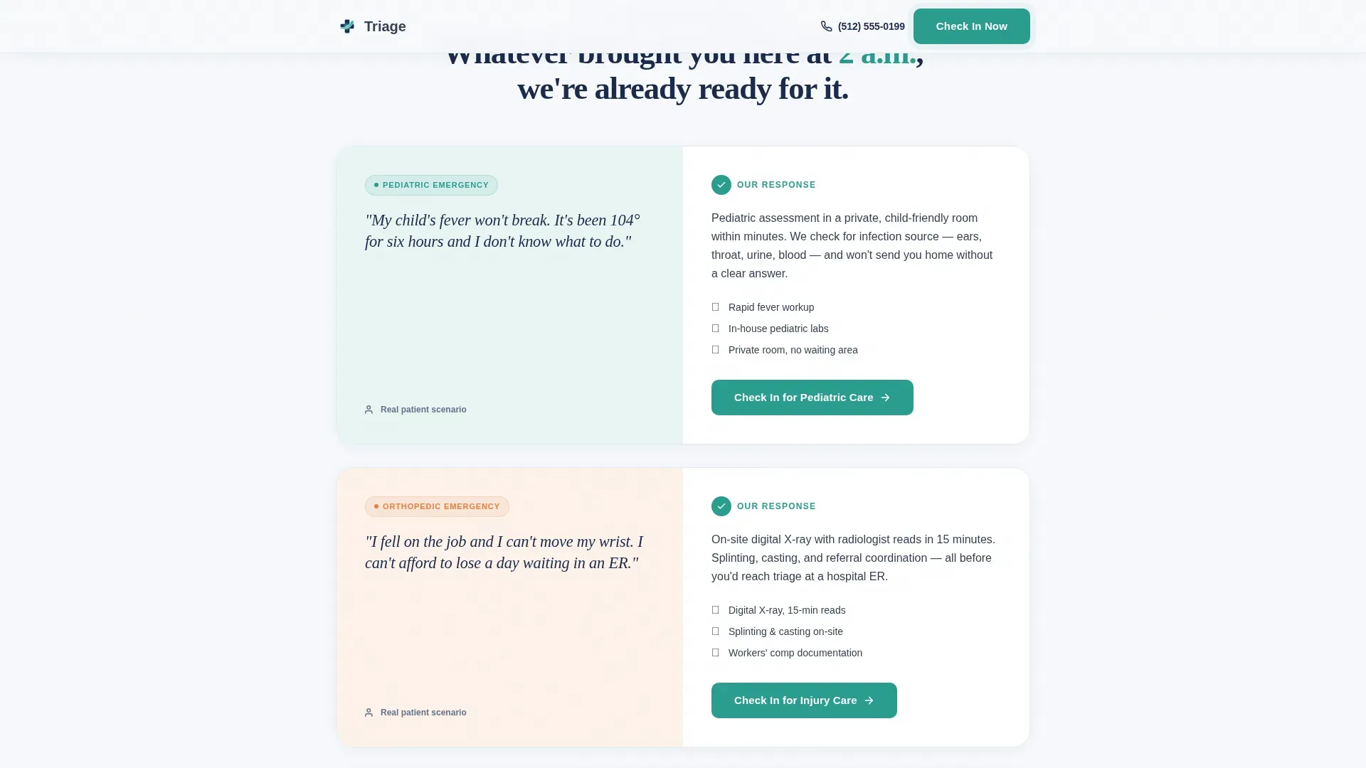
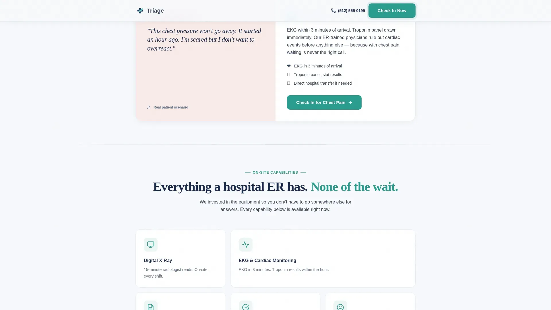
- Three Problem-to-Solution scenario cards covering pediatric fever, wrist fracture, and chest pain, each paired with a specific clinical response
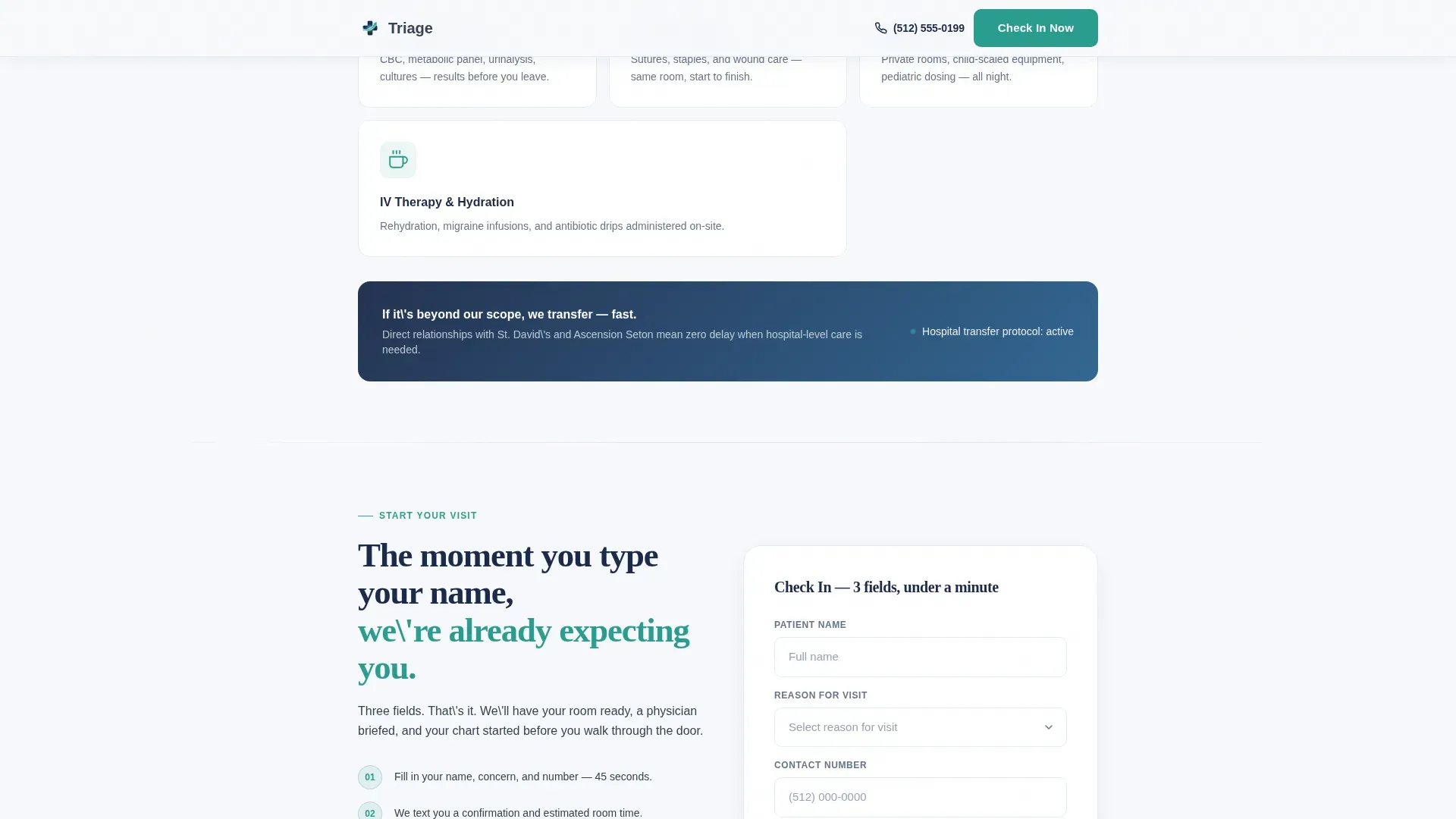
- A capabilities section listing on-site imaging, electrocardiogram testing, and lab panels, followed by a three-field check-in form and a tap-to-dial secondary option
- A social proof section with patient outcome testimonials and a live wait-time indicator
- A clean single-row footer
Feature list
This template is built with purpose at every layer. Each feature below comes directly from the brief and serves the goal of moving a frightened patient toward care.
Award Badge Hero Row
The page opens with a horizontal row of accreditation seals, regional awards, and board-certification insignias. Each badge animates in with a quiet fade, establishing clinical credibility in the first viewport before a visitor reads a single word of copy.
Problem-to-Solution Scenario Cards
Three scenario cards address specific emergencies in plain patient language. Each card names the fear directly, then immediately pairs it with the clinic's precise clinical response, building a section-by-section picture of total competence.
Three-Field Check-In Form
The check-in form asks only for a patient name, a reason for visit from a dropdown of common emergencies, and a preferred contact number. The sequence is short by design, reducing the cognitive load on someone who is already stressed.
Tap-to-Dial Secondary call to action
A secondary call-to-action button lets mobile visitors skip the form entirely and call the clinic directly. It is formatted as a tap-to-dial link, removing any barrier for someone holding a phone with one hand while managing a child with the other.
FAQ Accordion Interaction
An interactive accordion section handles common patient questions without cluttering the page. Visitors can expand only what they need, keeping the visual layout clean while still providing answers that reduce hesitation before check-in.
Scroll-Fade Animation System
Scroll-triggered fade-in reveals and a subtle pulse effect on call-to-action buttons add motion with purpose. Stat counters animate on scroll as well, making wait-time data and capability figures feel live rather than static.
Page sections overview
| Section | Purpose |
|---|---|
| Hero with Badges | Display credentials and wait-time proof immediately |
| Problem-Solution Cards | Match patient fears to specific clinical responses |
| Capabilities Overview | List on-site imaging, labs, and EKG availability |
| Check-In Form | Capture patient name, visit reason, and contact number |
| Tap-to-Dial call to action | Offer direct call path for mobile visitors |
| Social Proof Row | Build trust with patient outcome testimonials |
| Wait-Time Indicator | Show live or current median wait data |
| Single-Row Footer | Provide clinic contact and navigation essentials |
Design & branding system
The visual identity follows a Healing Space theme. The palette was chosen to feel sterile enough to trust and warm enough to exhale, a balance that emergency medicine pages rarely achieve.
- Colors: clinical white (#F7F9FC) as the dominant background, glacier blue (#D6E6F2) for card backgrounds and section dividers, steady-pulse navy (#1B2A4A) for headlines and trust elements, and calm-urgent teal (#2A9D8F) on every button and interactive accent
- Typography: DM Sans for body text and user interface elements, paired with Fraunces serif for emotional display headlines that carry weight without feeling cold
- No stock photography of smiling clinicians; proof-first layout with badges and data replacing decorative imagery
Mobile & speed optimization
This template was designed mobile-first, for a parent on a phone at 2 a.m. and a construction worker thumbing through during a break. Every layout decision reflects that priority.
- Single-column flow ensures no horizontal scrolling or layout collapse on small screens
- Tap-to-dial button is sized and positioned for easy thumb reach on mobile devices
- Animation is kept at a medium level with scroll-fade reveals and badge fade-ins, avoiding heavy video or resource-intensive effects that would slow a mobile connection
How this template helps you convert
The page is built as a lead-generation funnel where every section removes a reason not to act. Trust is front-loaded so the form never feels premature.
- The hero section places clinical proof before the call to action, so visitors feel confident before they are asked to do anything
- Each Problem-to-Solution card dissolves a specific fear with a specific clinical answer, reducing the anxiety that typically causes visitors to leave and search elsewhere
- The three-field form and tap-to-dial button offer two low-friction paths to conversion, meeting patients where they are, whether they prefer typing or calling
Other information about this template
This template is categorized under Health and Medical, specifically within the Emergency Medicine clinic and center niche. It is built as a single-column flow, which means the layout reads as one continuous scroll rather than a multi-page structure.
- The page is localized for a United States audience with English copy and 12-hour time format references
- The template style is Single Column Flow, matched to the Lead Generation landing page direction
- Interactive elements include the check-in form, the FAQ accordion, and the tap-to-dial button
- The creative direction follows a Problem-to-Solution arc, a structure particularly effective for urgent-care and emergency medicine contexts where specific fear resolution outperforms generic reassurance
- The footer uses a Pattern 1 Linear Single-Row layout, keeping the page exit clean and uncluttered
Theme
Healing Space
Creative direction
Problem→Solution Arc
Color system
Arctic White
Style
Single Column Flow
Direction
Lead Generation
Page Sections
Award Badge Hero with Fade Animation
Problem-to-solution Scenario Cards
Three-field Check-in Form
Tap-to-dial Mobile Button
Live Wait-time Indicator
FAQ Accordion Interaction
Related questions
Can I update the wait-time figure shown in the hero section?
How does the three-field check-in form work?
Can I replace the default emergency scenarios in the scenario cards?
Is this template a good fit for a clinic that handles both urgent and routine care?
What fonts does this template include?



