Emergency Physician Reviews Website Template
Triage is an emergency physician patient education landing page built to calm anxious patients and caregivers at their most uncertain moments. It pairs a guided five-question symptom assessment with evidence-based zigzag educational sections and real patient testimonials. The result is a warm, authoritative page that helps visitors decide whether to call 911, see a doctor today, or wait at home.
by Rocket studio
Quick summary
Triage is a single-page patient education hub designed for emergency physicians. It combines a branching symptom assessment, zigzag educational content, and a staggered testimonial mosaic to deliver calm, clear guidance. Visitors land on a warm hero image, answer five plain-language questions, and leave with a color-coded recommendation from board-certified emergency room doctors.
Who this template is for
This template is built for emergency physicians and healthcare educators who want to reach patients before they reach the waiting room. It suits practices and clinical teams that need a credible, conversion-ready digital presence.
- Emergency physicians publishing patient education content online
- Healthcare content teams building anxiety-reduction tools for caregivers
- Medical practices targeting parents, elderly patients, and young adults searching symptoms late at night
What problem this template solves
Most people facing a possible emergency turn to a search engine first. They find contradictory results, feel more anxious, and either delay care or rush to the emergency room unnecessarily. This template gives them a structured, physician-authored path instead.
- Visitors cannot tell whether their symptoms need the emergency room, urgent care, or home rest
- Symptom search results are noisy, jargon-heavy, and raise rather than reduce anxiety
- Physicians lack a polished, patient-facing page that earns trust before asking for action
What you get with this template
You get a fully structured single-page layout designed around the patient decision moment. Every section serves a specific role in moving a worried visitor from panic toward a clear, confident next step.
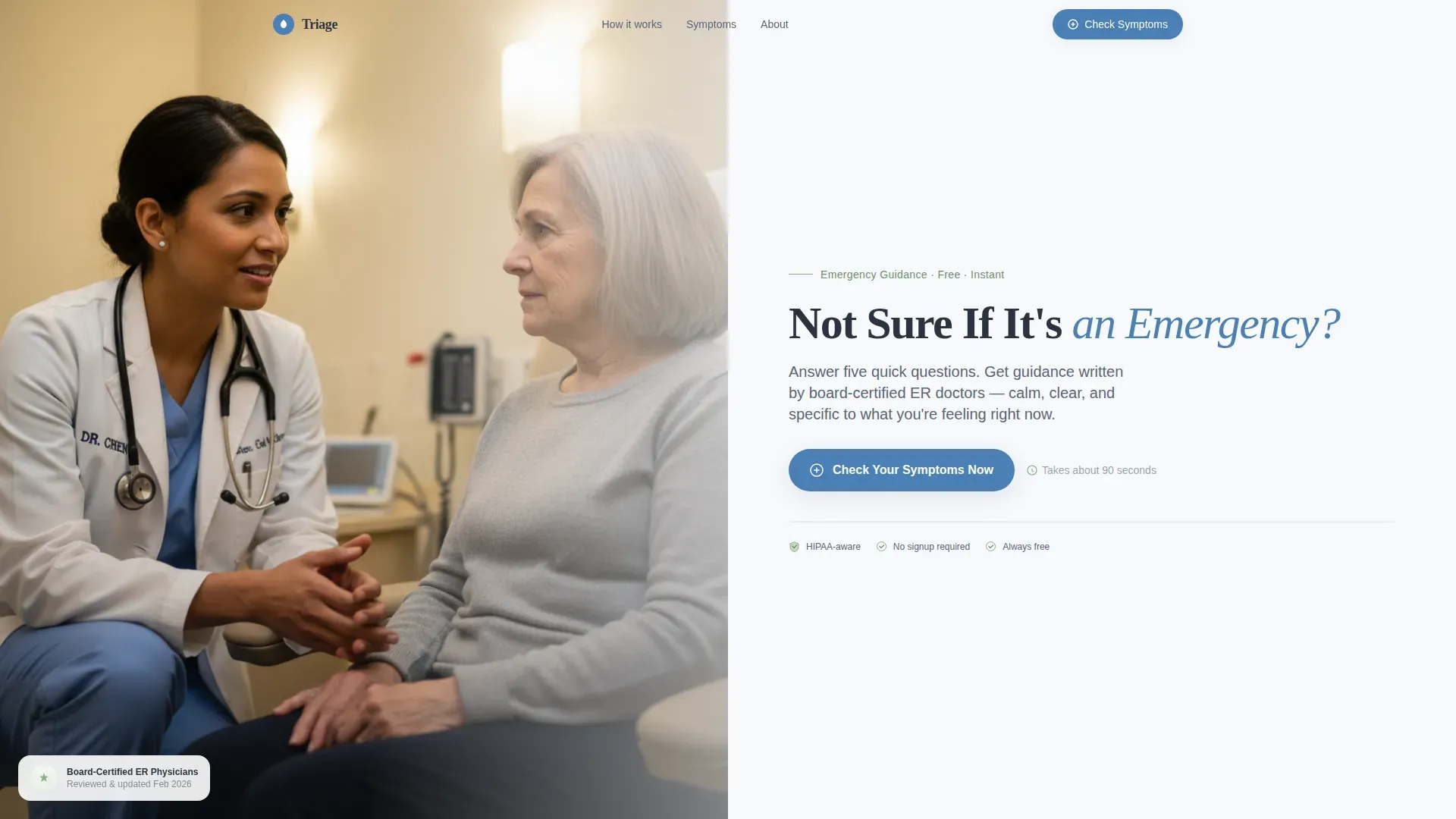
- A half-page hero with physician photo, headline, and primary call-to-action button
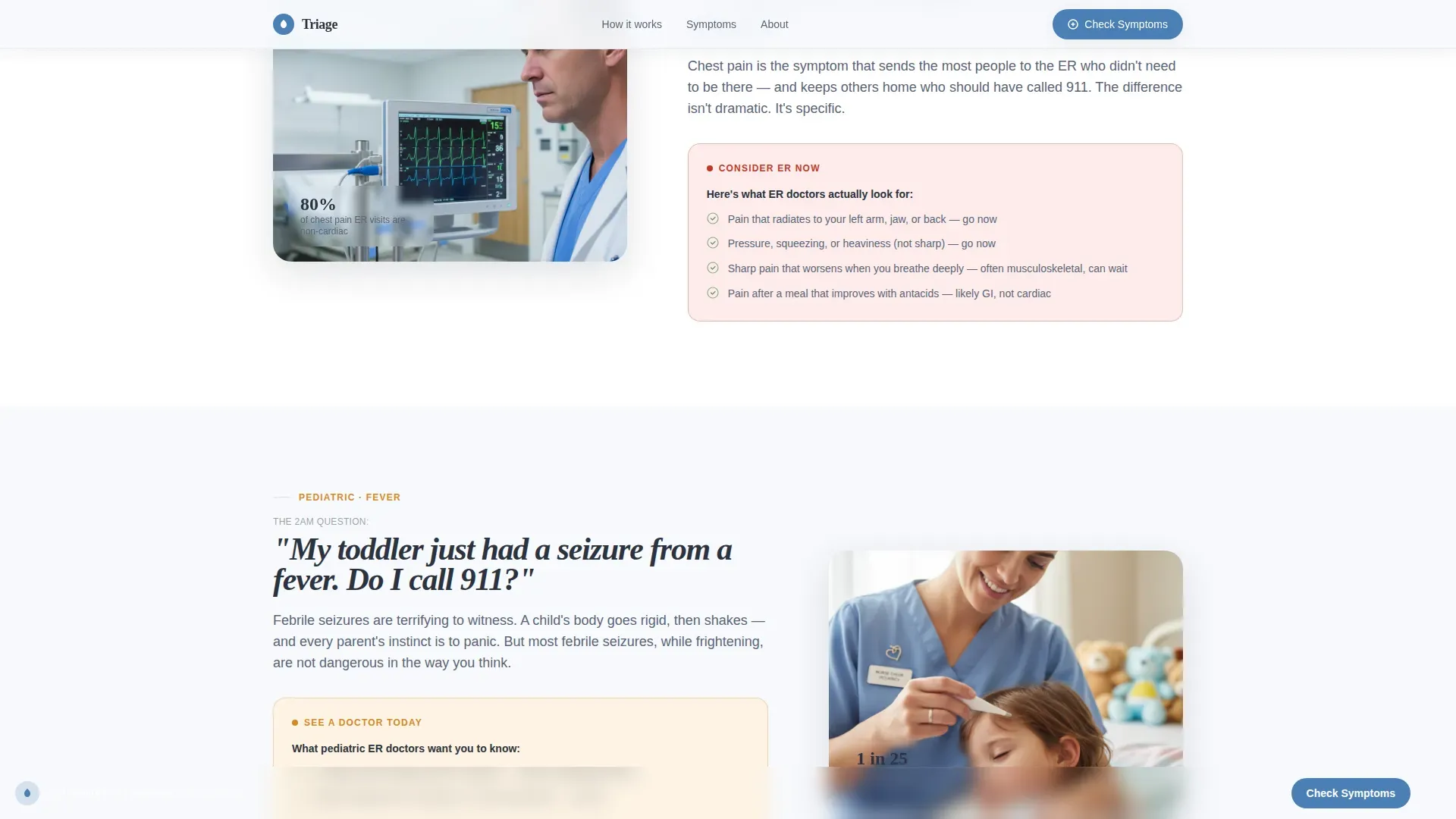
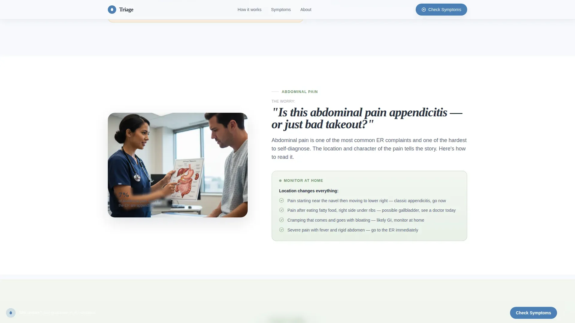
- Three zigzag educational sections covering chest pain, pediatric fever, and abdominal symptoms
- A staggered testimonial mosaic, a persistent bottom call-to-action bar, and a color-coded assessment results flow
Feature list
This template ships with a tightly integrated set of components that work together to build trust and drive decisions.
Branching Symptom Assessment Flow
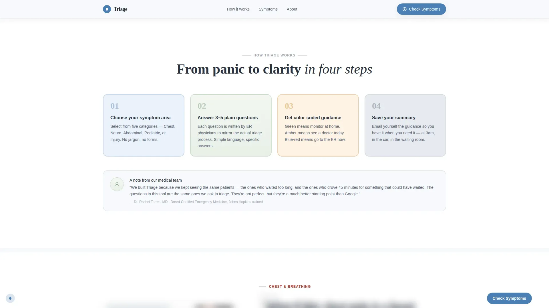
The assessment opens with one disarming question presented as five large clickable cards: Chest and Breathing, Head and Neuro, Abdominal, Pediatric, and Injury. It then narrows through four to five branching questions written entirely in plain language. Results deliver a color-coded guidance tier in green for monitor at home, amber for see a doctor today, and blue-red for go to the emergency room now.
Color-Coded Results with Printable Summary
Each assessment result includes a printable summary so patients can share their guidance with a family member or bring it to a care visit. An optional email capture on the results screen lets users send the summary to themselves for later reference.
Zigzag Educational Sections
Three alternating content pairs each place a common patient fear on one side and evidence-based reassurance on the other. Sections cover chest pain, pediatric fever, and abdominal pain. This structure makes complex clinical guidance feel approachable and scannable on any screen.
Testimonial Mosaic Layout
Real patient story cards appear between educational sections. Cards are staggered, softly shadowed, and slightly rotated to break the grid naturally. The layout creates a rhythm of tension, relief, and proof that builds confidence without pressure.
Persistent Bottom Call-to-Action Bar
After the second scroll, a fixed bottom bar reading "Check Your Symptoms Now" stays visible throughout the page. This ensures the primary action is always one tap away without disrupting reading flow.
Half-Page Photo and Text Hero
The header splits into a grain-touched physician photograph on the left and a headline with subline on the right. The photo bleeds to the edge. The text area breathes against the Cloud Canvas background. The layout immediately signals warmth and clinical credibility.
Page sections overview
| Section | Purpose |
|---|---|
| Hero header | Introduce the tool, show a real physician interaction, and present the primary call-to-action |
| Zigzag: Chest Pain | Contrast fear of chest pain with calm, evidence-based guidance on when to act |
| Testimonial Mosaic | Reinforce trust with staggered real-patient story cards between educational blocks |
| Zigzag: Pediatric Fever | Address the specific panic of parents dealing with fevers and febrile seizures |
| Zigzag: Abdominal Pain | Separate appendicitis concern from wait-and-see scenarios using plain language |
| Assessment call to action Banner | Full-width prompt to start the symptom checker, paired with the persistent bottom bar |
| Page footer | Horizontal flow footer carrying navigation, credentials, and physician badge area |
Design & branding system
The visual identity follows an Organic Flow theme built on the Cloud Canvas color system. The palette is intentionally warm and clinical without feeling cold or sterile.
- Soft clinical white (#F7F9FC) dominates large background areas to create breathing room between sections
- Calm sage (#8FAE8B) anchors educational content blocks, while exhale gray (#D6DCE5) carries borders and body text
- Reassurance blue (#4A7FB5) appears only on interactive elements and call-to-action states, keeping action signals visually distinct
Typography uses Fraunces, a humanist serif, for all headlines and DM Sans for body copy and interface labels. Soft grain texture adds warmth to the hero photograph treatment.
Mobile & speed optimization
This template is built mobile-first, reflecting the reality that most late-night symptom searches happen on a phone. Every interactive element is designed for touch.
- The symptom assessment uses large tap-friendly card targets sized for one-handed phone use
- Scroll-triggered reveals and staggered card animations are scoped to keep the experience smooth on smaller screens
- The persistent bottom call-to-action bar stays accessible throughout the scroll without covering critical content
How this template helps you convert
The page earns the click by demonstrating competence before asking for anything. Every section builds credibility in sequence.
- The hero immediately signals physician authority through a candid, eye-level photograph and a direct, empathetic headline, lowering visitor anxiety from the first moment
- Zigzag sections and testimonials prove the page understands the specific fear each visitor carries, making the assessment feel like a natural next step rather than a sales ask
- The color-coded results with a printable summary and optional email capture give visitors something tangible to keep, increasing the chance they return or share the tool
Other information about this template
This template is a strong fit for any emergency physician or healthcare team that wants to publish a patient education resource with a guided self-assessment component. The layout is organized for a single-page flow with no external routing required.
- The footer follows a horizontal flow pattern suitable for listing physician credentials, badge areas, and essential navigation links
- Scroll-triggered reveal animations and subtle parallax on the hero photograph are included in the animation scope
- The assessment modal is designed as an in-page flow, keeping users on the landing page rather than redirecting them elsewhere
- The template is scoped for English (United States) audiences with 12-hour time format and MM/DD/YYYY date conventions
Theme
Organic Flow
Creative direction
Testimonial Mosaic
Color system
Cloud Canvas
Style
Zigzag/Alternating
Direction
Quiz/Assessment
Page Sections
Branching Five-question Symptom Assessment
Color-coded Results and Printable Summary
Zigzag Educational Content Pairs
Staggered Testimonial Mosaic
Persistent Bottom Call-to-action Bar
Half-page Photo and Text Hero
Related questions
Who is this template designed for?
What does the symptom assessment include?
Does this template address both pediatric and adult symptoms?
How does the page encourage visitors to use the assessment?
Is this a single page or a multi-page template?



