Healthcare Management Consultant Landing Page Template
Triage is a healthcare management consultant landing page template built around evidence-first storytelling. It uses before-and-after comparison tables, a bold left-anchored headline, and a booking-focused layout to turn complex operational results into a compelling case for the diagnostic call. The design is clean, clinical, and built to qualify serious healthcare decision-makers.
by Rocket studio
Quick summary
Triage is a single-page landing page template for healthcare management consultants. It leads with a commanding headline, then walks visitors through real engagement case studies in a structured comparison table format. Every section is designed to build credibility quickly and move the right buyers toward scheduling a diagnostic call.
Who this template is for
This template is built for healthcare management consulting practices that work with complex, high-stakes clients. It speaks directly to consultants whose value is measurable and whose buyers need evidence before they act.
- Regional health system executives and hospital network administrators
- Practice group operators dealing with revenue cycle and compliance challenges
- Healthcare consultants presenting post-merger integration outcomes to new clients
What problem this template solves
Hospital and health system buyers are skeptical. They have seen consultants come and go, and they do not respond to polished promises. They respond to numbers, specificity, and proof that someone else in their situation got results. Most consulting landing pages fail to deliver that. They rely on vague value statements instead of structured evidence.
- Generic consulting pages bury the proof or omit it entirely
- Disorganized layouts make it hard for busy executives to find the data they need
- Weak calls to action fail to qualify leads or capture the right buyer intent
What you get with this template
You get a fully structured landing page layout with a clear narrative arc. It opens with a bold, metric-backed headline, moves through escalating case study comparison tables, and closes with a booking form and a secondary lead capture path. Every section has a defined job to do.
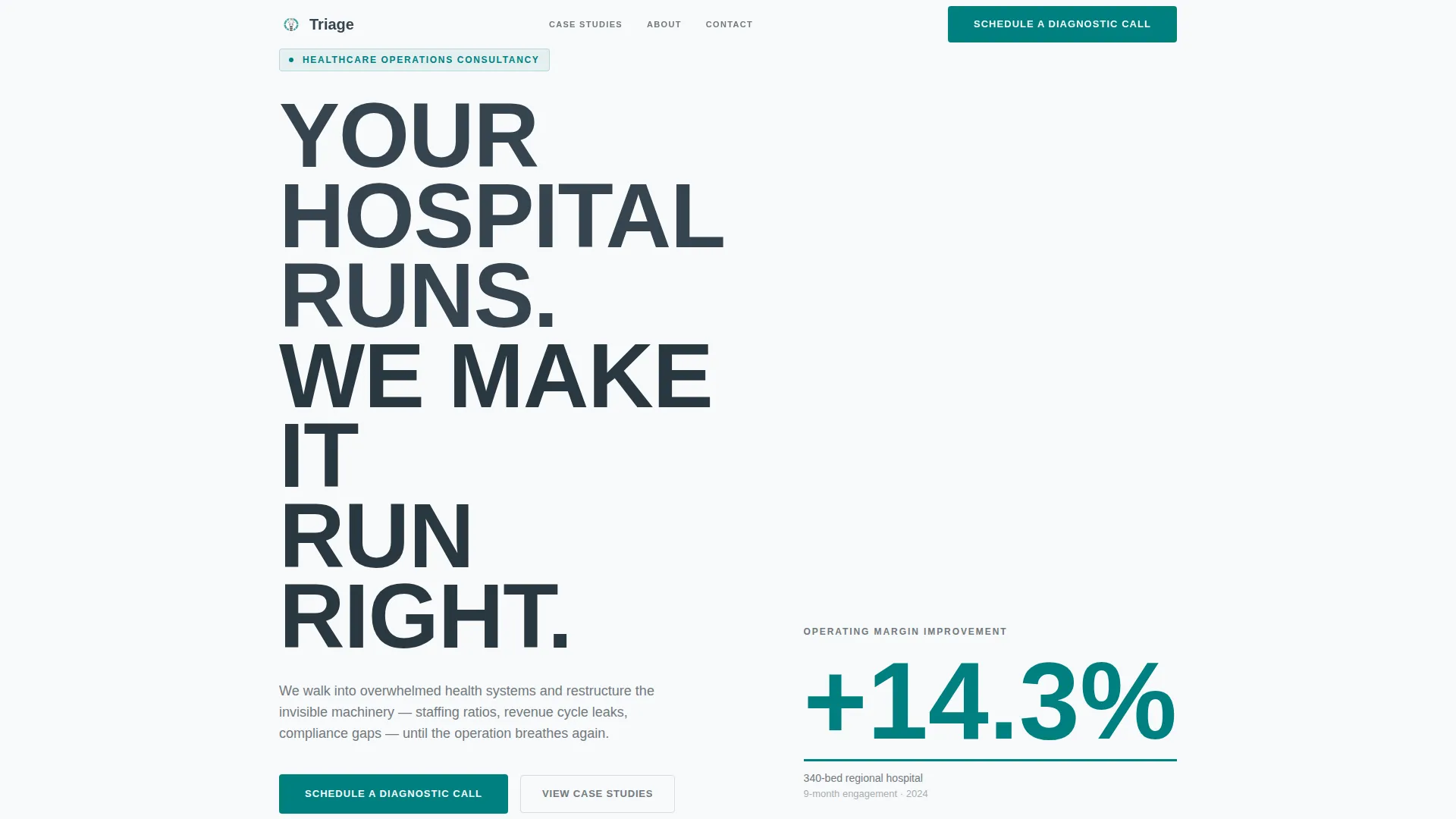
- A giant left-anchored headline block with a real operating margin metric as a visual anchor
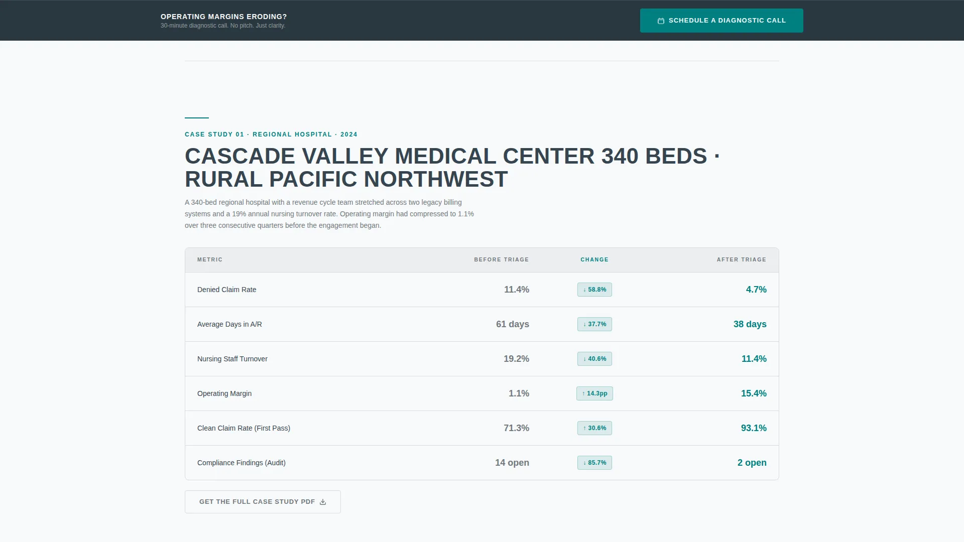
- Multiple before-and-after comparison tables, each covering a distinct client engagement type
- A primary booking form and a gated PDF download path for two-stage lead capture
Feature list
This template is built around a specific set of components that serve the healthcare management consulting use case directly.
Before-and-After Comparison Tables
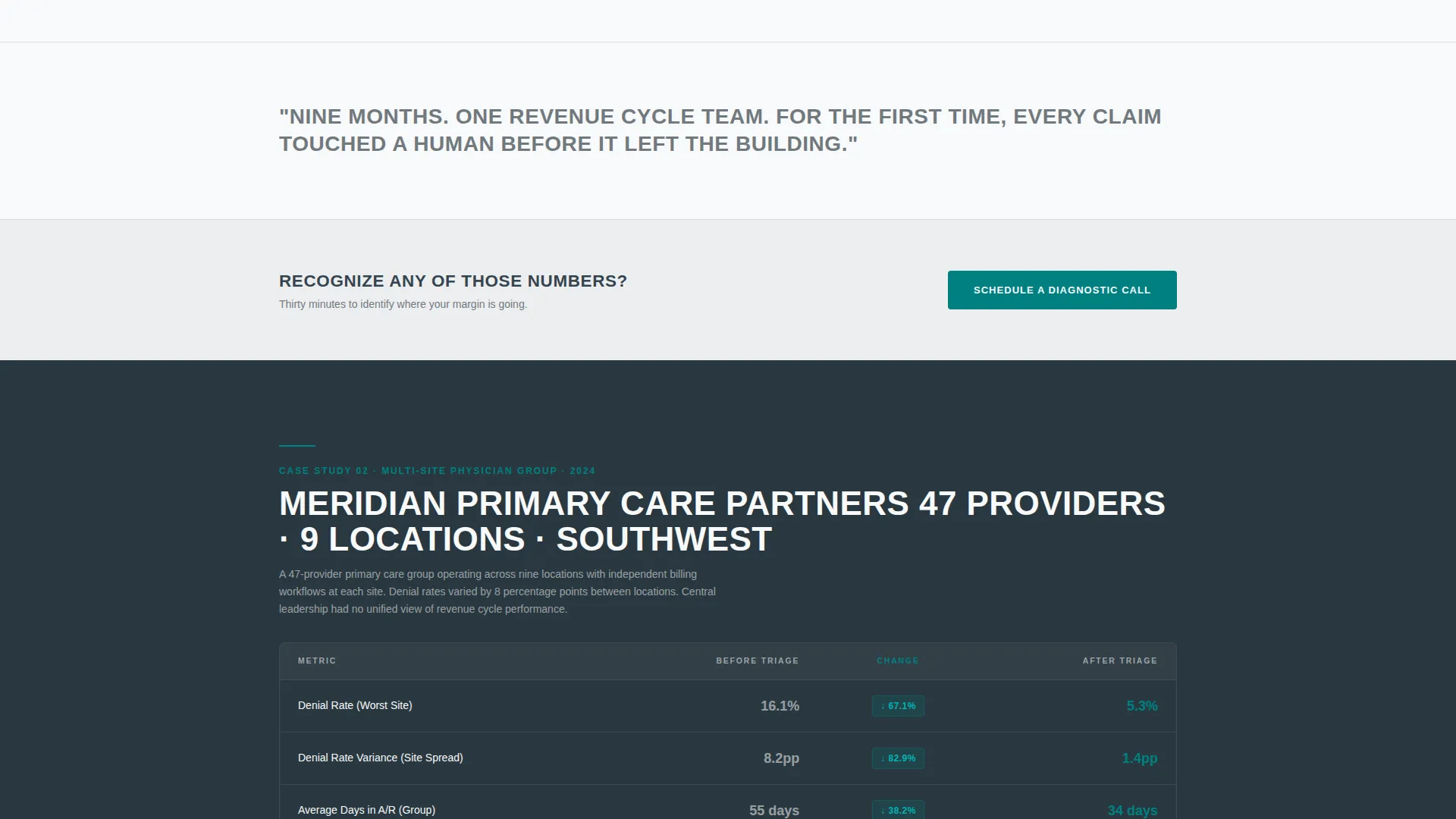
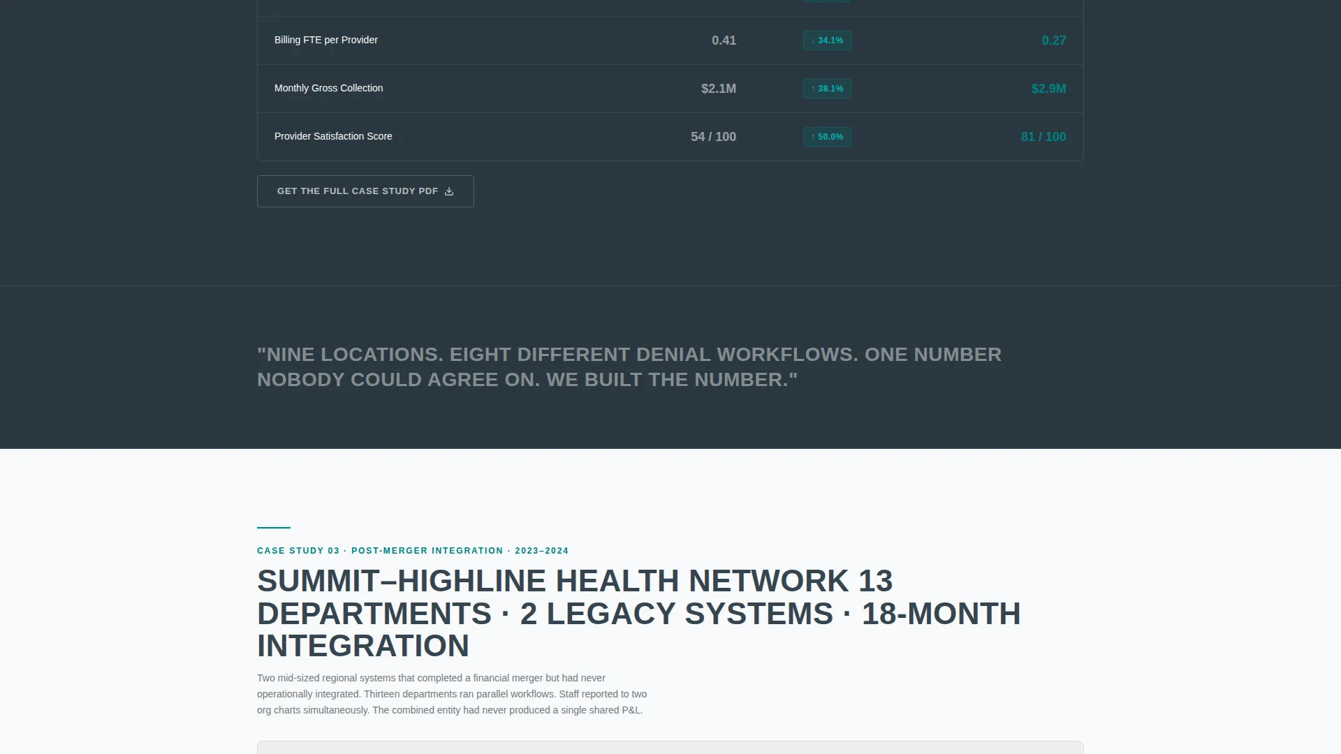
Each comparison table presents pre-engagement and post-engagement metrics side by side. Teal percentage-change badges bridge the two columns and make improvement immediately visible. The template includes separate tables for a regional hospital, a multi-site physician group, and a post-merger integration.
Giant Headline Left Layout
The header section uses a condensed sans-serif headline that occupies sixty percent of the viewport, anchored to the left. The right forty percent is reserved for a single oversized operating margin metric with a teal underline. There is no imagery. The confidence comes from the structure and the number.
Booking and Scheduling Form
The primary call to action is a scheduling form labeled "Schedule a Diagnostic Call." It captures organization type, bed count or provider count, and an open-field response labeled "What's breaking?" This keeps the intake specific and filters for serious buyers.
Gated PDF Lead Capture
A secondary conversion path offers a downloadable case study PDF. It is gated behind an email address and job title. This path qualifies buyers who are not ready to book a call but are ready to engage with detailed evidence.
Clinical Observation Interstices
Between each comparison table, a single sentence of context appears. These are written as clinical observations, not testimonials. An example from the brief: "Thirteen departments. Nine months. One shared P&L for the first time." These sentences give the scroll rhythm a deliberate pause.
Fixed Bottom call to action Bar
After the second case study table, a slim bottom bar appears and stays fixed during scroll. It repeats the "Schedule a Diagnostic Call" prompt. This ensures the primary action is always reachable without requiring the visitor to scroll back up.
Page sections overview
| Section | Purpose |
|---|---|
| Header Headline Block | Anchors brand authority with headline and metric |
| First Case Study | Regional hospital before-and-after comparison |
| Clinical Observation One | Single-sentence context break after first table |
| Second Case Study | Multi-site physician group comparison table |
| Clinical Observation Two | Single-sentence context break after second table |
| Third Case Study | Post-merger integration comparison table |
| Diagnostic Call Form | Primary booking and lead qualification form |
| PDF Download Gate | Secondary email-gated lead capture path |
| Fixed Bottom Bar | Persistent call to action visible throughout scroll |
Design & branding system
The visual identity follows a Service Utility theme built on a Monochrome Steel color system. Every color choice is functional. Nothing decorates without purpose.
- Surgical steel (#71797E) and charcoal scrub gray (#36454F) handle all body text and background alternation
- Sterile white (#F8F9FA) serves as the primary background, with charcoal sections used for contrast between tables
- Teal (#008080) appears only on calls to action, percentage-change badges, and metric underlines, making every instance feel like a green light
Mobile & speed optimization
The layout is built to stay readable and functional at any screen width. The comparison tables and headline block are structured to reflow cleanly on smaller screens without losing their logical hierarchy.
- Comparison tables stack or compress gracefully on mobile viewports
- The fixed bottom call to action bar remains visible and tappable on touch devices
- The form fields are sized and spaced for easy input on phones and tablets
How this template helps you convert
This template is engineered around a specific buyer psychology. Healthcare executives need evidence first, then a clear and low-friction next step.
- The case study comparison tables deliver quantified proof early, before any ask is made, so skeptical buyers stay engaged long enough to reach the form.
- The two-stage conversion path captures both high-intent buyers ready to book a call and research-stage buyers willing to exchange an email for a detailed case study PDF.
- The fixed bottom call to action bar removes friction by keeping the scheduling prompt visible throughout the entire scroll, so the buyer never has to hunt for the next step.
Other information about this template
This template is a strong fit for healthcare management consulting practices that compete on documented outcomes rather than brand recognition. It is designed to work as a standalone landing page within a broader consulting website or as a focused campaign page.
- The template style is Comparison Table, which makes it especially suited to consultants who have real before-and-after data to present
- The Case Study Narrative creative direction means content does the persuasion work, not decorative design elements
- The Booking and Scheduling landing page direction keeps the conversion goal singular and measurable
- The header concept is Giant Headline Left, which communicates authority without requiring a photography budget or custom illustration
Theme
Service Utility
Creative direction
Case Study Narrative
Color system
Monochrome Steel
Style
Comparison Table
Direction
Booking/Scheduling
Page Sections
Before-and-after Comparison Tables
Giant Headline Left Header
Diagnostic Call Booking Form
Gated Case Study PDF Download
Fixed Bottom Call to Action Bar
Clinical Observation Interstices
Related questions
Who is this landing page template designed for?
Can I use this template if I only have one case study?
What does the diagnostic call booking form capture?
What is the gated PDF download path for?
Does the template include actual case study data?



