Emergency Medicine Booking Website Template
Triage is a split-screen landing page built for a private emergency medicine practice. It leads with speed metrics, board-certified credentials, and transparent pricing before a single form field appears. The layout pairs a stats-driven hero with an editorial physician photo, a diagnostic comparison checklist, a capabilities grid, and a streamlined booking module, all designed to move a distressed visitor toward reserving a visit window.
by Rocket studio
Quick summary
Triage is a single-page booking experience for a private emergency medicine practice. The 50/50 split-screen layout opens with oversized performance metrics and a real physician photograph. Every scroll section builds clinical trust through a diagnostic-style checklist, a capabilities overview, and patient-reported outcome numbers, so visitors arrive at the booking form already confident.
Who this template is for
This template is built for private emergency medicine practices that want to convert distressed visitors into booked appointments without relying on a hospital brand. It works equally well at launch or as a redesign for an established direct-pay urgent care practice.
- Parents who need same-day evaluation for a sick or injured child
- Adults with workplace injuries, fractures, or acute illness requiring board-certified care
- Concierge medicine providers referring patients for same-day stabilization and follow-up
What problem this template solves
Hospital emergency departments are associated with long waits, rotating residents, surprise billing, and no real follow-up plan. A private emergency medicine practice solves all four problems, but visitors in acute distress need to see proof of that before they will trust a new provider with something urgent.
- Visitors arrive anxious and skeptical; the template front-loads speed, credentials, and cost transparency to earn trust fast
- The standard urgent care website buries booking behind blocks of text; this layout puts the call to action in the hero and pins it again after the second scroll
- Most medical pages treat form fields as the starting point; this template treats them as the finish line, reached only after proof is delivered
What you get with this template
You get a complete, ready-to-customize landing page structured around the specific conversion needs of an emergency medicine private practice. Every section maps to a proven moment in the visitor's decision process.
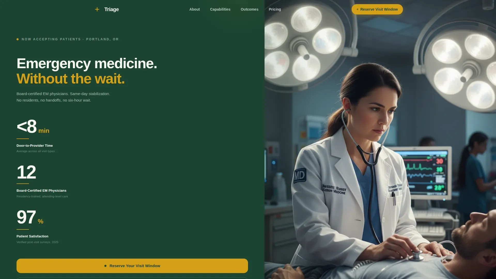
- A stats-driven hero with three oversized performance figures and an editorial physician photograph
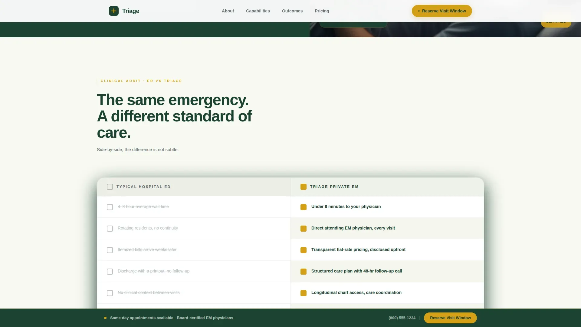
- A diagnostic comparison checklist showing hospital pain points versus practice answers, with animated amber check reveals
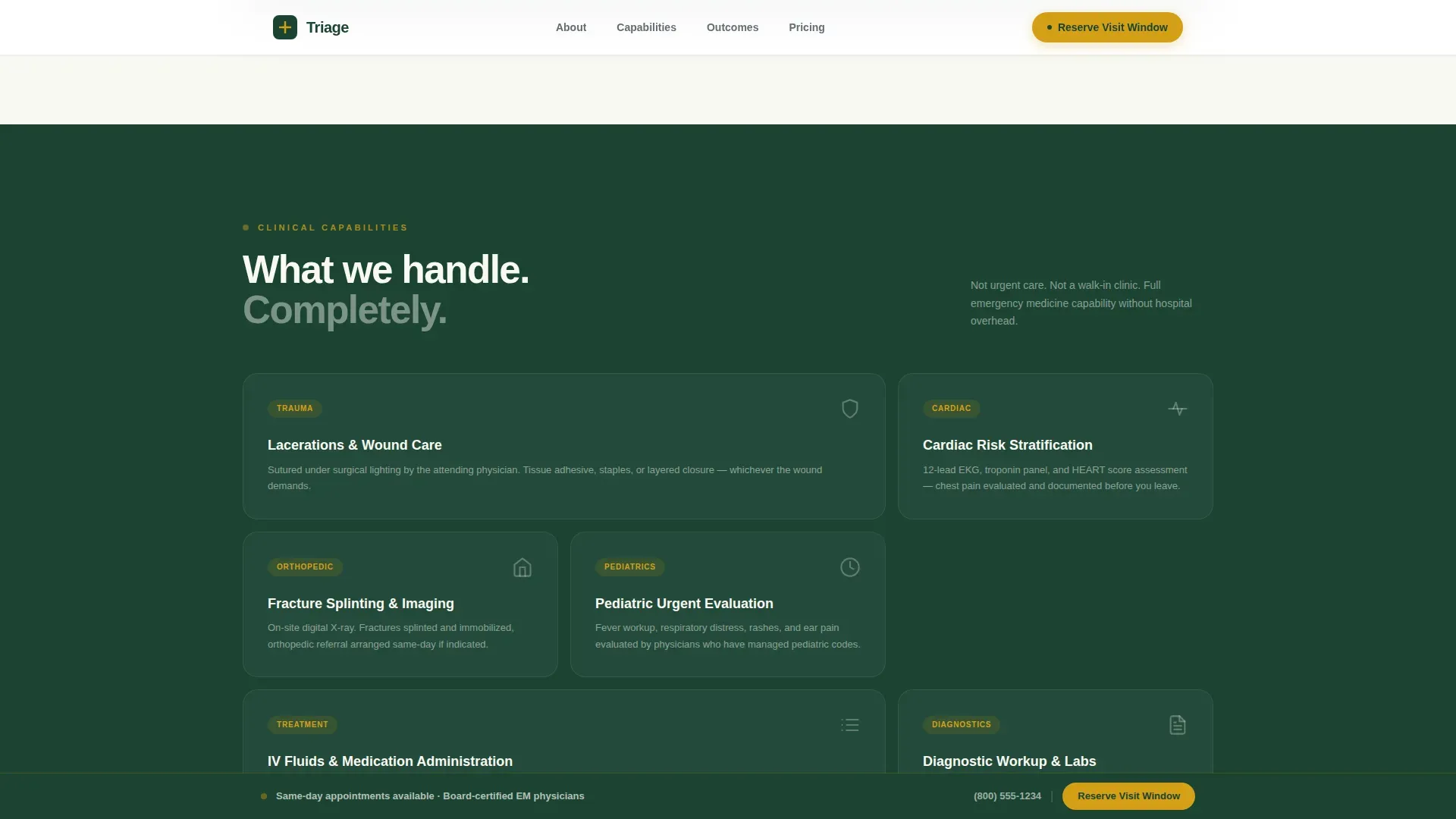
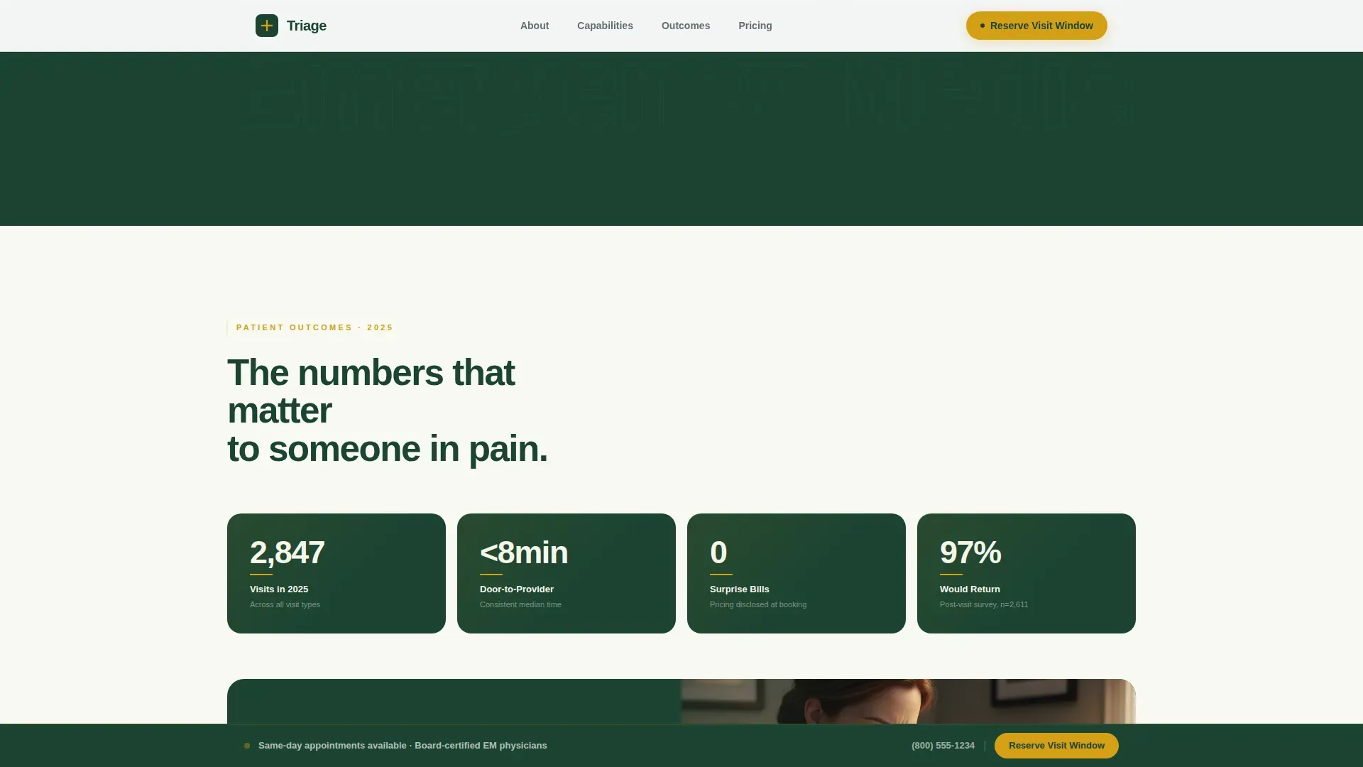
- A capabilities bento grid, a patient metrics section with real outcome numbers, and a full booking module with reason selector, time window picker, and triage line fallback
Feature list
The following features are built directly into this template based on the source brief.
Split-Screen Stats Hero
The hero divides into two equal panels. The left panel stacks three oversized figures, door-to-provider time, physician count, and patient satisfaction, each set in birch white on deep evergreen with a thin amber underline. The right panel holds a single editorial physician photograph shot tight at shoulder level under surgical light.
Diagnostic Comparison Checklist
Scrolling past the hero reveals a side-by-side audit of the typical hospital emergency department experience versus this practice. Left-panel pain points appear with unchecked charcoal boxes. Right-panel answers reveal amber checkmarks through a GSAP ScrollTrigger stagger animation, making the comparison feel methodical and evidence-based.
Capabilities Bento Grid
A bento-style grid organizes the full range of clinical capabilities: laceration repair, fracture splinting and imaging, chest pain risk stratification, and more. Each cell is self-contained and scannable, giving visitors a clear picture of what the practice handles before they book.
Booking Module with Reason Selector
The booking section includes a tab-style reason-for-visit selector covering injury, illness, diagnostic evaluation, and follow-up. Visitors choose a preferred time window in 12-hour format, then enter their name and phone number. A secondary "Call Our Triage Line" path with a live phone number sits directly beneath the form.
Sticky Call-to-Action Bar
After the second scroll section, a sticky bottom bar appears carrying the primary "Reserve Your Visit Window" call to action in amber against evergreen. The bar stays visible as visitors continue reading, reducing the effort required to book at any point in the page.
Patient Metrics and Social Proof Section
A dedicated section surfaces real outcome numbers and patient-reported satisfaction data. Testimonials accompany the metrics to give context to the figures, reinforcing the practice's claims with direct patient voice before the booking form appears.
Page sections overview
| Section | Purpose |
|---|---|
| Hero Stats Wall | Display speed, credentials, and satisfaction metrics alongside an editorial physician photo |
| Diagnostic Comparison Checklist | Contrast hospital pain points with practice answers through animated audit-style reveals |
| Capabilities Bento Grid | Show the full range of clinical cases the practice handles in a scannable grid layout |
| Patient Metrics Section | Reinforce trust with real outcome numbers and patient testimonials |
| Booking Module | Capture visit reason, preferred time, and contact details with a triage line fallback |
| Footer | Single-row linear footer with essential practice links and contact information |
Design & branding system
The visual identity follows a Corporate Precision theme built on a Forest Trust color system. The palette deliberately balances clinical authority with organic warmth, so the page feels credible rather than cold.
- Deep evergreen (#1B4332) anchors backgrounds and section dividers; birch white (#F8F9F2) opens breathing room across content panels; steady-state charcoal (#2D3436) carries all body text
- Pulse-point amber (#D4A017) is reserved exclusively for calls to action, urgency indicators, and checklist check reveals, it appears only where action is needed
- Typography uses DM Sans for headings and Manrope for body text, pairing clinical authority with readable warmth across every section
Mobile & speed optimization
The template is designed desktop-first around the 50/50 split-screen hero, with a full mobile responsive fallback that stacks panels vertically without losing the visual hierarchy or the sticky call-to-action bar.
- GSAP ScrollTrigger animations are used for checklist stagger reveals and section transitions, keeping motion purposeful rather than decorative
- Interactive elements, the booking form, tab-style reason selector, and sticky bar, are built as client components, while static sections use server components to keep initial load lean
- The sticky bottom bar and the triage line phone number remain accessible at every scroll depth on both desktop and mobile
How this template helps you convert
Every layout decision in this template is made with a distressed, time-sensitive visitor in mind. The goal is to remove doubt before the form ever appears.
- The hero leads with the three numbers that matter most to someone in pain, how fast they will be seen, who will see them, and how satisfied past patients were, so the visitor's first impression is evidence, not marketing language.
- The diagnostic checklist converts abstract claims into a visible audit, letting visitors compare a familiar bad experience against a specific, named alternative on the same screen without needing to search for reassurance.
- The booking module is the last section the visitor reaches, positioned as the natural next step after proof has been delivered, and the triage line ensures that visitors whose urgency cannot wait for a form still have an immediate path to the practice.
Other information about this template
This template is categorized under Health and Medical, with a specific focus on the Emergency Medicine private practice niche. It is built for direct-pay urgent care operations in the United States, using USD pricing references and 12-hour time format throughout the booking module.
- The template uses a linear single-row footer pattern consistent with focused landing page layouts that minimize exit opportunities
- Animation intensity is set to medium, using GSAP ScrollTrigger for stagger reveals and checklist item animations without overwhelming visitors who are already under stress
- The page is localized for a US audience and reflects direct-pay, transparent-pricing positioning throughout, which is central to the practice's value proposition
Theme
Corporate Precision
Creative direction
Checklist & Audit
Color system
Forest Trust
Style
Split Screen (50/50)
Direction
Booking/Scheduling
Page Sections
Split-screen Stats Hero
Animated Diagnostic Checklist
Capabilities Bento Grid
Booking Module with Reason Selector
Sticky Call-to-action Bar
Patient Metrics and Testimonials
Related questions
What type of medical practice is this template designed for?
Can I customize the metrics and checklist content?
How does the booking module handle different visit types?
Does the sticky call-to-action bar appear on mobile as well?
Is this template suitable for a concierge medicine referral workflow?



