Emergency Physician Comparison Website Template
Triage is a comparison table landing page built for emergency medicine professionals. It presents protocol-driven condition cards that map symptoms to differentials to interventions in clinical order. The layout uses side-by-side differential tables, a specialty-first lead generation form, and a typographic header that mirrors how a physician thinks through a case.
by Rocket studio
Quick summary
Triage is a lead generation landing page for an emergency medicine reference library. It organizes clinical conditions into protocol-driven cards that follow the exact sequence a physician uses: symptom, differential, intervention. The design is sterile and high-contrast, built for fast scanning at a workstation or on a phone during a call shift.
Who this template is for
This template is built for emergency medicine professionals who need a reference tool that works at the speed of a real shift. It fits educators and product teams building clinical decision-support resources for frontline providers.
- Attending emergency physicians updating their clinical practice
- Emergency medicine residents drilling differential diagnoses before overnight shifts
- Nurse practitioners and physician assistants working as sole providers in rural emergency departments
What problem this template solves
Clinical reference tools are often organized by textbook logic, not by how a physician's hands actually move in a room. This template solves the gap between how medical information is stored and how it is retrieved under pressure.
- Scattered protocols force providers to lose time during high-acuity moments
- Generic landing pages cannot communicate clinical depth to a skeptical physician audience
- Standard lead forms ask for commitment before demonstrating value to the user
What you get with this template
You get a fully structured, single-page layout designed to demonstrate the depth of a clinical protocol library while generating qualified leads. Every section has a defined clinical and conversion purpose.
- A typographic hero section that communicates the product's core logic before any explanation is needed
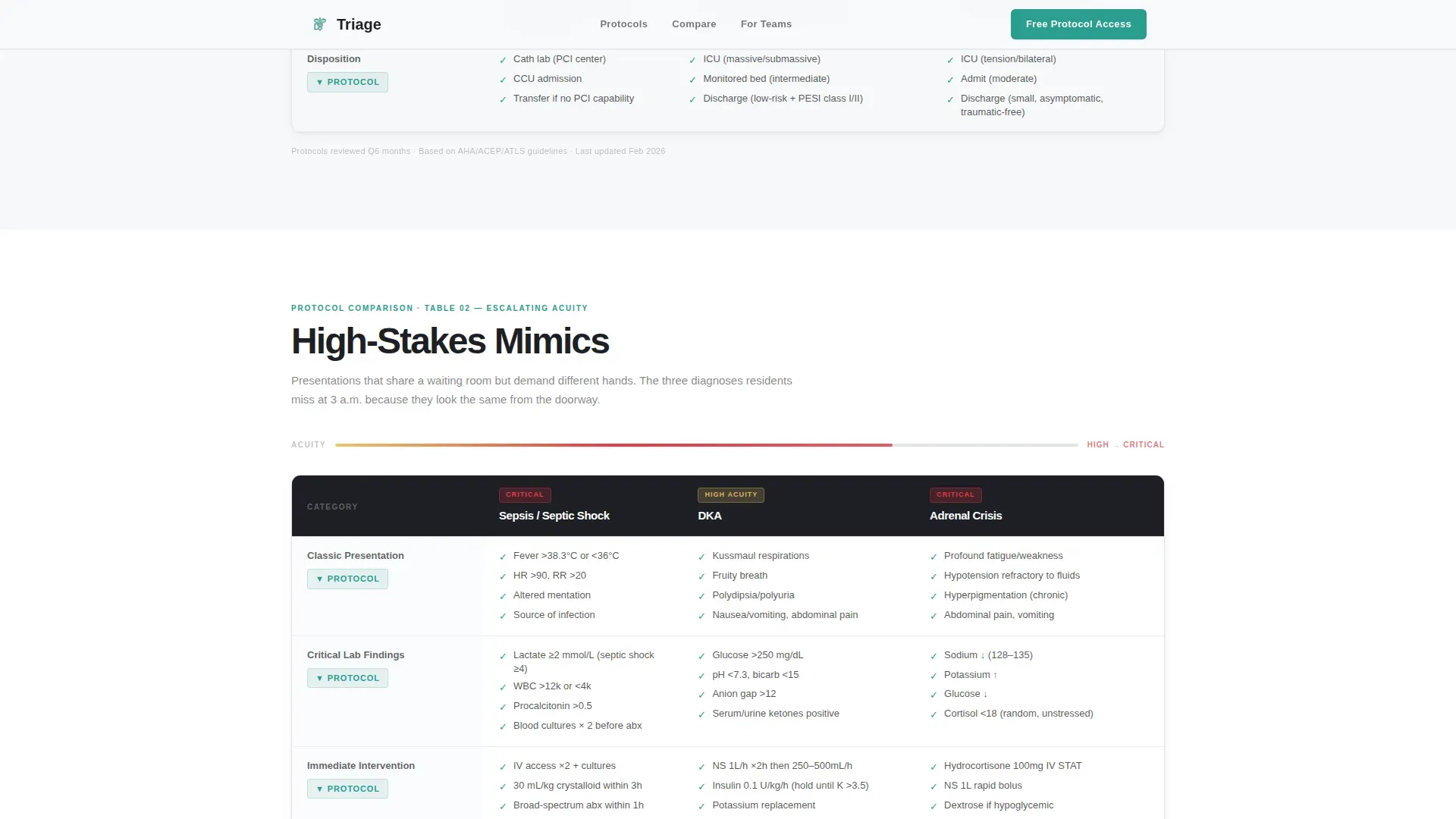
- Side-by-side comparison tables for chest pain differentials and high-acuity mimics with expandable protocol row previews
- A specialty-first three-field lead form plus a gated PDF download path for visitors not yet ready to register
Feature list
This template includes a focused set of components built specifically around clinical reference communication and lead capture.
Stacked Type Tower Hero
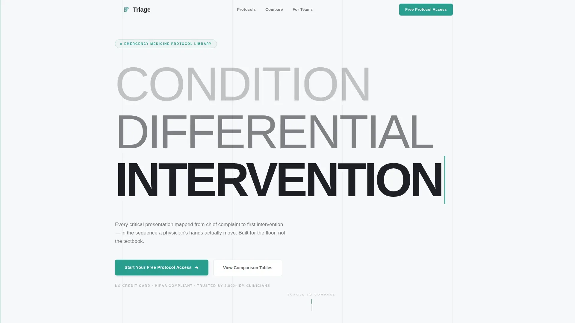
The header arranges three words in a typographic cascade: "CONDITION" in ultra-light weight at the top, "DIFFERENTIAL" in medium weight below it, and "INTERVENTION" in heavy bold at the bottom. Each line grows darker and heavier, mirroring the clinical decision pathway from presentation to action. A single teal cursor blinks beside "INTERVENTION" to signal that the system is ready.
Side-by-Side Differential Tables
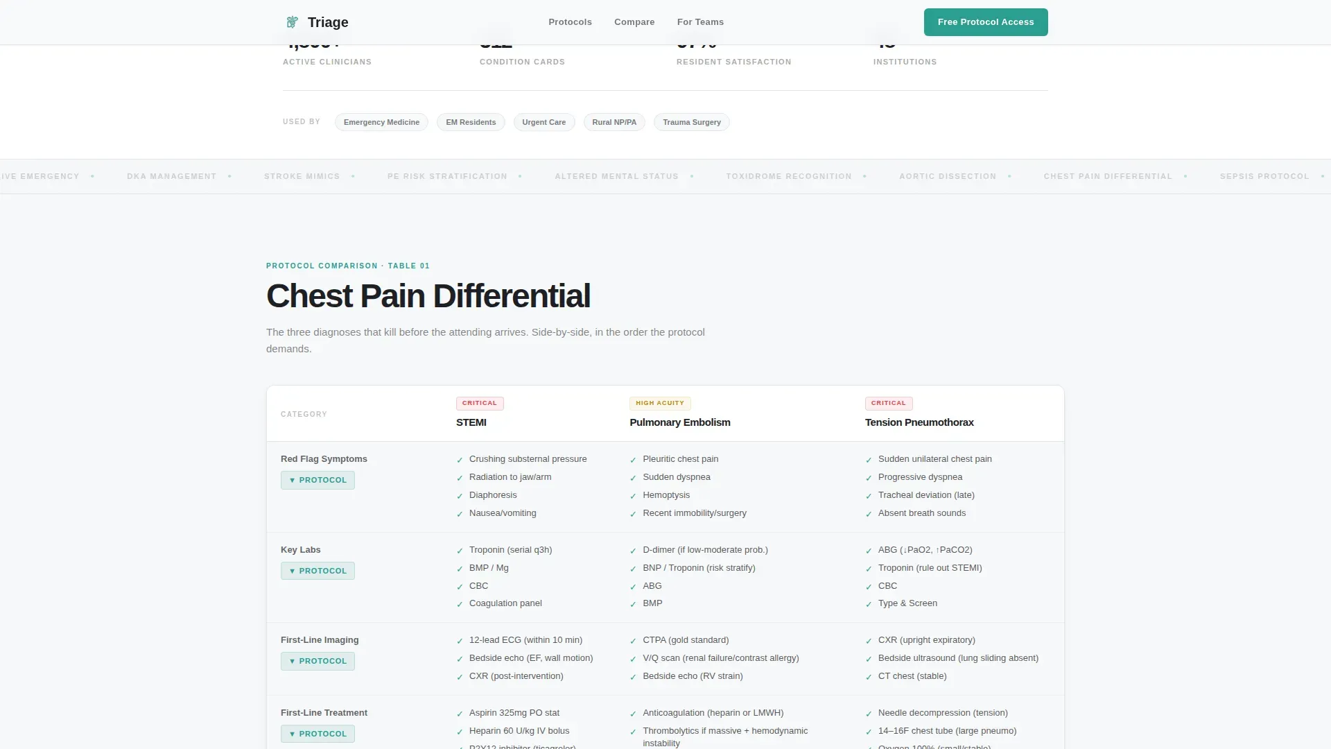
Comparison tables place conditions next to each other exactly as a physician runs a differential. The chest pain section maps STEMI, pulmonary embolism, and tension pneumothorax across rows covering red flags, key labs, imaging, and first-line treatment. Checkmark icons mark each completed protocol row, reinforcing the checklist-and-audit rhythm of real clinical decision-making.
Expandable Protocol Row Previews
Every table row includes a "View Full Protocol" expansion that opens a preview of the deeper condition card. This demonstrates the library's depth without requiring registration. Visitors see enough clinical detail to understand the product's value before they commit to signing up.
Specialty-First Lead Capture Form
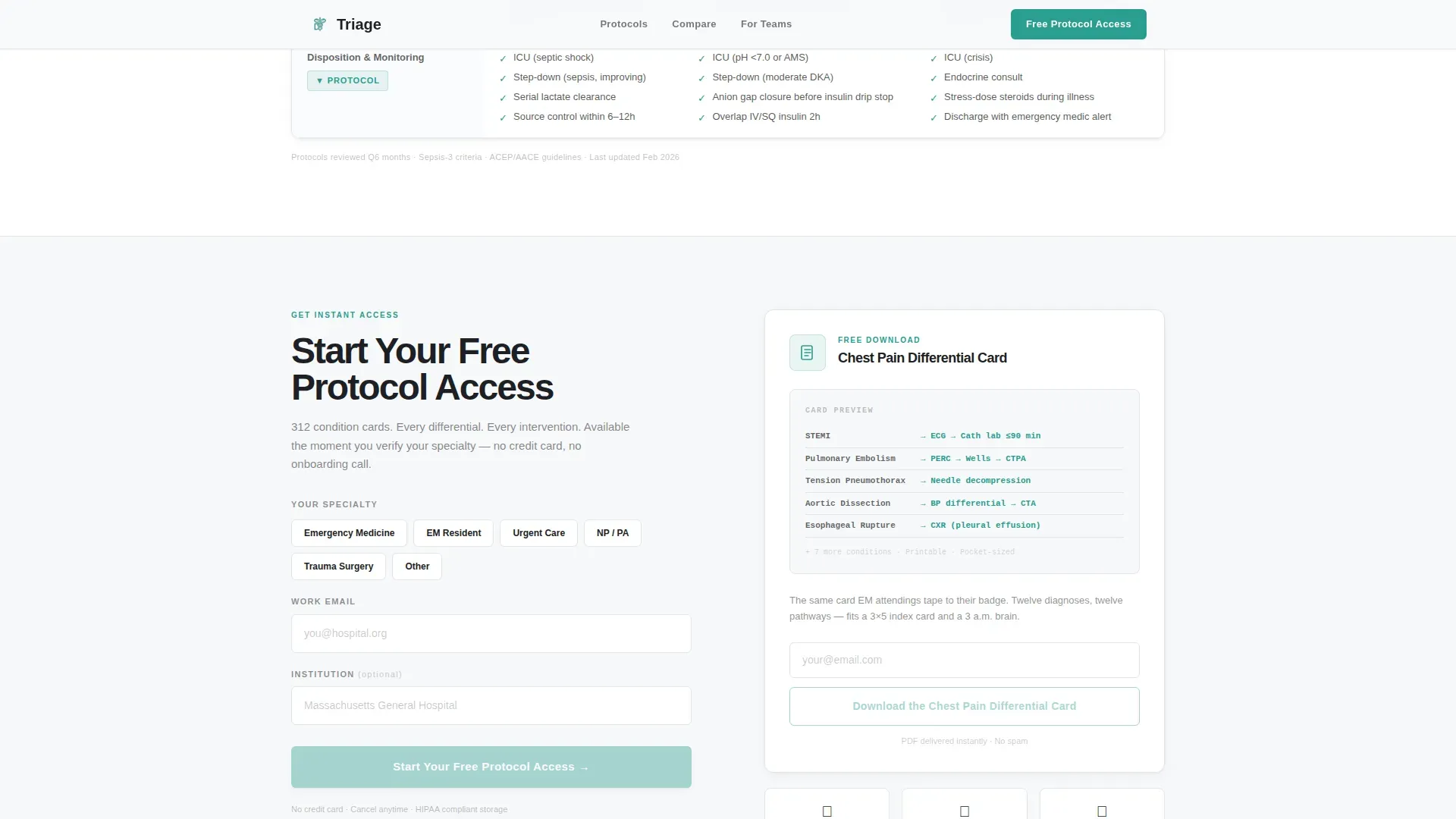
The three-field registration form asks for specialty before email or institution name. Visitors self-identify as Emergency Medicine, Urgent Care, EM Resident, or NP/PA first. This ordering reduces friction and filters leads by clinical identity before asking for any contact information.
Gated PDF Secondary Path
A secondary conversion path offers a downloadable chest pain differential card as a portable document file. Visitors who are not ready to register can still exchange their email for a tangible clinical artifact. This path captures leads through demonstrated value rather than direct commitment.
Social Proof Strip
A trust section displays institution counts, specialty distribution, and protocol depth metrics. These signals are relevant to the physician audience, which evaluates tools by clinical credibility before usability or design.
Page sections overview
| Section | Purpose |
|---|---|
| Stacked Type Hero | Communicates condition-differential-intervention logic visually |
| Chest Pain Tables | Side-by-side STEMI, PE, and tension pneumothorax comparison |
| High-Acuity Mimics | Escalating-acuity comparison tables with expandable protocol rows |
| Lead Generation Form | Specialty-first three-field registration with PDF download option |
| Social Proof Strip | Institution logos, specialty counts, and protocol depth metrics |
| Footer | Single-row linear footer with navigation and legal links |
Design & branding system
The visual identity follows a Medical Clarity theme built on the Cloud Canvas color system. Every design decision prioritizes scanability and clinical authority over decoration.
- Backgrounds use soft clinical white (#F7F8FA) and light instrument gray (#E2E5EA); teal (#2A9D8F) appears only on interactive elements and active protocol highlights
- Deep charcoal (#1D1F24) carries all body text and headings with the weight of a printed drug reference
- Typography uses the Manrope typeface across an ultra-light to ExtraBold weight cascade, matching the stacked header hierarchy
Mobile & speed optimization
The template is designed desktop-first to match emergency department workstation use. Mobile support is built for residents checking references during on-call shifts.
- The primary call-to-action button persists as a fixed bottom bar on mobile, keeping "Start Your Free Protocol Access" visible throughout the scroll
- Table layouts and expandable rows are adapted for touch interaction on smaller screens
- Server Components handle static content to reduce the amount of JavaScript loaded on the page
How this template helps you convert
Every layout decision in this template moves a clinically trained, skeptical audience from curiosity to registration by proving value before asking for anything.
- The comparison tables build clinical trust immediately by demonstrating protocol depth across real high-stakes conditions, so visitors recognize the library's usefulness before they see the form
- The specialty-first form order lets physicians self-identify before entering contact details, which reduces the psychological friction of commitment and improves lead quality
- The gated PDF download gives hesitant visitors a low-commitment path that still captures their email, so no qualified lead leaves the page empty-handed
Other information about this template
This template is categorized under Health and Medical, with a subcategory of Emergency Physician Website. It sits within the Emergency Physician Condition and Treatment Library niche and is designed as a comparison table layout with a Lead Generation page direction.
- The animation level is set to medium, including entrance sequences, table row reveals, the cursor blink in the hero, and scroll-linked interactions
- Interactivity is high, covering expandable protocol rows, a specialty selector, and form validation
- The template is localized for United States English with no currency formatting and standard date conventions
- The Checklist and Audit creative direction shapes how every table and row is presented, making the experience feel like reviewing a structured protocol rather than browsing a website
Theme
Medical Clarity
Creative direction
Checklist & Audit
Color system
Cloud Canvas
Style
Comparison Table
Direction
Lead Generation
Page Sections
Stacked Type Tower Hero
Side-by-side Differential Tables
Expandable Protocol Row Previews
Specialty-first Lead Capture Form
Gated PDF Secondary Path
Social Proof Strip
Related questions
Who is this landing page template designed for?
What kind of content goes into the comparison tables?
How does the lead generation form work?
Can this template support both desktop and mobile users?
What makes this different from a general medical website template?



