Emergency Medicine Reviews Website Template
Triage is a sidebar companion landing page built for a 24/7 emergency telemedicine service. It connects patients with board-certified emergency physicians via video in under 90 seconds. The layout pairs a guided multi-step symptom form with a sticky sidebar, a testimonial mosaic, a zip code coverage checker, and a physician credentials strip, all tuned for mobile-first, high-urgency moments.
by Rocket studio
Quick summary
Triage is a single-page emergency telemedicine landing page designed for one high-stakes moment: a person who needs a doctor right now. The layout puts a calming, structured form in front of panicked visitors, pairs it with a persistent physician sidebar, and builds trust through real patient stories and verified clinical credentials, guiding every visitor toward a coverage check or a saved contact before they close the tab.
Who this template is for
This template is built for emergency telemedicine services that need to convert frightened visitors into confirmed patients within seconds. It serves healthcare brands whose audience reaches for a phone before they reach for car keys.
- New parents and caregivers dealing with pediatric emergencies at unpredictable hours
- Rural residents in counties where the nearest urgent care closes before dinnertime
- Business travelers in unfamiliar cities who need immediate medical guidance without navigating a local hospital system
What problem this template solves
Medical emergencies don't happen during office hours. Most health websites still feel like intake paperwork, slow, cold, and built for calm. This template solves the trust gap between a panicked visitor and a clinical service they've never used before.
- Visitors arrive frightened and need to feel answered immediately, not browsed
- Standard contact forms offer no reassurance of speed, credentials, or real availability
- Rural and traveling patients need local coverage proof before they can commit
What you get with this template
This template delivers a complete, conversion-focused landing page structured around urgency, proof, and micro-commitment. Every section is purpose-built to reduce hesitation and replace it with confidence.
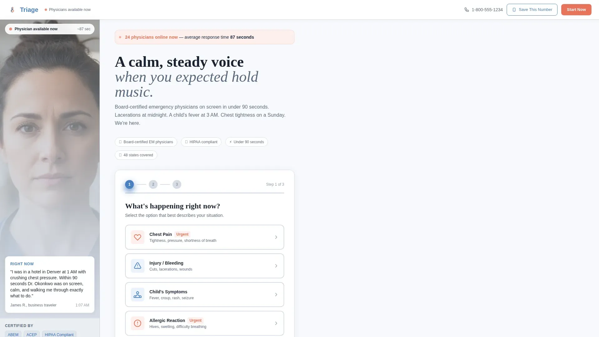
- A three-step symptom intake form in the hero, with a live physician availability indicator
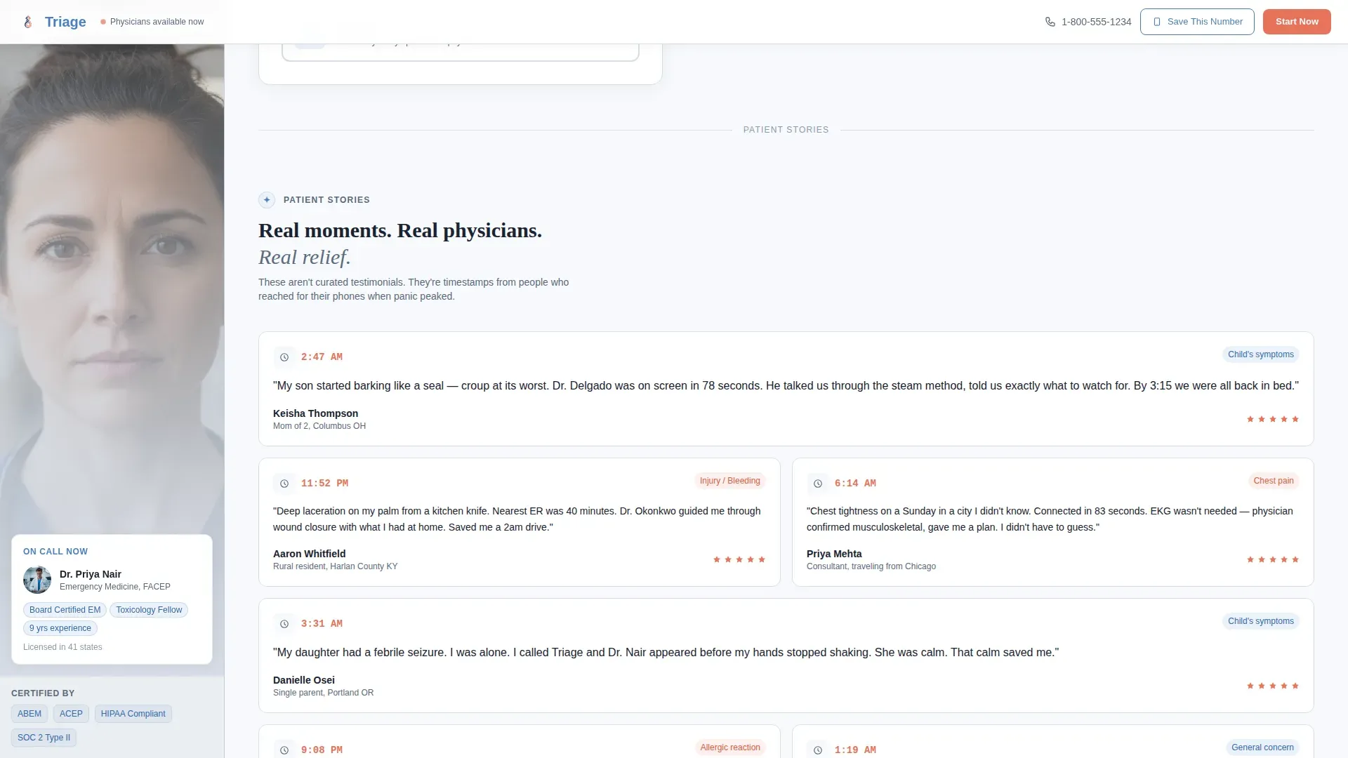
- A scrollable testimonial mosaic featuring timestamped patient stories and situational snapshots
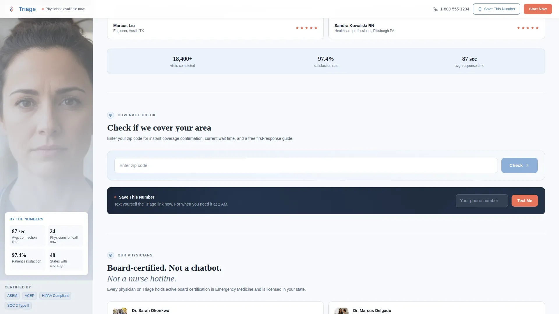
- A zip code coverage checker that returns instant coverage confirmation, regional wait times, and a downloadable first-response PDF
Feature list
This template includes six purpose-designed components. Each one handles a specific barrier between a frightened visitor and a confirmed patient connection.
Three-Step Symptom Intake Form
The hero section leads with a guided form that walks visitors through symptom selection, patient details, and availability confirmation. Step one offers five large tappable symptom cards. Step two captures patient age and current medications. Step three shows a pulsing coral availability badge beside a single confirmation button, designed to feel like a calm voice asking the right questions, not a bureaucratic intake process.
Sticky Physician Sidebar
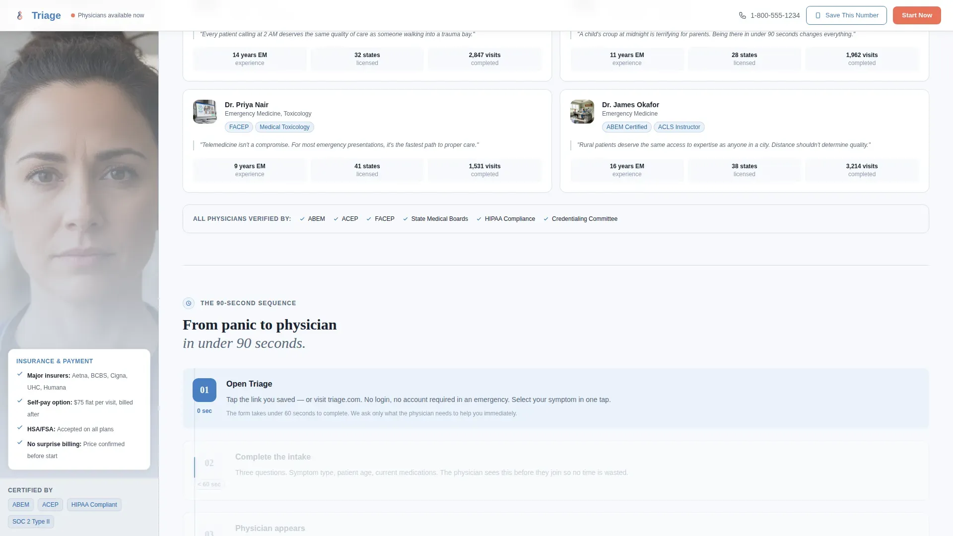
A persistent sidebar runs alongside the main content column throughout the page. It opens with a soft-focus photograph of a physician mid-consultation and cycles through physician credential bios, average response time data, state licensure maps, and insurance compatibility details as the visitor scrolls, answering rational objections while the main column builds emotional trust.
Timestamped Testimonial Mosaic
Rather than generic review cards, the testimonial section presents situational snapshots: a 2:47 AM timestamp beside a quote about a toddler's croup, a rural zip code paired with a stitches-over-video story, a business traveler's two-sentence relief. These are not portraits but real-moment compositions designed to mirror the visitor's own potential experience.
Zip Code Coverage Checker
The primary conversion section asks for a zip code and instantly returns three things: coverage confirmation for that region, the average physician wait time for that area, and a downloadable PDF titled "What To Do Before the Doctor Appears" with basic first-response guidance. This section turns browsing into preparation.
Save This Number SMS Path
A secondary conversion option lets visitors text the service's direct link to their own phone for true-emergency bookmarking. This micro-commitment is designed for people who are not in crisis yet but want the number ready when they are.
Physician Credentials Strip
A dedicated section displays board certifications, state licenses, and physician experience markers. Credentials are styled with the reassurance blue accent color to signal clinical authority clearly and without clutter.
Page sections overview
| Section | Purpose |
|---|---|
| Hero Form | Three-step symptom intake with sticky physician sidebar |
| Testimonial Mosaic | Timestamped patient stories building emotional proof |
| Coverage Checker | Zip code input returning coverage, wait time, and PDF |
| Credentials Strip | Board certifications, licenses, and physician experience |
| How It Works | Three-step 90-second sequence visualization |
| Footer | Single-row linear links and contact anchors |
Design & branding system
The visual identity follows a Medical Clarity theme built on a Soft Mist color palette. The result feels like a modern urgent care clinic at dawn: scrubbed, precise, and quietly human. DM Sans handles all body copy and interface labels for clean legibility at small sizes, while Fraunces serif display headings give the page a grounded, trustworthy voice.
- Clinical white (#F7F9FC) fills open backgrounds; quiet fog gray (#D6DCE5) defines the sidebar and divider lines; reassurance blue (#4A7FC1) marks all interactive elements and physician credential labels
- Warm coral (#E8735A) appears exclusively on urgent call-to-action buttons and the live physician availability pulse indicator, making it impossible to miss the one action that matters most
Mobile & speed optimization
This template is built mobile-first. Visitors arriving mid-panic are almost always on a phone, not a desktop. Every layout decision prioritizes thumb-reachable interaction zones and fast visual clarity.
- GPU-accelerated CSS animations handle the coral pulse keyframe and scroll-synced sidebar cycling without layout jank on low-powered mobile devices
- The three-step form, symptom cards, zip code checker, and SMS call-to-action are all sized and spaced for one-handed mobile use in a high-stress moment
How this template helps you convert
This template is structured around two conversion goals: a zip code coverage check and a "Save This Number" micro-commitment. Every design and content decision funnels toward one of those two actions.
- The hero form replaces a passive homepage with an active intake experience. By the time a visitor reaches step three and sees the pulsing availability badge, they are already engaged with the service, not evaluating it from a distance.
- The testimonial mosaic and cycling sidebar create an alternating rhythm of emotional proof and clinical fact. Each scroll deepens trust so that when the coverage checker appears, visitors enter their zip code as preparation, not speculation.
Other information about this template
This template supports the full content and layout stack described in the project brief. It is a sidebar companion landing page format, meaning the sidebar is a persistent, scroll-responsive column rather than a collapsible menu or a static image block.
- The sidebar content cycles dynamically through physician bios, response time averages, state licensure maps, and insurance compatibility details as the visitor scrolls through the main column
- Animation interactivity is set to high, including entrance animations on scroll, the coral pulse keyframe on the availability badge, a marquee element, and the scroll-synced sidebar transitions
- The downloadable PDF resource ("What To Do Before the Doctor Appears") is included as a content conversion asset tied to the zip code checker section
- The footer uses a linear single-row pattern for clean, minimal navigation without distraction from primary conversion paths
Theme
Medical Clarity
Creative direction
Testimonial Mosaic
Color system
Soft Mist
Style
Sidebar Companion
Direction
Content/Resource
Page Sections
Three-step Symptom Intake Form
Sticky Physician Sidebar
Timestamped Testimonial Mosaic
Zip Code Coverage Checker
Save This Number SMS Path
Physician Credentials Strip
Related questions
Who is this landing page template designed for?
What are the two main conversion goals this template supports?
How does the sidebar work while a visitor scrolls?
Does the template include real patient testimonials?
Is this template suitable for mobile visitors in a medical emergency?



