Advanced General Practitioner Appointment Booking Website Template
The Triage landing page template is designed specifically for neighborhood general practitioner clinics that want to convert new visitors into registered patients. It leads with bold data, a three-column comparison table, and a pinned "Become a Patient" call to action. The result is a healthcare landing page that builds trust fast and moves prospective patients toward booking without friction.
by Rocket studio
Quick summary
Triage is a single-page healthcare landing page template built for general practitioner clinics ready to welcome new patients. It opens with stacked statistics, moves into an animated comparison table, and closes with a pinned call to action bar. The design blends clinical precision with genuine warmth, making it the right landing page for practices that earn trust before they ask for commitment.
Who this template is for
This landing page is built for independent general practitioner clinics, family medicine practices, and primary care providers who need a focused new patient welcome page. It suits practices that want to convince prospective patients with real data rather than vague reassurances. Whether you run a solo practice or a small clinical team, this template gives your landing page a confident, data-first voice.
- General practitioners and family medicine doctor practices welcoming new patients to the area
- Primary care providers whose patients need a clear reason to switch from urgent care or a closed practice
- Medical professionals running a neighborhood clinic who want a landing page that converts visitors efficiently
What problem this template solves
Most medical landing page options for general practitioners either feel too corporate or too generic. They bury the most convincing information, fail to differentiate the clinic from urgent care centers and the emergency room, and give visitors no clear reason to act. A landing page template for a general practitioner must blend professionalism with warmth to reassure patients and drive them to book an appointment. Triage solves this directly.
- Visitors arrive unsure whether your clinic is faster, cheaper, or better than urgent care; the comparison table answers all three questions immediately
- New patients moving to a neighborhood have no existing relationship with a local doctor and need a landing page that builds trust before they even call
- Practices without a dedicated intake landing page lose potential patients to whoever has a cleaner, clearer medical website
What you get with this template
Triage delivers a complete, single-page healthcare landing page structured around one goal: turning a curious visitor into a registered patient. Every section earns its place. The layout, the copy structure, and the interaction design all serve the same desired action, clicking "Become a Patient" and completing the intake portal. You get a purposeful medical landing page, not a generic placeholder.
- A stacked hero section with bold stats, an animated comparison table pitting your practice against urgent care and the emergency room, a philosophy paragraph, insurance logos, a testimonial card, and a pinned call to action bar
- Arctic White and periwinkle gradient branding with calm slate body text and soft teal interactive elements, using Plus Jakarta Sans headings and DM Sans body copy
- A click-through landing page structure with a secondary "Just have a question?" message modal, so contact forms stay lightweight and friction stays low
Feature list
This landing page template includes several key components designed specifically for general practitioner new patient acquisition. Each feature contributes directly to the landing page's ability to educate, reassure, and convert visitors.
Stacked Type Tower Hero
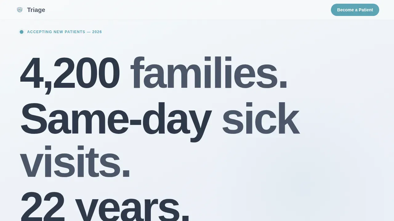
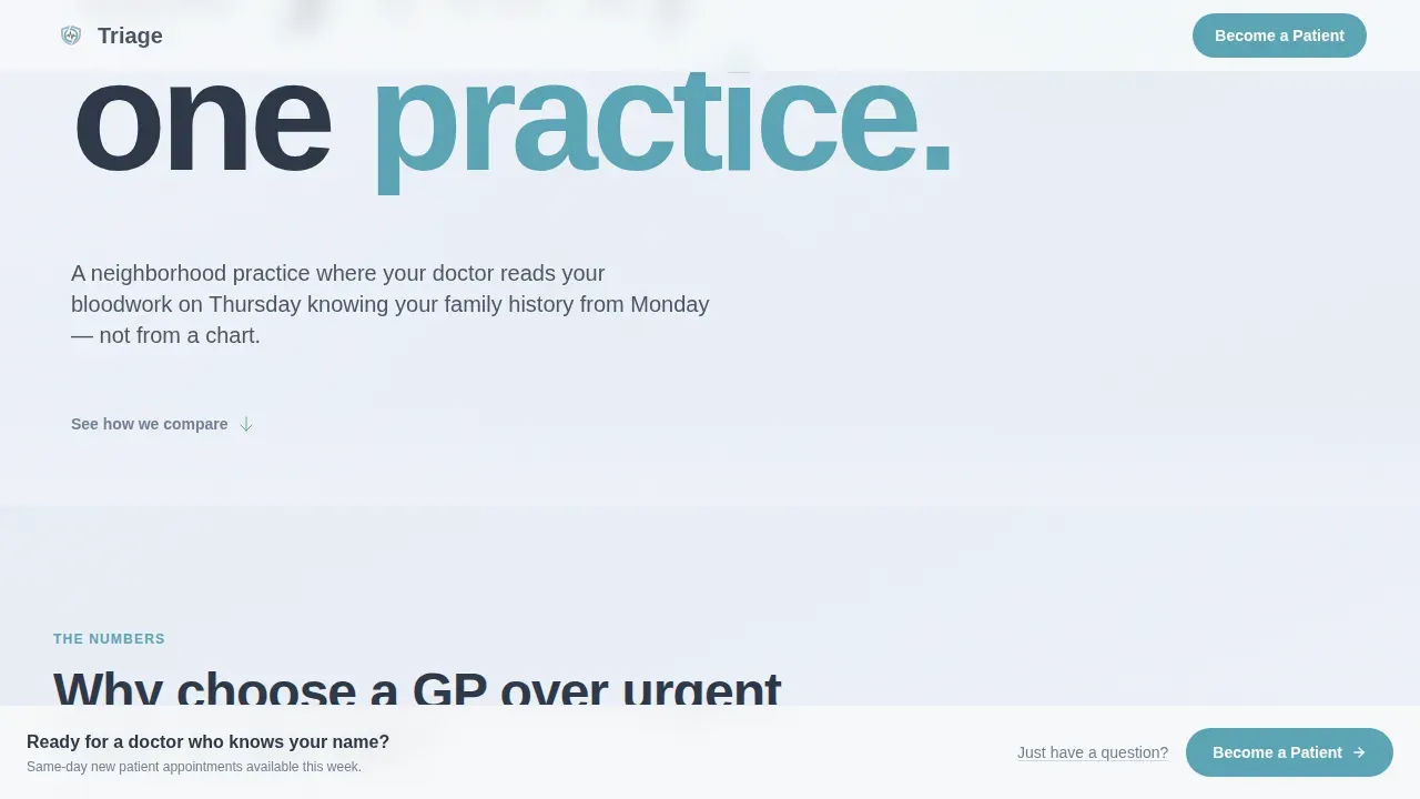
The hero section uses enormous flush-left numerals and bold statistics as its focal point. Lines like "4,200 families," "Same-day sick visits," and "22 years, one practice" stack vertically in Plus Jakarta Sans, functioning as both headline and proof simultaneously. There is no hero image to manage or update. The numbers are the visual. A teal accent underline draws the eye to the single most urgent stat on the page.
Animated Comparison Table
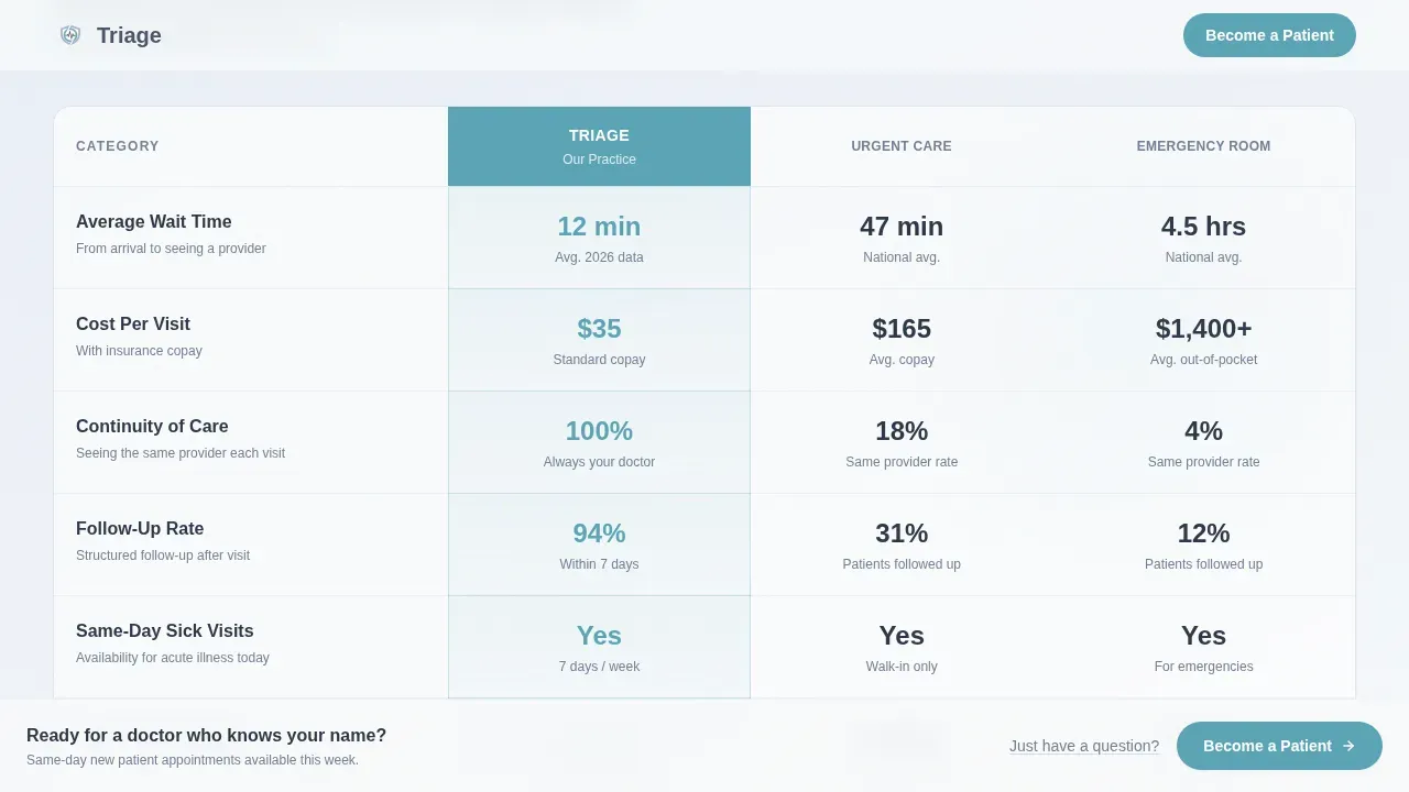
The core of this landing page is a three-column table comparing your practice directly against urgent care and the emergency room across metrics like average wait times, cost per visit, continuity of care, and follow-up rates. Each table row animates in sequentially as the visitor scrolls, so each advantage lands separately rather than all at once. Real numbers replace checkmarks, making the case for your clinic feel factual rather than promotional. This is the section that earns the click on the prominent call to action.
Pinned "Become a Patient" Call to Action Bar
After the visitor scrolls past the comparison table, a fixed bar appears at the bottom of the viewport carrying the primary call to action. The bar stays visible through the remaining sections, making it easy to act at any moment without scrolling back. It links directly to the practice's existing intake portal, so no separate form is needed on the landing page itself. Call to action buttons stay visible and accessible throughout the scroll.
Philosophy and Insurance Logo Section
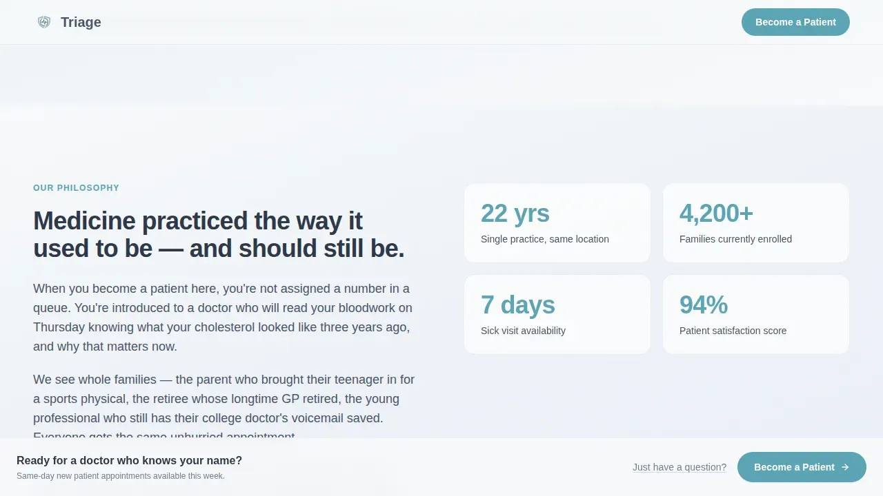
Below the table, the landing page softens. A brief philosophy paragraph gives the clinic a human voice after the data-heavy opening. Accepted insurance provider logos tile beneath it in grayscale, removing financial hesitation for potential patients before they reach the call to action. This section handles the emotional side of the conversion after the comparison table handles the rational side.
Single Testimonial Card
One patient testimonial appears in a soft card treatment. Patient testimonials at this position reinforce the data already seen in the comparison table with a human story. A single, well-chosen patient quote from someone who switched to the practice lands more convincingly than a generic grid of reviews. It is positioned to comfort the visitor just before the final push toward the call to action.
Secondary Question Modal
A text link reading "Just have a question?" sits alongside or near the primary call to action. Clicking it opens a simple message field modal. This gives hesitant visitors a lower-commitment path without cluttering the landing page with embedded contact forms. The modal keeps the page clean while still capturing visitors who are not yet ready to begin the full intake process.
Page sections overview
| Section | Purpose |
|---|---|
| Stacked Hero Stats | Opens with bold social proof stats to establish credibility immediately |
| Comparison Table | Differentiates the clinic from urgent care and emergency room with real numbers |
| Philosophy Paragraph | Adds warmth and clinical voice after the data-heavy table section |
| Insurance Logo Tiles | Displays accepted provider logos to reduce financial hesitation for visitors |
| Patient Testimonial Card | Reinforces trust with a single real patient story in a soft card layout |
| Pinned call to action Bar | Keeps the "Become a Patient" action visible after the visitor passes the table |
| Question Modal | Offers a lightweight message field for visitors not ready to start intake |
| Single-Row Footer | Closes the landing page with minimal, clean footer information |
Design & branding system
The Triage landing page uses a Soft Gradient visual theme built on an Arctic White color system. The palette shifts from clinical snow (#F8FAFB) into a barely-there periwinkle (#E8EDF6), with calm slate (#4A5568) carrying all body text and soft teal (#5BA4B5) highlighting buttons and interactive elements. Gradients between sections read as natural light movement rather than designed transitions, keeping the page calm and coherent from top to bottom.
- Typography: Plus Jakarta Sans for all headings at large scale; DM Sans for body text and clinical information, creating a legible hierarchy across desktop and mobile devices
- Color roles: Arctic White and periwinkle for backgrounds, slate for text, teal reserved for call to action buttons, the accent underline in the hero, and all interactive highlights
- Visual tone: sterile without being cold, medical without being frightening, every design decision supports the feeling of walking into a clinic where you are already expected
Mobile & speed optimization
The Triage landing page is built desktop-first, reflecting the fact that medical decision-making for primary care tends to happen on larger screens. However, the layout is fully responsive, adapting cleanly to mobile devices without sacrificing readability or usability. Over 45% of web traffic comes from mobile devices, and mobile responsiveness is essential for any healthcare landing page that wants to capture patients searching for a doctor on a phone.
- The comparison table reflows for smaller viewports so patients on mobile devices can still read all three columns clearly without horizontal scrolling
- The pinned call to action bar and the question modal remain accessible on touch screens, and the landing page structure supports a click-to-call phone number placement for mobile users
- Sequential row animations use Intersection Observer so they trigger correctly on scroll across both desktop and mobile, keeping the reveal effect intact without affecting overall page behavior
How this template helps you convert
The Triage landing page is structured around a single conversion outcome: getting a new patient to click "Become a Patient" and reach the intake portal. Every section either builds the case or reduces friction. The average conversion rate for healthcare landing pages is around 3.2%, but well-designed, data-first landing pages can reach significantly higher rates. This template is engineered to be a high converting landing page for primary care practices.
- The comparison table makes choosing any alternative, urgent care, the emergency room, or doing nothing, feel like the irrational option, so visitors arrive at the call to action already convinced rather than still undecided
- The pinned call to action bar with a prominent call to action keeps the next step visible at all times, so the visitor never has to hunt for how to act once the decision is made
- The secondary question modal captures visitors who need one more answer before committing, reducing abandonment without adding form complexity to the main landing page
Other information about this template
The Triage trusted family care general practitioner landing page template is designed to serve medical practices that operate in a genuinely relational model, where the doctor knows a patient's medical history and the clinical team provides continuity across every visit. It is well suited to private practices and independent medical clinics that compete with urgent care centers and emergency services for the same audience of unattached patients. Below are additional details relevant to practices considering this landing page.
- This landing page supports informative content placement for telehealth services alongside in-person appointments, so practices offering virtual consultations can explain both access options within the existing section structure
- The hero section is designed to work without professional photos, relying on typographic impact instead, which reduces the time and cost of launching the landing page and lets medical professionals go live faster
- The philosophy and insurance section can accommodate specific services like annual physicals, immunizations, and chronic medical conditions management as simple bullet points within the paragraph copy, helping patients quickly assess whether this doctor handles their needs
- The landing page connects to the practice's existing intake portal rather than collecting patient information directly on the page, keeping the landing page clean and directing sensitive patient data through the practice's own intake procedures
- Practices that also handle speaking engagements, clinical education, or telehealth services can adapt the philosophy section to briefly note those treatment options without restructuring the landing page
- The template is built to drive traffic from paid campaigns and search engines equally well, since the data-first layout answers the questions a visitor from any source would arrive with
- Medical website visitors evaluating a new doctor are serving a dual purpose: they are prospective patients researching options and, once registered, they become existing patients who will return to schedule appointments and access clinical information
- The landing page does not include embedded contact forms on the main page surface; instead, contact forms are surfaced only through the lightweight question modal, keeping the primary flow clean
- Practices should double check that their intake portal link and accepted insurance list are current before launching, since these are the two details most likely to affect visitor confidence at the point of conversion
- A great first impression depends on accurate, up-to-date clinical information; the template provides the structure, but the practice supplies the proof
Theme
Soft Gradient
Creative direction
Stats-First Impact
Color system
Arctic White
Style
Comparison Table
Direction
Click-Through
Page Sections
Stacked Type Tower Hero Section
Animated Three-column Comparison Table
Pinned Call to Action Bar
Philosophy and Insurance Section
Patient Testimonial Card
Secondary Question Modal
Related questions
Does this landing page include a built-in appointment booking form?
Can I display accepted insurance providers on this landing page?
How does the animated comparison table work?
Can a practice offering telehealth services use this template?
What makes this different from a generic medical landing page template?



