Urgent Care & Walk-In FAQ Website Template
Triage is a split-screen rural health clinic landing page built for patient acquisition through honest, fear-dissolving conversation. An FAQ-driven scroll guides ranchers, elderly patients, and young families from first question to confident action. Award badges, warm Organic Flow visuals, and a downloadable New Patient Guide turn a gravel-lot search into a trusted first step toward care.
by Rocket studio
Quick summary
Triage is a single-page rural health clinic template designed to convert cautious, cost-aware patients into new patient registrations. It leads with trust signals, then walks visitors through real questions about walk-ins, finances, and continuity of care. The primary call to action is a one-field email capture tied to a downloadable New Patient Guide.
Who this template is for
This template is built for rural primary care clinics, federally qualified health centers, and nurse practitioner-led practices serving patients in underserved areas. It fits any clinic where staff handle walk-in visits, telehealth consultations, and sliding-scale billing under one roof.
- Clinic administrators launching a new patient acquisition page for a rural or frontier community
- Nurse practitioners and independent providers building patient trust before the first visit
- Health center marketing teams needing a content-first resource page with downloadable materials
What problem this template solves
Rural patients arrive with more than a health concern. They carry the weight of long drives, tight budgets, and past experiences of being rushed or dismissed. A generic clinic page does nothing to ease that. Triage addresses it directly.
- Patients searching on a phone in a gravel lot need immediate clarity on walk-ins, cost, and provider access
- Uninsured or underinsured visitors leave pages that hide fee structures rather than answer the question plainly
- Clinics lose trust when they ask for contact details before proving they understand the patient's situation
What you get with this template
You get a fully structured single-page layout built around a FAQ-driven scroll that earns the visitor's trust section by section. Every component is purpose-built for rural health patient acquisition.
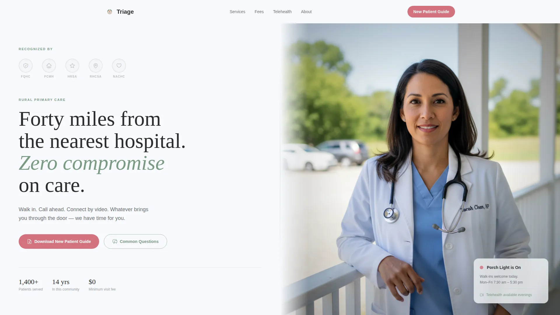
- A split-screen hero with an award badge wall, a practitioner photograph, and a floating availability status card
- Three layered FAQ sections covering practical access, financial options, and emotional continuity of care
- A primary call-to-action section with a single-field email capture, optional zip code confirmation, and a downloadable New Patient Guide
Feature list
A paragraph overview of the features: each component below is drawn directly from the template brief and serves a specific conversion or trust function.
Split-Screen Hero Layout
The hero divides the viewport evenly. The left panel displays the award badge wall rendered in sage monotone alongside a single serif tagline. The right panel holds a softly vignetted practitioner photograph. A floating status card anchors the lower portion of the hero, signaling current clinic availability.
FAQ-Driven Scroll Structure
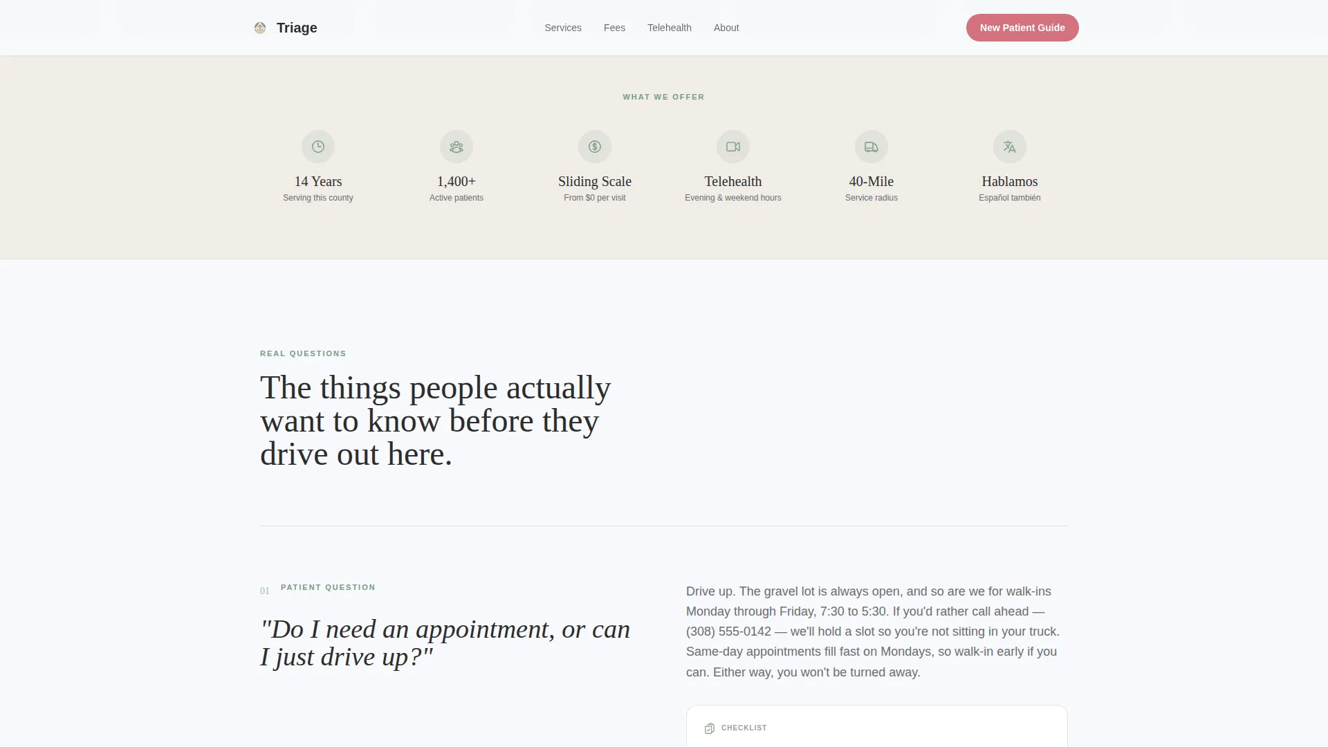
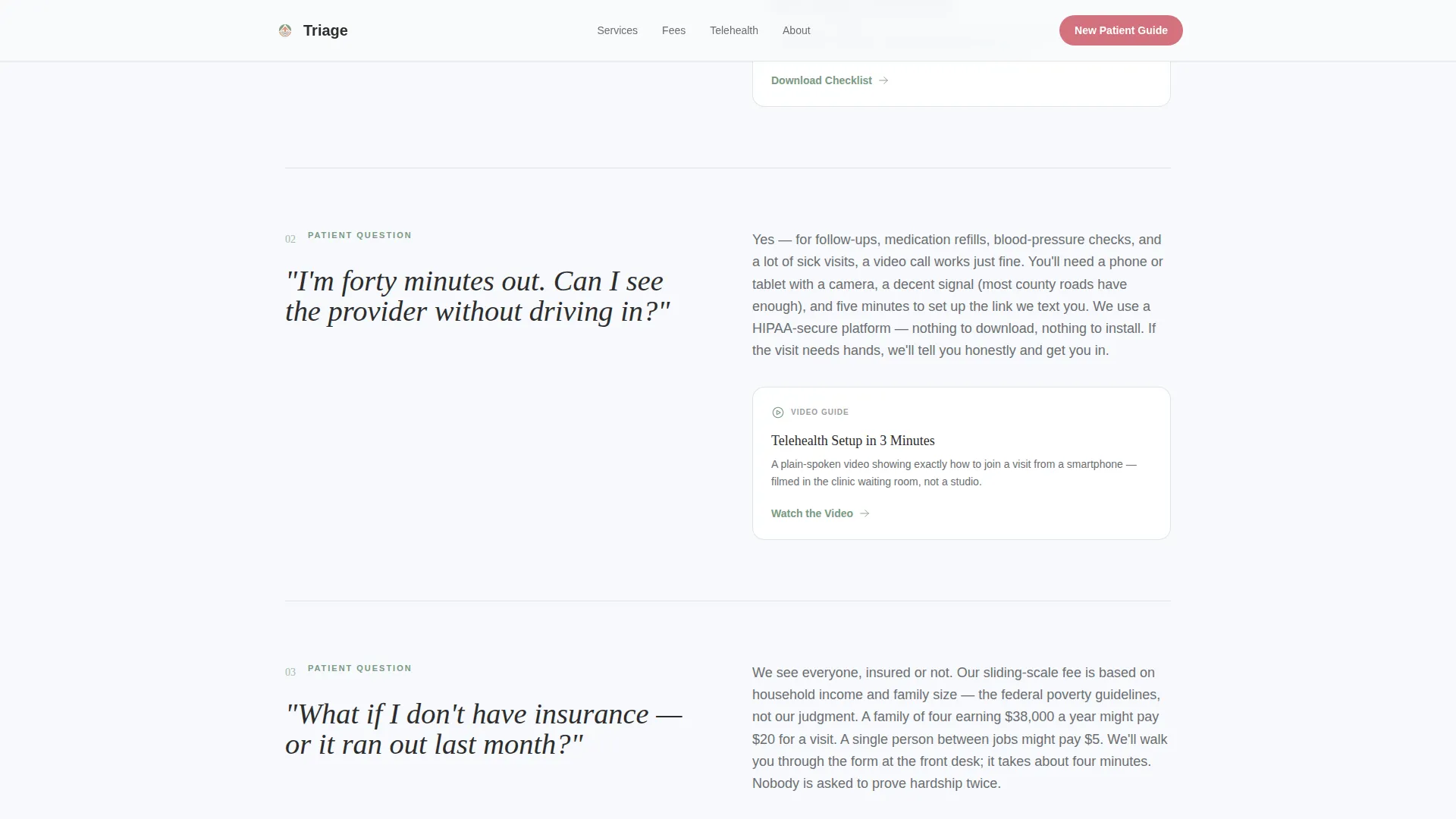
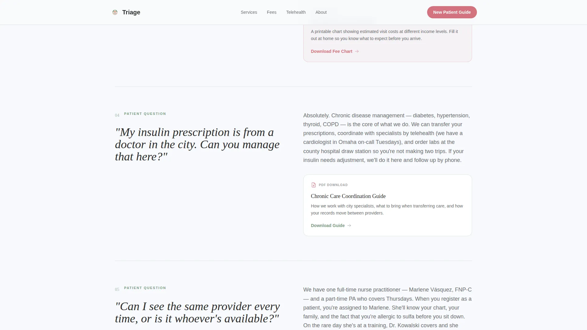
The page unfolds as a series of real patient questions set in large serif type on the left, with short paragraph answers and downloadable resource cards on the right. Questions progress from practical through financial to emotional, dissolving each barrier before the next one appears.
Downloadable Resource Card Grid
Secondary conversion points appear throughout the scroll as resource cards. Each card links to a printable sliding-scale fee worksheet, a telehealth setup checklist, or a seasonal vaccine schedule. Cards use spotlight hover states to draw attention without interrupting the reading flow.
Award Badge Trust Header
A horizontal band of recognition seals sits at the top of the hero section. Badges representing the Federally Qualified Health Center designation, Patient-Centered Medical Home recognition, Health Resources and Services Administration quality marks, and state rural health honors are displayed in a consistent sage monotone.
Primary Call-to-Action with Email Capture
The bottom section presents a single-field email form paired with an optional zip code field for service-area confirmation. The call to action reads "Download the New Patient Guide" and is styled in prairie-rose blush to stand out from the arctic white background.
Scroll-Reveal Animations
Sections animate into view as the visitor scrolls. Subtle parallax motion and FAQ hover states keep the page feeling alive without adding unnecessary loading weight. Resource card spotlight effects highlight secondary downloads without competing with the primary conversion goal.
Page sections overview
| Section | Purpose |
|---|---|
| Hero Split Screen | Establish trust with badges, tagline, and practitioner photo |
| Porch Light Status Card | Signal real-time clinic availability to arriving visitors |
| FAQ Section: Practical | Answer walk-in, hours, and telehealth questions with resource cards |
| FAQ Section: Financial | Address sliding-scale fees and uninsured patient options |
| FAQ Section: Emotional | Reassure patients about provider continuity and personal care |
| New Patient Guide call to action | Capture email and zip code; deliver downloadable guide |
| Resource Card Grid | Offer secondary downloads as mid-page conversion points |
| Footer | Linear single-row contact and navigation links |
Design & branding system
The visual identity follows an Organic Flow theme built on an Arctic White color system. The palette feels like a clean exam room with a window open to a hay field: clinical where it needs to be, warm where it counts. Typography pairs Fraunces serif headlines with DM Sans body copy for a grounded, readable hierarchy.
- Background: open-sky white (#F7F9FC) dominates generously; sage (#A3B9AA) anchors section dividers and iconography; warm gray (#6B6E70) carries body text
- Accent: prairie-rose blush (#D4727E) reserved strictly for interactive elements, calls to action, and trust signal highlights
- Typography: Fraunces serif for display headings and FAQ questions; DM Sans for answer paragraphs, labels, and resource card text
Mobile & speed optimization
The template is built mobile-first because the primary audience is most likely searching on a phone while parked on a gravel road. Layout decisions prioritize fast loading and thumb-friendly interaction before desktop polish.
- Split-screen columns stack vertically on small screens so no content is hidden or truncated on mobile viewports
- Scroll-reveal animations use lightweight reveal logic; resource card interactions rely on minimal JavaScript to keep page weight low
- Static server components handle the majority of page structure, limiting client-side rendering to interactive elements like the email form and FAQ hover states
How this template helps you convert
The page is designed as a trust ladder. Each section gives the visitor something useful before asking for anything in return. By the time the call to action appears, the visitor has already received real value and the download feels like the obvious next step.
- The FAQ scroll answers fears in sequence, starting with logistics and ending with personal continuity of care, so no unanswered concern remains before the call to action
- Resource cards throughout the page offer printable downloads as low-commitment conversions, warming visitors who are not yet ready to submit their email
- The single-field email capture paired with an optional zip code lowers friction at the final step, making the guide feel accessible rather than gated
Other information about this template
This template is part of a broader collection of health and medical landing page templates built for specific clinical niches. The Triage design can support rural urgent care clinics, community health centers, and frontier medicine practices that need to communicate value quickly to a skeptical audience.
- The FAQ-driven creative direction is well suited to any healthcare context where patient anxiety is a primary barrier to first contact
- The Arctic White color system and Organic Flow theme can be rebranded to match an existing clinic identity by swapping the accent color and badge assets
- The linear single-row footer pattern keeps the page focused on the primary conversion goal without adding navigational distraction
Theme
Organic Flow
Creative direction
FAQ-Driven
Color system
Arctic White
Style
Split Screen (50/50)
Direction
Content/Resource
Page Sections
Split-screen Hero with Badge Wall
Faq-driven Scroll Layout
Downloadable Resource Card Grid
Trust Signal Badge Header
Email Capture Call-to-action Section
Scroll-reveal and Hover Animations
Related questions
Can I edit the FAQ questions to match my clinic's real patient concerns?
Does this template support telehealth information without a separate page?
How does the sliding-scale fee content work in this template?
Is this template suitable for a walk-in-only clinic?
What does the New Patient Guide call-to-action section include?



