Advanced Emergency Dentist Appointment Booking Website Template
A hub and spoke landing page built for emergency dental virtual consultations. It guides panicked patients through a self-triage flow, from identifying where it hurts to booking a same-night video or phone consultation. The Stacked Type Tower hero, interactive symptom checklist, and three-step booking form work together to convert fear into a confirmed appointment, fast.
by Rocket studio
Quick summary
This single-page template turns dental panic into a structured booking experience. Visitors move through four diagnostic checkpoints, guided by an anchor navigation rail. By the time they reach the booking form, they have already described their symptoms. The page is calm, clinical, and built entirely around getting someone seen as quickly as possible.
Who this template is for
This template is designed for emergency dental practices and telehealth providers who want to convert late-night, high-stress visitors into confirmed virtual consultations. It works equally well for solo dentists offering after-hours video calls and group practices running an on-demand consultation service.
- Parents dealing with a child's dental injury outside clinic hours
- Shift workers, travelers, and uninsured patients who have delayed care and need guidance fast
What problem this template solves
When dental pain strikes at night or on a weekend, patients have nowhere obvious to turn. A standard clinic website offers a phone number that rings out and a contact form that replies in two business days. This template solves the gap between acute pain and professional guidance.
- Patients arrive panicked and leave with a booked consultation and a clear next step
- Dentists receive pre-populated symptom summaries instead of cold, uninformed intake calls
What you get with this template
The template includes a complete set of interactive components and section layouts built specifically for emergency dental triage and virtual booking. Every section serves a distinct role in moving the visitor from distress to action.
- A Stacked Type Tower hero with a pulsing call-to-action button and deliberate negative space
- A four-checkpoint anchor navigation hub, an interactive tooth region map, a visual severity scale, a tappable red-flag symptom checklist with a dynamic summary card, and a three-step booking form modal
Feature list
This template delivers purpose-built interactive features that guide visitors through self-assessment and straight into booking.
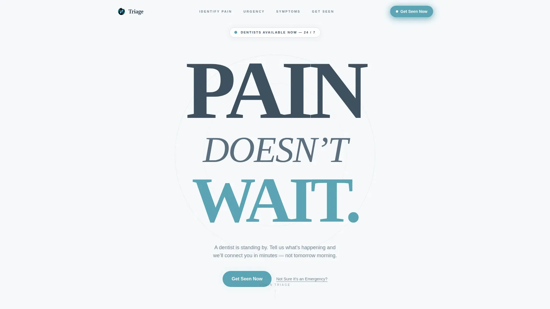
Stacked Type Tower Hero
The hero displays the words PAIN, DOESN'T, and WAIT stacked vertically in contrasting weights and sizes. A single pulsing teal button sits beneath the tower. There is no stock photography, just a typographic statement that commands attention and communicates urgency immediately.
Anchor Navigation Progress Rail
A sticky anchor navigation rail shows four triage checkpoints across the top of the page. Each checkpoint fills with a teal checkmark as the visitor completes it. This gives users a visible sense of progress and keeps navigation effortless on both desktop and mobile.
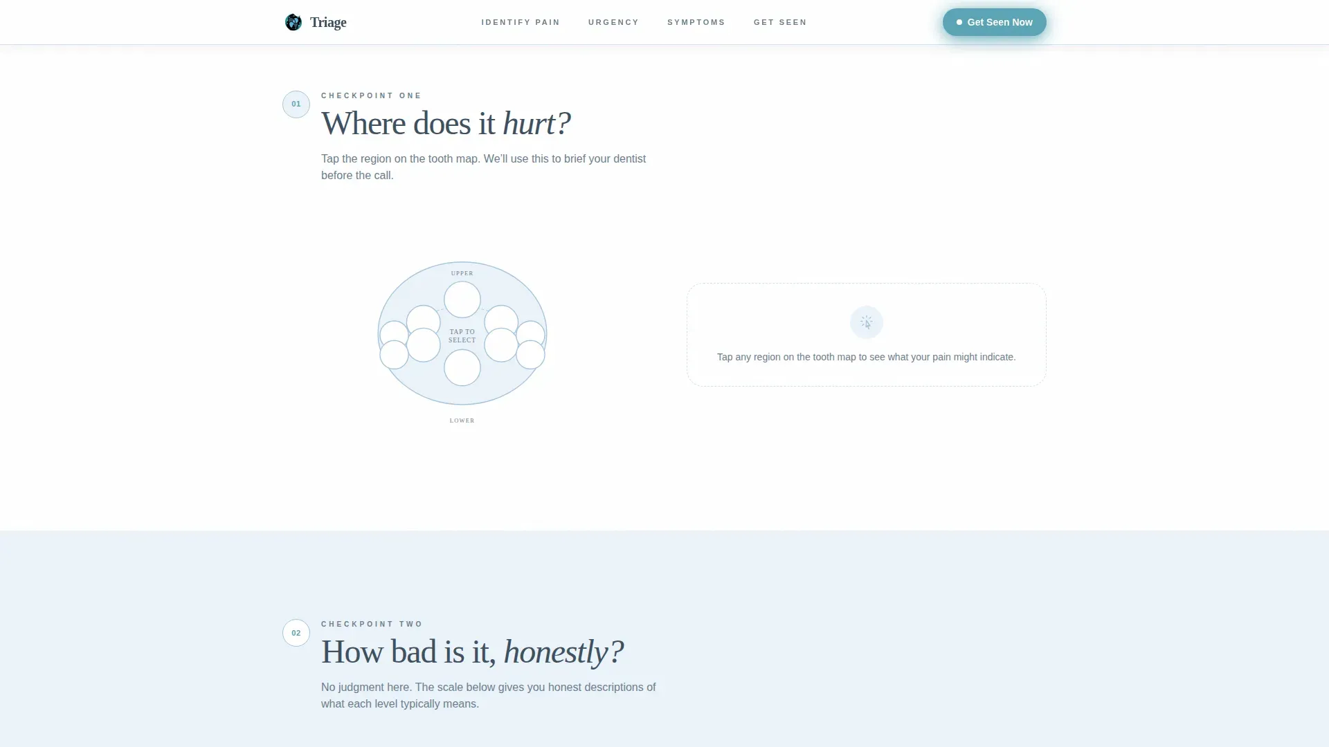
Interactive Tooth Region Map
The Identify Your Pain section presents an illustrated tooth map. Visitors tap the region that hurts to begin their self-assessment. The selection carries forward and pre-populates the booking form in step one, reducing friction at the point of scheduling.
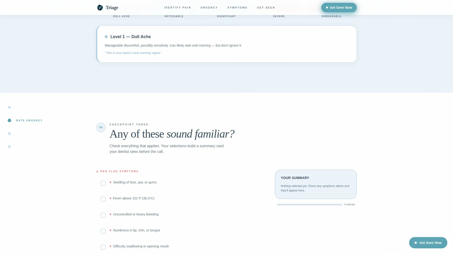
Visual Severity Scale
The Rate Your Urgency section uses a five-point visual scale, from dull ache to unbearable. Each level includes an honest plain-language description of what it likely signals. Visitors understand their situation more clearly and arrive at the booking step with realistic expectations.
Tappable Symptom Checklist with Dynamic Summary Card
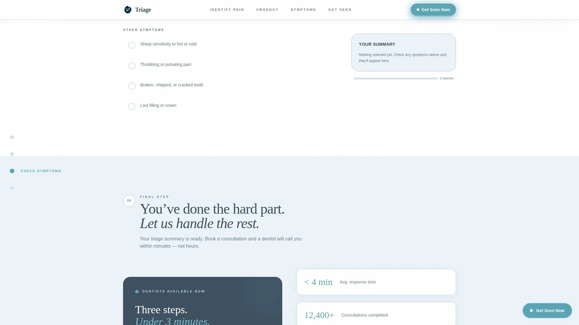
The Check Your Symptoms section presents a tappable checklist of red-flag indicators including swelling, fever, bleeding, and numbness. A summary card pinned to the side updates dynamically as selections are made. The completed summary auto-populates step one of the booking form.
Three-Step Booking Form Modal
The Get Seen Now modal walks visitors through three focused steps: symptom summary review, preferred consultation window and format (video or phone), and contact details with an inclusive no-insurance option. The form is triggered by the primary call-to-action button and by a persistent floating button that appears after the second spoke section.
Page sections overview
| Section | Purpose |
|---|---|
| Hero Type Tower | Delivers urgency and surfaces the primary call to action |
| Anchor Nav Hub | Orients visitors and tracks triage progress across checkpoints |
| Identify Your Pain | Interactive tooth map for locating and logging the pain source |
| Rate Your Urgency | Visual severity scale that sets honest expectations before booking |
| Check Your Symptoms | Red-flag checklist that builds a live symptom summary |
| Get Seen Now | Three-step booking modal that converts triage into a confirmed consultation |
| Footer | Linear single-row footer with essential contact and availability details |
Design & branding system
The visual identity follows an Organic Flow theme. The palette is clinical without being institutional, drawing on cool, medical tones that feel immediately reassuring rather than sterile or cold.
- Colors: clinical slate (#3D4F5F) for text and navigation, calming sky (#A8C6DF) as alternating section wash backgrounds, sterile white (#F7F9FB) as the dominant canvas, and soft teal (#5BA4B5) reserved exclusively for buttons and interactive checkmarks
- Typography: Fraunces handles the display and hero weight for emotional impact, while DM Sans carries body copy, navigation labels, and form fields for clean legibility
Mobile & speed optimization
This template is built mobile-first. The brief notes that roughly ninety percent of emergency dental searches happen on a phone, often late at night. Every interactive element, from the tooth map to the severity slider, is designed for touch input and one-handed use.
- CSS smooth scroll and Intersection Observer handle section transitions and scroll-triggered reveals without heavy page overhead
- GSAP animations power the scroll reveals, pulsing button, checkmark fills, and progress rail updates, keeping motion purposeful and load impact minimal
How this template helps you convert
The page removes every obstacle between a patient in pain and a confirmed booking. It does not ask visitors to read walls of text or find a phone number. Instead, it guides them through a structured process that builds trust and commitment with each completed step.
- The persistent floating call-to-action button and the secondary "Not Sure It's an Emergency?" screener path together capture both decisive visitors and hesitant ones, so no potential patient leaves without a next step
- The auto-populated booking form uses the visitor's own symptom selections to personalize step one, reducing perceived effort and increasing form completion rates
Other information about this template
This template is categorized under Health and Medical, specifically within the Emergency Dentist Website subcategory, and is optimized for the Emergency Dentist Virtual Consultation Page niche. It is built as a hub and spoke landing page with anchor navigation, which means all content lives on a single scrollable page with smooth jump links between sections.
- The page is localized for United States English, uses twelve-hour time formatting, and includes USD-friendly insurance field options including a no-insurance path that does not feel discouraging
- Social proof elements including a response time stat, a consultations completed counter, and an availability badge are planned section components that reinforce trust before the visitor reaches the booking form
- The template style is Hub and Spoke with Anchor Navigation, the theme is Organic Flow, the creative direction is Checklist and Audit, and the header concept is the Stacked Type Tower
Theme
Organic Flow
Creative direction
Checklist & Audit
Color system
Slate & Sky
Style
Hub & Spoke (Anchor Nav)
Direction
Booking/Scheduling
Page Sections
Stacked Type Tower Hero
Anchor Navigation Progress Rail
Interactive Tooth Region Map
Tappable Symptom Checklist
Three-step Booking Form Modal
Secondary Screener Path
Related questions
Who is this landing page template built for?
Can I customize the symptom checklist and tooth map?
Does the booking form support patients without insurance?
What happens to the symptom summary the visitor builds?
Is this template suitable for mobile users searching late at night?



