Emergency Physician Professional Website Template
Triage is a hub and spoke landing page template built for emergency physician virtual consultation services. It guides anxious patients from symptom recognition to a confirmed video consultation in five clearly marked steps. Designed with a calm Slate and Sky color system, a pinned anchor nav, and a gated resource layer, it converts urgent need into confident action.
by Rocket studio
Quick summary
Triage is a single-page, anchor-navigated landing page template for emergency physician virtual consultation services. Five scroll sections walk patients from describing their symptoms to receiving an e-prescription, replacing fear of the unknown with a clear, trustworthy process. The page is built mobile-first for patients who reach it in crisis, phone in hand.
Who this template is for
This template is built for telehealth providers and emergency medicine practices that offer 24/7 virtual consultations with board-certified emergency physicians. It suits organizations serving patients who cannot easily reach an emergency room or urgent care clinic.
- Parents of young children facing middle-of-the-night fever emergencies
- Rural adults and long-haul truckers who are far from the nearest emergency room
- Elderly couples managing chronic conditions who need physician guidance without waiting room exposure
What problem this template solves
When someone is frightened and in pain at 2 AM, a confusing or generic telehealth page makes them close the tab and wait. This template replaces that hesitation with calm, immediate clarity about what happens next, who is on the other side of the screen, and how fast help arrives.
- Patients do not know whether their condition qualifies for virtual care, so urgency-tier condition cards answer that question before they have to ask
- First-time visitors lack trust in virtual emergency services, so verified patient testimonials and physician credentials are front and center
- Visitors already in crisis need one clear action, so a persistent "Talk to a Doctor Now" button stays visible throughout the entire scroll
What you get with this template
This template delivers a fully structured, content-ready landing page organized around five patient journey phases. Every section has a defined purpose, a specific visual treatment, and pre-built interactive components ready for your content.
- A floating testimonial card hero with a slate-to-sky gradient and a pinned five-stop anchor navigation
- Urgency-tier condition cards (green, yellow, and red tiers), a consultation timeline walkthrough, and an e-prescribing section
- A gated PDF resource modal collecting email and zip code, plus a linear single-row footer
Feature list
This template includes a focused set of purpose-built components, each designed to move a patient from confusion to confident consultation.
Pinned Anchor Navigation
A five-stop navigation bar pins to the top of the page as visitors scroll. The labeled stops are Symptoms, Connect, Consult, Prescribe, and Follow-Up. Each stop is a direct anchor link to the corresponding page section, keeping orientation clear at every point in the scroll.
Floating Testimonial Card Hero
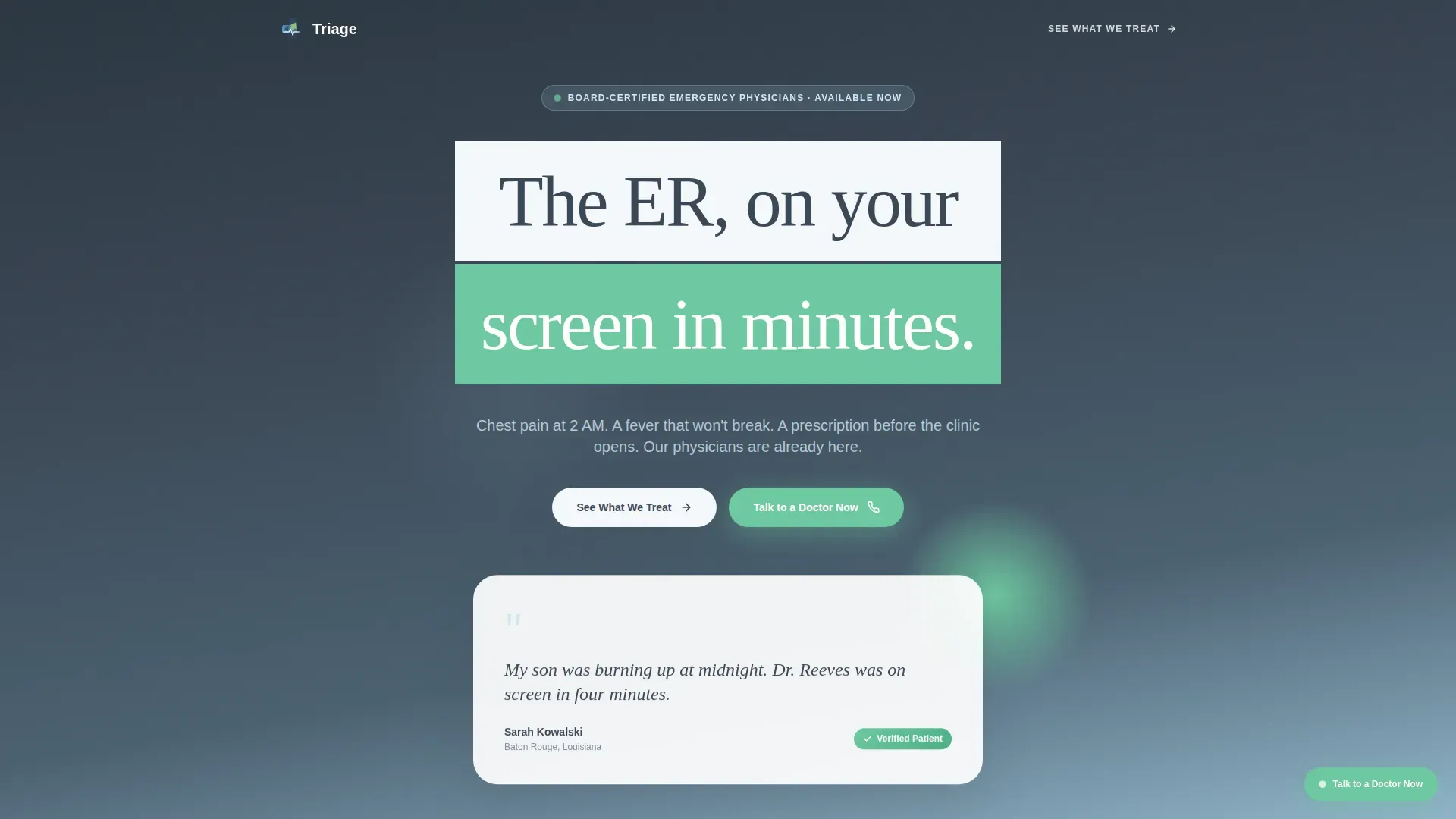
The page opens with an oversized testimonial card set against a vertical slate-to-sky gradient. A real patient quote in large serif type, a name, a city, and a verified-patient badge appear together. There are no stock photos or decorative medical icons, just human words presented with calm authority.
Urgency-Tier Condition Cards
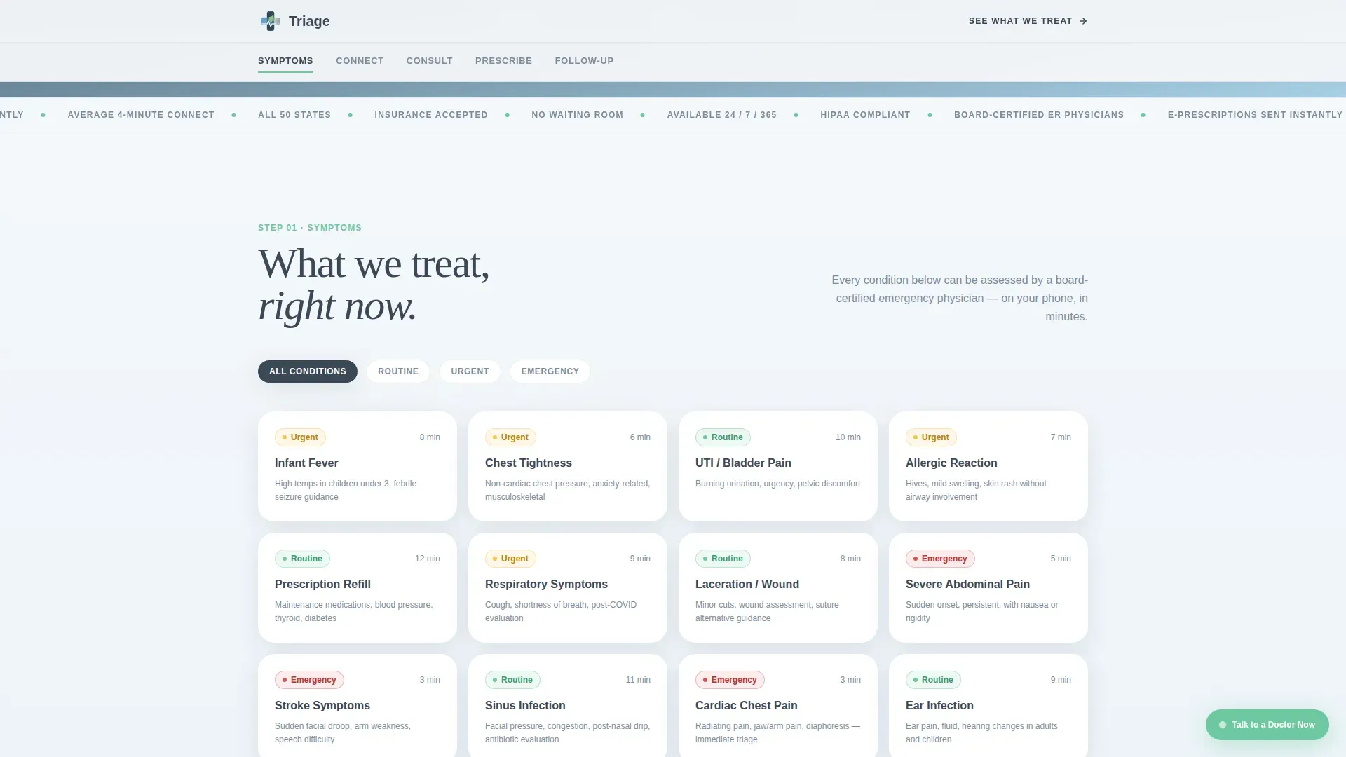
The Symptoms section displays condition cards organized into three color-coded urgency tiers. Green marks conditions safe for virtual care, yellow signals conditions that need prompt attention, and red flags emergencies requiring an in-person visit. A filter control lets visitors sort by tier without leaving the page.
Consultation Timeline Walkthrough
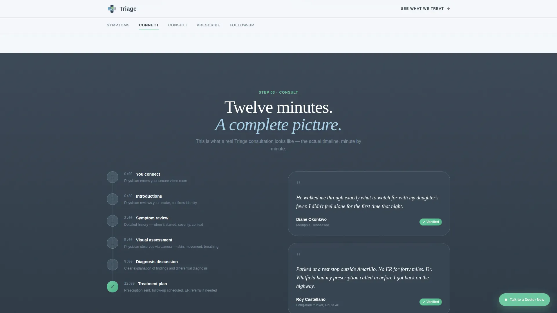
The Consult section shows a real step-by-step timeline of a virtual visit. It references an average connection time of four minutes and a face-to-face consultation averaging twelve minutes. This demystifies the virtual emergency room experience and replaces uncertainty with specifics.
Gated PDF Resource Download
The Prescribe section includes a modal that gates a downloadable PDF titled "When to Go to the ER versus. When to Call Us." Visitors enter their email address and zip code to unlock the download. The zip code entry qualifies geography while giving the practice a retargetable contact.
Persistent Secondary Call to Action
A "Talk to a Doctor Now" button styled in reassurance green remains visible throughout the page scroll. It gives visitors who are already in crisis a single, unmistakable action they can take at any moment without scrolling back to the top.
Page sections overview
| Section | Purpose |
|---|---|
| Hero testimonial card | Opens with a verified patient quote and a slate-to-sky gradient to establish immediate trust |
| Symptoms urgency tiers | Displays color-coded condition cards so visitors confirm their situation qualifies for virtual care |
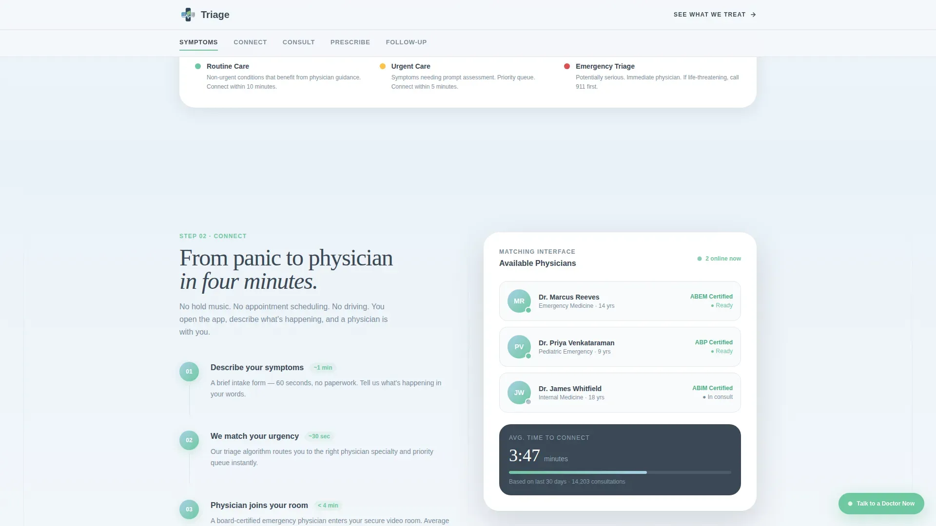
| Connect matching interface | Shows the physician-matching interface and references the average four-minute connection time |
| Consult timeline walkthrough | Walks through a real virtual visit timeline, average twelve minutes face-to-face |
| Prescribe and download | Explains e-prescribing to the nearest pharmacy and gates a PDF resource behind email and zip code |
| Footer linear row | Delivers a clean single-row footer with essential links and practice information |
Design & branding system
The visual identity uses a Soft Gradient theme built on the Slate and Sky color system. The palette is designed to feel steady and safe, like the first light through hospital blinds after a long night, rather than cheerful or clinically sterile.
- Core colors are deep clinical slate (#3B4856), calming mid-gray (#7B8D9E), open-sky blue (#A8D0E6), and soft dawn white (#F4F7FA) as the primary background
- Reassurance green (#6EC8A0) marks completed steps, positive states, and the persistent secondary call-to-action button
- Typography pairs Fraunces serif for patient quotes and major headings with DM Sans for all body copy, creating a warm yet authoritative reading experience
Mobile & speed optimization
This template is designed mobile-first because patients in crisis are almost always reaching for their phones. The build approach prioritizes fast loading and minimal interaction friction for small screens.
- Server Components handle all static sections, keeping JavaScript payloads lean and initial load times short
- Scroll-reveal animations, the floating testimonial card, and staggered section entrances use medium-weight animation that does not block the primary content from rendering
- The pinned anchor nav, urgency-tier filter, and gated PDF modal are all built for thumb-friendly tap targets and small-screen readability
How this template helps you convert
Every design and content decision in this template is oriented toward one outcome: turning a frightened visitor into a confirmed consultation. The page earns trust before it asks for anything.
- The hero testimonial card leads with a real patient voice before any service claim, which builds credibility in the first three seconds a visitor spends on the page.
- The five-phase anchor nav and step-by-step section structure replace vague telehealth promises with a transparent, specific account of exactly what happens from symptom to prescription.
- The gated PDF modal qualifies visitor geography through the zip code field while delivering genuine educational value, creating a permission-based contact list from visitors who are not yet ready to book.
Other information about this template
This template is part of the Health and Medical category, filed under the Emergency Physician Website subcategory. It is localized for the United States market with English copy, USD pricing references, 12-hour time format, and Eastern time zone context built into the consultation timeline section.
- The template style is Hub and Spoke with anchor navigation, and the creative direction follows a Step-by-Step Guide structure that demystifies the virtual emergency room process section by section
- The header concept is a Testimonial Card and the landing page direction is Content and Resource, meaning the page educates visitors before presenting a booking call to action
- Animation is set to a medium weight, covering scroll reveals, a floating card entrance, a marquee element, and staggered section transitions
Theme
Soft Gradient
Creative direction
Step-by-Step Guide
Color system
Slate & Sky
Style
Hub & Spoke (Anchor Nav)
Direction
Content/Resource
Page Sections
Pinned Five-stop Anchor Navigation
Floating Testimonial Card Hero
Urgency-tier Condition Cards
Consultation Timeline Walkthrough
Gated PDF Resource Modal
Persistent Crisis Call to Action
Related questions
What type of medical practice is this landing page template designed for?
Can I customize the urgency-tier condition cards for my practice?
How does the gated PDF download work in this template?
Is this template suitable for patients who have never used telehealth before?
Does the template include social proof beyond the opening testimonial card?



