Portugal Travel Specialist Booking Website Template
Trilha is a single-column adventure landing page built for Portugal tour operators running multi-experience offerings. It guides visitors through four seasonal chapters, surfaces bookable adventure cards with inline availability, and funnels buyers toward a quick-match quiz or a custom itinerary builder. The design feels raw and atmospheric, anchored by a deep Atlantic palette and bold portrait photography.
by Rocket studio
Quick summary
Trilha is a Portugal adventure tour landing page designed to move visitors from awe to booking without friction. It unfolds as a single scrolling column divided into four seasonal chapters. Each chapter surfaces three to five bookable adventures, and two conversion paths capture buyers at every stage of intent.
Who this template is for
This template suits adventure tour operators who run Portugal-based experiences across multiple seasons and activity types. It works best when your offer spans coastal hikes, water activities, and ridge trails rather than a single trip type.
- Independent guides or small operators selling multi-day Portugal adventures to international travelers.
- Tour businesses offering tiered intensity levels, from easy coastal walks to technical scrambles.
- Operators whose clients arrive from urban European markets and book on impulse or during a short research window.
What problem this template solves
Most adventure booking pages force visitors into a dry catalog grid. Browsers skim prices, lose context, and leave without a clear reason to commit. Trilha replaces the catalog with a story-driven scroll that builds desire before it asks for a booking.
- Visitors with no fixed dates can use the quiz to find their best-fit season and intensity level.
- Visitors ready to commit can tap a card's inline availability calendar without leaving the page flow.
- Groups or undecided travelers can use the itinerary builder to receive a personal proposal within twenty-four hours.
What you get with this template
You get a fully structured, single-column landing page built around a seasonal narrative arc. Every section serves a conversion purpose while maintaining the atmospheric visual identity described in the design brief.
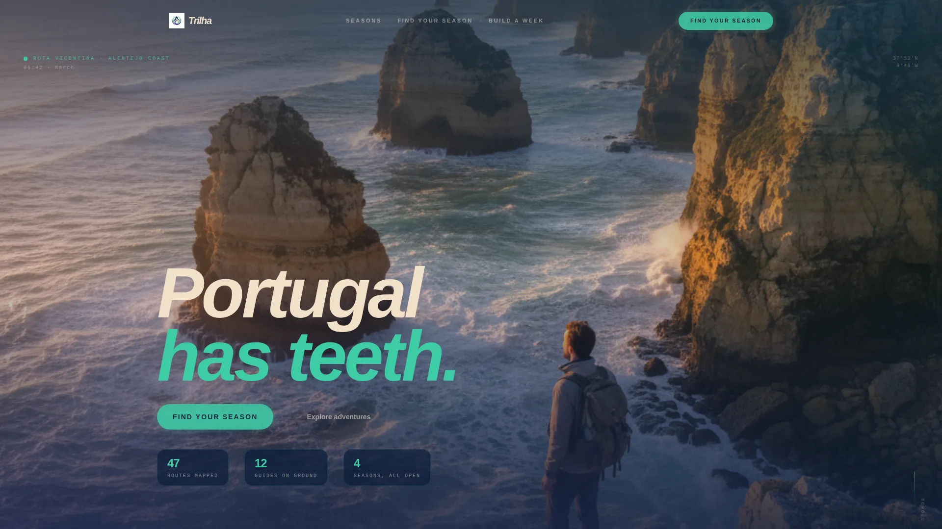
- A full-viewport portrait header with a low-placed headline that sets the emotional tone immediately.
- Four seasonal chapter sections, each with timestamped photography and three to five adventure cards per season.
- Two built-in conversion paths: a three-question quick-match quiz and a custom itinerary builder that captures email and trip dates.
Feature list
This template is built around a set of purposeful components that serve both the storytelling experience and the booking journey.
Full-Viewport Portrait Header
The header uses a vertical portrait crop of a lone figure at the cliff edge of Rota Vicentina. Shot from below, the composition forces the eye upward along stacked ochre and black rock layers. The headline sits low near the figure's feet in sandstone white, delivering immediate emotional impact.
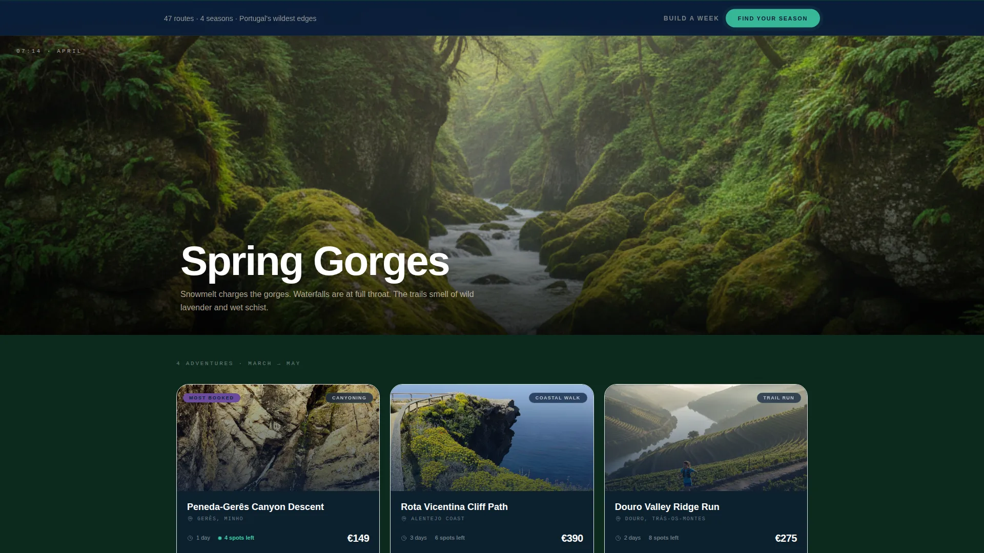
Four Seasonal Chapter Sections
The scroll unfolds through Spring Gorges, Summer Surf, Autumn Ridgelines, and Winter Storms. Each chapter opens with a time-stamped photograph showing the hour and month. Palette temperature shifts per season: aurora green for spring, sandstone tones for summer, violet for autumn, and midnight with white spray for winter.
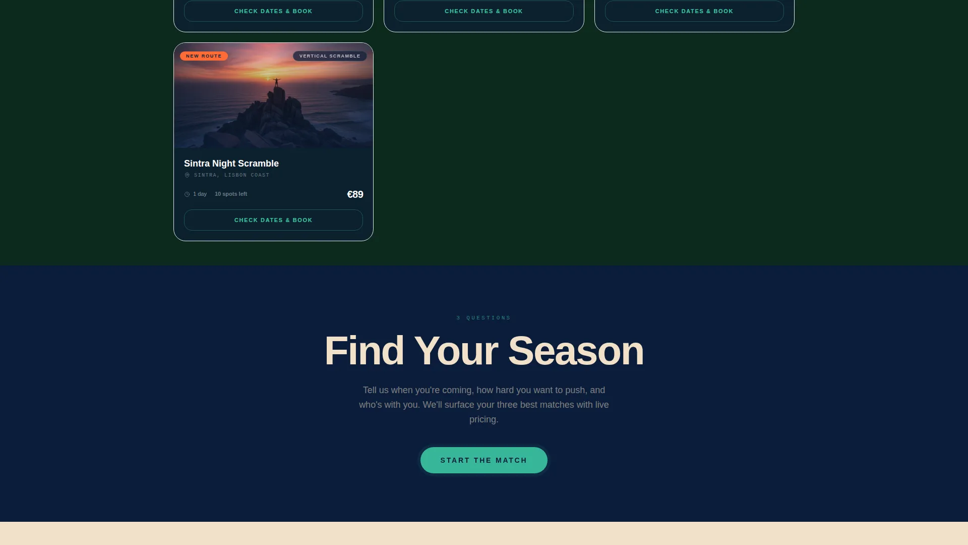
Bookable Adventure Cards with Inline Calendars
Each adventure card carries its own "Check Dates and Book" button. The button opens an inline availability calendar without sending the visitor to a separate page. Live pricing and remaining spot counts are visible directly on the card.
Sticky Quick-Match Quiz call to action
A persistent "Find Your Season" button smooth-scrolls visitors to a three-question quiz covering travel month, intensity level, and group size. Results surface a filtered shortlist with live pricing and available spots, giving undecided visitors a clear, personalized next step.
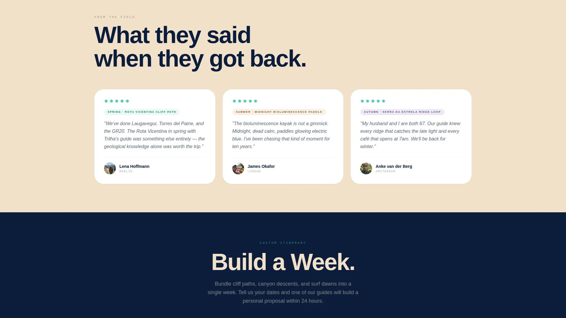
Custom Itinerary Builder Path
The "Build a Week" secondary conversion path lets visitors bundle multiple adventures into one custom itinerary. It captures email and preferred trip dates, triggering a personal guide proposal within twenty-four hours.
Organic Flow Design System
The Northern Lights color palette uses deep Atlantic midnight for text and navigation, aurora green for calls to action and availability indicators, twilight violet for seasonal badges and premium experiences, and warm sandstone as breathing space between sections.
Page sections overview
| Section | Purpose |
|---|---|
| Portrait Hero Header | Sets emotional tone and introduces the headline |
| Sticky Navigation Bar | Anchors "Find Your Season" call to action throughout scroll |
| Spring Gorges Chapter | Showcases spring canyoning and gorge adventures |
| Summer Surf Chapter | Highlights surf dawns and warm coastal experiences |
| Autumn Ridgelines Chapter | Features ridge hikes and golden-hour trail adventures |
| Winter Storms Chapter | Presents dramatic coastal and kayak winter experiences |
| Quick-Match Quiz Section | Filters adventures by month, intensity, and group size |
| Adventure Card Grid | Displays bookable cards with inline availability calendars |
| Build a Week Builder | Captures email and dates for custom itinerary proposals |
| Footer Information | Closes the page with secondary navigation and contact context |
Design & branding system
The visual identity follows an Organic Flow theme built on the Northern Lights color system. Every color in the palette carries a defined role, keeping the page legible and atmospherically consistent from top to bottom.
- Deep Atlantic midnight (#0B1D3A) anchors all body text, headings, and navigation backgrounds.
- Aurora green (#3ECCA5) marks every call-to-action button and live availability indicator across the page.
- Twilight violet (#6B4C9A) appears on seasonal badges and premium-tier experience labels; warm sandstone (#F2E0C9) fills open sections as breathing space between content blocks.
Mobile & speed optimization
The single-column layout is structurally suited to mobile viewports because the scroll direction and chapter flow translate naturally to a tall screen. Portrait-oriented hero photography and card-based adventure listings both read clearly on smaller displays.
- The single-column flow removes horizontal complexity, making tap targets and card buttons easy to reach on any screen size.
- Inline availability calendars open within the existing scroll context, avoiding full-page redirects that disrupt the mobile reading experience.
How this template helps you convert
The page is designed to meet visitors at every stage of readiness, from the traveler who just discovered Portugal adventure tours to the one with a flight booked and dates in mind.
- The seasonal chapter structure builds desire progressively. By the time a visitor reaches a bookable card, they have already spent time inside the experience emotionally, making a booking decision feel natural rather than transactional.
- The three-question quiz removes the paralysis of too much choice. It filters the full offer down to a personal shortlist with pricing and availability, giving hesitant visitors a low-effort path to commitment.
- The "Build a Week" path captures the most valuable audience segment: visitors ready to invest in a multi-day experience but still deciding on the details. The twenty-four-hour personal proposal keeps them engaged without requiring a full purchase decision upfront.
Other information about this template
Trilha is built specifically for the Portugal adventure tour niche, where buyers are often experienced international travelers comparing multiple operators. The template's narrative-driven scroll and seasonal framing help differentiate an operator's offer beyond price alone.
- The template style is Single Column Flow with an Organic Flow theme, making it a strong fit for immersive storytelling categories within the Travel and Hospitality space.
- The Marketplace and Multi conversion surface structure means multiple experiences can live on one page without creating a cluttered catalog feel.
- Operators offering Portugal travel experiences across the Alentejo coast, Peneda-Gerês, Ericeira, and the Algarve will find the four-chapter seasonal layout maps naturally to their actual product range.
Theme
Organic Flow
Creative direction
Seasonal/Moment
Color system
Northern Lights
Style
Single Column Flow
Direction
Marketplace/Multi
Page Sections
Full-viewport Portrait Header
Four Seasonal Chapter Sections
Bookable Adventure Cards
Sticky Quick-match Quiz
Custom Itinerary Builder
Northern Lights Color System
Related questions
Can this landing page show multiple bookable adventures at once?
How does the quick-match quiz help visitors choose an adventure?
What is the Build a Week feature and who is it for?
Is the four-chapter seasonal layout easy to adapt for my actual tour calendar?
What makes this template different from a standard tour catalog page?


