Subscription-Based Business Specialist Booking Website Template
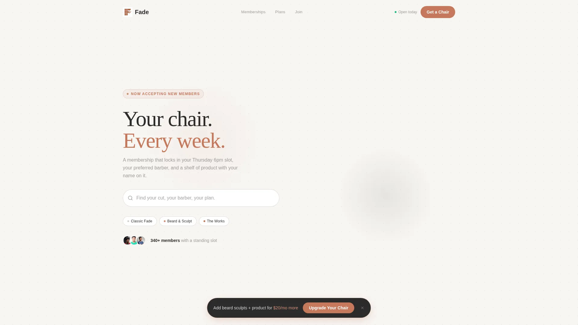
Fade is a bento grid landing page built for subscription-based barbershops. It combines a smart search header, tile-based membership discovery, and a persistent upgrade prompt to move visitors from browsing to booking. The warm Cloud Canvas palette and curated grid layout make every plan feel worth considering, whether someone is starting fresh or upgrading their current chair.
by Rocket studio
Quick summary
Fade is a single-page barbershop landing page designed around membership discovery and plan upgrades. The bento grid layout presents each membership benefit as its own browsable tile. A pinned terracotta call-to-action button and a one-tap upgrade flow make converting visitors into subscribers feel effortless and natural.
Who this template is for
This template is built for barbershop owners who sell recurring memberships rather than one-off appointments. It works equally well for established shops ready to convert walk-ins into subscribers and for new locations building a clientele from the ground up.
- Barbershop owners running tiered subscription plans
- Shop managers who want current members to self-upgrade without staff involvement
- Independent barbers launching their first branded online presence
What problem this template solves
Most barbershop websites present a static menu of services with a phone number at the bottom. That approach loses the customer who wants to understand what a membership actually means before committing. Fade solves this by letting visitors explore benefits tile by tile, at their own pace.
- Visitors do not know which membership tier suits them without seeing benefits side by side
- Current members have no easy path to upgrade without calling or visiting in person
- New visitors need a low-friction entry point before they commit to a recurring plan
What you get with this template
You get a fully structured barbershop landing page with a bento grid layout, a smart search header, membership tier tiles, and a sticky upgrade call-to-action. Every section is purpose-built to guide both new visitors and returning members toward the right plan.
- A bento grid membership section with individual tiles for benefits, scheduling, and product shelves
- A persistent "Upgrade Your Chair" button pinned to the bottom of the viewport
- A lightweight three-field sign-up form for new visitors choosing the entry-level plan
Feature list
This template ships with six purpose-built components, each designed to support the subscription sales flow described in the brief.
Smart Search with Auto-Suggest
The header features an oversized search input centered against a soft-focus flat-lay background. As a visitor types, the field auto-suggests membership tiers and services. Three pill tags float below the field to offer instant starting points: Classic Fade, Beard and Sculpt, and The Works.
Bento Grid Membership Tiles
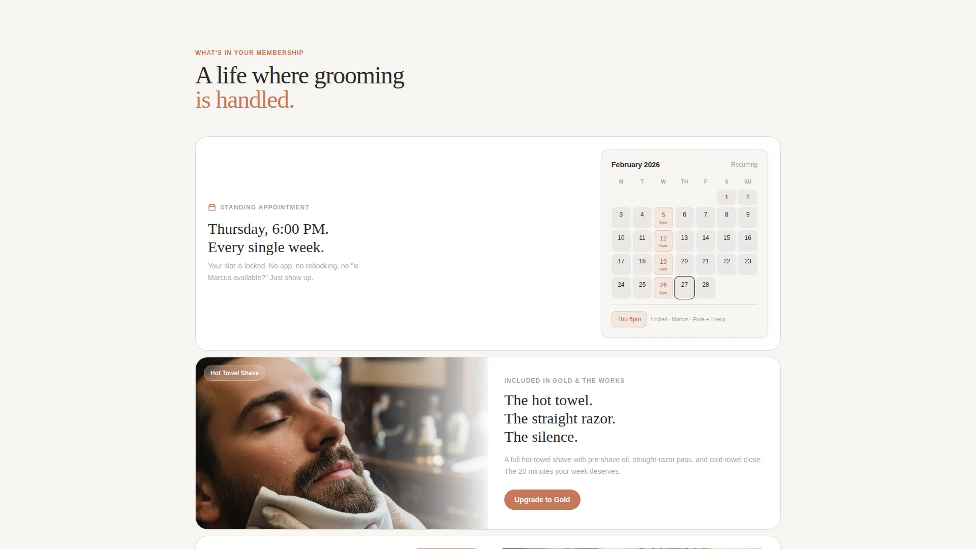
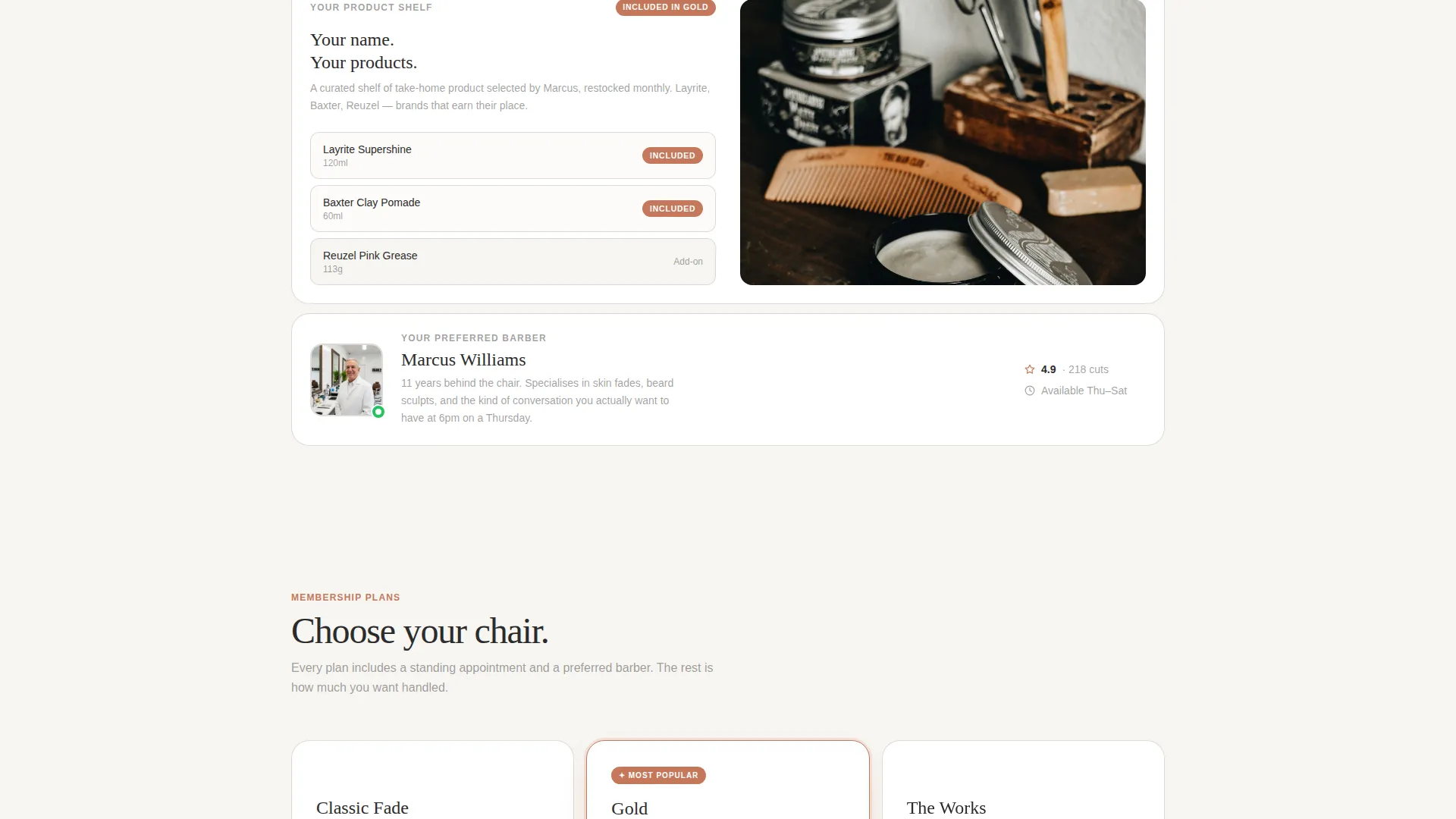
The core of the page is a non-linear bento grid where each tile presents a single membership benefit. One tile holds a looping hot-towel shave video. Another shows a recurring calendar slot locked in. A third displays a curated product shelf with a tier ribbon attached. Visitors browse and compare rather than scroll past.
Persistent Upgrade Call-to-Action
A terracotta "Upgrade Your Chair" button stays pinned to the bottom of the viewport. It appears only after the visitor has browsed at least three tiles, so the prompt feels earned rather than intrusive. The button color follows the palette rule: terracotta appears only where a transaction is invited.
Active Plan Recognition
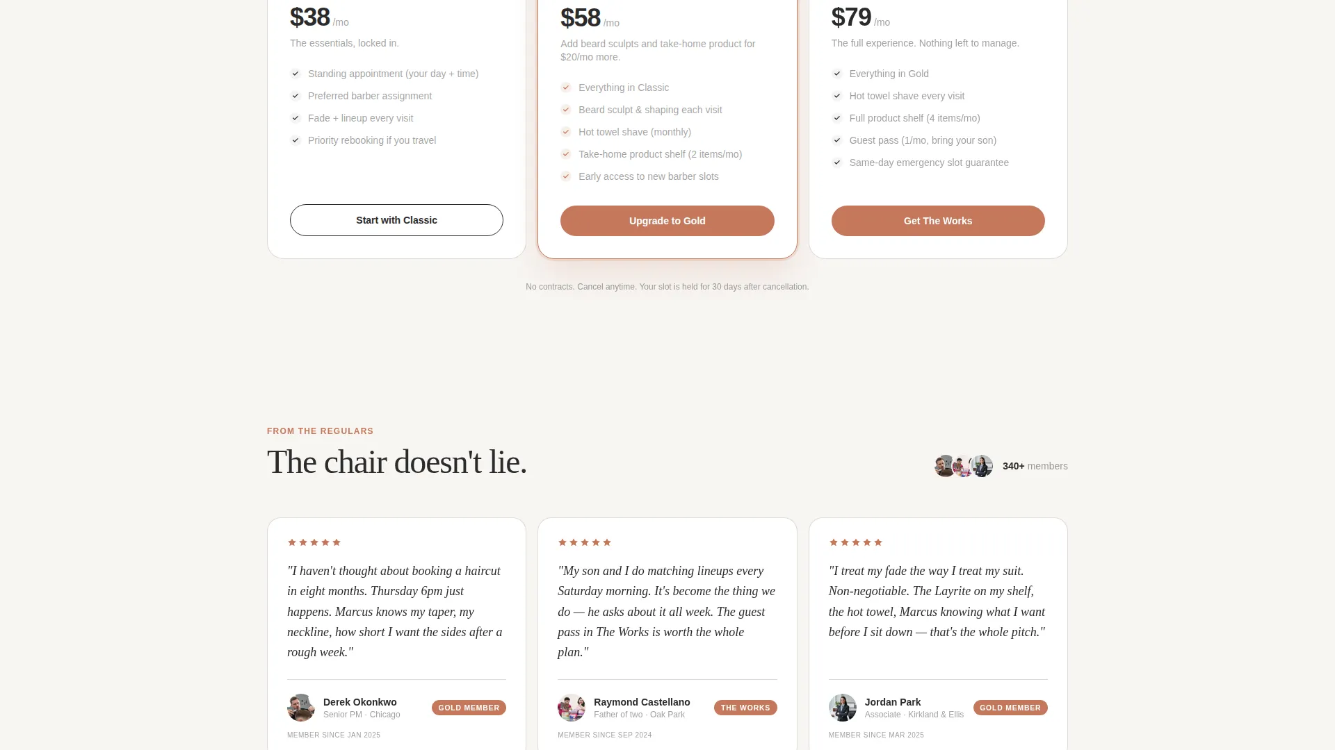
Returning members who arrive from an email or app link see their current plan highlighted inside the grid with a "Your Plan" tag. The next tier up glows with a "Most Popular" badge and a concise value line explaining the upgrade benefit in a single sentence.
One-Tap Upgrade Flow
Current members can confirm a plan upgrade with a single tap. There is no re-entering of payment details and no new form to complete. The confirmation is immediate, keeping the experience closer to a loyalty interaction than a checkout process.
New Visitor Sign-Up Form
For visitors who are not yet members, a secondary path labeled "Start with Classic" opens a three-field form collecting first name, phone number, and preferred day of the week. The form is short by design, removing hesitation at the point of first commitment.
Page sections overview
| Section | Purpose |
|---|---|
| Search Header | Introduces the brand and guides visitors toward the right plan through auto-suggest discovery |
| Pill Tag Row | Offers three instant entry points below the search field for quick self-identification |
| Bento Grid | Displays individual membership benefits as browsable, comparable tiles |
| Video Tile | Showcases the hot-towel shave experience in a looping format inside the grid |
| Calendar Tile | Illustrates a recurring weekly appointment slot locked to the member |
| Product Shelf Tile | Presents take-home product inclusions with a membership tier ribbon |
| Active Plan Grid | Highlights the current member's plan and positions the next tier with a value prompt |
| Sticky Upgrade Button | Pins the primary call-to-action to the viewport bottom after three tiles are browsed |
| Classic Sign-Up Form | Captures first name, phone number, and preferred day for new entry-level members |
Design & branding system
The visual identity follows the Cloud Canvas color system built around four deliberate tones. The palette reads like a well-kept barbershop: clean surfaces, warm light, and one sharp accent reserved for action.
- Backgrounds use soft warm white (#F7F5F2) and barbershop fog gray (#D6D2CC) to keep the canvas calm and readable
- Body text and tile content live in charcoal leather (#2B2B2B) for strong contrast without harshness
- Faded terracotta (#C4785B) appears exclusively on upgrade badges, active-state buttons, and tier ribbons where a purchase decision is involved
Mobile & speed optimization
The bento grid layout is designed to reflow gracefully on smaller screens without losing the browsable, tile-by-tile experience. The sticky upgrade button remains accessible on mobile viewports throughout the session.
- Individual tiles stack into a readable single-column or two-column mobile grid depending on screen width
- The three-field sign-up form is thumb-friendly and requires minimal input
- The flat-lay header background is formatted to remain crisp without heavy load overhead on mobile connections
How this template helps you convert
Every design decision in this template points toward a single outcome: turning a visitor into a paying subscriber. The page earns attention before it asks for a commitment.
- The auto-suggest search turns the first interaction into a moment of self-identification, connecting the visitor to a specific plan before they have scrolled a single tile.
- The bento grid creates comparison momentum. Each tile makes the next tier feel like a natural step up rather than an upsell, building desire through browsing rather than through persuasion copy alone.
- The sticky terracotta button appears only after three tiles have been viewed, so the call-to-action arrives when intent is highest, not before the visitor has had a chance to understand what they are buying.
Other information about this template
This template is categorized under Retail and E-Commerce as a Subscription-Based Business landing page. It was built around the Marketplace Grid theme with a Curated Collection creative direction, meaning each tile functions like a product in a carefully arranged shop display.
- The template style follows a Scroll Reveal approach where content is uncovered progressively as the visitor moves through the grid
- The landing page direction is Click-Through, guiding visitors toward a clear next action rather than holding them on-page indefinitely
- The header concept draws from a UGC Photo Wall sensibility, using a flat-lay arrangement of barbershop tools to set atmosphere without requiring custom photography
- The intersection context aligns this template with subscription retail businesses, making it adaptable beyond barbershops for any service business built on recurring membership tiers
Theme
Marketplace Grid
Creative direction
Curated Collection
Color system
Cloud Canvas
Style
Scroll Reveal (Progressive)
Direction
Click-Through
Page Sections
Smart Search with Auto-suggest Header
Bento Grid Membership Display
Persistent Viewport-pinned Call to Action
Active Plan Recognition for Members
One-tap Upgrade Confirmation
Three-field New Member Form
Related questions
Can this template work for a barbershop that does not yet offer memberships?
Does the 'Your Plan' feature require an on-page login system?
When does the sticky upgrade button appear on screen?
Can I edit the pill tags in the search header?
How many membership tiers does the bento grid support?



