General Practitioner Appointment Booking Website Template
A warm, split-screen landing page built for neighborhood general practice clinics. It introduces each doctor as a trusted individual, not a generic provider, through chapter-style profiles, patient testimonials, and jargon-free health explainers. The primary call to action drives appointment bookings, while a downloadable checklist and a symptom-guided FAQ accordion capture visitors at every stage of readiness.
by Rocket studio
Quick summary
This is a single-page, desktop-first landing page for a neighborhood general practitioner clinic. It uses a 50/50 split-screen layout to build patient trust before asking for a booking. Doctor profiles, real patient testimonials, health concern explainers, and an email-gated checklist work together to move visitors from curious to committed.
Who this template is for
This template is designed for small to mid-size general practice clinics that want to stand out from urgent care chains and large hospital networks. It works especially well for practices where the same physicians see the same families over years, not just for single visits.
- Independent general practitioners who want to introduce themselves personally before a patient books
- Clinic managers looking to capture new patient leads through a downloadable resource
- Practices serving a mixed community of young families, working adults, and older patients managing ongoing conditions
What problem this template solves
Most medical practice websites feel cold and transactional. They list services and show a booking button, but they never earn the visitor's trust first. Patients searching for a family doctor need reassurance, not just availability.
- Patients arriving from a late-night symptom search need to feel that this clinic genuinely listens
- Clinics lose potential patients who browse, feel nothing, and close the tab without booking
- A rotating roster of anonymous providers creates doubt; this template counters that with named doctors and personal care philosophies
What you get with this template
The template delivers a fully structured, single-page layout with every section purpose-built for a general practice audience. Each component does a specific job in the conversion journey, from first impression to final click.
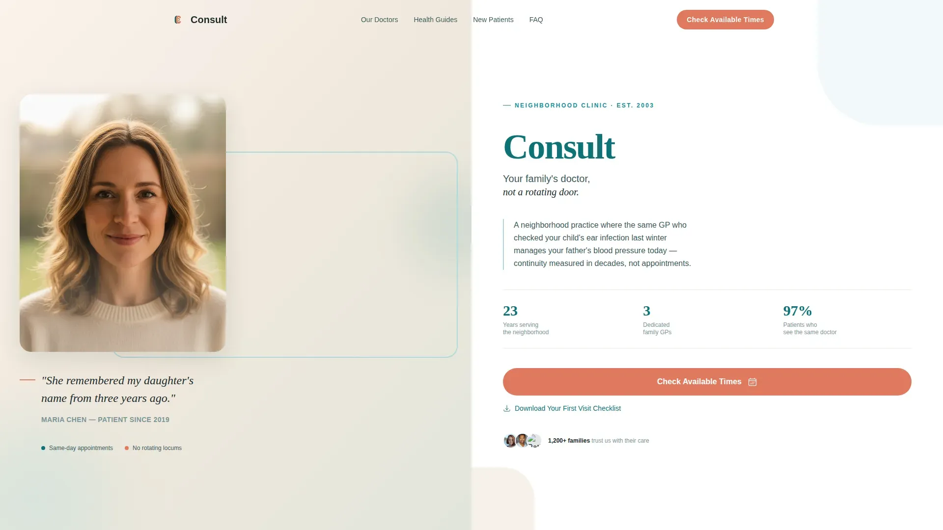
- A hero section with a patient testimonial portrait on one side and a clinic introduction with a booking button on the other
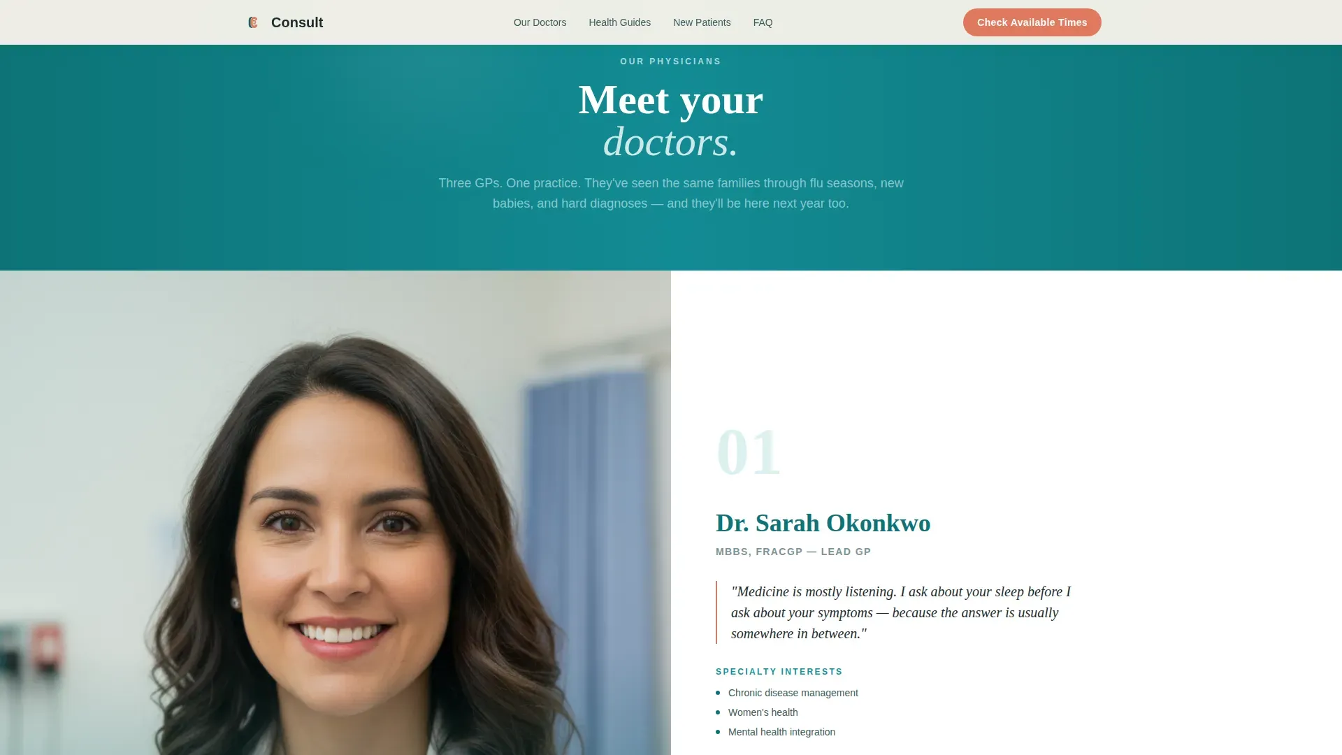
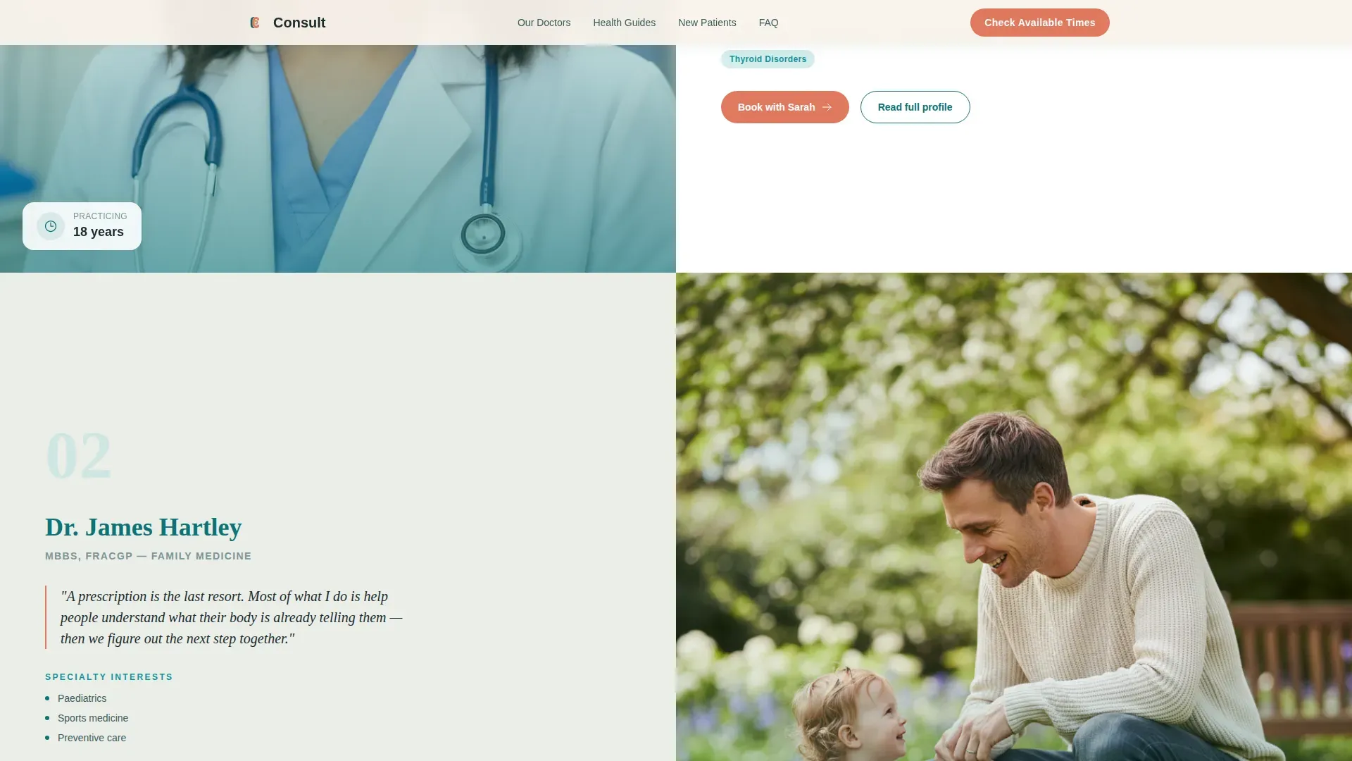
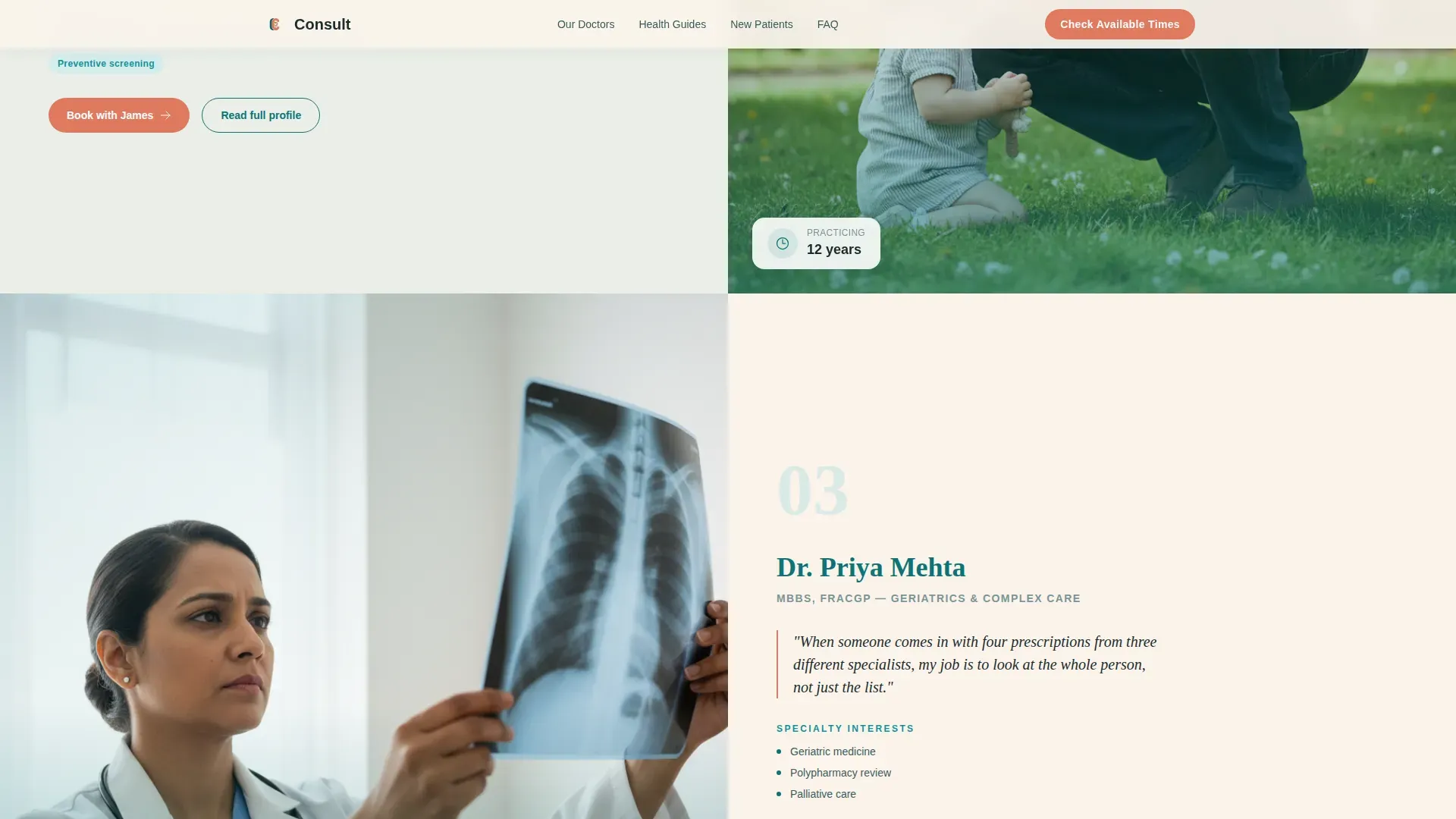
- Chapter-style doctor profile panels, each with a photo, specialty interests, years of practice, and a personal care philosophy quote
- Health concern explainer sections, an email-capture checklist gate, and a symptom-guided FAQ accordion at the footer
Feature list
This template ships with six ready-to-use structural and design features drawn directly from the source brief.
Split-Screen Hero with Testimonial Card
The opening section divides the viewport evenly. The left half holds a softly lit patient portrait alongside a handwritten-style quote. The right half presents the clinic name, a single-line descriptor, and a teal booking button. The layout establishes warmth and credibility before the visitor has scrolled at all.
Chapter-Style Doctor Profile Panels
Each general practitioner gets their own full-width split section. The left panel features the doctor in a real clinical moment. The right panel covers their specialty interests, years practicing, a personal philosophy-of-care quote, and the conditions they see most often. A repeat booking call to action appears after each profile.
Health Concern Explainer Sections
Between doctor profiles, paired split sections connect a common health concern on the left with a plain-language explainer and a resource download link on the right. These sections build a content library that gives visitors a reason to return and bookmark the page.
Email-Gated Checklist Capture
A dedicated section offers a "Your First Visit Checklist" PDF in exchange for a single email address. The micro-call to action reads "Send Me the Checklist." This passive conversion path captures visitors who are not ready to book but are clearly interested in the clinic.
Symptom-Guided FAQ Accordion
The footer area includes an accordion-style FAQ section. Each question follows the format "Should I see a general practitioner for this?" and ends with a contextual "Book for [condition]" link. This component answers real patient hesitations and routes each answer back to a booking action.
Scroll-Reveal Animations and Hover Interactions
The template includes medium-weight scroll reveal transitions, staggered fade-ins as sections enter the viewport, and subtle hover lifts on interactive elements. These animations are handled with minimal JavaScript so the page remains responsive and light.
Page sections overview
| Section | Purpose |
|---|---|
| Hero testimonial panel | Opens with patient trust signal and primary booking call to action |
| Doctor profile one | Warm introduction to the first general practitioner |
| Health concern explainer | Pairs a common condition with a plain-language explainer and download |
| Doctor profile two | Reveals clinical depth of the second general practitioner |
| Health concern explainer | Second condition pairing with resource download link |
| Doctor profile three | Shows range across the full clinical roster |
| Checklist email capture | Captures visitor email in exchange for first-visit PDF |
| FAQ accordion footer | Answers symptom questions with contextual booking links |
| Linear footer row | Single-row footer with clinic essentials |
Design & branding system
The visual identity follows a Healing Space theme. The goal is to feel professional enough for a clinical setting while remaining genuinely human and approachable. Every color and type choice reinforces that balance.
- Color palette: deep clinical teal (#0D7377) for headers and navigation, soft seafoam (#A8DADC) on alternating section backgrounds, warm linen white (#FAF3EB) as the primary canvas, and coral (#E07A5F) used only on buttons and urgent callouts
- Typography pairing: Plus Jakarta Sans handles body text and interface labels for clarity, while Fraunces serif headings add the warmth needed for a care-focused brand
- Visual style: warm clinical aesthetic with natural wood references, morning light tones, and shallow depth-of-field photography that looks like real patients, not stock imagery
Mobile & speed optimization
The template is built desktop-first to honor the 50/50 split-screen layout. On smaller screens, the split sections stack vertically so every panel remains fully readable without horizontal scrolling.
- Split-screen sections reflow to single-column stacking on mobile devices
- Static content uses server components to reduce unnecessary JavaScript load, keeping the page responsive on slower connections
- Interactive elements such as the FAQ accordion and email capture form rely on minimal JavaScript, limiting overhead without removing functionality
How this template helps you convert
Every section in this template exists to move a hesitant patient one step closer to a booked appointment or a submitted email. The conversion architecture has three distinct paths so no visitor leaves without an option that fits where they are right now.
- The primary path places a "Check Available Times" booking button after the hero testimonial and repeats it after every doctor profile, linking to a scheduling widget filtered by doctor and visit type.
- The secondary path offers the "Your First Visit Checklist" PDF behind a single email field, converting visitors who are researching but not yet ready to commit to a time slot.
- The passive path uses the symptom-guided FAQ accordion at the footer, where each answer ends with a "Book for [condition]" link that re-enters the visitor into the booking flow from a point of genuine need.
Other information about this template
This template is part of a Health and Medical category build focused specifically on the general practitioner appointment booking niche. A few additional details are worth knowing before you begin customizing.
- The template style is Split Screen (50/50), meaning the desktop layout divides every major section into two equal halves before stacking on mobile
- The header concept is a Testimonial Card, which means the very first thing a visitor sees is a real patient voice, not a clinic logo or a generic headline
- The creative direction follows an Expert Panel approach, treating each doctor as a chapter with depth and personality rather than a simple photo-and-name card
- The landing page direction is Content and Resource, so the page earns trust through useful information before it asks for a booking
- The color system is called Teal Catalyst, and the theme is Healing Space, both of which inform the specific palette and typographic warmth described in the design section above
Theme
Healing Space
Creative direction
Expert Panel
Color system
Teal Catalyst
Style
Split Screen (50/50)
Direction
Content/Resource
Page Sections
Split-screen Hero with Patient Testimonial
Chapter-style Doctor Profile Panels
Health Concern Explainer Sections
Email-gated First Visit Checklist
Symptom-guided FAQ Accordion
Scroll-reveal and Hover Animations
Related questions
Can I add or remove doctor profile panels from this template?
Does the email capture form connect to a mailing list automatically?
Can I replace the health concern topics in the explainer sections?
Is the FAQ accordion pre-filled with symptom questions?
How does the scheduling widget work inside this template?



