Oncologist Specialist Reviews Website Template
This hub-and-spoke landing page is built for oncology practices that lead with patient trust. Five anchor-nav spoke sections organize verified testimonials by concern category, each opening with an audit-style checklist before expanding into real patient cards. The design is calm, clinical, and warm, guiding anxious visitors toward a single action: scheduling their first conversation.
by Rocket studio
Quick summary
This landing page gives an oncology practice a structured, trust-first home for patient testimonials. Five spoke sections, each tied to a concern category, let visitors methodically confirm every worry before a clear call to action appears. The page earns confidence quietly, through verified voices and a steady visual rhythm, before ever asking for a click.
Who this template is for
This template is built for oncology practices where the patient relationship begins long before the first appointment. It suits any practice that wants its patient voices to do the trust-building work.
- Oncologists and their patient coordinators who want testimonials organized by concern, not just displayed in a wall of quotes
- Adult children researching care options late at night on behalf of a parent newly facing a diagnosis
- Referring physicians looking for confirmation that a colleague's reputation matches what patients actually experience
What problem this template solves
When someone receives a difficult diagnosis, their first instinct is to search. They arrive at a practice page carrying a specific inventory of fears: Will the doctor listen? Will the options be explained clearly? Is the staff kind? A generic testimonials page does nothing with those fears. This template meets each one directly.
- Visitors cannot easily match a scattered review list to their specific concern, so anxiety lingers even after reading positive quotes
- Without a clear, calm structure, late-night scrollers lose focus and leave before they reach a booking step
- Practices with genuinely strong patient feedback often fail to communicate it because the format does not reflect the care quality inside it
What you get with this template
The template delivers a complete single-page testimonial hub. Every component is designed to move a worried visitor from arriving with questions to leaving with a reason to call.
- An animated SVG line-art header that draws itself on load, setting a tone of quiet craft before a single word is read
- Five fully built spoke sections, one for each concern category, each containing an audit-style checklist and a layout ready for verified patient cards with treatment tags and timestamps
- A sticky mobile call-to-action button and desktop section-close buttons that surface the booking prompt at exactly the right moment
Feature list
This template includes the following purpose-built features, each grounded in the needs of oncology patient communication.
Animated SVG Line-Art Header
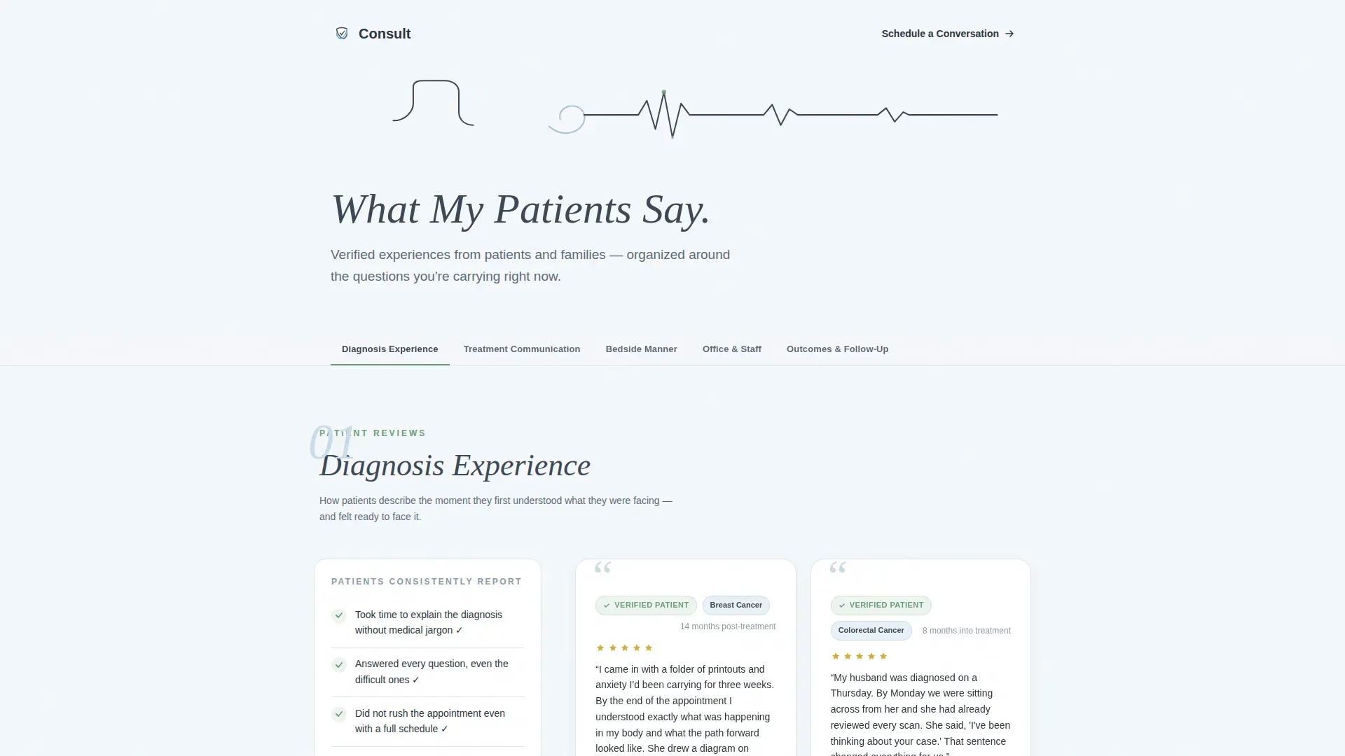
A single continuous line-art illustration traces a stethoscope, transitions into two hands holding, and resolves into a heartbeat rhythm line. The path animates on load from left to right over three seconds, as if drawn by an invisible pen. No stock photography is used; the restraint earns attention.
Hub-and-Spoke Anchor Navigation
Five category labels pin to the top of the page as a sticky anchor navigation bar. Clicking any label scrolls directly to that spoke section. Categories cover Diagnosis Experience, Treatment Communication, Bedside Manner, Office and Staff, and Outcomes and Follow-Up.
Audit-Style Checklist Blocks
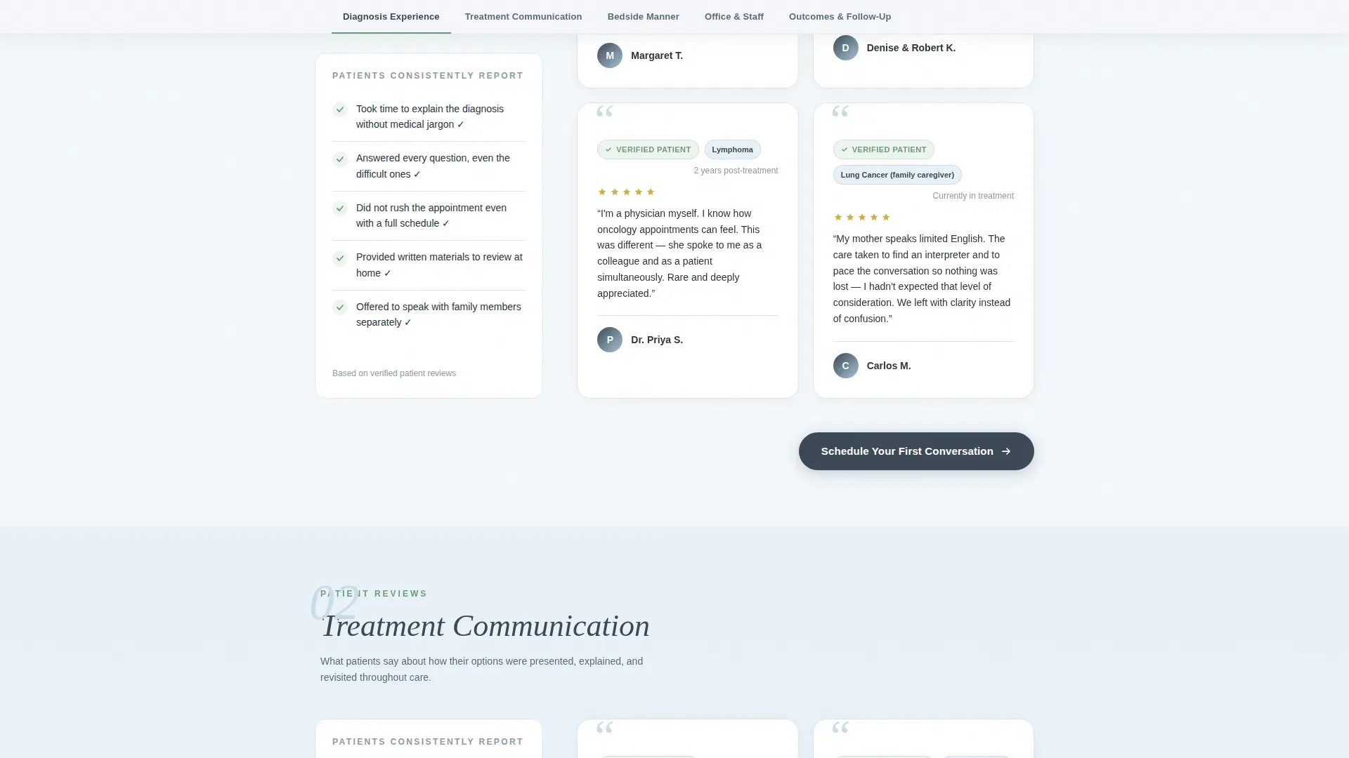
Each spoke section opens with a checklist summarizing what patients consistently report, using plain patient-voice language. Items are expandable, letting visitors linger on the concerns most relevant to them before reading full testimonials below.
Verified Patient Testimonial Cards
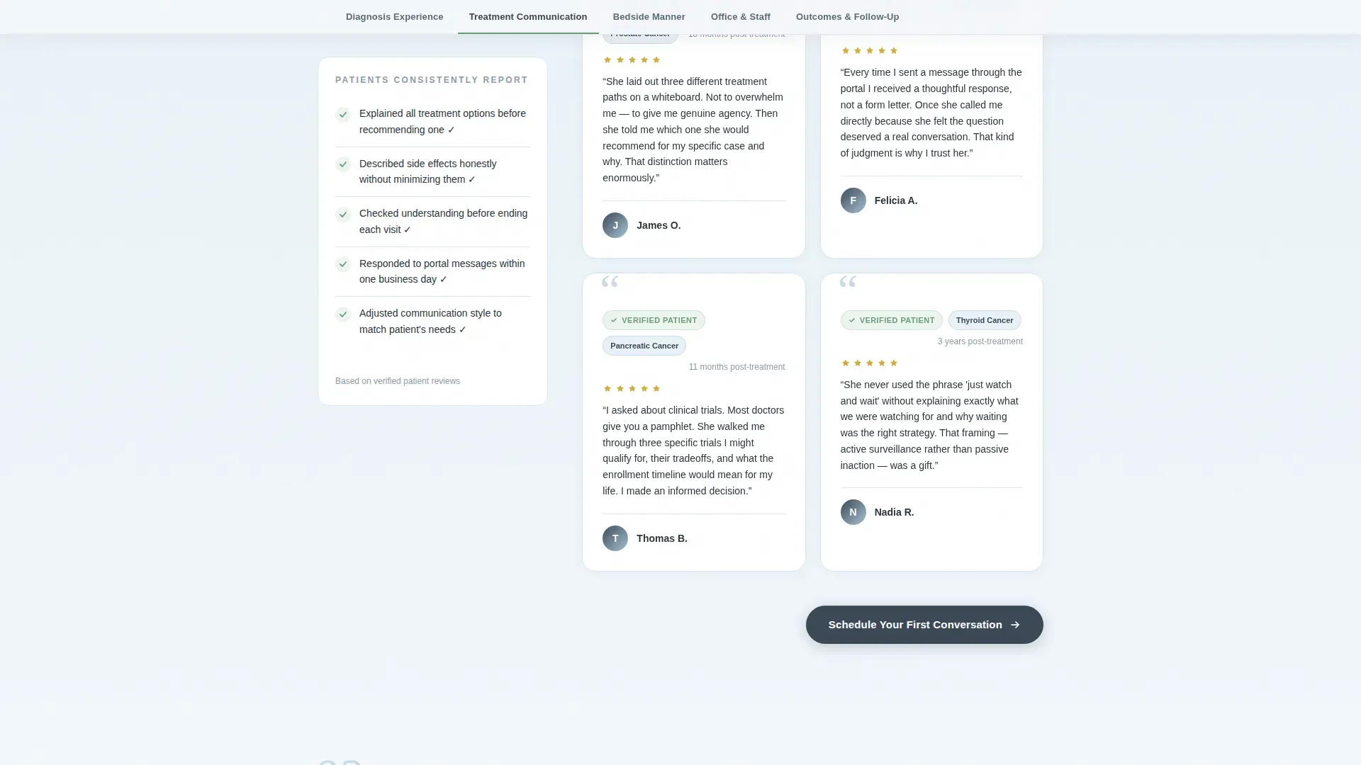
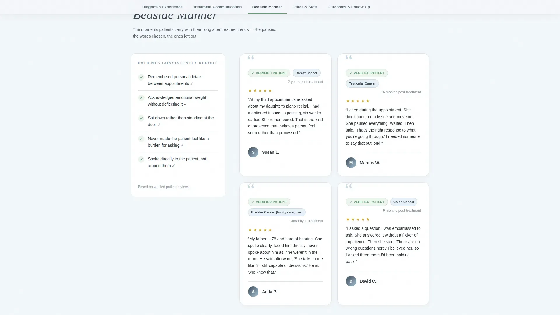
Every testimonial card carries a verified-patient badge, a treatment type tag, and a post-treatment timestamp. These three signals work together to show recency, context, and authenticity without requiring visitors to take anything on faith.
Spoke-Specific and Sticky Call to Action
On desktop, a "Schedule Your First Conversation" button appears at the close of each spoke section. On mobile, the same button anchors to the bottom of the viewport as a persistent sticky element. Both versions click through to the practice's scheduling portal.
Scroll-Reveal Animation System
Testimonial cards and checklist items animate into view with a staggered scroll-reveal pattern. The effect feels unhurried and deliberate, matching the clinical warmth of the overall design rather than competing with it.
Page sections overview
| Section | Purpose |
|---|---|
| Hero with Nav | Animated line-art header, "What My Patients Say" headline, and sticky anchor navigation |
| Diagnosis Experience | Checklist audit and verified patient cards about the initial diagnosis conversation |
| Treatment Communication | Checklist and testimonials about how options were explained and questions were answered |
| Bedside Manner | Checklist and patient voices describing the emotional quality of appointments |
| Office and Staff | Checklist and cards covering the front-desk experience, wait times, and staff warmth |
| Outcomes and Follow-Up | Checklist and testimonials about post-treatment care and ongoing communication |
| Footer | Linear single-row footer with essential practice links |
Design & branding system
The visual identity follows an Organic Flow theme. Every design decision reinforces the feeling of morning light in a quiet room: clean enough to trust, warm enough to stay.
- Typography pairs Plus Jakarta Sans for body text and navigation with Instrument Serif for headlines and italic accents, balancing clinical clarity with human warmth
- The color system uses deep clinical slate (#3B4856) for grounding type and navigation, soft horizon blue (#A8C4D8) for alternating section washes, open-sky white (#F4F7FA) as the base, and living green (#6B9E78) reserved strictly for verified badges, checkmarks, and interactive states
- Green appears only where the page confirms something real, a verified patient, a completed checklist item, an active hover state, so its meaning is never diluted
Mobile & speed optimization
The template is built with a mobile-first mindset. Its primary visitor is someone scrolling a phone in low light at 2 a.m., and every interaction is sized and sequenced for that reality.
- The sticky call-to-action button anchors to the bottom of the mobile viewport throughout the page, so the booking step is never more than a thumb-reach away
- Static content is structured to rely on minimal JavaScript, keeping the page light and responsive even on slower connections
- Scroll-reveal and checklist-expand animations are scoped to avoid interfering with reading flow on small screens
How this template helps you convert
This template is not designed to rush visitors. It is designed to remove every remaining reason not to book. By the time the call to action appears, it feels inevitable rather than pressured.
- The audit-style checklist structure lets visitors match their specific fears to real patient language, so each spoke section they complete lowers the anxiety they arrived with
- Verified-patient badges, treatment tags, and timestamps give the social proof enough context that it reads as evidence rather than marketing
- The call to action appears only after trust has been built inside each spoke section, so clicking "Schedule Your First Conversation" feels like the obvious next step, not a leap
Other information about this template
This template is part of a broader health and medical category of practice pages designed for high-stakes, emotionally sensitive contexts. A few additional details worth noting:
- The page uses no contact form; all conversion happens through a single click-through to the practice's external scheduling portal, keeping the page focused and the patient experience uncluttered
- The footer follows a linear single-row pattern, keeping the page's close as clean as its open
- The Organic Flow theme and Slate and Sky color system are specifically chosen to distinguish this page from the cold, clinical aesthetic common in healthcare web design
- This template suits practices that already have a meaningful volume of patient testimonials and want a format that honors the weight of those stories
Theme
Organic Flow
Creative direction
Checklist & Audit
Color system
Slate & Sky
Style
Hub & Spoke (Anchor Nav)
Direction
Click-Through
Page Sections
Animated SVG Line-art Header
Hub-and-spoke Anchor Navigation
Audit-style Checklist Blocks
Verified Patient Testimonial Cards
Sticky and Section-close Call to Action
Staggered Scroll-reveal Animations
Related questions
Does this template include a booking form?
Is this page suitable for a practice without many reviews yet?
How does the animated header work?
Who is the primary visitor this landing page is built for?
Can the five spoke sections be changed or reordered?



