Brick Restoration Landing Page Template
Tuckpoint is a hero-dominant landing page template built for brick restoration contractors serving historic Chicago properties. It combines an interactive map header, three scrolling case study narratives, and a five-step mortar diagnostic quiz to convert historic homeowners, property managers, and preservation architects into qualified leads.
by Rocket studio
Quick summary
Tuckpoint is a single-page restoration landing page template designed for specialty masonry crews working in historic districts. It opens with a map-based header showing completed projects across the service region, flows through three in-depth case study narratives, and closes with a diagnostic quiz that grades the visitor's mortar condition and captures their contact details.
Who this template is for
This template is built for brick restoration businesses that serve clients with high-stakes, historically sensitive projects. The copy tone, visual weight, and lead-capture flow are calibrated for a specific type of buyer who already knows the problem is serious.
- Historic homeowners dealing with city violation letters and deteriorating pre-war facades
- Property managers responsible for maintaining multi-unit buildings through harsh winter cycles
- Preservation architects specifying original bond patterns for landmark commission reviews
What problem this template solves
Most masonry contractor pages look like generic service directories. They list skills without proving them, and they ask for a phone number before earning any trust. Historic property owners need more than a contact form. They need evidence that the crew understands lime putty chemistry, landmark requirements, and the difference between a cosmetic patch and a proper restoration.
- Visitors leave without confidence because there is no proof of completed work at scale
- Leads arrive unqualified, wasting estimate time on buildings that need a different service tier
- Property owners with urgent city violations have no fast way to understand what grade of repair they actually need
What you get with this template
This template gives you a fully structured, single-page lead generation layout built around storytelling and qualification. Every section earns the visitor's trust before asking for their contact information.
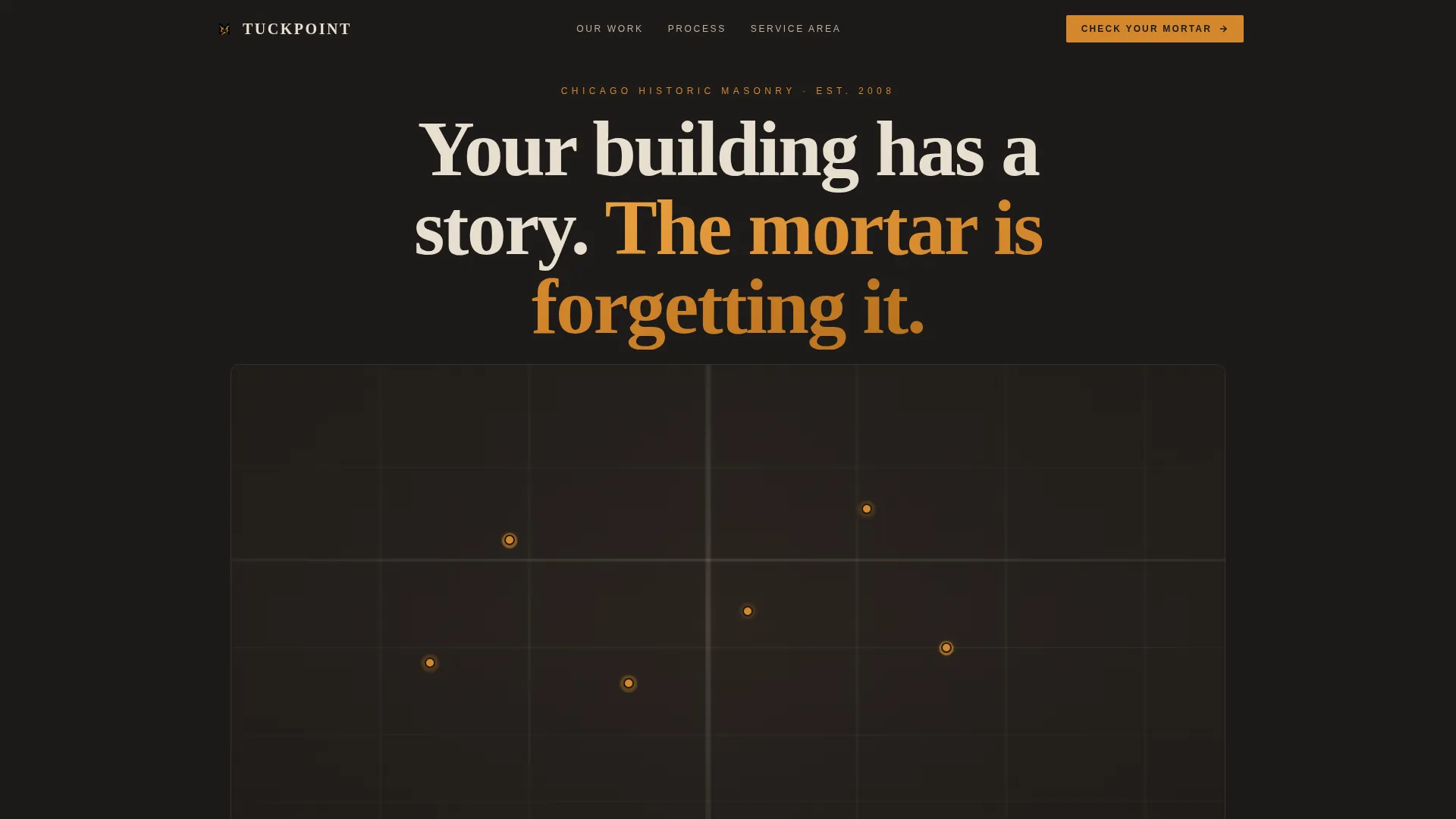
- An interactive map header with pulsing amber pins and hover-reveal project thumbnails
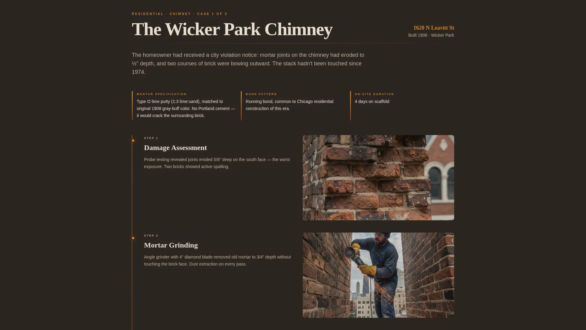
- Three scrolling case study timelines covering a chimney, a six-flat facade, and a landmarked commercial building
- A five-step mortar diagnostic quiz that delivers a preliminary condition grade in exchange for an email and phone number
Feature list
This template packs purpose-built components into a single cohesive scroll. Each one is designed to do specific work at a specific moment in the visitor's journey.
Interactive Map Header
A stylized aerial map of the service region displays amber pins marking completed restoration projects across Chicago neighborhoods. Each pin pulses faintly and expands on hover to show a before-and-after facade thumbnail, the street address, and the year the building was constructed. The map communicates geographic reach without a single word of body copy.
Three-Part Case Study Narrative
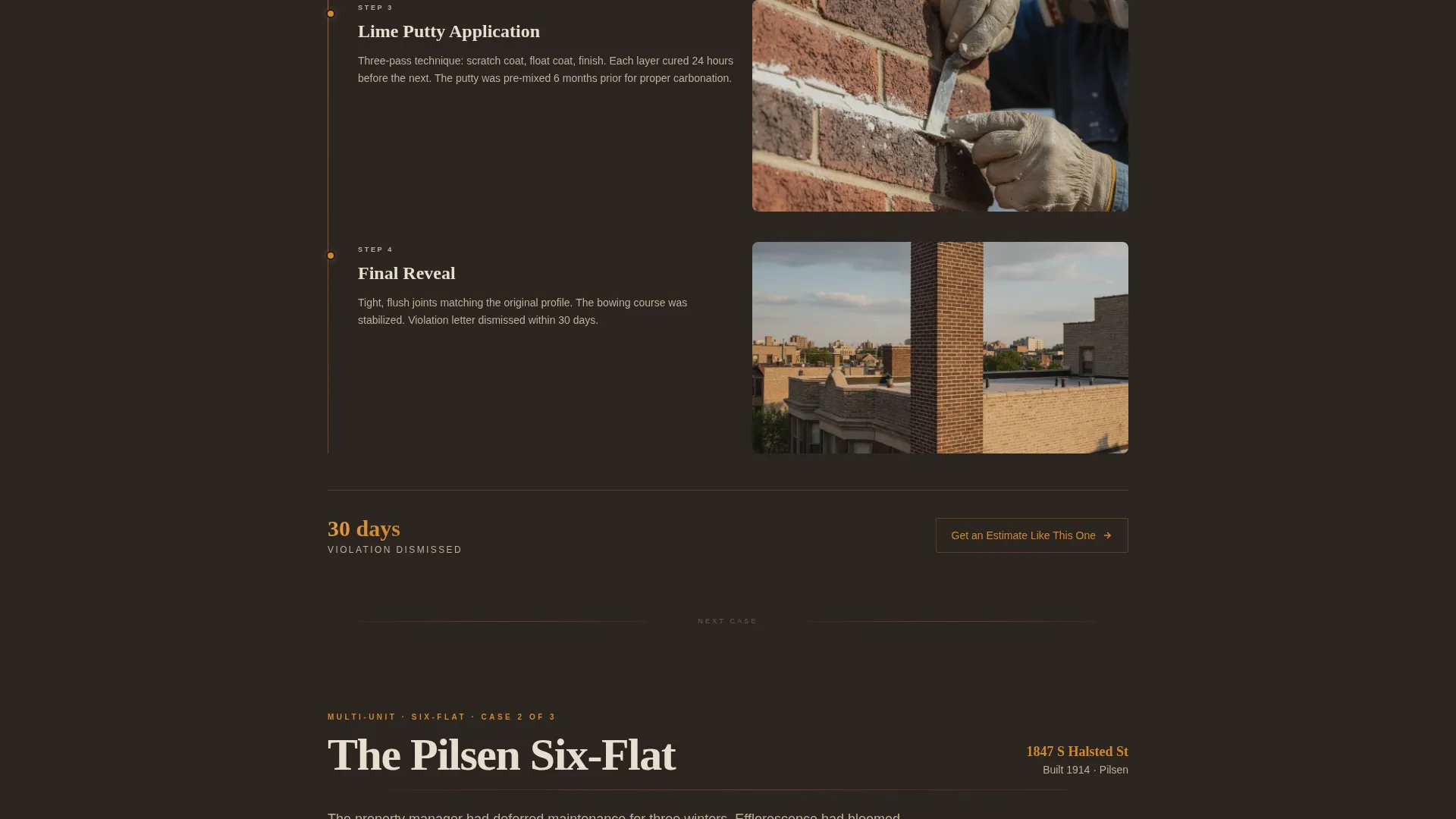
The page scrolls through three restoration stories presented as structured timelines. Each story includes a damage report photograph, the original mortar specification, scaffold installation, the grinding and repointing sequence, and a final street-level reveal. The three projects escalate in complexity, moving from a residential chimney to a six-flat facade to a landmarked commercial building.
Five-Step Mortar Diagnostic Quiz
The primary call to action launches a guided five-step assessment. Visitors upload a close-up photo of their worst joint, select their building era, identify their brick bond pattern from visual examples, describe visible damage types, and enter their address. Each step includes a one-sentence explanation of why the question matters. Results return a preliminary mortar condition grade and a recommended service tier.
Contextual Secondary Path
Beneath each case study, a secondary call-to-action link reads "Get an Estimate Like This One." Clicking it opens the quiz with the building type pre-selected, reducing friction for visitors who are already sold on the service and just need to start the process.
Credentials and Proof Section
A dedicated section surfaces preservation certifications, landmark commission citations, and material specifications. This section supports the claims made in the case studies and gives preservation architects the technical grounding they need before recommending a contractor.
Agrarian Root Visual System
The template uses a considered four-color palette anchored in earth tones pulled from the materials themselves. Soot black grounds the header and footer, mortar cream carries the body text, amber activates every interactive element, and iron oxide appears only on hover states and dividers. Typography pairs Fraunces display serif with DM Sans body text for warmth and legibility at every size.
Page sections overview
| Section | Purpose |
|---|---|
| Hero map header | Proves service territory with interactive project pins |
| Case study one | Residential chimney restoration timeline |
| Case study two | Six-flat facade restoration timeline |
| Case study three | Landmarked commercial building timeline |
| Mortar diagnostic quiz | Five-step lead qualification and condition grading |
| Credentials section | Certs, landmark citations, and material specs |
| Final call to action | Mortar grade teaser with email and phone capture |
| Footer | Logo and tagline left, navigation links right |
Design & branding system
The visual identity follows an Agrarian Root theme. Every color, typeface, and motion choice references the physical materials of the trade itself. The result feels like a salvage yard at golden hour: dusty, warm, and built from the earth.
- Four-color palette: soot black (#1C1917), kiln-fired amber (#D4872C), weathered mortar cream (#E8DFD0), and iron oxide red (#7C3A2A) used in strict roles across the layout
- Typography pairing: Fraunces display serif for headlines and DM Sans for body text, balancing historical warmth with clear readability
- Animation layer: scroll-reveal text, pulsing map pins, hover thumbnail expansion, and quiz step transitions create a high-interactivity feel without distracting from content
Mobile & speed optimization
The template is built desktop-first to serve preservation architects reviewing specifications on large screens, but full mobile support is included across all breakpoints.
- Static sections use Server Components to keep initial load lean while complex interactive elements load separately
- The quiz and interactive map run as Client Components, isolating their rendering from the rest of the page
- All animations and hover interactions are designed to degrade gracefully on smaller screens without breaking the core layout
How this template helps you convert
Conversion is built into the page structure from the first scroll. Visitors are educated, qualified, and guided toward action before they ever see a form field.
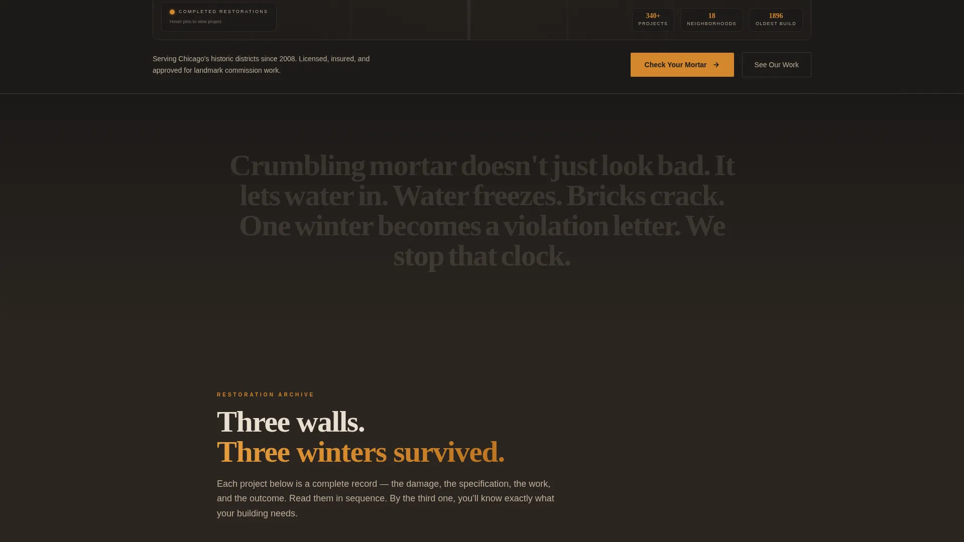
- The map header establishes proof of territory immediately. Visitors see completed projects in their own neighborhood before reading a single line of service copy, which builds trust faster than any written claim.
- The case study scroll pre-qualifies intent. By the time a visitor reaches the quiz, they have watched three increasingly complex restorations and are already imagining their own building in the sequence. The secondary "Get an Estimate Like This One" path inside each case study captures visitors who convert early.
- The diagnostic quiz exchanges education for contact details. Visitors receive a real preliminary mortar condition grade and a recommended service tier. They give their email and phone number because the result is genuinely useful, not because they were pushed into a generic contact form.
Other information about this template
This template is a strong fit for contractors who operate in markets where historic preservation standards govern the scope and materials of masonry work. The layout was designed with Chicago's landmark districts in mind, but the structure adapts to any city with a dense stock of pre-war masonry buildings.
- The footer follows an Arc Browser Split layout: logo and tagline on the left, navigation links on the right
- Localization is set for United States format: Chicago metro context, US dollars, and MM/DD/YYYY date formatting
- Social proof is built into the template through before-and-after photography slots, street address and year-built labels, and landmark commission citation fields within the credentials section
- The page is structured as a hero-dominant layout with a 90/10 ratio, meaning the hero and map occupy the dominant visual weight before the narrative content begins
Theme
Agrarian Root
Creative direction
Case Study Narrative
Color system
Charcoal & Amber
Style
Hero-Dominant (90/10)
Direction
Quiz/Assessment
Page Sections
Interactive Map Header with Project Pins
Three-part Scrolling Case Studies
Five-step Mortar Diagnostic Quiz
Pre-selected Estimate Path
Credentials and Proof Section
Agrarian Root Animation Layer
Related questions
Who is this landing page template designed for?
What does the mortar diagnostic quiz do for my leads?
Can I adapt this template for a service area outside Chicago?
How does the secondary call to action inside each case study work?
What makes this template different from a generic contractor page?



