Tumbler - Precision Locksmith Landing Page Template
Tumbler is a split-screen landing page template built for commercial locksmith services operating at building-management scale in Tokyo. It pairs cinematic photography with case study storytelling to earn trust before asking for a lead. The charcoal and amber design system, scroll-reveal animations, and a structured assessment form make it purpose-built for property managers and facility directors.
by Rocket studio
Quick summary
Tumbler is a precision-built landing page template for a Tokyo commercial locksmith service. It uses a 50/50 split-screen layout, a case study narrative structure, and a charcoal and amber color system to convert property managers and facility directors into qualified leads. Every section earns the next click before asking for commitment.
Who this template is for
This template is designed for commercial locksmith businesses that serve large property portfolios and time-sensitive clients. It works best when your audience makes decisions based on proof, not promises.
- Property management firms overseeing multiple commercial buildings
- Corporate facility directors handling post-termination lockouts or access-control migrations
- Real estate agents who need same-day lock changes between tenancies
What problem this template solves
Generic service pages fail commercial clients. A property manager evaluating a locksmith for a 40-floor office tower needs evidence, not bullet points. This template replaces vague claims with structured, narrative proof.
- It removes the credibility gap between a new visitor and a first inquiry
- It presents speed, scale, and discretion as proven facts through timestamped case studies
- It guides visitors with different urgency levels toward the right next step
What you get with this template
You get a fully structured single-page layout that moves visitors through a deliberate confidence arc. Each section builds on the last, escalating from routine capability to emergency response to complex portfolio management.
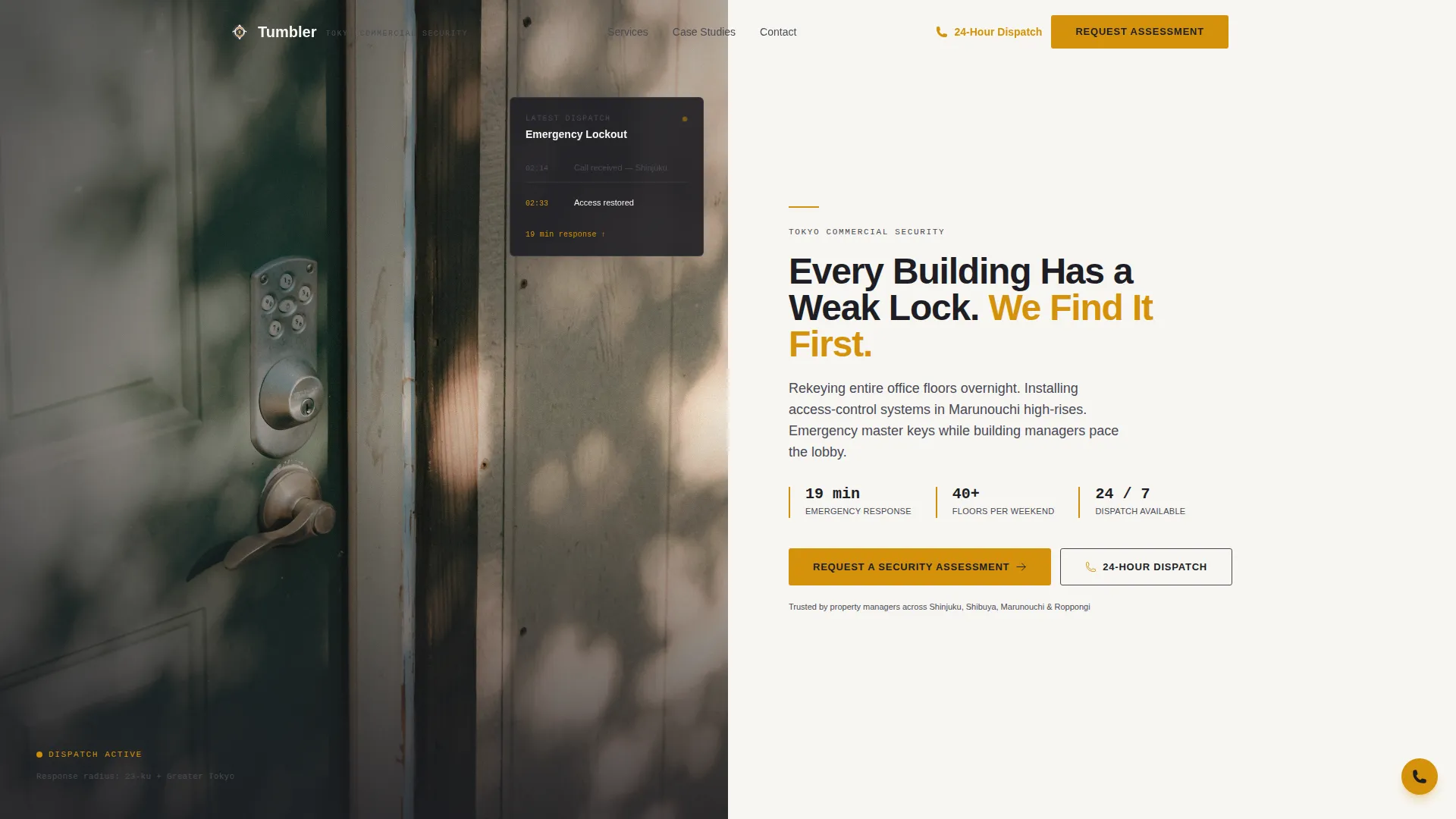
- A 50/50 split-screen hero with photo left and headline right, plus a floating dispatch card
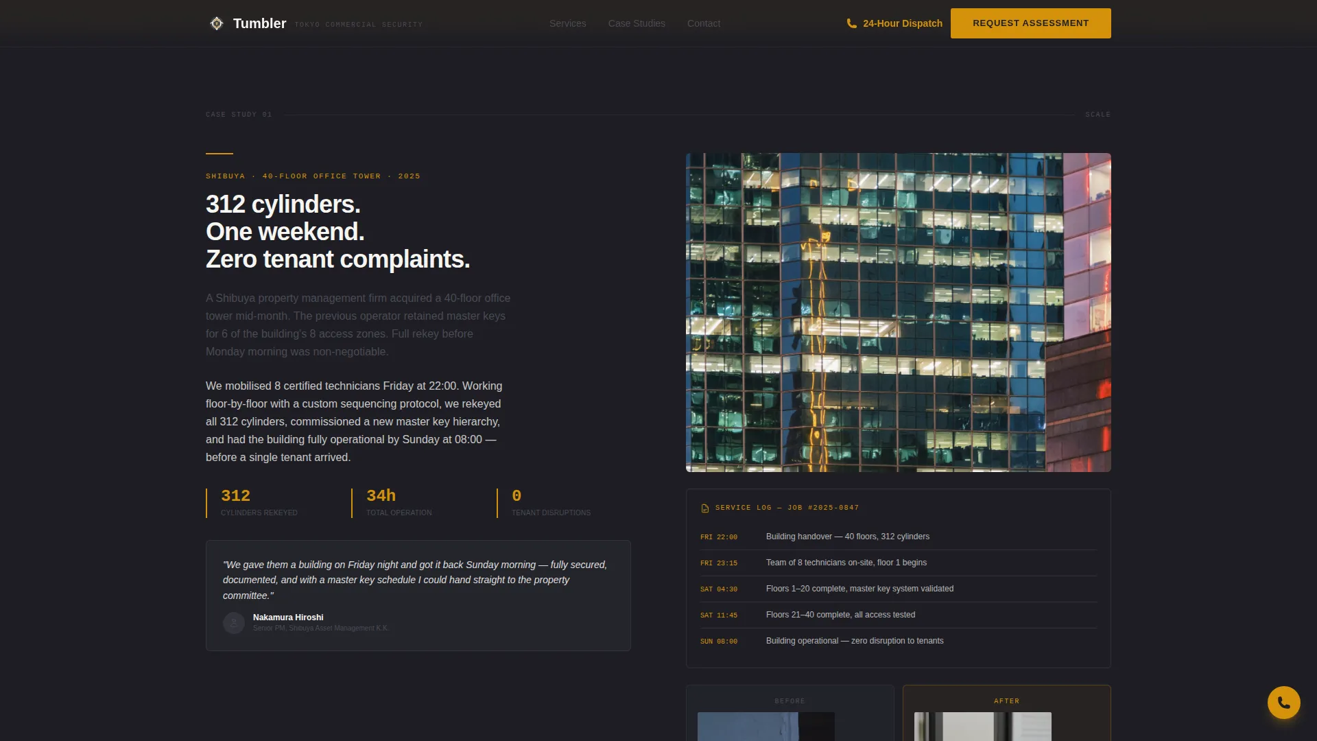
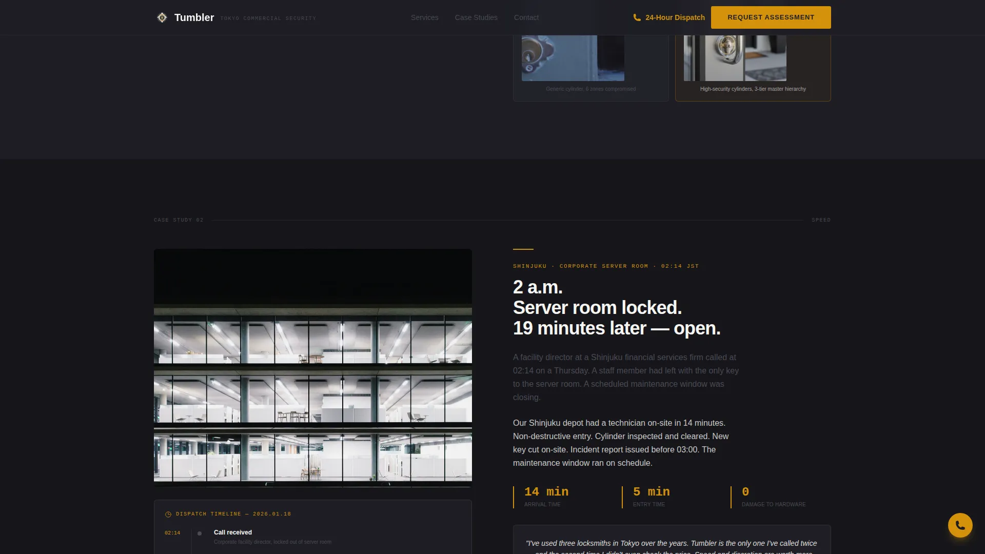
- Three case study sections with situation, constraint, and resolution storytelling paired with evidence panels
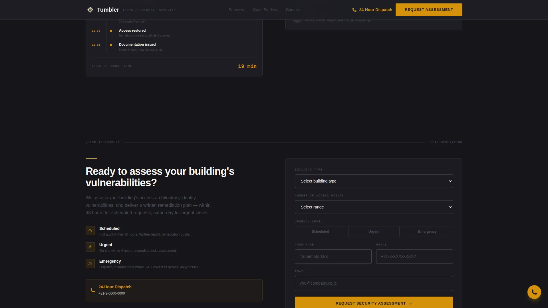
- A lead generation form with conditional fields for building type, access point count, and urgency level
Feature list
This template ships with purpose-built components matched to the operational realities of a commercial locksmith business.
50/50 Split-Screen Hero Layout
The header divides the viewport cleanly: a cinematic photograph on the left and a white text panel on the right. The photograph features a locksmith's gloved hands threading a high-security cylinder into a brushed-steel commercial door, with a soft-focused Tokyo skyline visible through the hallway window behind. The right side holds the primary headline in charcoal, a one-line subhead in amber, and the primary call-to-action button.
Case Study Narrative Sections
Three scroll sections each present a real-world engagement at increasing stakes. The first covers a 40-floor Shibuya office tower rekeyed in a single weekend. The second documents a 2 a.m. emergency lockout resolved in nineteen minutes. The third walks through a full access-control migration for a Roppongi property portfolio. Left panels carry the story; right panels display the evidence.
Evidence Panels with Social Proof
Each case study pairs its narrative with concrete proof elements. These include time-stamped service logs rendered in monospaced type, before-and-after photographs of hardware, and building manager testimonials. The evidence panel design uses JetBrains Mono for data and timestamps to signal precision and authenticity.
Conditional Lead Generation Form
The security assessment form adapts based on visitor input. Fields include building type (office, residential, retail, or mixed-use), number of access points, and urgency level (scheduled, urgent, or emergency). Conditional logic surfaces relevant follow-up fields so the form stays focused rather than overwhelming.
Floating 24-Hour Dispatch Button
An amber phone icon floats persistently on the page for visitors already in an active crisis. This secondary conversion path, labeled "Call Our 24-Hour Dispatch," does not require form completion. It serves the segment of visitors who need immediate action rather than a scheduled assessment.
Scroll-Reveal and Parallax Animation System
The template uses scroll-triggered reveals, parallax depth on photography panels, and staggered entrance animations on data points and testimonial blocks. Hover states activate on all interactive elements. The animation pace is measured, not showy, reinforcing the corporate precision tone.
Page sections overview
| Section | Purpose |
|---|---|
| Hero Split Screen | Establish credibility and present primary call to action |
| Case Study 1 | Prove scale with Shibuya tower weekend rekey |
| Case Study 2 | Prove speed with 2 a.m. nineteen-minute response |
| Mid-Page call to action | Capture leads warmed by first two case studies |
| Case Study 3 | Prove complexity handling with Roppongi portfolio migration |
| Security Assessment Form | Convert qualified visitors into booked leads |
| Footer Row | Provide contact and navigation in a single linear strip |
Design & branding system
The visual identity follows a Corporate Precision theme. Every design decision reinforces the feeling of a precision mechanism operating without friction.
- Color palette: deep graphite (#1E1E24) dominates backgrounds and photo overlays; brushed steel mid-tone (#4A4A55) supports secondary surfaces; warm amber (#D4920B) marks every call-to-action element, accent line, and data highlight; clean paper white (#F7F6F3) fills text panels
- Typography: DM Sans handles all body copy and interface text for readability at scale; JetBrains Mono renders timestamps, service logs, and data points to signal technical precision
- Visual tone: dark panels create weight and authority; amber accents draw the eye naturally to conversion points; white text areas breathe across dense information blocks
Mobile & speed optimization
The template is designed desktop-first to match the primary audience of property managers working at a desk. Mobile behavior is handled with dedicated components rather than afterthoughts.
- A fixed bottom bar on mobile surfaces the primary call-to-action button persistently as visitors scroll through case studies
- The floating amber dispatch button remains accessible at all scroll positions on mobile and desktop
- Scroll-reveal behavior uses Intersection Observer, and scroll-driven effects use native CSS scroll-behavior to keep animation smooth across devices
How this template helps you convert
The conversion strategy is built on a confidence arc. The page earns trust through proof before it asks for anything.
- The hero section establishes authority immediately with a specific headline and a visible primary call to action, so visitors know exactly what the service offers within seconds of landing.
- The three case studies escalate in stakes and complexity, guiding visitors from awareness to conviction before they reach the lead generation form.
- The mid-page call-to-action placement after the second case study captures visitors who are already convinced, without requiring them to scroll to the bottom of the page.
Other information about this template
This template is part of a broader set of professional services templates built for niche service providers in urban commercial markets. A few additional details worth noting:
- The template is localized for a Tokyo context, with district references (Shibuya, Marunouchi, Roppongi) and Japanese commercial building conventions reflected in the copy structure
- The footer follows a linear single-row pattern, keeping the page exit clean and uncluttered
- The form's conditional field logic is built for high-stakes B2B inquiries, where urgency level and building type change the nature of the engagement
- The template style is classified as Split Screen (50/50), suitable for service businesses that need equal visual weight between photography and messaging
- Animation intensity is set to medium, using scroll reveals, parallax, stagger, and hover states without overwhelming the professional tone
Theme
Corporate Precision
Creative direction
Case Study Narrative
Color system
Charcoal & Amber
Style
Split Screen (50/50)
Direction
Lead Generation
Page Sections
50/50 Split-screen Hero
Three-part Case Study Narrative
Conditional Lead Generation Form
Floating 24-hour Dispatch Button
Scroll-reveal and Parallax Animations
Corporate Precision Typography System
Related questions
Who is this landing page template designed for?
Can I replace the case studies with my own service history?
What makes the lead generation form different from a standard contact form?
How does the floating dispatch button work alongside the main form?
Is this template suitable for a locksmith who also serves residential clients?



