Turf - Elite Lawncare Landing Page Template
Turf is a single-column landing page template built for elite Bangalore lawn care services. It uses a case study narrative flow, moving visitors through three real client transformations before asking for a click. The Arctic White and manicured green palette signals premium positioning, and every section builds confidence before the primary call to action appears.
by Rocket studio
Quick summary
Turf is a click-through landing page template for a Bangalore-based lawn care service. It opens with a bold manifesto header, then walks visitors through three escalating client case studies. The design stays in an Arctic White palette with controlled green accents. The goal is simple: prove competence three times, then earn the click to a service and pricing page.
Who this template is for
This template suits premium lawn care providers operating in and around Bangalore. It is particularly well-suited to service businesses that rely on visual proof and word-of-mouth credibility to win high-value clients.
- Tech-park facility managers maintaining large, multi-acre campuses
- Villa and estate owners in areas such as Whitefield and Sarjapur
- Wedding venue operators who need consistently flawless outdoor greenery
What problem this template solves
Bangalore's lawn care market is visually competitive. Most service pages look generic and fail to communicate the technical skill involved. Potential clients, especially facility managers and premium property owners, need evidence before they commit to a site visit or assessment.
- Visitors leave without trust because the page shows no real-world proof
- The service's technical depth, soil expertise, and irrigation knowledge goes unnoticed
- High-intent visitors who might convert drift away to comparison shopping instead
What you get with this template
This template delivers a focused, single-column landing page structured around a narrative of transformation. Every layout decision is made to build credibility progressively and funnel visitors toward a single, clear next step.
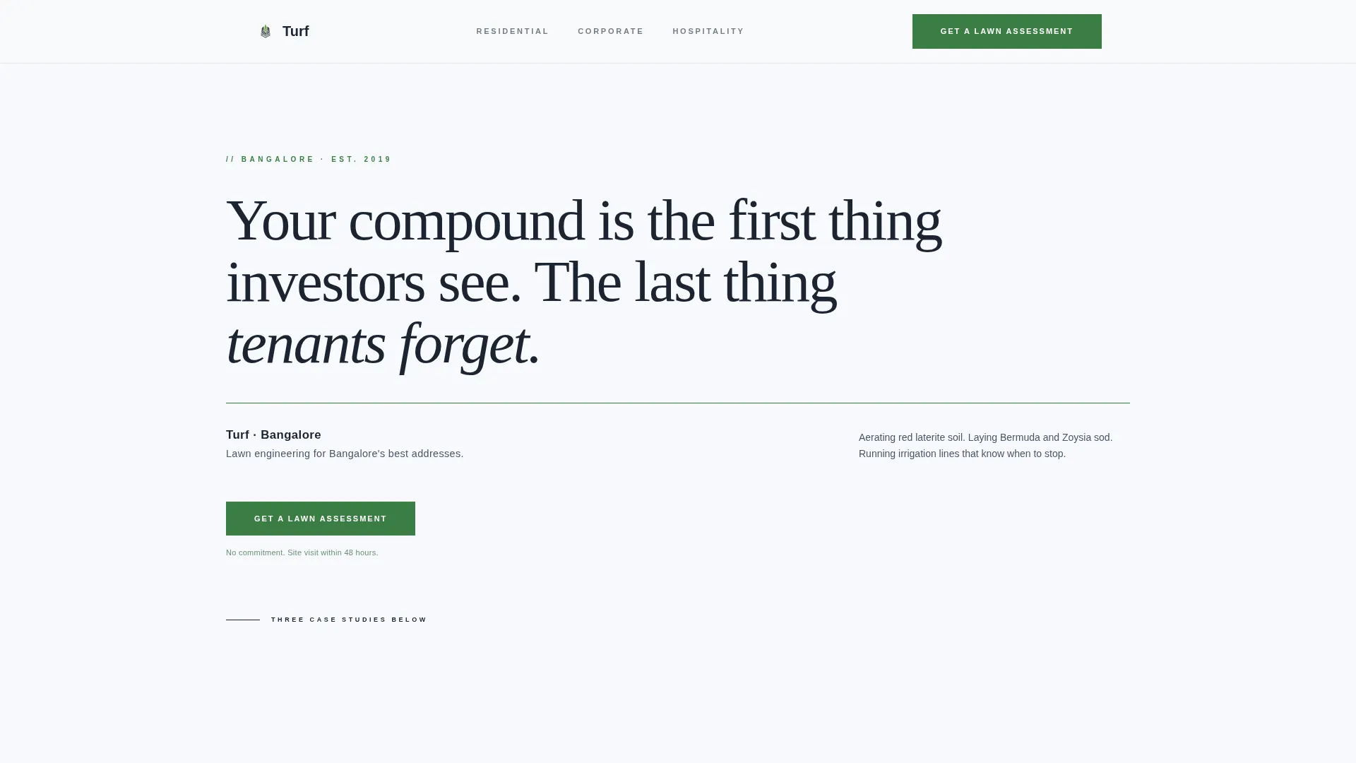
- A manifesto-style header with a serif quote, thin green rule, and subheading block
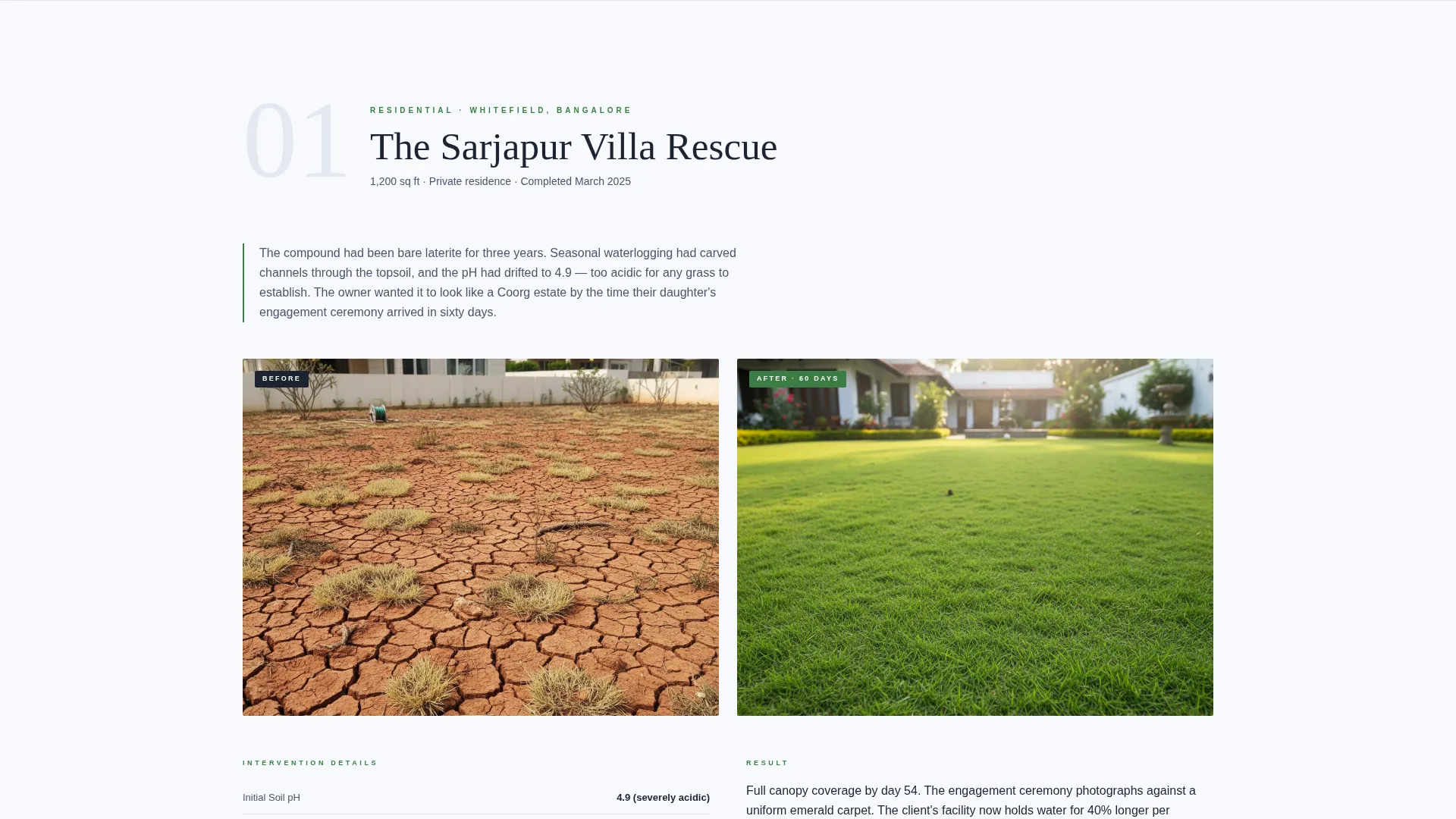
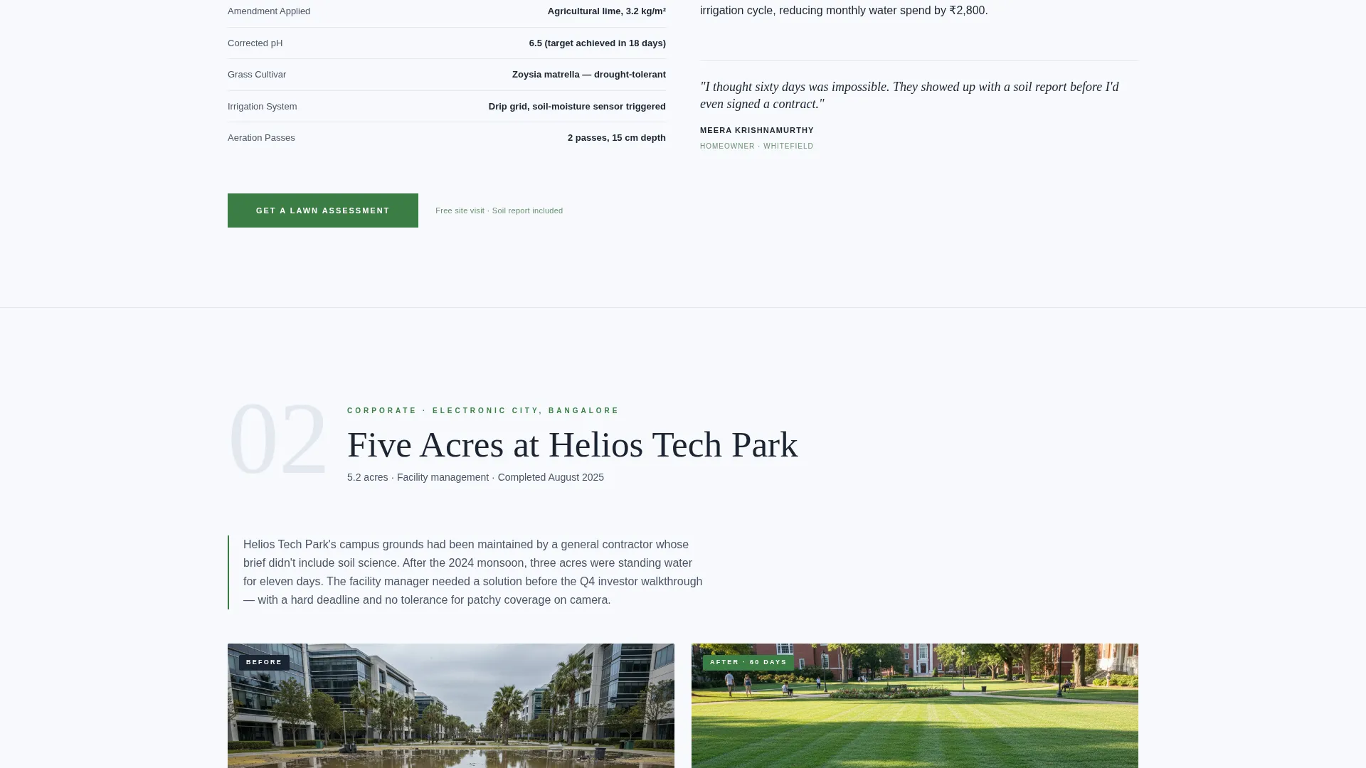
- Three escalating case study sections, each with problem, intervention, and result beats
- Primary and secondary call-to-action placements distributed across the page flow
Feature list
This template is built around a specific editorial and visual framework. Each feature below reflects a deliberate design and layout choice present in the source brief.
Manifesto Header Block
The page opens with large serifed charcoal type on pure white, no background image. A single-line statement reads like a boardroom declaration, followed by a thin green rule and a company subheading. This opening sets tone immediately and gives facility managers a reason to keep reading.
Case Study Narrative Sections
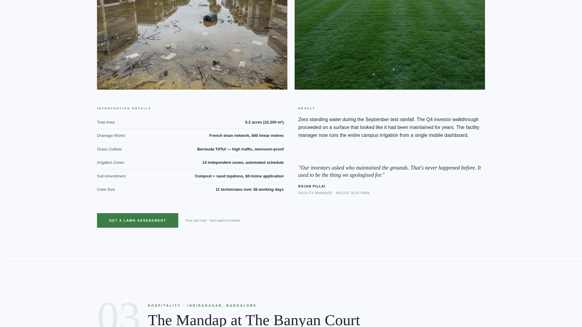
Three client stories are laid out in a repeating three-beat structure: the problem photograph, the detailed intervention, and the result photograph. Each case escalates in scale, from a residential garden to a five-acre tech campus to a heritage hotel. This structure builds an evidence wall before any ask is made.
Distributed Primary Call to Action
The "Get a Lawn Assessment" button appears first below the header and repeats after each case study. There is no form on this page. The button carries accumulated momentum forward to a detailed service and pricing page.
Secondary Navigation Link
A text-only link reading "See Our Service Plans" sits at the bottom of the page. It serves comparison shoppers who need to review options before committing to an assessment request.
Arctic White Color System
The palette uses crisp linen white (#F7F9FC), pale frost (#E3E8EF), deep estate charcoal (#1B2432), and a single living accent of manicured green (#3A7D44). Green appears only on buttons, progress indicators, and before-after dividers, so every accent carries visual weight.
Executive Suite Typography
Body text sits in charcoal. Headings use large, serifed, unhurried typefaces. The typographic system communicates restraint and authority without using imagery as a crutch in the header.
Page sections overview
| Section | Purpose |
|---|---|
| Manifesto Header | Sets tone with a bold serif statement and subheading |
| Green Rule Divider | Marks the transition from header to case study flow |
| Case Study One | Residential garden transformation story, first evidence beat |
| Case Study Two | Tech-park campus transformation, mid-scale proof point |
| Case Study Three | Heritage hotel lawn, largest-scale credibility anchor |
| Primary call to action Blocks | Repeated after each case study to capture ready visitors |
| Secondary Text Link | Bottom-page option for visitors who want to compare plans |
Design & branding system
The visual identity follows an Executive Suite theme. The palette and typography work together to communicate premium positioning without relying on loud imagery or decorative excess.
- Backgrounds cycle between crisp linen white (#F7F9FC) and pale frost (#E3E8EF); charcoal (#1B2432) is used for all body copy
- Manicured green (#3A7D44) is reserved strictly for buttons, progress indicators, and before-after dividers to preserve its visual impact
- Large serifed display type carries the emotional weight of the header, while the rest of the page stays clean and easily scannable
Mobile & speed optimization
The single-column flow is a natural fit for mobile visitors. Scrolling through case studies one at a time works well on smaller screens, and the layout avoids complex grid structures that could break on narrow viewports.
- Vertical single-column stacking keeps the reading order logical on any screen size
- No embedded forms or heavy interactive components that could slow initial load
- Call-to-action buttons are sized and spaced to be comfortably tappable on mobile devices
How this template helps you convert
This template is designed as a click-through page, meaning its entire job is to build enough confidence that the visitor taps the primary button before they leave.
- The manifesto header creates an immediate emotional hook, making the visitor feel understood before a single service is named.
- Three progressively larger case studies demonstrate competence at the residential, campus, and hospitality scales, so the visitor self-qualifies and thinks "my project is smaller than what they have handled."
- The repeated "Get a Lawn Assessment" button, placed right after each proof point, catches visitors at their peak confidence without forcing them to scroll back to the top.
Other information about this template
This template is designed specifically for the Bangalore lawn care market and reflects the environmental realities of that context: red laterite soil, monsoon flooding cycles, and April heat. The intervention details within case studies reference soil pH data, grass cultivars such as Bermuda and Zoysia, and irrigation scheduling, giving the page a technical depth that generic service pages lack.
- The template is categorized under Professional Services for Bangalore local service businesses
- It works well for any lawn care provider serving premium residential, commercial, or hospitality clients in the city
- The click-through structure means there is no conversion friction on this page; the only ask is a single button tap
- This is a single-column flow template built on the Executive Suite theme with an Arctic White color system and a Case Study Narrative creative direction
Theme
Executive Suite
Creative direction
Case Study Narrative
Color system
Arctic White
Style
Single Column Flow
Direction
Click-Through
Page Sections
Manifesto-style Header Block
Three-beat Case Study Flow
Repeated Click-through Call to Action
Arctic White Color System
Executive Suite Typography
Secondary Comparison Link
Related questions
Does this landing page include a contact form?
How many case study sections does the template include?
Can this template work for lawn care businesses outside Bangalore?
What call-to-action placements are included in this template?
Who is this landing page template best suited for?



