Specialty Construction Professional Website Template
Turnstile is a zigzag landing page template built for revolving door installation specialists. It leads with a full-bleed interior photo, walks visitors through three case study narratives, and funnels every scroll toward a single consultation request. The Agrarian Root design system pairs deep charcoal with harvest amber to project precision, craft, and quiet confidence.
by Rocket studio
Quick summary
Turnstile is a click-through landing page template designed for revolving door installation companies. It uses an alternating case study layout to build credibility section by section. A full-bleed header photo drops visitors straight into the work, and every section flows toward one call to action: "Spec Your Entrance."
Who this template is for
This template is built for specialty contractors whose clients think in tolerances, not trends. If your pitch requires proof before a prospect will pick up the phone, this layout earns that trust visually and structurally.
- Revolving door installation crews pitching general contractors on commercial and hospital projects
- Property managers and building owners evaluating energy-saving vestibule retrofits
- Architects and specification writers sourcing entrance systems for flagship retail or office lobbies
What problem this template solves
Most specialty trade websites bury their best work inside a portfolio grid that nobody scrolls. Prospects leave without understanding the engineering behind the product, and without a clear reason to reach out. This template solves that by turning each project into a structured argument.
- Visitors leave before seeing proof of technical capability because content is scattered or generic
- No clear conversion path guides prospects toward requesting a consultation
- The craft of precision installation goes unrecognized when it lives inside a plain photo gallery
What you get with this template
You get a single-page layout built around three zigzag case study blocks, each pairing photography with a structured project story. The page moves from problem to engineering decision to measurable result, compounding visitor confidence with every scroll.
- A full-bleed header section with a serif headline and a ghost-button call to action
- Three alternating case study blocks, each with a photo panel, a narrative column, and a micro-call to action
- A final conversion section with a brief qualifying paragraph and a solid amber "Spec Your Entrance" button
Feature list
Full-Bleed Header with Motion-Implied Photography
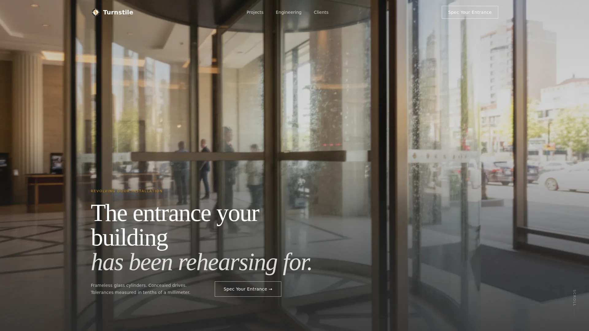
The header is designed around a shoulder-height interior shot taken from inside a revolving door mid-rotation. Motion blur on the brushed-steel center column signals movement and precision. A white serif headline fades in after a beat, reading: "The entrance your building has been rehearsing for."
Zigzag Case Study Narrative Layout
Three installation stories are told in alternating left-right pairs. Each block opens with the client problem, moves through the engineering decision, and lands on a single measurable result. The alternating rhythm keeps the eye moving and the confidence building.
Layered Call-to-Action Architecture
The primary call to action appears three times across the page. It starts as a ghost button over the header, returns as a solid amber button after the second case study, and anchors a sticky bottom bar on mobile. Each case study also carries a micro-call to action to deepen engagement before the final push.
Golden Hour Full-Width Result Shots
Each case study closes with a full-width beauty shot of the finished entrance photographed at golden hour. These images are structural, not decorative. They provide the visual payoff that makes the engineering story feel real and resolved.
Qualifying Conversion Section
The final section before the main call to action names three signals that indicate a building is ready for a revolving door installation. This short paragraph functions as a self-qualifying filter, so visitors who click "Spec Your Entrance" already understand the scope of the conversation.
Mobile Sticky Call-to-Action Bar
On mobile, the primary call to action persists as a sticky bar at the bottom of the screen. Visitors never have to scroll back to find where to act. The bar appears after the header and stays visible through every case study section.
Page sections overview
| Section | Purpose |
|---|---|
| Full-Bleed Header | Opens with interior revolving door photography and the serif brand headline |
| Ghost Button call to action | First call-to-action placement over the header photo |
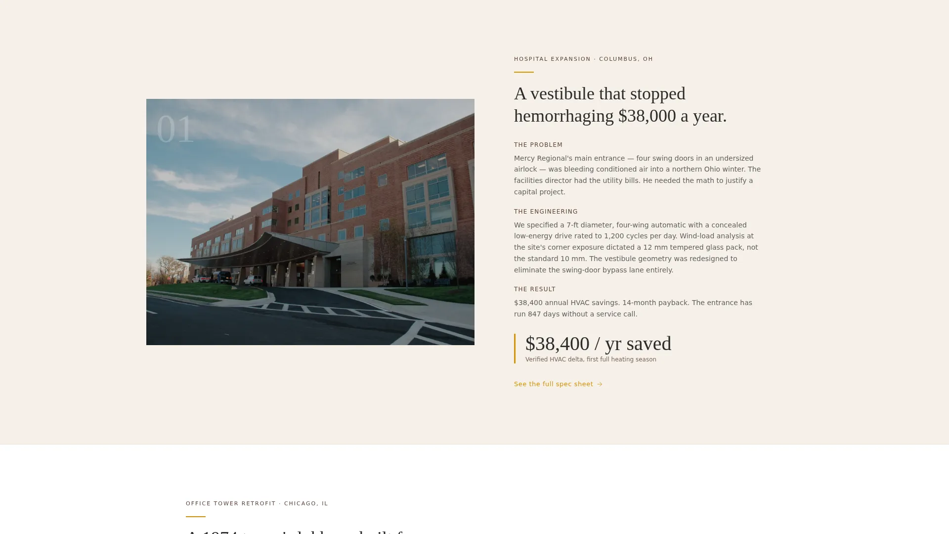
| Case Study One | Introduces first project problem, engineering decision, and measurable result |
| Micro-call to action One | "See the full spec sheet" link deepens engagement after project one |
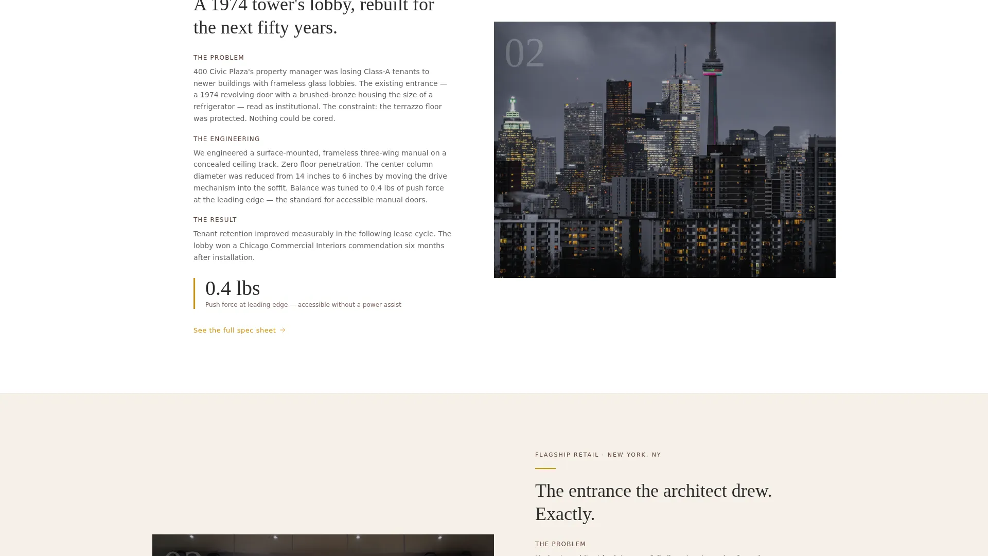
| Case Study Two | Second alternating project block with flipped photo-text layout |
| Amber Button call to action | Solid amber call to action appears after the second case study |
| Micro-call to action Two | "See the full spec sheet" link after project two |
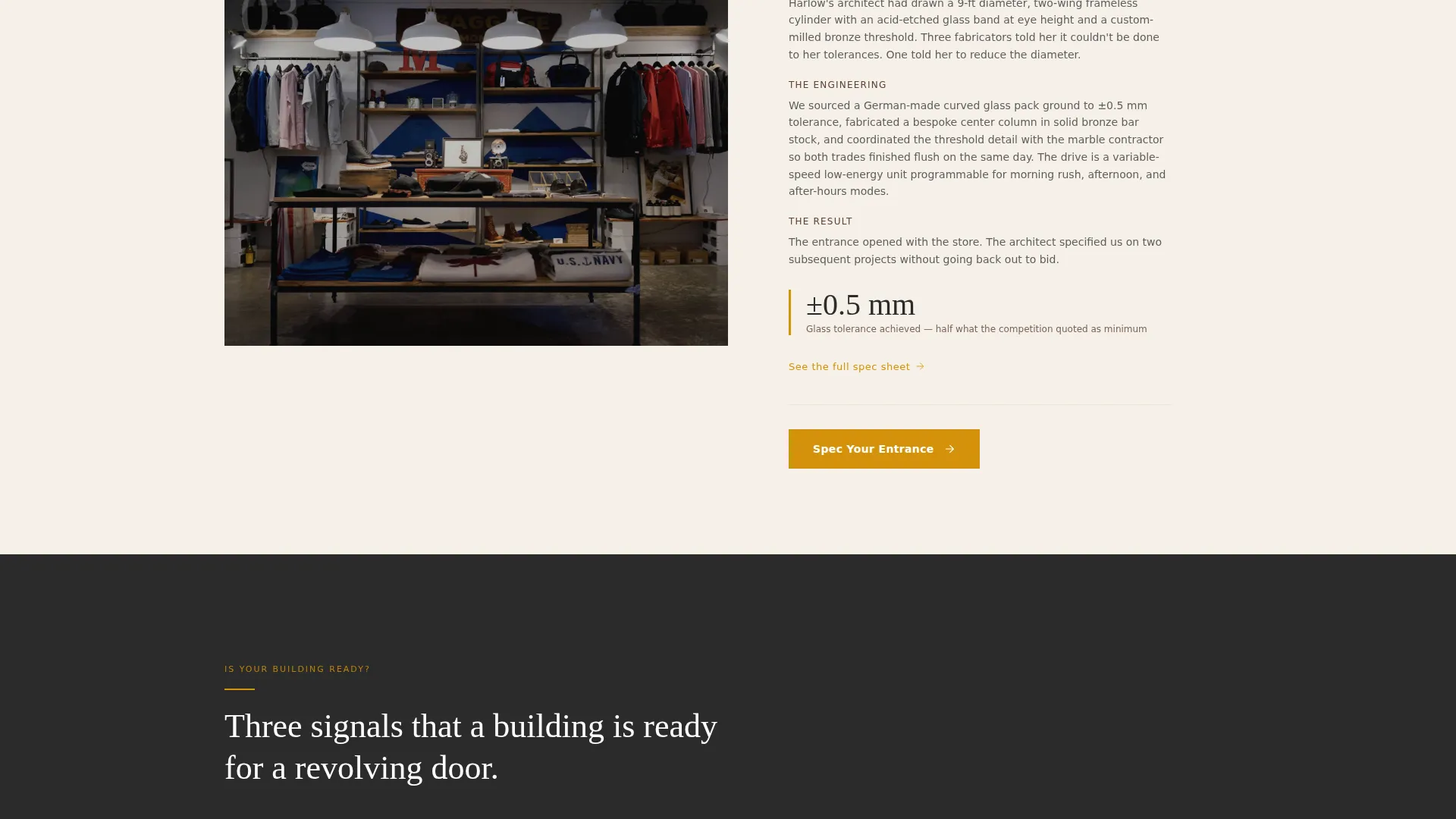
| Case Study Three | Third and largest project block, completing the confidence arc |
| Micro-call to action Three | "See the full spec sheet" link after project three |
| Qualifying Paragraph | Three-signal section that filters and prepares visitors to convert |
| Final call to action Section | Anchors the page with the primary amber "Spec Your Entrance" button |
Design & branding system
The Agrarian Root theme treats the page like a piece of crafted ironwork: heavy where it needs to be, luminous where the light catches. Charcoal grounds the headlines and photo overlays. Linen opens the space between sections. Amber appears only where action is expected.
- Deep plowed-earth charcoal (#2B2B2B) for headlines, overlays, and dominant type
- Sun-bleached linen (#F5F0E8) for open background panels that let content breathe
- Harvest amber (#D4920B) reserved strictly for accent lines, hover states, and call-to-action buttons
Mobile & speed optimization
The layout is structured to perform cleanly on smaller screens without sacrificing the visual weight that makes the template feel credible. Zigzag blocks stack vertically on mobile while preserving the photo-first rhythm.
- Zigzag columns reflow into single-column stacks on narrow viewports, keeping the narrative order intact
- The sticky amber call-to-action bar anchors to the bottom of mobile screens for persistent access
- Full-bleed and full-width image sections are composed to remain impactful at reduced sizes
How this template helps you convert
This template is built around a single conversion goal: move visitors to a consultation request on the next page. Every layout decision works toward that moment.
- The case study structure builds credibility through documented project outcomes before asking for any commitment, so the click feels earned rather than demanded.
- The qualifying paragraph near the end acts as a natural filter, ensuring visitors who reach the final call to action already understand what a revolving door installation project involves.
Other information about this template
This template is specifically suited to the specialty construction sector, where purchase decisions involve multiple stakeholders and a long consideration period. The click-through structure respects that reality by delivering value before asking for action.
- The template style is Zigzag/Alternating, which is well-suited for presenting sequential project narratives
- The creative direction is Case Study Narrative, meaning the layout is built to carry real project stories with specific data points
- No forms live on this page; all conversion paths lead to a separate consultation request page
- The header concept is Full-Bleed Photo, framing the work from the perspective of the installer, not a showroom
Theme
Agrarian Root
Creative direction
Case Study Narrative
Color system
Charcoal & Amber
Style
Zigzag/Alternating
Direction
Click-Through
Page Sections
Full-bleed Header with Serif Headline
Zigzag Case Study Layout
Layered Call-to-action Placement
Golden Hour Full-width Result Photography
Qualifying Conversion Section
Mobile Sticky Call to Action Bar
Related questions
What kind of business is this template designed for?
Does this template include a contact form?
Can I replace the case study content with my own projects?
How many times does the call to action appear on the page?
Is this template suitable for a single project showcase or multiple projects?



