Tutoring Center Marketing Pricing Website Template
The Tutor Free Estimate Comparison Landing Page Template is a single-page, click-through landing page built for neighborhood tutoring centers. It pairs a vivid comparison chart with a mosaic of eight real parent testimonials, letting anxious families compare homework help, subject mastery, and test prep packages at a glance before hitting one high-contrast "Get My Free Estimate" button.
by Rocket studio
Quick summary
This template gives tutoring centers a focused, conversion-ready landing page that stacks a clear comparison chart against real social proof. Parents scroll through a side by side comparison of three tutoring packages, absorb eight specific before-and-after testimonials, and arrive at the estimate button already convinced. No form fields live on this page, the comparison landing drives one action: the click.
Who this template is for
This comparison landing page template is built for local and neighborhood tutoring centers that want to turn website visitors into free estimate requests without overwhelming them. It suits centers that offer tiered service packages and need a fast, credible way to show the differences between those options.
- Parents of kindergarten through twelfth grade students struggling with math, reading, or writing
- Guardians researching ACT or SAT prep at a price point below private tutoring
- Tutoring center owners and marketers who want a polished, mobile-first comparison page ready to customize and launch quickly
What problem this template solves
Most tutoring center pages bury parents in generic promises. A mom in a carpool line does not have time to hunt for details across multiple pages. She needs to compare options, read proof that it works, and take one clear step, all in under two minutes. This template removes that friction entirely.
- Parents cannot easily compare packages when details are scattered across separate pages
- Generic testimonials without grade-level or subject context feel like marketing noise rather than evidence
- A long or unclear estimate process causes drop-off before a family ever contacts the center
What you get with this template
You get a fully structured, single-page comparison landing page designed around one goal: sending qualified families to the free estimate form. Every design element, every testimonial placement, and every comparison chart row serves that goal without distraction.
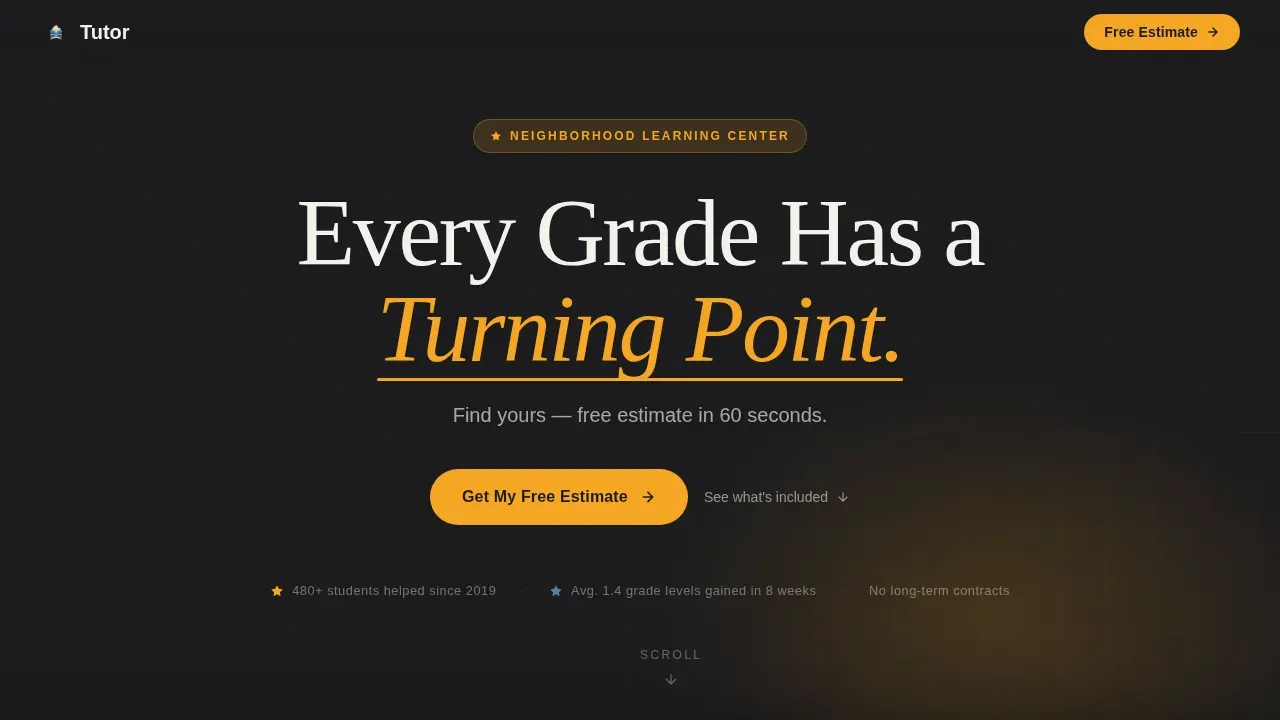
- A dark full-bleed hero with a warm amber glow, a headline that speaks directly to the turning-point moment, and a subhead that promises a 60-second estimate
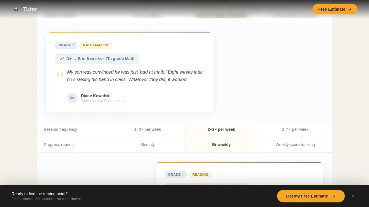
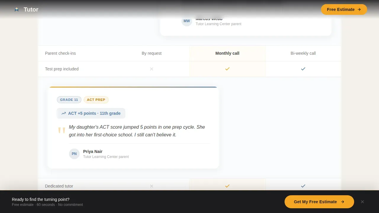
- An interleaved testimonial and comparison table mosaic with eight before-and-after parent stories woven between every row of the comparison chart
- A pinned bottom call to action bar that stays visible after the first scroll, keeping the primary action within reach at all times
Feature list
This section covers the key features built into the template as described in the project brief. Each feature reflects a specific, prompt-grounded capability.
Dark Full-Bleed Hero with Amber Glow
The hero section uses a deep graphite background with a soft radial glow of amber light at center frame. The effect mimics a desk lamp clicking on in a dim room. A single pulse draws the eye downward to the headline and the 60-second estimate promise. It creates immediate atmosphere and establishes emotional resonance before any comparison chart data appears.
Interleaved Testimonial and Comparison Chart Mosaic
The comparison table does not stand alone. Between each row of the comparison chart, a parent testimonial tile slides in from alternating sides of the screen. Each tile carries a student grade level, a subject area, and a specific before-and-after result. By the time visitors reach the final comparison chart row, they have absorbed eight real transformations alongside every package detail. This storytelling approach turns a standard comparison page into a cumulative case for trust.
Three-Package Side by Side Comparison Table
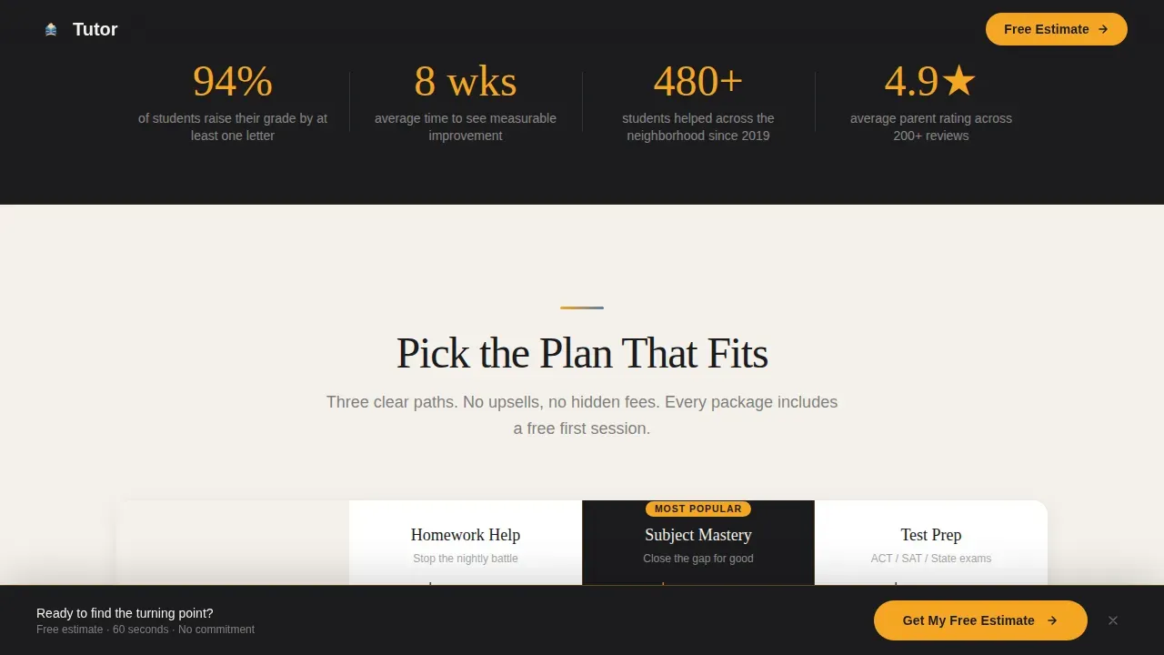
The comparison table presents homework help, subject mastery, and test prep packages in a clean, scannable grid. Each column allows hover interaction so visitors can focus on one package at a time. The side by side comparison makes the differences between packages immediately legible, helping families make informed decisions without needing to read dense text blocks or visit new pages.
Pinned Bottom Call to Action Bar
After the first scroll, a sticky bottom bar appears with the "Get My Free Estimate" button. The bar stays pinned to the viewport throughout the rest of the page, so the primary action is always one tap away. This design feature is critical for mobile users who may spend time reading testimonials and comparing packages before they feel ready to act.
Secondary "See What This Includes" Text Links
Beneath each comparison column, a secondary text link invites browsers who need more detail before committing. These links let hesitant visitors self-select into deeper information without interrupting the main comparison landing flow. Prospective customers who are not yet ready to click the primary button have a clear, low-pressure alternative.
Stats Strip and Trust Signal Section
A four-metric stats strip presents concrete outcome data in a visually appealing format. Below it, a dedicated trust signal section reinforces the social proof built through the testimonial mosaic. Together, these sections give the comparison page a data visualization layer that complements the qualitative testimonials with quantitative reassurance.
Page sections overview
| Section | Purpose |
|---|---|
| Hero with glow | Opens with emotional headline and 60-second estimate promise |
| Testimonial mosaic | Interleaves comparison chart rows with eight parent before-and-after tiles |
| Stats strip | Shows four concrete outcome metrics in a scannable row |
| Trust signals | Reinforces testimonials with grade-level and subject case-file format |
| Final call to action block | Centers a closing prompt above the footer |
| Pinned bottom bar | Keeps the estimate button visible throughout the full scroll |
| Footer row | Linear single-row footer with essential links |
Design & branding system
The template follows an Educational Guide visual theme built on a Cloud Canvas color scheme. The palette feels like a well-loved notebook left open on a clean desk, approachable, warm, and purposeful. The color scheme avoids neon or high-contrast gimmicks in favor of colors that feel trustworthy and focused. Typography pairs DM Sans for body text with Fraunces for headlines, giving the page a warm serif confidence that suits an education brand.
- Chalk white (#F4F1EB) for primary backgrounds and body text areas, graphite (#4A4A4A) for secondary text, and composition blue (#5B7FA5) for structural design elements and comparison table column headers
- Warm highlighter amber (#F5A623) reserved for the call to action button, the pinned bar, progress indicators, and the hero glow effect, using strategic color placement to highlight the primary action without feeling pushy
- Scroll-triggered animations include the pulsing hero glow, slide-in testimonial tiles from alternating sides, and hover states on comparison table columns
Mobile & speed optimization
Over 60% of tutoring traffic often comes from mobile devices, making mobile-first design essential for this landing page. The template is built with that reality in mind. Parents in carpool lines, searching on phones between pickups, are the primary users. Every design element prioritizes fast comprehension and easy tapping on small screens.
- The comparison table stacks cleanly on mobile viewports, preserving legibility without horizontal scrolling
- The pinned bottom call to action bar is thumb-friendly and stays accessible throughout the full page scroll on any screen size
- Server-side rendering of static sections and minimal JavaScript usage keep the landing page responsive and snappy on mobile connections
How this template helps you convert
The comparison landing page is engineered to earn the click through cumulative, specific proof rather than generic claims. Each section builds on the last, so visitors arrive at the estimate button already confident. Minimizing user friction and establishing immediate trust are the two principles that govern every design decision on this page.
- The testimonial mosaic builds credibility row by row, each parent story is placed directly beside the comparison chart data it supports, so visitors compare package details and absorb real outcomes at the same time, making informed decisions feel natural rather than pressured.
- The pinned call to action bar eliminates the need to scroll back to the top, removing a common friction point that causes drop-off on mobile, and the "Get My Free Estimate" button uses high-contrast amber so it is impossible to miss at any point in the scroll.
- The secondary "See what this includes" text links beneath each comparison column serve visitors who need more details before committing, catching browsers who would otherwise leave, and routing them back into the conversion flow through a lower-stakes entry point.
Other information about this template
This comparison landing page template belongs to the Professional Services category under the Tutoring Center Marketing subcategory. It is the tutor free estimate comparison landing page template designed specifically for the tutoring center free estimate niche. Below are additional details relevant to how this template fits into a broader digital marketing and comparison page strategy.
- The comparison chart approach used here mirrors proven tactics from successful comparison pages across industries. For example, companies like Duda, ActiveCampaign, and Shopify all use side by side comparison tables and feature highlights to guide potential customers toward a decision. Applying those same comparison chart principles to a local tutoring service makes the format just as effective in education as it is in business software.
- Comparison charts help simplify complex decision-making processes. Parents weighing multiple tutoring options benefit from the same data visualization clarity that buyers of software products rely on. A comparison chart online is just as useful for a parent choosing a tutoring package as it is for a buyer comparing enterprise tools.
- The comparison chart template structure here supports content marketing goals beyond a single campaign. Templates allow for high-volume creation of pages targeted to specific locations or subjects. A tutoring center could create new pages for each neighborhood or grade level by customizing the headline, testimonials, and comparison chart rows within the same layout.
- Developing competitor comparison pages and competitive comparison pages is a recognized strategic marketing tactic. Creating competitor comparison pages helps tutoring centers control the narrative about what makes their service worth choosing. This template provides the foundation for that process without requiring a separate comparison chart maker or design tool.
- The comparison chart maker role is handled by the template's built-in comparison table structure. You do not need a standalone comparison chart maker to produce a comprehensive comparison of your packages. The layout is ready to customize with your own data, making it easy to highlight the features offered in each tier and show the differences clearly.
- Platforms like Unicorn Platform and Webflow are good for quick setups with education-specific templates. Weblium Tutoring Templates offer strong location-specific headlines and integrated booking calendars as a point of comparison. This template takes a different approach, it foregoes the booking calendar in favor of a dedicated estimate calculator flow, keeping the landing page focused on a single action.
- For e commerce and service businesses alike, high-converting landing pages share the same core traits: clear copy, authentic social proof, and a prominent call to action. This template applies all three to a local education service context.
- Real time collaboration on customization is possible in platforms that support this template's format, making it practical for small teams to iterate on comparison chart rows, testimonial copy, and color scheme details together before going live.
- The comparison page layout is intentionally general enough to adapt. You can switch the package names, adjust comparison chart criteria, add icons to each feature row, or update the color scheme to match your tutoring center's existing brand without breaking the design logic.
- Additional add ons such as a progress bar, a bar chart of student grade improvement data, or extra testimonial tiles could be incorporated to deepen the data visualization layer, though these are optional enhancements beyond the base template.
- The Intersection Match Score for this template is 13, reflecting a strong alignment between the Cloud Canvas color system, Testimonial Mosaic creative direction, Dark Full-Bleed+Glow header concept, and Click-Through landing page direction.
Theme
Educational Guide
Creative direction
Testimonial Mosaic
Color system
Cloud Canvas
Style
Comparison Table
Direction
Click-Through
Page Sections
Dark Full-bleed Hero with Amber Glow
Interleaved Testimonial and Comparison Mosaic
Three-package Side by Side Comparison Table
Pinned Bottom Call to Action Bar
Stats Strip and Trust Signal Section
Secondary Detail Links Per Package Column
Related questions
Does this template include the estimate form itself?
Can I customize the comparison chart rows and package names?
How many testimonials does the template include space for?
Is this template suited for mobile users?
Can this page be adapted for specific subjects or locations?



