Elegant Japanese Counter Landing Page Template
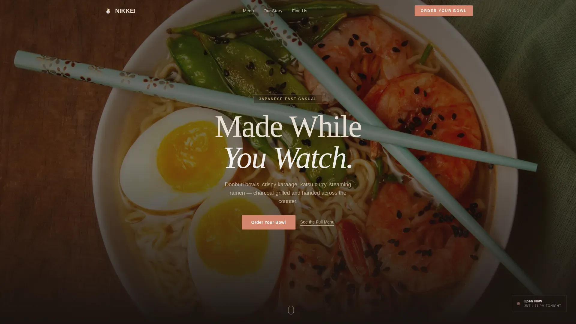
Nikkei is a warm, sensory-first landing page template for Japanese fast casual restaurants. It uses a full-screen video header, a day-in-the-life card grid timeline, and modular menu category cards to move hungry visitors directly to online ordering. Built around an Organic Flow visual identity in earthy Warm Stone tones, it earns the click before it asks for one.
by Rocket studio
Quick summary
Nikkei is a card grid landing page template designed for Japanese fast casual restaurants. It opens with a cinematic full-screen video header and scrolls through a day-in-the-life timeline of modular moments. Every section builds appetite and guides visitors to an online ordering platform with a single tap and zero friction.
Who this template is for
This template is built for independent Japanese fast casual restaurants that want a page matching the quality of their food. It suits operators who serve a lunch crowd, a late-night crowd, and everyone in between, and who want online ordering to feel effortless rather than clunky.
- Restaurant owners and operators running a Japanese fast casual counter or dining concept
- Food and beverage brands that want a sensory-first digital presence without a custom build
- Restaurateurs targeting mobile-first customers who order on their phones during a lunch break
What problem this template solves
Most restaurant landing pages either look too corporate or feel too plain to match the energy of the food. Visitors leave before they feel anything. This template fixes that by leading with atmosphere, then letting the menu earn the click naturally.
- No engaging visual narrative to make visitors hungry before they read a word
- No clear path from browsing to ordering, causing drop-off before a decision is made
- No mobile-ready layout built for the quick, on-the-go ordering behavior of the lunch crowd
What you get with this template
You get a complete, single-page layout with every section planned and structured for a Japanese fast casual restaurant. The design, copy placeholders, card structure, and call-to-action logic are all built in and ready to customize.
- A full-screen cinematic video header with a headline overlay and a sticky "Order Your Bowl" call-to-action button
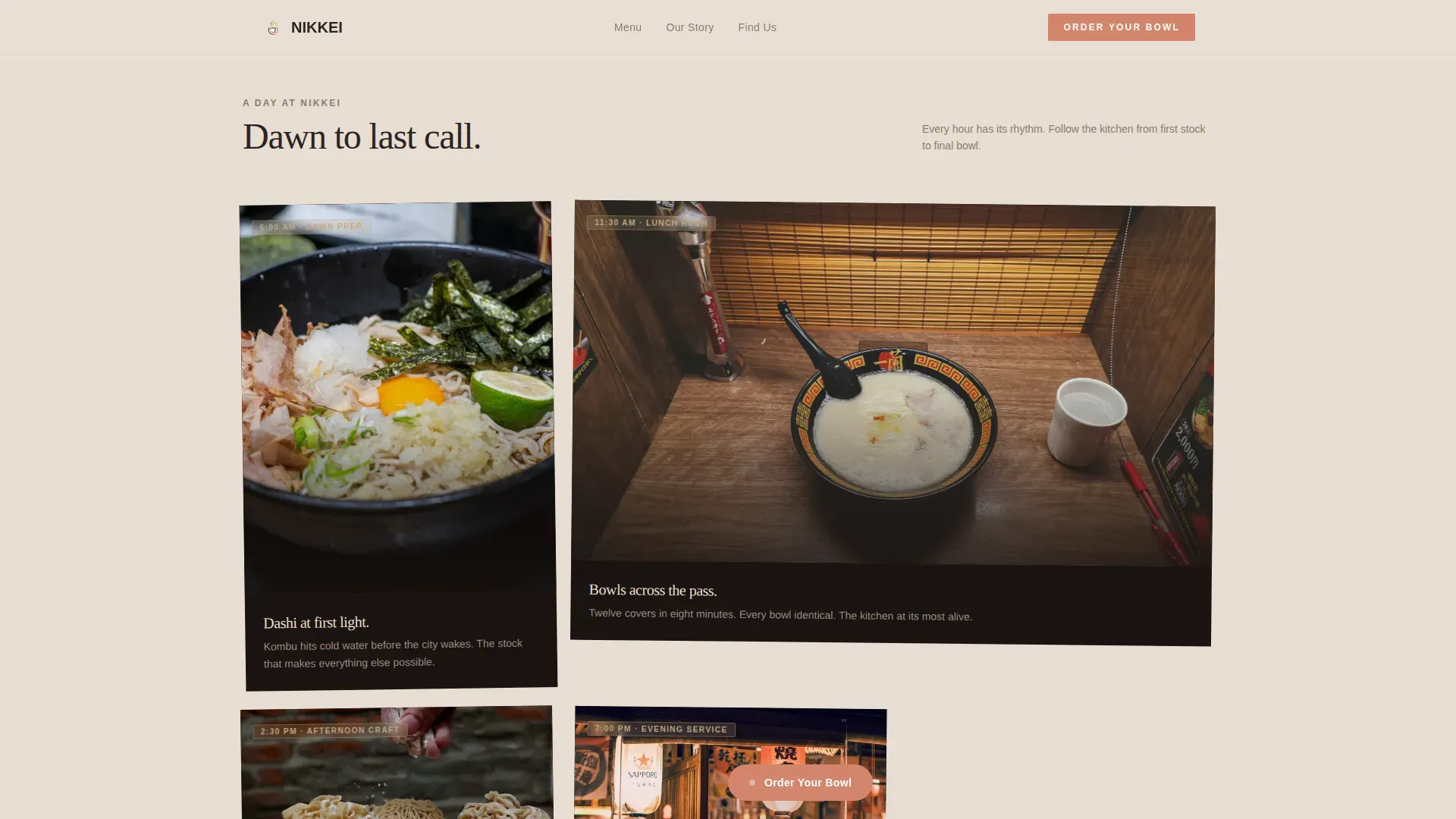
- A day-in-the-life asymmetric card grid timeline running from morning prep through evening atmosphere
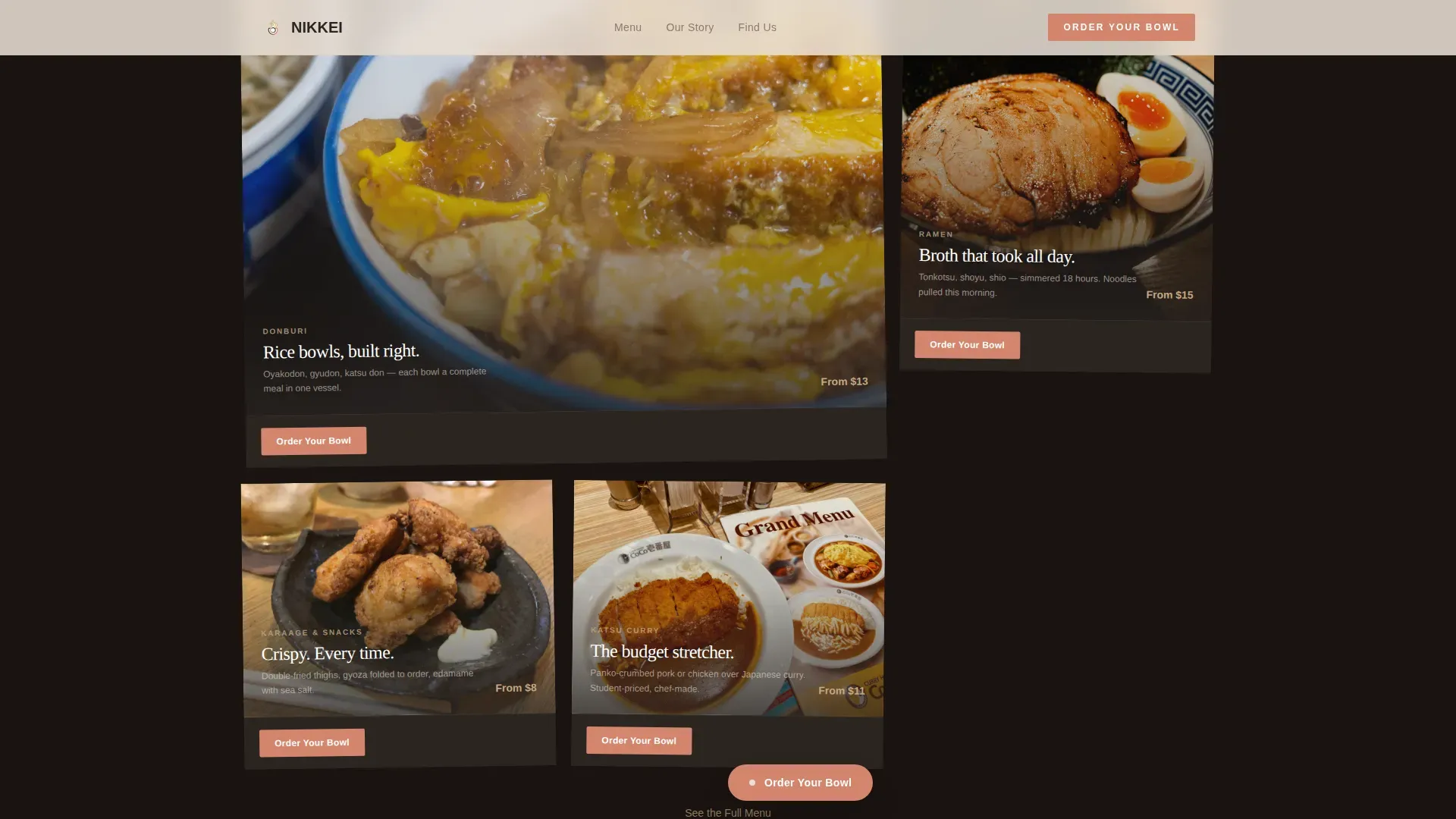
- Modular menu category cards, a social proof strip, an evening atmosphere close section, and a split-style footer
Feature list
This template includes six core features drawn directly from the brief. Each one serves the goal of converting a curious visitor into an active customer.
Full-Screen Video Header with Sticky Call to Action
The header plays a single continuous video take following a bowl from flame to counter. The headline "Made While You Watch" appears in clean slab type over the final steam frame. After the visitor scrolls past the header, a sticky "Order Your Bowl" button stays visible throughout the rest of the page.
Day-in-the-Life Card Grid Timeline
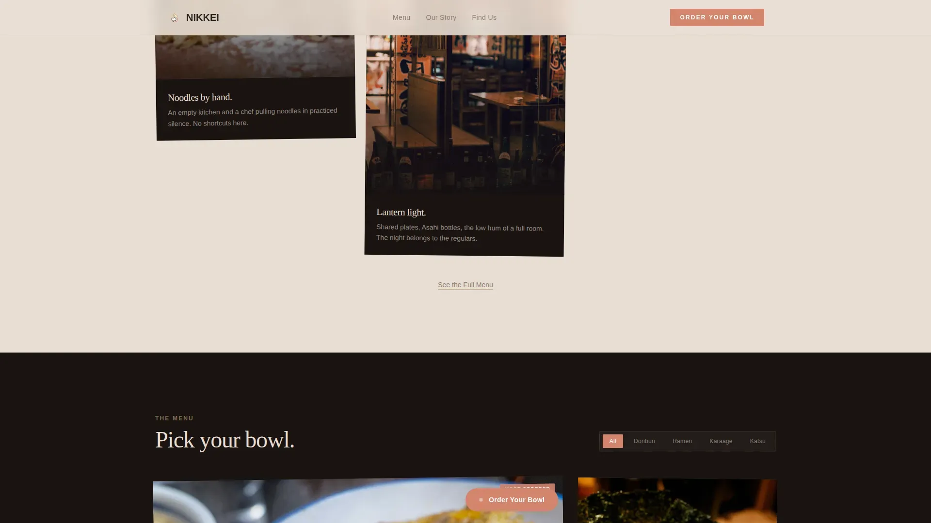
Cards are laid out in an asymmetric staggered grid, referencing the feel of polaroids pinned to a kitchen wall. Each card represents a moment in the restaurant day, from dawn dashi prep through the lunch rush to evening lantern light. The rhythm of the grid accelerates as the day progresses, matching the pace of real service.
Hover Motion Effects on Cards
Each card in the grid responds to hover with subtle motion, including rising steam, rippling broth, and a mid-chop knife freeze. These micro-interactions reward exploration and deepen the sensory effect without slowing the page down.
Per-Card "Order Your Bowl" Call to Action
Every menu category card carries its own primary call-to-action button in pickled ginger pink. One tap routes the visitor to the ordering platform with the selected category already pre-filtered. There is no form, no extra step, and no friction between the card and the order.
Social Proof Strip
A dedicated strip displays a bowl count metric, years open, a single customer quote, and a nod to the regulars. This section builds credibility quickly without interrupting the sensory flow of the page.
Organic Flow Visual Design System
The layout uses staggered card sizes, varied aspect ratios, and earthy textures to create a page that feels handmade rather than templated. Fade-up stagger animations and scroll-triggered effects add energy as the visitor moves down the page.
Page sections overview
| Section | Purpose |
|---|---|
| Hero Video Header | Opens with cinematic video and sticky ordering call to action |
| Day-in-the-Life Timeline | Asymmetric card grid from morning prep to last call |
| Menu Category Cards | Modular ordering entry points with per-card calls to action |
| Social Proof Strip | Bowl count, years open, and a customer quote |
| Evening Atmosphere Close | Dark closing section with a final call to action |
| Footer | Arc Browser Split pattern with navigation and secondary links |
Design & branding system
The visual identity follows an Organic Flow theme built on the Warm Stone color system. Every color choice references a physical material, and every layout decision favors tactile warmth over digital polish.
- Colors: toasted sesame (#C4A882) and unglazed ceramic (#E8DDD3) alternate as card and section backgrounds; shou sugi ban charcoal (#2B2522) anchors typography and navigation; pickled ginger (#D4856D) appears only on buttons and hover states
- Typography: Fraunces handles display headlines and gives the page its warm, editorial weight; DM Sans handles body text and interface labels for clean legibility
- Layout style: staggered card grid with varied aspect ratios, organic spacing, and imperfect-on-purpose proportions that reference handmade ceramics and kitchen-wall pinboards
Mobile & speed optimization
The template is designed mobile-first. The target visitor is someone ordering on a phone during a lunch break, so the layout, tap targets, and call-to-action placement are all calibrated for small-screen use.
- Video header includes a fallback image for devices or connections where autoplay video is not available
- Cards use lazy loading so content below the fold does not delay the initial page render
- Sticky call-to-action button and per-card ordering links are sized and positioned for comfortable thumb-reach on mobile screens
How this template helps you convert
The conversion strategy is built into the page structure itself. Every section is designed to build appetite first and remove friction second, so that by the time a visitor sees the call-to-action button, they are already ready to order.
- The video header and day-in-the-life timeline create sensory investment before any menu item is shown, making the visitor feel the restaurant before they read it.
- Per-card "Order Your Bowl" buttons with pre-filtered category routing remove every extra tap between browsing and ordering, keeping the path to purchase as short as possible.
- A secondary "See the Full Menu" text link beneath each card cluster gives browsers an alternative path, so visitors who are not yet ready to order still stay engaged rather than leaving.
Other information about this template
This template is part of a broader card grid modular template family designed for food and beverage operators. It is particularly well-suited for Japanese dining concepts that want to communicate craft, speed, and atmosphere in a single page without building from scratch.
- Template style: Card Grid (Modular), meaning sections and cards can be rearranged or repurposed for different menu structures or seasonal updates
- Creative direction: Day-in-the-Life, a storytelling format that works equally well for ramen counters, donburi shops, izakaya-adjacent concepts, and other Japanese fast casual formats
- The Warm Stone color system and Organic Flow theme are designed to translate across brand identities without requiring a full color rebuild
- Animation level is set to high, with fade-up stagger on cards, hover micro-interactions, and a scroll-triggered sticky call-to-action button
Theme
Organic Flow
Creative direction
Day-in-the-Life
Color system
Warm Stone
Style
Card Grid (Modular)
Direction
Click-Through
Page Sections
Full-screen Video Header
Day-in-the-life Card Grid
Hover Motion Micro-interactions
Per-card Ordering Call to Action
Social Proof Strip
Modular Section Architecture
Related questions
Can I use this template if my restaurant is not called Nikkei?
How does the 'Order Your Bowl' button connect to my ordering platform?
Is this template suitable for a ramen shop or donburi counter?
Does the video header require a specific video format?
Can I hide the social proof strip if my restaurant is new?



