Vegetarian Meal Kit Subscription Landing Page Template
Umami is a Haute Craft vegetarian meal kit subscription landing page template built on a modular card grid. It pairs a full-screen video hero with a live box-builder flow, guiding design-conscious home cooks from a single-field email gate to a fully custom weekly selection. The Japanese Zen color palette and editorial typography make every dish feel like a course worth savoring.
by Rocket studio
Quick summary
Umami is a single-page landing page template for artisan vegetarian meal kit subscriptions. It opens with a cinematic full-screen video header, moves through a modular card grid where visitors build their own weekly box, and closes the loop with a sticky checkout bar. The design language draws from japanese cuisine aesthetics and haute cuisine presentation, making every scroll feel like lifting the lid off a carefully arranged kaiseki tray.
Who this template is for
This template is built for founders, operators, and designers who want to launch a premium vegetarian meal kit subscription with a landing page that earns trust before it asks for a purchase. It suits brands that treat cooking as a craft and their subscribers as an audience, not just a customer base.
- Design-conscious direct-to-consumer food brands that sell weekly meal kits online
- Operators running artisan subscription boxes who want a high-converting box-builder flow
- Designers and developers building client sites in the food, dining, and gastronomy space
What problem this template solves
Most meal kit landing pages treat every dish like a product listing. Visitors see flat photography, a generic menu, and a single "subscribe now" button that asks for full commitment before they have felt anything. That is the wrong approach for a premium brand. Umami solves the trust and engagement gap that separates a curious visitor from a paying subscriber.
- Visitors drop off when they cannot explore what they are buying before they sign up
- Generic templates lack the editorial depth needed to communicate chef-level quality and cuisine craft
- A flat single-call to action page cannot support the marketplace-style box-builder experience that converts browsers into builders
What you get with this template
You get a fully designed, section-complete landing page template ready for a vegetarian meal kit subscription brand. Every section is purposeful. Every component has been considered as part of a single flowing experience, not as a collection of widgets dropped onto a canvas. The template prioritizes experience, flavor depth, and convenience at every scroll depth.
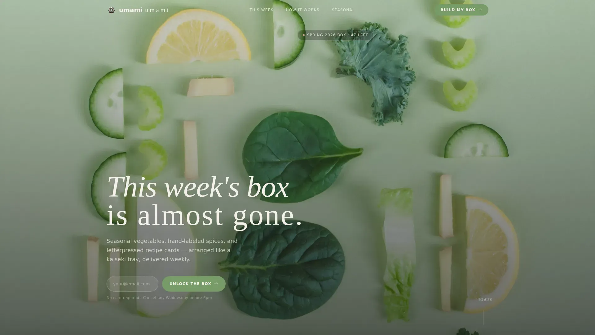
- A full-screen video hero with a scarcity headline and single-field email gate
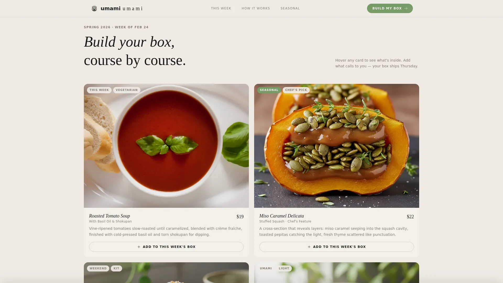
- A modular card grid box builder with per-card "Add to This Week's Box" actions and a sticky bottom bar tally
- Sections for craft narrative, seasonal highlights, and ritual-language testimonials
Feature list
This template ships with a focused set of high-impact components. Each one is grounded in the brief and designed to earn the visitor's attention at every stage of the page.
Full-Screen Video Hero with Scarcity Headline
The header opens with a slow overhead camera drifting across a marble counter as hands unwrap a meal kit in real time. Kraft paper peels back to reveal ingredients. Steam from a cast-iron skillet enters the frame at second six. A single letterspaced headline materializes: "This week's box is almost gone." The scarcity message is calm, not loud, and it works because the visual quality makes the box feel worth chasing.
Single-Field Email Gate
First-time visitors see a one-field email capture that unlocks the full box builder. Just an email address. No multi-step form, no account creation, no commitment beyond one keystroke. This reduces friction at the exact moment when interest is highest and the visitor has not yet decided to sign up. The gate is the purest expression of low-barrier conversion: one action, full access.
Modular Card Grid Box Builder
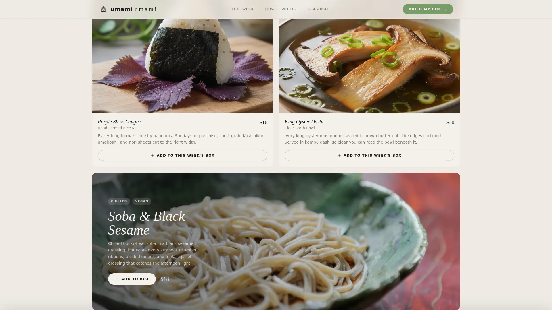
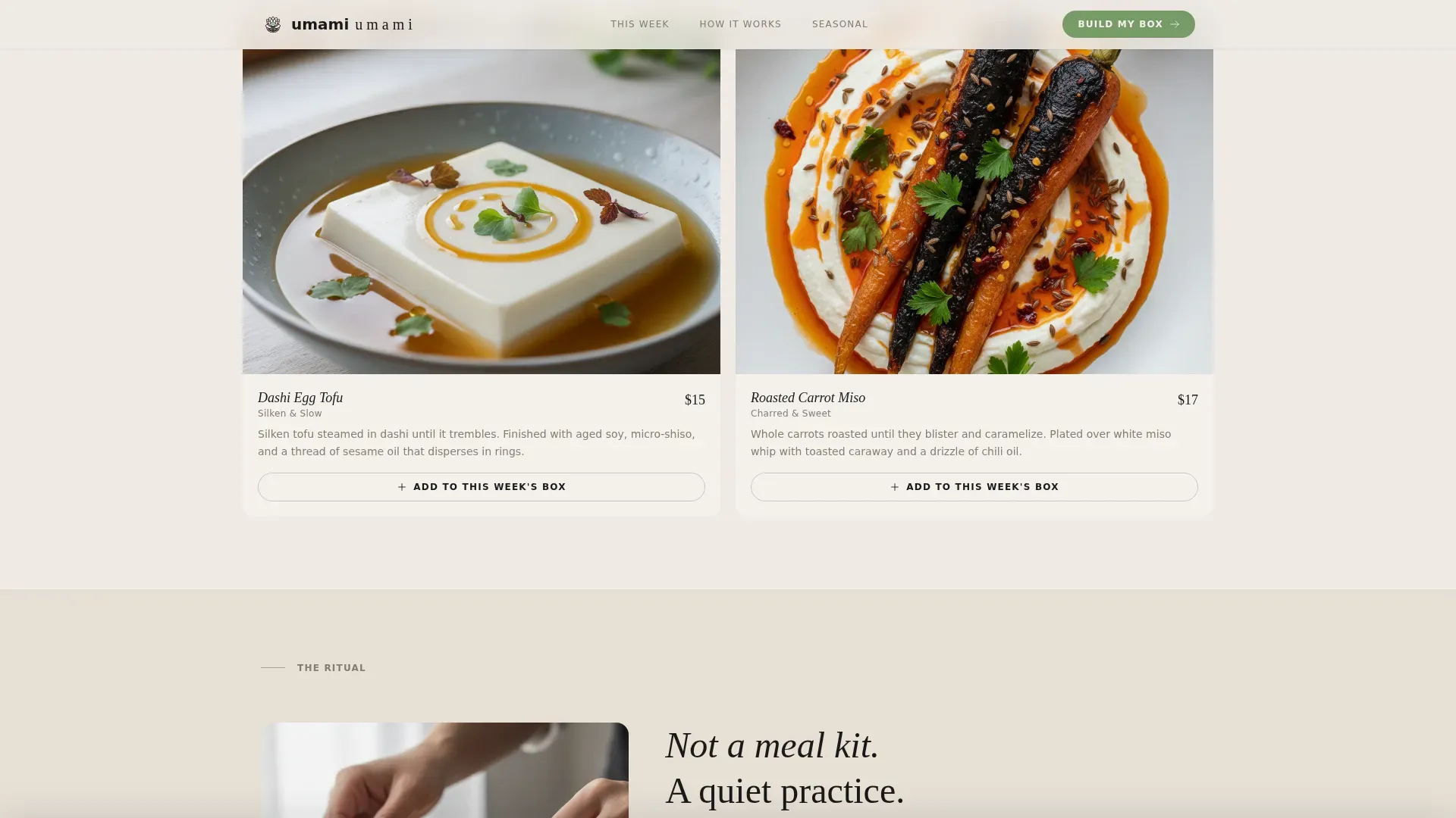
The box contents section is a breathing card grid where each card is a dish moment, not a product shot. Cards shift between tight two-up pairs and full-bleed single beauty shots every third row, resetting the visual palate. Hover micro-interactions release ingredient lists like steam lifting off a plate. Each card carries its own "Add to This Week's Box" button, making the selection process feel like building a personal tasting menu.
Sticky Bottom Bar with Live Tally
A sticky bar anchors the bottom of the viewport as visitors build their box. It shows item count and next-delivery date in real time. The primary call to action reads "Lock In My Box" in matcha green (#7B9E6B). This persistent element keeps the commitment visible without interrupting the browsing flow, functioning like a restaurant table where the chef is tracking your courses quietly in the background.
Craft Narrative and Seasonal Highlights Sections
The Ritual section uses an asymmetric split layout with craft and process photography showing hand-labeled spice sachets, letterpressed recipe cards on cotton stock, and ingredients nested in recycled kraft. The Seasonal Highlights section follows with full-bleed beauty shot cards and matcha-green call-to-action buttons. Together these sections tell the story behind the box, supporting higher perceived quality and encouraging visitors to eat with intention.
Testimonial Section with Ritual Language
The testimonials section uses intimate quote cards written in the language of ritual, not marketing. Subscribers describe Tuesday dinner as a quiet moment, a table set with care, a meal that felt earned. Social proof in this language speaks directly to the design-conscious home cook who does not want to feel sold to. It builds the kind of trust that a chef's reputation builds over a dozen years in a respected restaurant.
Page sections overview
| Section | Purpose |
|---|---|
| Video Hero | Cinematic opener with scarcity headline and email gate |
| Box Builder Grid | Modular card grid for per-item selection with hover reveals |
| The Ritual | Asymmetric craft and process photography narrative |
| Seasonal Highlights | Full-bleed beauty shots with matcha call to action buttons |
| Testimonials | Ritual-language subscriber quote cards |
| Footer | Horizontal flow footer with brand and navigation links |
Design & branding system
The visual identity follows a Haute Craft theme built on a Japanese Zen color system. The palette feels like a kaiseki tray photographed in the last ten minutes of golden hour, warm neutrals grounding moments of living color. Typography pairs DM Sans for body text with Fraunces as the editorial display serif, echoing the kind of menu design you would find in a world-class dining room.
- Washi paper white (#F5F0EB), lacquer black (#1A1A1A), pickled ginger blush (#D4A69A), and matcha glaze (#7B9E6B) for calls to action and seasonal highlights
- Fraunces display serif for headlines and editorial moments; DM Sans for body copy and interface labels
- Taste and Aroma creative direction: every visual is a moment, not a product shot, driving scroll like courses in an omakase
Mobile & speed optimization
The template is designed desktop-first, prioritizing the box-builder experience where visitors need room to browse, hover, and select. A responsive mobile fallback ensures the full page remains usable on smaller screens without losing the editorial feel. Server components handle static content sections while client components manage the interactive builder, keeping the interactive bar and card state responsive.
- Desktop-first layout with responsive fallback for mobile browsing
- Server components used for static sections; client components scoped to the interactive builder and sticky bar
- Card grid adapts gracefully between breakpoints, preserving the modular rhythm and visual quality on all screen sizes
How this template helps you convert
A landing page for a haute craft vegetarian meal kit needs more than great visuals. It needs a conversion architecture that earns trust early and reduces commitment at each step. This template is built around a clear flow: engage with video, unlock with email, build with cards, commit with the sticky bar.
- The email gate removes the biggest barrier first. Visitors give one field to unlock the full builder, making the sign-up feel like a reward rather than a tax.
- The per-card "Add to Box" mechanic turns passive browsing into active selection. Every dish a visitor adds increases their personal investment in completing the checkout, a principle borrowed from the best restaurant tasting menus where each course deepens commitment to the next.
- The sticky bottom bar keeps the call to action visible at all times without interrupting the scroll, so when a visitor is ready to lock in their box, the action is always one tap away.
Other information about this template
This template is the umami haute craft vegetarian meal kit subscription landing page template in its complete, designed form. It is built for the food and dining market, specifically the artisan meal kit segment where cuisine craft, quality ingredients, and chef-level storytelling matter as much as price.
- The Taste and Aroma creative direction means every visual component is chosen to trigger appetite. Compelling visuals of prepared dishes are central to how this landing page captures attention and holds it long enough for visitors to build a box.
- Transparent pricing placement is supported by the template's sticky bar, which shows item count and delivery date. Operators can surface clear cost information alongside the "Lock In My Box" call to action so visitors understand exactly what they are committing to.
- Dietary preference indicators, such as icons for gluten-free or nut-free options, can be added to individual cards without cluttering the overall design. The modular card structure provides natural space for these labels.
- The template draws on the concept of vibe coding, where the emotional resonance of the user experience is as deliberate as the visual design. Every animation, hover state, and scroll transition is built to make visitors feel the quality of the box before it arrives.
- Engaging storytelling about ingredients and recipes is built into the page structure. The Ritual section, the letterpressed recipe card references, and the hand-labeled sachet details all communicate chef-level care and culinary history without a single word of marketing jargon.
- The card grid supports the kind of menu exploration that diners experience in a restaurant with thoughtfully curated tasting menus. Visitors can browse dishes, read ingredient reveals, and build a personal selection that reflects their own taste.
- Umami, the fifth basic taste alongside sweet, sour, bitter, and salty, is the organizing principle behind the ingredient curation concept. Vegetarian sources of umami including mushrooms, tomatoes, fermented miso, and soy sauce are the foundation of the chef-curated recipes this template is designed to showcase.
- The template is well-suited for brands that prefer a gastronomy-forward positioning over a convenience-first pitch. It speaks to subscribers who treat cooking as a dining room ritual rather than a weeknight chore.
- Customer testimonials and reviews are built into a dedicated section with intimate quote cards. These signals build credibility for new visitors who arrive wondering whether the box is worth the investment.
- Social media sharing and reach can be supported by the open graph title and description fields baked into the template metadata. Operators can customize these for platform-specific promotion.
- This template works best for US-market launches targeting urban demographics in cities like New York, San Francisco, and Los Angeles, where design-conscious food culture and willingness to invest in artisan subscriptions are strongest.
- The template supports a direct-to-consumer subscription commerce model where the box builder, email gate, and sticky bar together form the full conversion funnel from first visit to locked box.
Theme
Haute Craft
Creative direction
Taste & Aroma
Color system
Japanese Zen
Style
Card Grid (Modular)
Direction
Marketplace/Multi
Page Sections
Full-screen Video Hero with Scarcity Hook
Single-field Email Gate
Modular Card Grid Box Builder
Sticky Bottom Bar with Live Box Tally
Craft Narrative and Seasonal Highlights
Ritual-language Testimonial Cards
Related questions
Can I customize the card grid to show different dish categories?
Does the email gate work as a standalone lead capture tool?
Is this template suitable for a brand that offers both vegetarian and non-vegetarian options?
How does the sticky bottom bar update as visitors build their box?
What typography and colors come included with this template?



