Neo-Retro Japanese Delivery Kitchen Landing Page Template
Umami is a Neo-Retro Japanese delivery kitchen landing page built around sensory-first storytelling. It uses a cinemagraph hero, scroll-triggered menu gallery, expandable dish detail panels, and a floating cart to turn visitors into repeat orders. The design draws from 1970s Tokyo warmth, with a four-color Japanese Zen palette and high-contrast food photography that makes savory broth feel close enough to taste.
by Rocket studio
Quick summary
Umami is a single-page delivery kitchen template built for ghost kitchens and cloud-kitchen brands that live and die by the order button. The design leads with a cinemagraph hero, walks visitors through a sensory scroll of broth, toppings, and dish stories, then closes with a subscription drop selector and floating cart. Every section is built to make the food feel present before the visitor even clicks.
Who this template is for
This template is built for founders and operators running a single-brand delivery kitchen with a focused, intentional menu. It suits anyone whose food story is worth telling slowly, and whose customers order the same dish every week like a ritual.
- Ghost kitchen and cloud kitchen operators launching a direct-to-consumer delivery brand
- Independent chefs and small food businesses who want a conversion-focused page without writing code
- Food brands targeting late-shift workers, remote professionals, and weekend ritual customers in urban markets
What problem this template solves
Most delivery kitchen pages feel like a spreadsheet. Items listed, prices shown, nothing else. Visitors scroll past without feeling anything, and the brand becomes invisible the moment the tab closes. That gap between a great dish and a loyal customer is almost entirely a design problem.
- No visual identity: generic layouts strip away the craft that a chef pours into every recipe
- No sensory hook: flat photography and static grids cannot communicate umami-level depth of flavor
- No conversion path: a page without a sticky cart or subscription option loses repeat buyers before they form a habit
What you get with this template
You get a complete, single-page delivery kitchen experience built around scroll-triggered storytelling and two clear conversion paths. Every section is pre-structured so you can swap in your own dish names, photos, and copy without rebuilding the layout.
- Cinemagraph hero section with letter-by-letter brand name reveal and looping steam animation
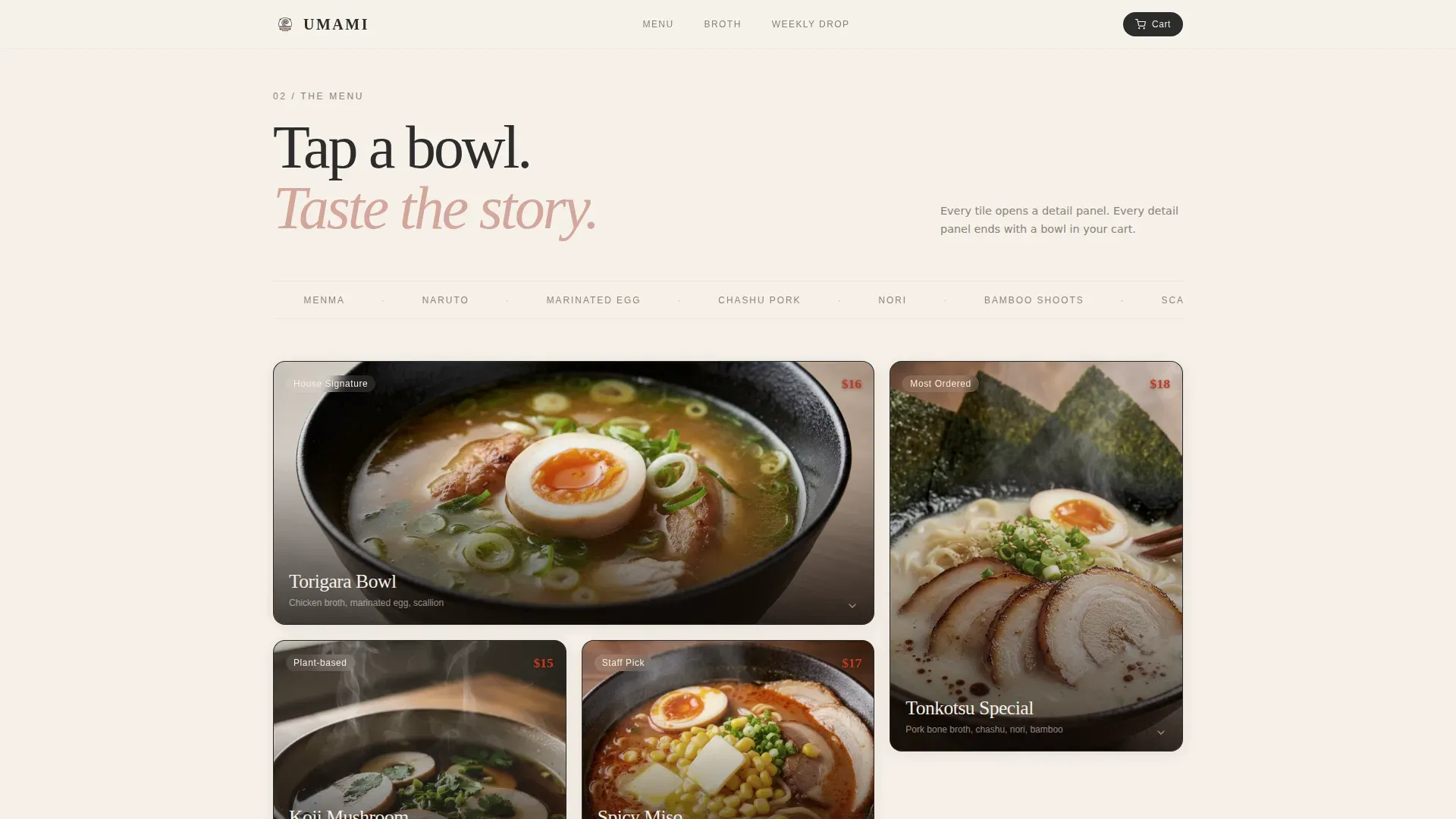
- Asymmetric bento-grid menu gallery with expandable dish detail panels, calorie counts, and ember heat indicators
- Weekly Drop subscription module with a frequency selector and a floating cart widget that tallies live
Feature list
The template ships with six purpose-built features that carry a visitor from first impression through to committed order.
Cinemagraph Hero with Text Reveal
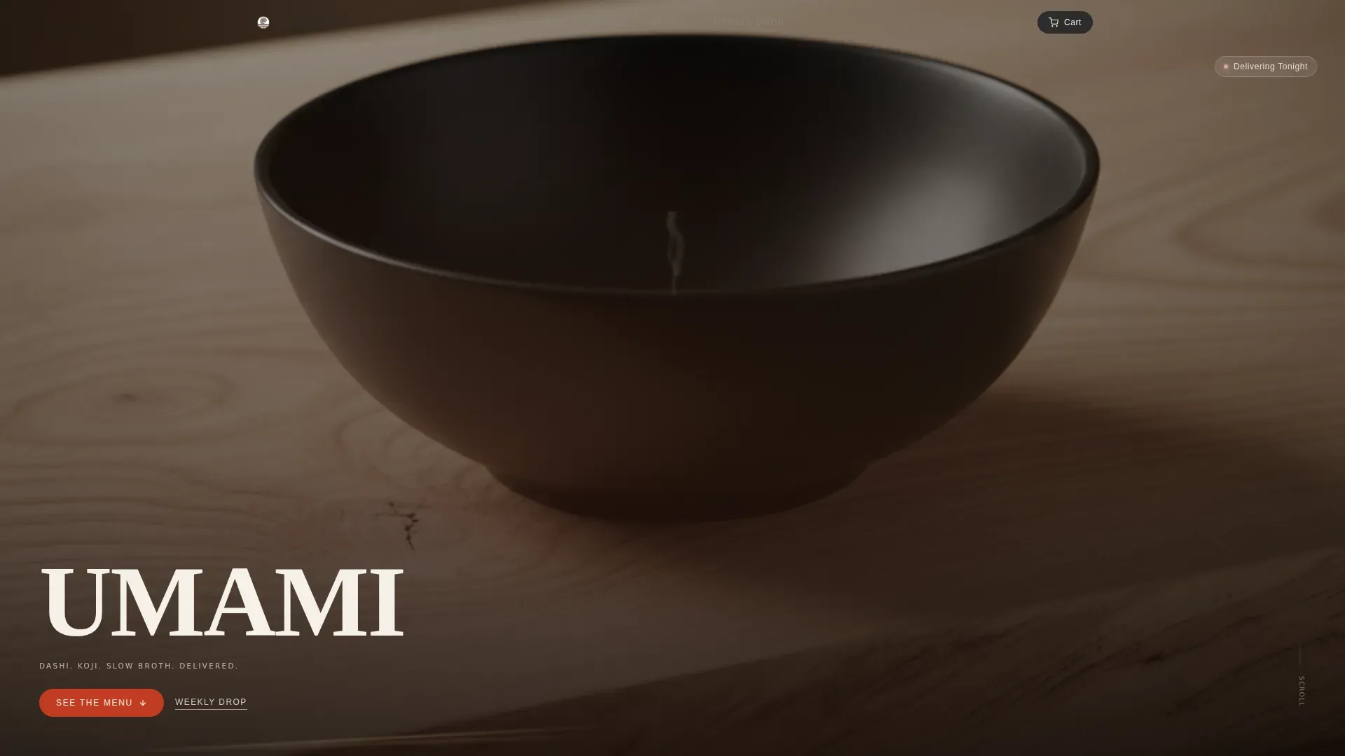
The hero is a fixed-frame cinemagraph of a matte-black bowl on a raw wood counter. Broth sits perfectly still while a single curl of steam rises and dissolves in a continuous loop. The brand name appears letter by letter in a condensed serif, bottom-left, like a film title card. This opening communicates craft before a single word of copy is read.
Scroll-Triggered Sensory Gallery
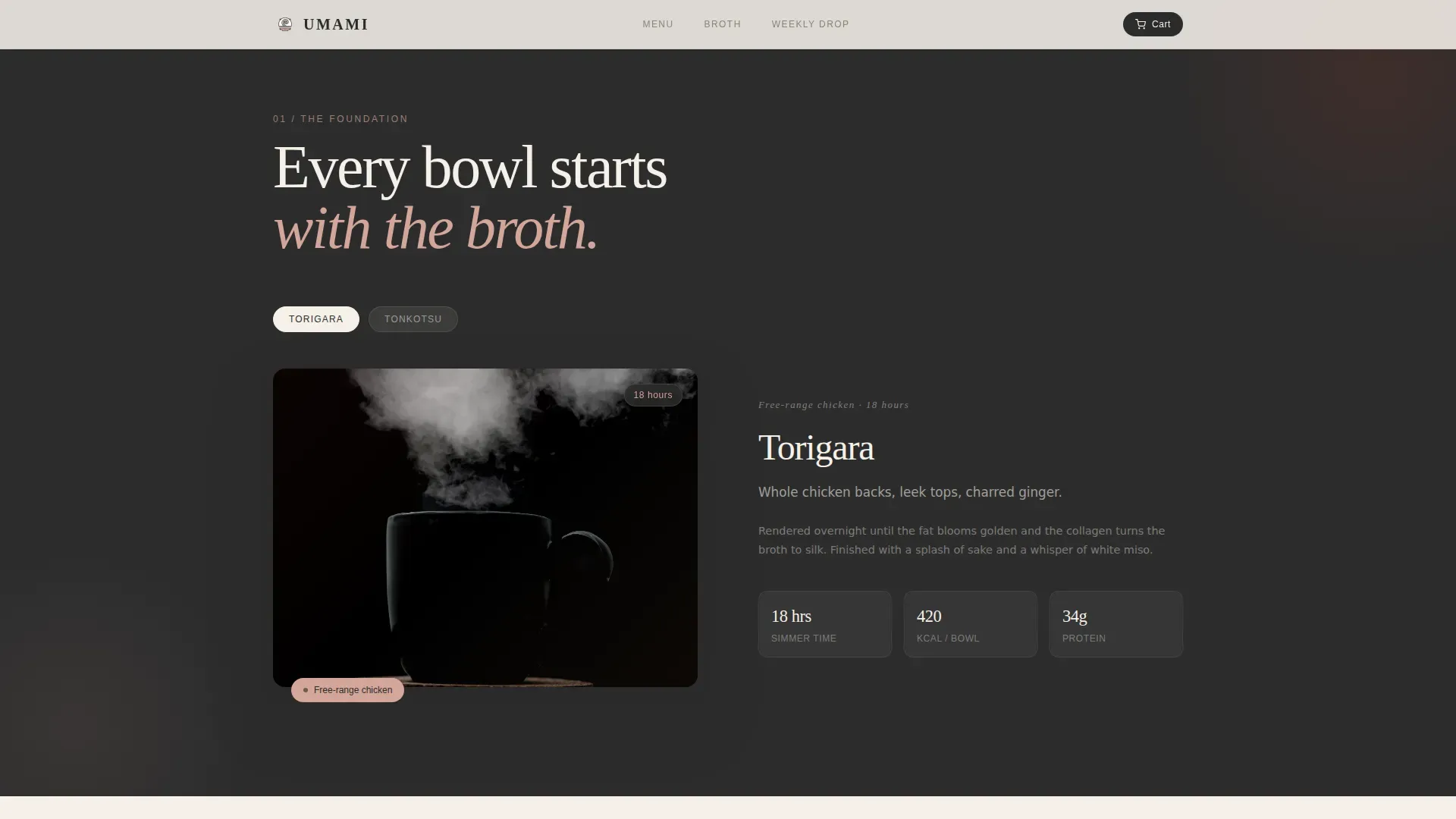
Scrolling moves the visitor through the menu as a sensory escalation rather than a flat list. The first section focuses on broth: a macro pour shot with a one-line description naming the ingredient and the hours it took to cook. Toppings then arrive one at a time. Each tile is built to feel like a close-up bite of the dish itself, making the savory depth of every recipe visible.
Expandable Dish Detail Panels
Each gallery tile expands into a full detail panel with the dish story, calorie count, and a spice-heat indicator rendered as glowing embers. The primary call-to-action button, styled in lacquerware vermillion for high contrast, appears inside each panel so the order path is always one tap away. The panel layout keeps the focus on the dish without pulling the visitor away from the page.
Floating Cart Widget
A floating cart tallies in the corner of the screen as visitors add dishes. It stays visible throughout the scroll so the order summary is never lost. This persistent presence reduces friction at checkout and keeps the value of a meal in view while the visitor continues to browse the menu.
Weekly Drop Subscription Module
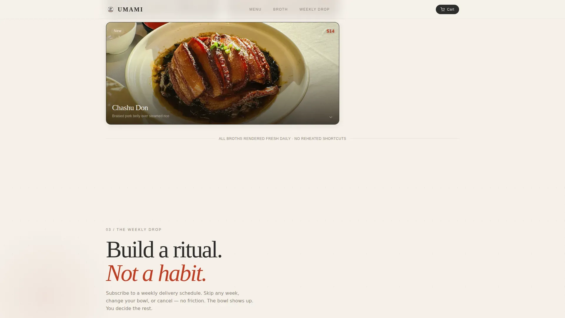
The Weekly Drop section presents subscription bundles with a frequency selector offering twice, three times, or nightly delivery options. This module creates a direct path to recurring revenue and positions the kitchen as a ritual rather than a one-time order. Visitors who reach this section have already been warmed by the sensory scroll above.
Neo-Retro Animation System
The template uses a layered animation system including the cinemagraph steam loop, scroll-triggered tile expansion, ember glow indicators, and the floating cart tally. GPU-accelerated transforms and lazy image loading are built into the structure to keep motion smooth. Every animation serves the food story rather than distracting from it.
Page sections overview
| Section | Purpose |
|---|---|
| Hero Cinemagraph | Opens with looping steam, letter-by-letter brand reveal, and above-fold order call to action |
| Broth Origin | Macro pour shot with ingredient name and cook hours for sensory context |
| Menu Gallery | Asymmetric bento grid with scroll-triggered topping tiles and expandable detail |
| Dish Detail Panel | Story, calories, ember heat indicator, and primary order call-to-action |
| Weekly Drop | Subscription frequency selector tied to floating cart widget |
| Footer | Linear single-row layout with delivery info and contact details |
Design & branding system
The visual identity follows a Neo-Retro Japanese Zen direction, described in the brief as a 1970s Tokyo kissaten photographed on expired film. The palette is deliberately quiet. Nothing shouts. Every surface feels worn smooth by use, and the photography sits close enough to the food that you feel the steam before you process the composition.
- Four-color Japanese Zen palette: stone garden charcoal (#2C2C2C), unglazed ceramic warm white (#F5F0E8), pickled ginger blush (#D4A59A), and lacquerware vermillion (#C23B22) reserved for buttons and price callouts
- Typography pairs Fraunces condensed serif for display headings with DM Sans for body text, blending nostalgic weight with clean readability
- Photography direction calls for shallow depth of field, macro food close-ups, and warm grain consistent with the expired-film aesthetic
Mobile & speed optimization
The brief specifies a mobile-first build with equal attention to desktop, reflecting the late-night delivery context where most orders come from a phone screen. The animation system is built on GPU-accelerated transforms only, and images use lazy loading to keep the scroll smooth even on mid-range devices.
- Mobile-first layout with touch-optimized gallery tiles, tap-friendly call to action buttons, and a floating cart sized for thumb reach
- Lazy image loading across all gallery and detail panel assets to reduce initial load weight
- GPU-accelerated transforms drive all scroll animations, tile expansions, ember glows, and the steam loop without blocking the main thread
How this template helps you convert
The page is designed around a single behavioral insight: the longer a visitor spends inside a sensory scroll, the harder it becomes to close the tab without ordering. Every design decision builds on that insight.
- The cinemagraph hero and letter-by-letter brand reveal create an immediate atmosphere of craft and deliberateness, setting a taste expectation before the menu appears
- Expandable dish panels with ember heat indicators and calorie context give visitors the detail they need to commit to a specific dish, while the vermillion order button stays prominent and above the scroll line at every expansion point
- The Weekly Drop subscription module catches visitors who are already sold on the food and converts a single order intent into a recurring delivery ritual, backed by a frequency selector that makes the commitment feel light
Other information about this template
This template is a strong fit for food brands that want to communicate umami-level depth through a digital layout. The philosophy embedded in the design reflects what culinary researchers and chefs have understood for decades: fermented ingredients like soy sauce, miso, and sake are the pillars of savory, deeply satisfying food. Soy sauce adds saltiness and umami character that lifts other flavors across a dish. Miso contributes layered sweetness and depth. Sake rounds the sauce base used in Japanese soups and marinades.
Umami itself is the fifth taste, grounded in glutamate, the amino acid responsible for the savory satisfaction found in aged cheese, dried mushrooms, tuna, tomatoes, pork, and fermented fish. Tomatoes are high in glutamic acid, and their umami flavor deepens as they cook down. MSG, or monosodium glutamate, delivers pure umami without other added flavor compounds, making it an efficient tool when a chef wants to build depth without layering more sauce. Combining ingredients high in glutamate with those containing nucleotides creates a synergistic increase in flavor that skilled chefs use deliberately. Dashi, made from kombu kelp, is the ultimate umami backbone in Japanese cooking, and kombu itself is one of the highest natural sources of glutamate known.
Japanese ingredients have a remarkable ability to harmonize with other culinary traditions. Sesame oil adds a roasted, savory note. Green onions bring a fresh garnish that cuts through rich broths. Sesame seeds add texture to rice and noodle dishes. Ginger balances the saltiness of soy sauce and brightens heavier meat-based soups. These ingredients travel well beyond Japan: similar umami logic applies in italy, where parmesan and slow-cooked tomatoes carry the same glutamate depth, and in france, where long-rendered stocks share the same patience. California has become one of the most active markets for Japanese-inspired delivery, and avocado appears frequently as a garnish alongside tuna in fusion preparations.
The template is also well-suited for operators who want to launch quickly using no-code or AI-assisted tools. AI-powered no-code platforms allow non-technical users to build production-ready pages from natural-language prompts, and this template is structured to slot directly into that process. No-code tools are particularly useful for small food businesses and product managers who need to launch and iterate fast. The template structure supports that workflow: swap the dish names, drop in your photography, update the sauce and recipe details for your menu, and the sensory logic of the page remains intact.
The Umami neo-retro Japanese delivery kitchen landing page template is built specifically to serve single-brand delivery operators who want their food to feel cooked by a person, not a factory. Kikkoman soy sauce, black garlic aged to an earthy-sweet umami flavor, nutritional yeast for a cheesy nutty depth, and other ingredients used as garnish or base sauce all find a natural home in the dish storytelling sections this template provides. The page earns the order by making the visitor feel the food before they ever reach checkout.
- The template covers all planned sections from hero through footer, including delivery info placement in the linear single-row footer
- Localization is set for USA markets with USD pricing and 12-hour time format
- The page is designed around the specific ingredient philosophy of dashi, koji, and slow-rendered broths, giving the brand story a concrete and credible foundation
- The subscription module supports twice, three times, or nightly frequency options for weekly delivery bundles
- The ember heat indicator and calorie display inside each dish panel give food-literate customers the context they need to choose and commit
- The color system is directly inspired by vibrant tones reminiscent of 70s Japanese advertisements, blending nostalgia with functional clarity
Theme
Neo-Retro
Creative direction
Taste & Aroma
Color system
Japanese Zen
Style
Gallery + Detail
Direction
Marketplace/Multi
Page Sections
Cinemagraph Hero with Brand Reveal
Scroll-triggered Sensory Menu Gallery
Expandable Dish Detail Panels
Floating Cart Widget
Weekly Drop Subscription Module
Neo-retro Animation System
Related questions
What kind of food business is this template designed for?
Can I customize the dish names, photos, and menu details?
Does the template support subscription or recurring order features?
Is this template optimized for mobile users?
What animations are included in the template?



