Wellness Subscription Box Landing Page Template
Unbox is a bento grid landing page template built for wellness subscription box brands. It features a warm Neo-Retro visual identity, a layered bento cell layout, and a two-step quiz flow that guides visitors from curiosity to checkout. The design balances editorial richness with clear sales momentum, making it ideal for curated health and wellness product subscriptions.
by Rocket studio
Quick summary
Unbox is a single-page bento grid template designed for wellness subscription box businesses. It pairs a warm Neo-Retro aesthetic with a structured sales flow, guiding visitors through tiered subscription options and a focused two-step quiz. The layout rewards scrolling with editorial depth while keeping the path to purchase clear and low-friction.
Who this template is for
This template is built for founders and marketers selling curated wellness products through a monthly subscription model. It suits brands whose customers are emotionally invested in their routines and respond to thoughtful, story-driven presentation.
- Wellness brands selling adaptogen, serum, or small-batch product subscriptions
- Founders targeting burned-out millennials, new mothers rebuilding postpartum rituals, or remote workers building morning wellness habits
- Health and wellness e-commerce teams that want a visually editorial landing page without sacrificing conversion structure
What problem this template solves
Wellness subscription brands often struggle to communicate value before the payment screen appears. Visitors need to feel the experience before they commit. Generic product pages fail to build that emotional connection, and friction at the quiz or tier selection stage drives drop-off.
- No clear way to present multiple subscription tiers in a visually differentiated and scannable format
- Difficult to tell a transformation story across a single page without it feeling cluttered or unfocused
- Discount offers and guarantees often buried below the fold, reducing their impact on hesitant buyers
What you get with this template
You get a fully designed bento grid landing page that balances editorial storytelling with direct sales mechanics. Every section is purpose-built to move a wellness-curious visitor toward a subscription purchase.
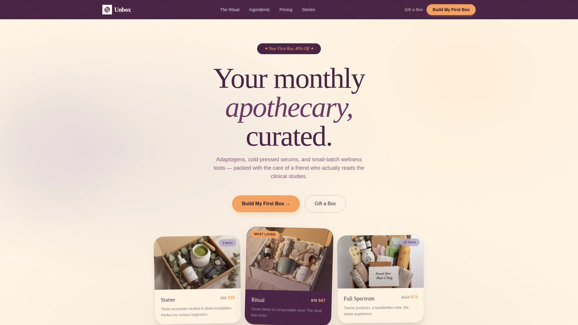
- A styled header with three subscription tiers displayed as photographed physical boxes on a linen tablecloth, each progressively larger and visually distinct
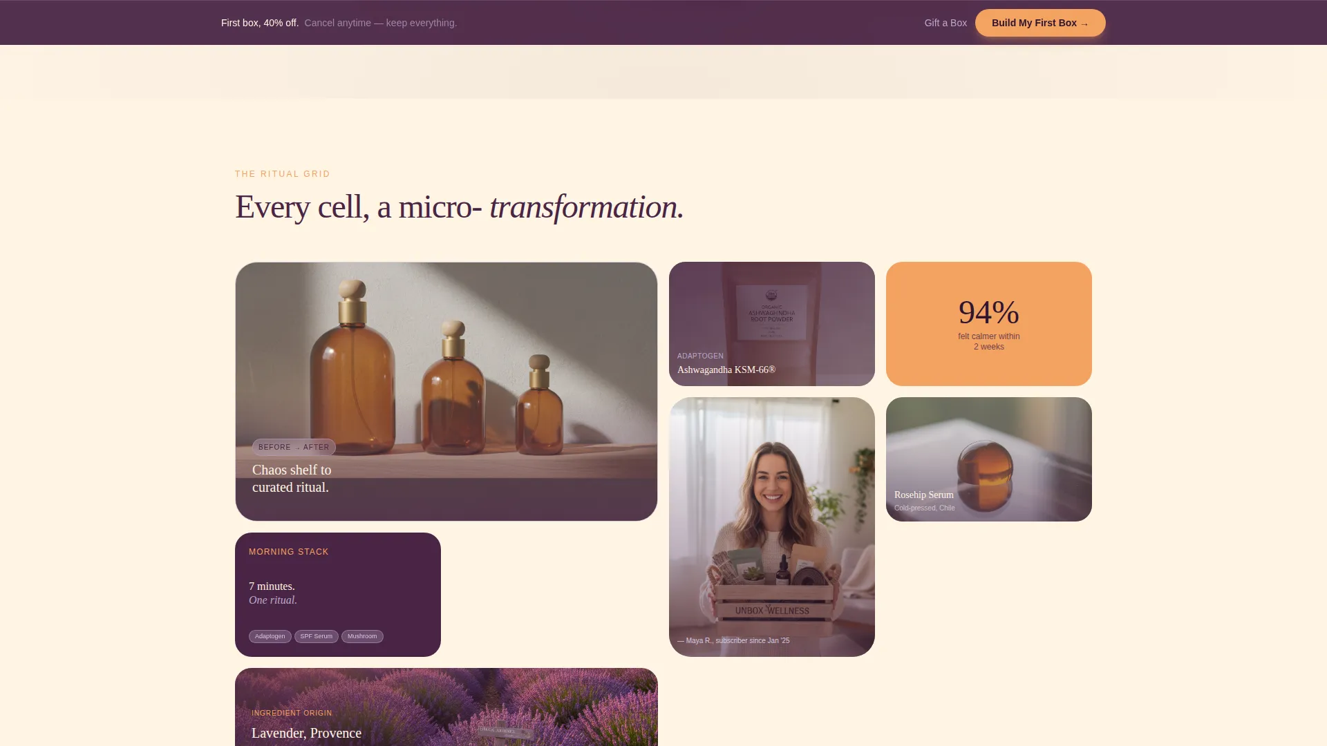
- A bento grid body with before-and-after micro-transformation cells, product close-ups, ingredient origin snapshots, and subscriber selfie slots
- A two-step quiz flow for wellness focus selection and tier picking, a sticky bottom call-to-action bar, a "Gift a Box" secondary path, and a visible first-box discount banner
Feature list
This template is built around a set of intentional design and layout decisions drawn directly from the Unbox brief. Each feature serves both the visual identity and the sales goal.
Bento Grid Layout with Editorial Cells
The page body is structured as a bento grid where each cell tells its own micro-story. Cells alternate between product close-ups, ingredient origin imagery, and subscriber unboxing moments. The grid creates visual tension while holding the page together as a cohesive whole.
Three-Tier Subscription Header Display
The header presents three subscription options, Starter, Ritual, and Full Spectrum, as overhead-photographed boxes on a linen tablecloth, lids half-open and contents spilling out. Each box is visibly larger than the last, making the tier value difference immediately clear without a comparison chart.
Two-Step Purchase Quiz Flow
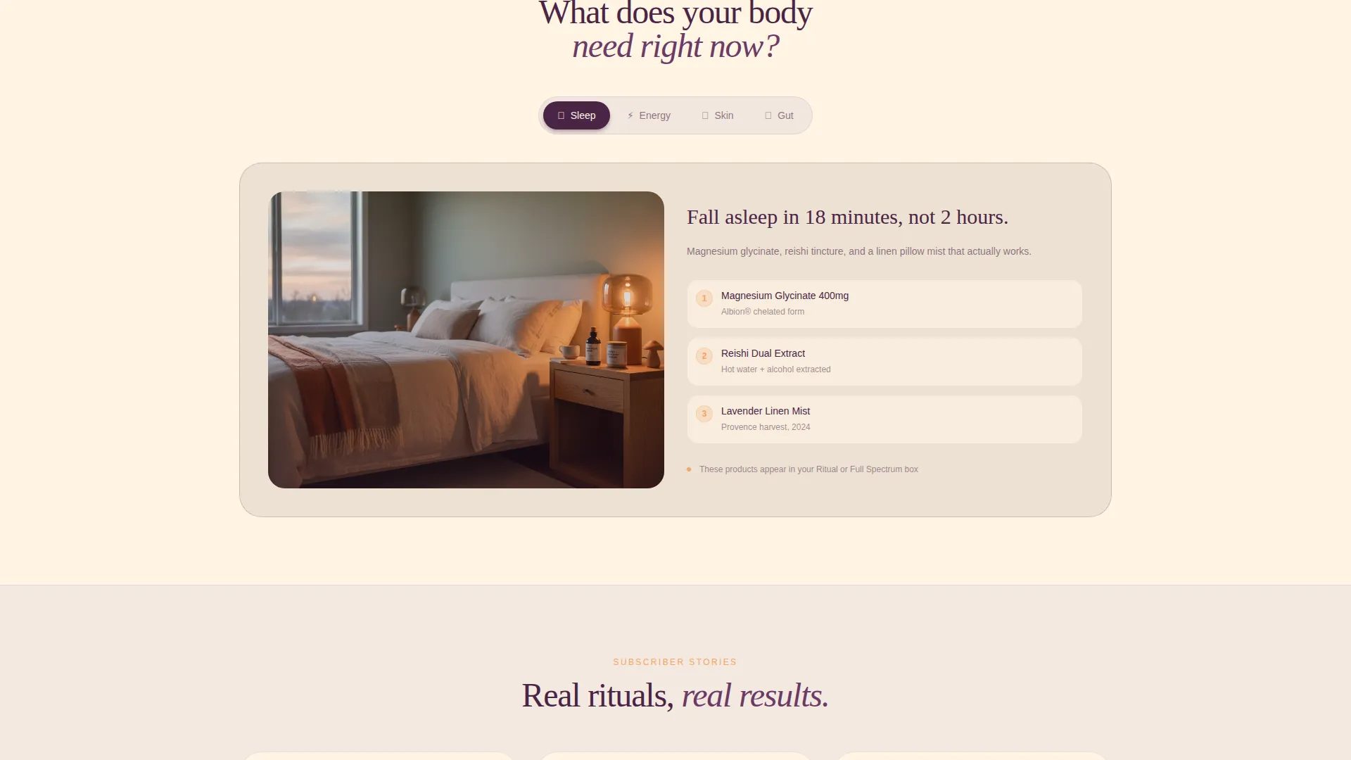
Clicking the primary call-to-action opens a two-step quiz. Step one asks visitors to choose a wellness focus from sleep, energy, skin, or gut health. Step two presents tier options with per-item price breakdowns visible, reducing hesitation before the payment field appears.
Sticky Bottom Call-to-Action Bar
After the third scroll section, a sticky bar anchors to the bottom of the viewport. It carries the primary "Build My First Box" call-to-action in tangerine on plum, keeping the conversion path accessible throughout the page without interrupting the editorial reading experience.
Before and After Reveal Visual Direction
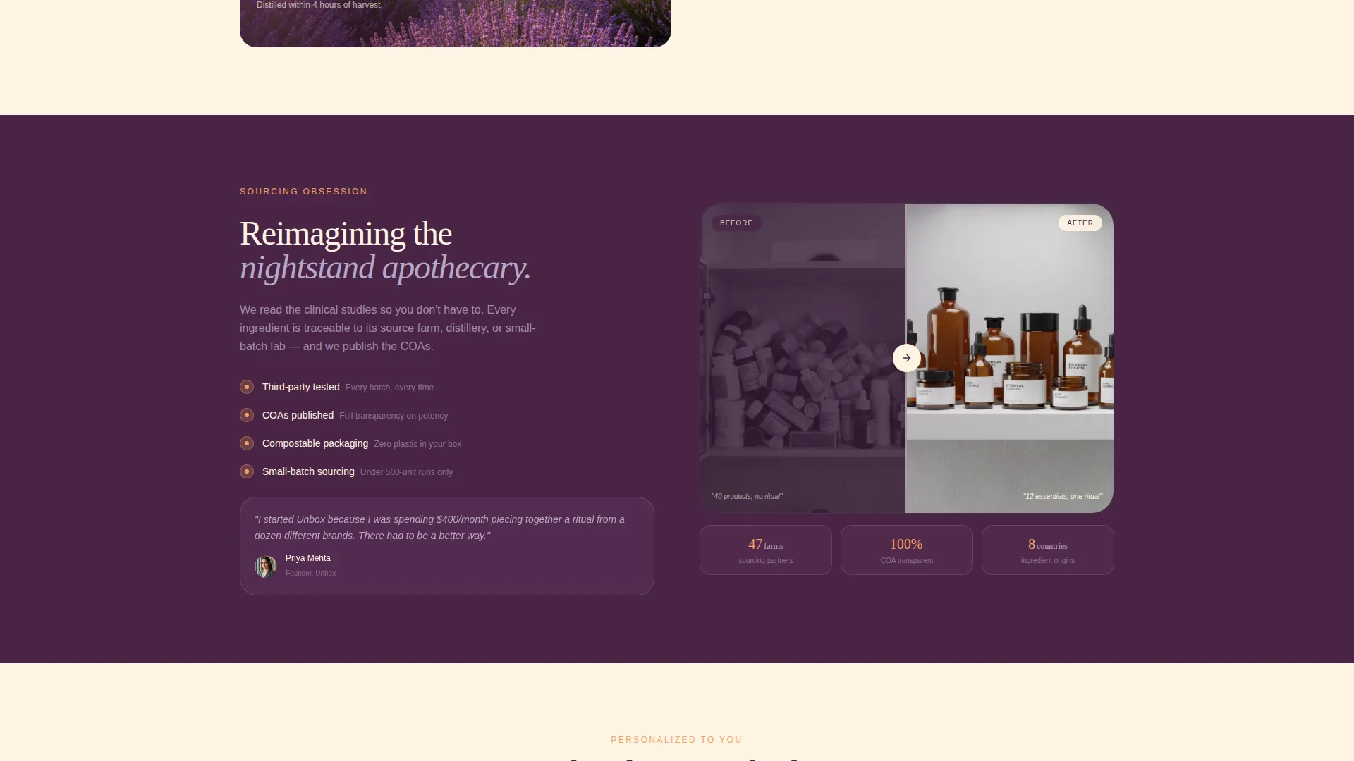
Each bento cell is designed around a before-and-after transformation concept. One cell shows a cluttered medicine cabinet transitioning to a curated amber-bottle shelf. Another shows a stressed morning routine softening into a calm ritual sequence. This creative direction communicates product impact without relying on written claims alone.
Neo-Retro Color and Typography System
The visual identity uses a four-color palette built around dusty lilac, warm cream, deep plum, and soft tangerine. Typography follows rounded serif styling that evokes a 1970s apothecary label redesigned with Scandinavian minimalist restraint. Tangerine appears only on buttons and price tags, creating clear visual hierarchy for conversion moments.
Page sections overview
| Section | Purpose |
|---|---|
| Header Bundle Display | Presents three subscription tiers as styled flatlay photography with a first-box discount banner |
| Bento Grid Body | Delivers editorial micro-transformation stories, product imagery, and subscriber moments |
| Wellness Focus Quiz | Guides visitors through a two-step selection of focus area and subscription tier |
| Ingredient and Sourcing | Rewards deeper scrolling with clinical sourcing details and founder voice content |
| Gift a Box Path | Offers a secondary conversion route for gift purchasers alongside the primary call-to-action |
| Sticky call to action Bar | Keeps the primary purchase action accessible after the third scroll section |
Design & branding system
The template uses a Neo-Retro visual identity that feels like a 1970s apothecary label reimagined through a Scandinavian minimalist lens. The palette is warm and intentional, with each color assigned a specific structural role across the layout.
- Warm cream (#FFF5E4) dominates the background, deep plum (#4A2545) anchors headlines and navigation, dusty lilac (#B8A9C9) fills bento cells with a pillowy softness, and soft tangerine (#F4A261) appears exclusively on buttons and price tags
- Photography carries a warm grain filter that evokes Polaroid texture without feeling gimmicky, and all imagery is styled around linen, dried eucalyptus, compostable wool, and amber bottles
- Rounded serif typography reinforces the nostalgic warmth of the palette while keeping the layout clean and readable at every scroll depth
Mobile & speed optimization
The bento grid layout is designed to reflow naturally across smaller screen sizes, keeping the editorial rhythm intact on mobile without losing the cell-by-cell storytelling structure.
- Each bento cell is self-contained, so the grid adapts to single-column mobile stacking without breaking the visual narrative
- The sticky bottom call-to-action bar is particularly effective on mobile, keeping the conversion action reachable with a thumb tap at any scroll position
- The two-step quiz flow is structured to work as a focused modal overlay, reducing friction on smaller touch screens where long-form forms often cause drop-off
How this template helps you convert
Every layout decision in this template is oriented toward reducing hesitation and guiding visitors toward a subscription purchase. The page layers trust signals, discount visibility, and quiz personalization to make the first box feel like an easy yes.
- The 40% first-box discount and "Cancel anytime, keep everything" guarantee appear near the primary call-to-action, addressing price hesitation and commitment anxiety before the checkout flow begins.
- The two-step quiz personalizes the experience by matching visitors to a wellness focus before revealing tier options, making the subscription feel chosen rather than sold.
- The sticky call-to-action bar and the secondary "Gift a Box" path ensure that both self-buyers and gift purchasers always have a clear next action visible, regardless of scroll depth.
Other information about this template
This template is categorized under Retail and E-Commerce, specifically within the Health and Wellness E-Commerce subcategory. It is designed as a single-page landing page with an overlap and layered template style, meaning bento cells can visually stack and overlap for depth and editorial richness.
- The Upsell and Upgrade landing-page direction means the layout naturally encourages visitors to consider higher subscription tiers through visible product quantity differences and per-item price transparency
- The template is built around a direct sales conversion goal, with the "Build My First Box" call-to-action as the primary driver and "Gift a Box" as a secondary path
- The Neo-Retro theme and Lavender Dream color system give this template a distinctive shelf presence in the health and wellness subscription market, differentiating it from clinical or minimalist-only wellness brands
Theme
Neo-Retro
Creative direction
Before/After Reveal
Color system
Cloud Canvas
Style
Overlap/Layered
Direction
Upsell/Upgrade
Page Sections
Bento Grid with Editorial Cells
Three-tier Subscription Header
Two-step Wellness Quiz Flow
Sticky Bottom Conversion Bar
Before and After Visual Storytelling
Neo-retro Color and Type System
Related questions
Can I customize the subscription tier names and product counts?
Does this template support a gift subscription flow?
How does the two-step quiz work within the template?
Is the first-box discount placement adjustable?
Who is this landing page template best suited for?



