Local Subscription Box Services Pricing & Packages Website Template
Unbox is a masonry-style landing page template built for children's toy and activity subscription boxes. It combines a Before/After Slider header, flip-animated card grids, and toggle-based tier comparison to turn casual browsers into paying subscribers. The Lavender Dream color system keeps every screen warm, playful, and parent-approved, while a pinned "Upgrade My Box" call-to-action drives upsell conversions.
by Rocket studio
Quick summary
Unbox is a single-page subscription box landing page template designed for kids' toy and activity deliveries. It opens with a dramatic Before/After Slider, flows through a Pinterest-style masonry card grid, and closes with an interactive tier comparison table. Every design choice speaks to exhausted parents who need to see the value before they commit.
Who this template is for
This template is built for subscription box brands that deliver curated toys, craft kits, and sensory play activities to families with young children. It works equally well for new launches and for upselling existing subscribers to higher tiers.
- Parents or founders running a monthly kids' activity subscription box service
- Brands targeting caregivers of children aged two to seven years old
- Teams looking to convert existing basic-plan subscribers into premium or deluxe tiers
What problem this template solves
Parents scrolling late at night do not want to read bullet points about what a subscription box contains. They want to feel the excitement before they buy. Static product pages and plain comparison charts fail to communicate that feeling. This template replaces flat copy with a scroll experience that shows past boxes in motion.
- Boring comparison tables that hide the real difference between subscription tiers
- Landing pages that tell parents what is inside a box instead of showing them
- Weak upsell flows that fail to make a modest price difference feel worthwhile
What you get with this template
You get a fully structured single-page layout with every section purpose-built for a kids' subscription box audience. The design is warm, layered, and visually rich right from the first load.
- A Before/After Slider header section that contrasts screen time with active, joyful play
- A masonry card grid with flip animations, mixed media cards, and expandable "peek inside" drawers
- A toggle-based subscription tier comparison that re-filters the grid to show only that tier's past boxes
Feature list
This template is built around components that earn attention through interaction, not just static content. Each feature below comes directly from the template's layout and behavior as described in the brief.
Before/After Header Slider
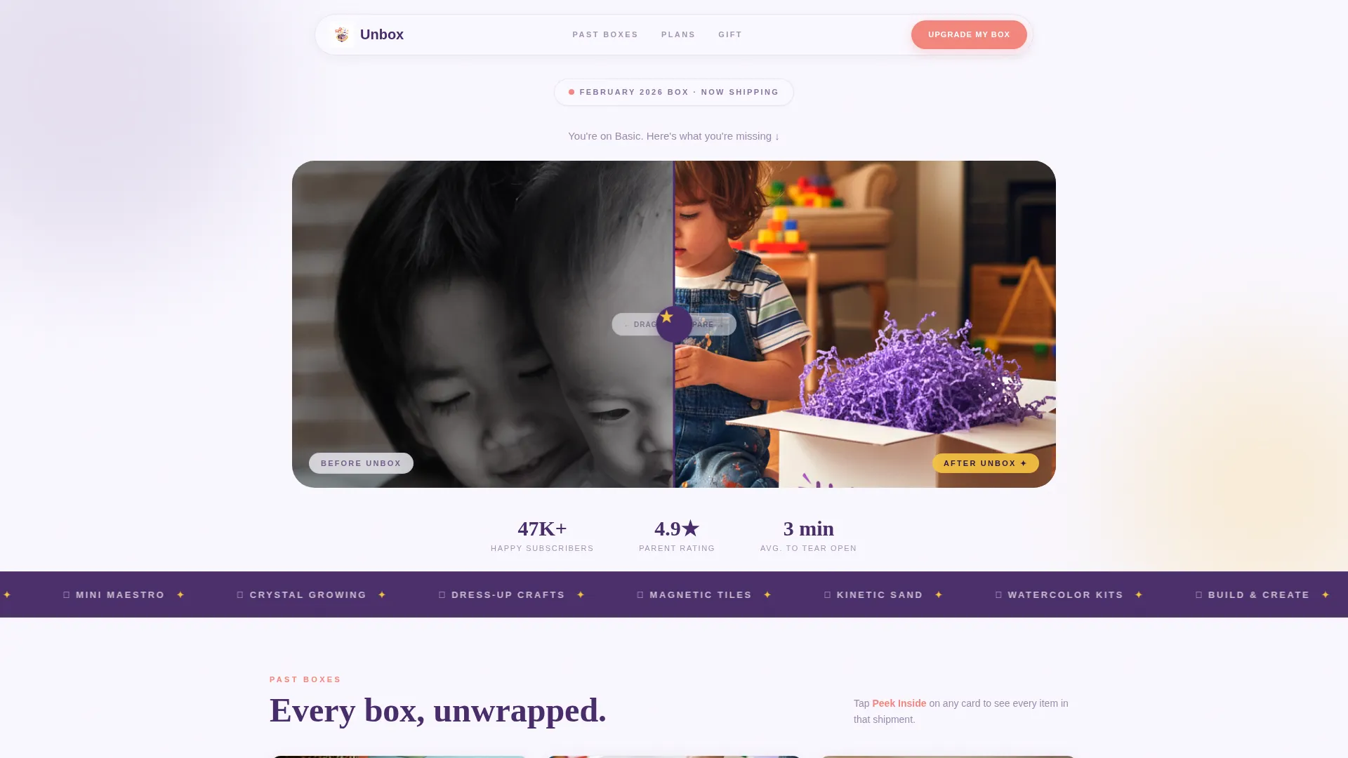
The header opens with a split-screen slider. The left panel shows a child watching a tablet on a beige couch. The right panel shows the same child surrounded by wooden blocks, paint pots, a cardboard rocket, and purple tissue paper. Dragging the plum-and-marigold handle feels like pulling back a curtain on a better Saturday morning. The headline "This Month's Box Changed Tuesday" fades in over the right panel.
Masonry Card Grid with Flip Animations
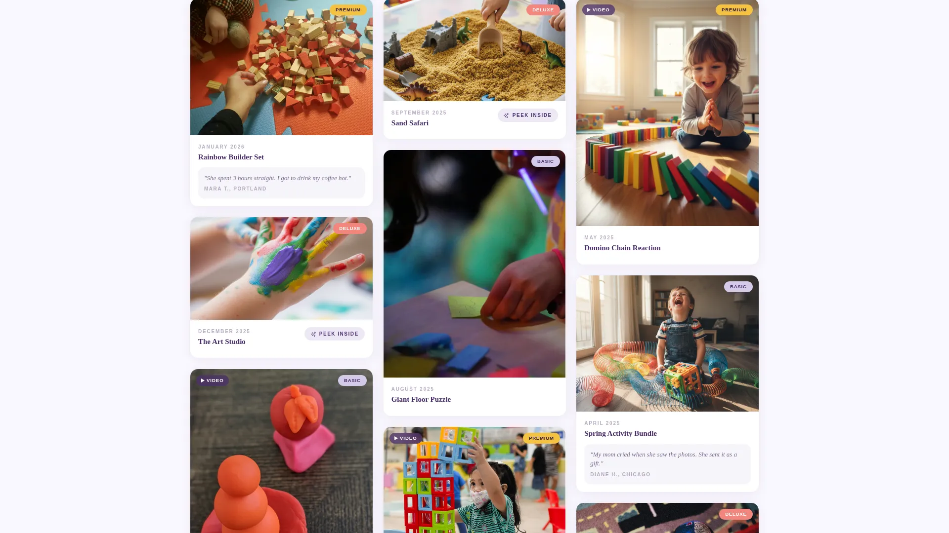
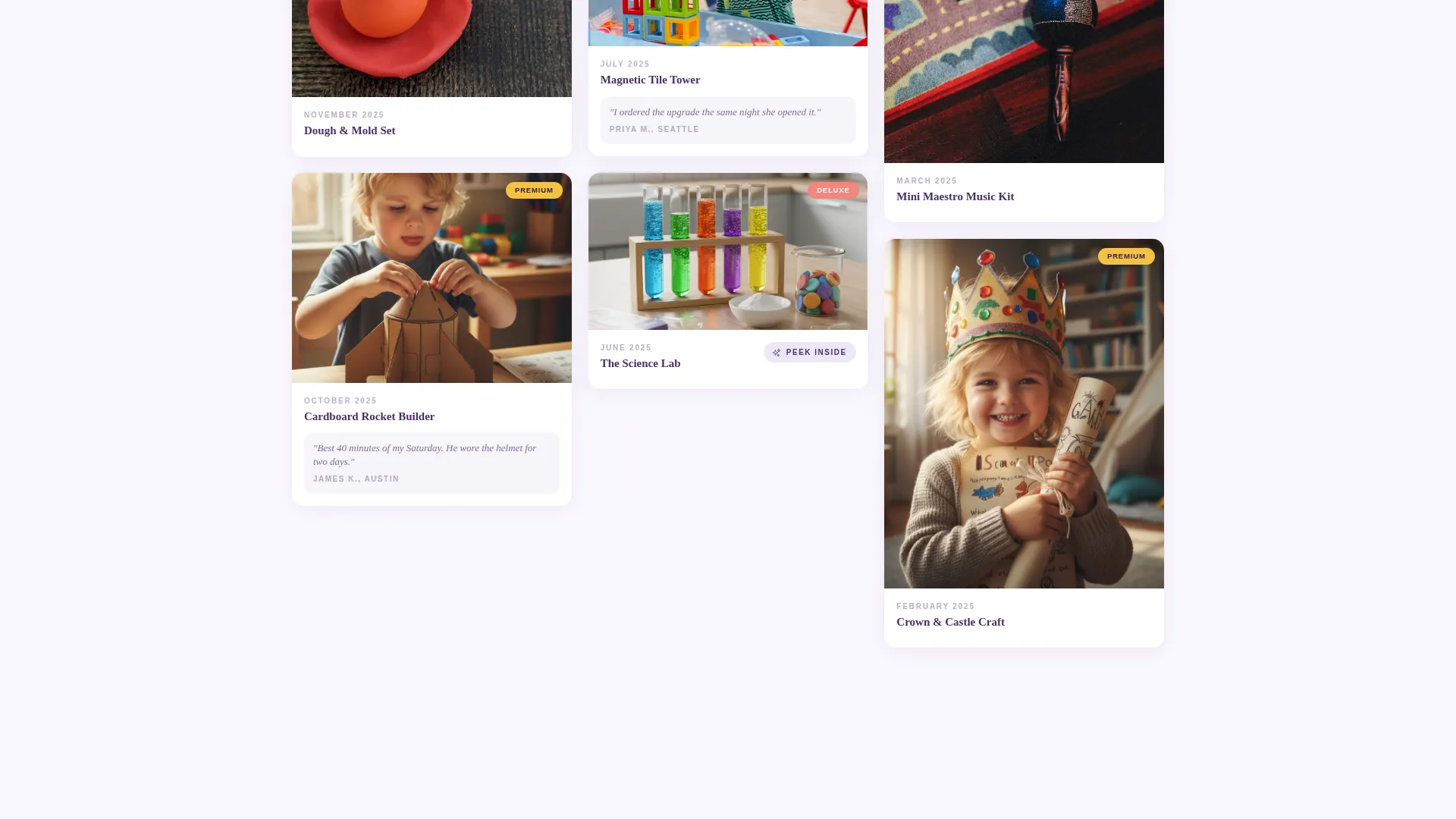
Cards load with a soft flip animation as if being unwrapped one by one. The grid mixes still photos of toys, candid shots of children mid-play, and short looping videos of activities like slime stretching or dominoes falling. The rhythm mirrors how parents naturally browse Pinterest, encouraging one more scroll, one more card.
Expandable "Peek Inside" Drawers
Every third row features a larger card that breaks the standard grid. Tapping or clicking it opens an expandable drawer that reveals every item in that month's shipment, complete with age-suitability indicators. Parents can see exactly what their child would receive without leaving the page.
Toggle-Based Tier Comparison
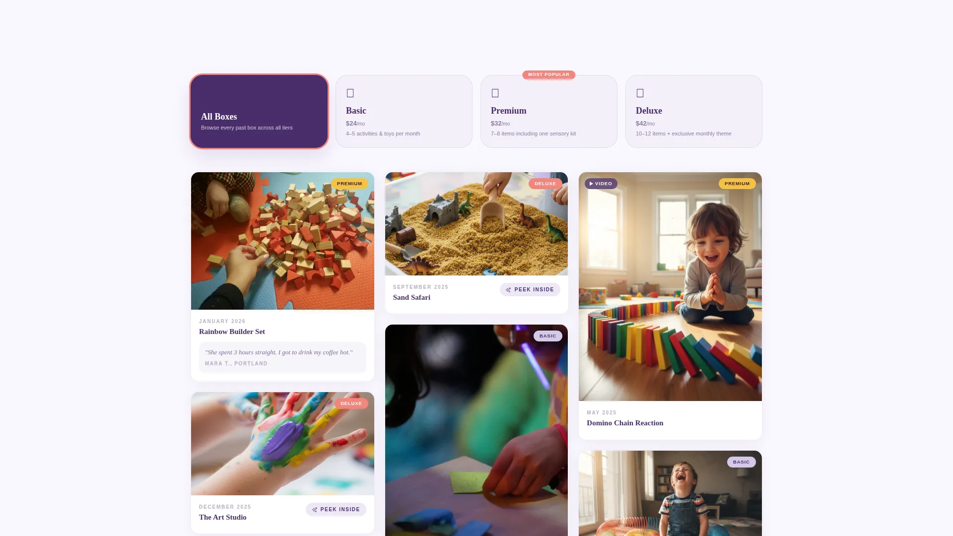
The comparison section uses toggle cards instead of a static chart. Selecting a subscription tier re-filters the masonry grid to display only that tier's past boxes. The difference between plans becomes visible and emotional rather than abstract and bullet-pointed.
Pinned "Upgrade My Box" Call-to-Action
A floating candy coral button reading "Upgrade My Box" pins to the screen after the visitor's first scroll. It stays visible throughout the entire page journey so the upgrade path is never more than one tap away.
Gift an Upgrade Form
A secondary call-to-action section targets grandparents and gift-givers. A simple name-and-address form lets anyone send an upgraded subscription as a gift, expanding the potential buyer pool beyond the primary parent audience.
Page sections overview
| Section | Purpose |
|---|---|
| Before/After Slider Header | Contrast screen time with joyful play to hook visitors instantly |
| Headline Fade-In | Deliver the emotional hook over the right panel of the slider |
| Masonry Card Grid | Showcase past boxes through photos, candid play shots, and looping videos |
| Peek Inside Drawers | Reveal full box contents with age-suitability details on demand |
| Tier Comparison Toggles | Let visitors filter the grid by subscription plan to feel the value difference |
| Pinned Upgrade Button | Keep the primary call-to-action accessible throughout the full scroll |
| Gift an Upgrade Form | Capture gift-giver conversions with a minimal name-and-address form |
Design & branding system
The Lavender Dream color system gives this template a watercolor warmth that feels handcrafted rather than corporate. Every color choice has a deliberate role in guiding the eye and building trust with a parent audience.
- Soft wisteria (#B8A9D0) and cloud white (#FAF8FF) wash across card backgrounds and section dividers for a dreamy, airy feel
- Playful marigold (#F5C242) and candy coral (#F2857D) activate on badges, price tags, buttons, and hover states to spark attention at the right moments
- Deep plum (#4A2D6B) anchors all typography with a weight that reads trustworthy and warm rather than stiff or corporate
Mobile & speed optimization
The masonry grid and mixed-media card layout are structured for smooth scrolling on smaller screens. Parents browsing at night on a phone should feel no friction between curiosity and conversion.
- The pinned floating call-to-action button remains accessible on mobile without blocking card content
- Looping video cards and flip animations are contained within the template's layout structure to keep the scroll experience fluid on touch screens
How this template helps you convert
Every design decision in this template is aimed at reducing hesitation and increasing the emotional certainty that a subscription upgrade is worth it. The page earns the click by showing value before asking for money.
- The Before/After Slider creates an immediate emotional contrast that makes the product's benefit tangible within the first three seconds of landing on the page.
- The toggle-based tier comparison makes the price difference between plans feel small once a parent has scrolled through a full grid of premium-tier past boxes, turning a data decision into a felt one.
Other information about this template
This template sits inside the Retail and E-Commerce category under the Subscription Box Services subcategory. It is built on a Marketplace Grid layout direction with an Overlap and Layered template style. The creative direction follows a Curated Collection approach, and the overall theme is Neo-Retro. These context choices shape the warm, slightly nostalgic feel of the card grid and color system throughout.
- The template is optimized for upsell flows, making it ideal for brands where an existing basic-plan subscriber base is the primary traffic source
- The "Gift an Upgrade" secondary call-to-action extends reach to grandparents and relatives who want to contribute to a child's development from a distance
- The masonry grid structure supports a visually diverse content mix including photos, videos, and illustrated cards without requiring a redesign
Theme
Neo-Retro
Creative direction
Curated Collection
Color system
Lavender Dream
Style
Overlap/Layered
Direction
Marketplace/Multi
Page Sections
Before/after Slider Header
Flip-animated Masonry Card Grid
Expandable Peek Inside Drawers
Toggle-based Tier Comparison
Pinned Floating Upgrade Button
Gift an Upgrade Form
Related questions
Can I use this template if I am launching a new subscription box from scratch?
How do the toggle-based tier cards work?
What types of media can I feature in the masonry grid?
Is the Gift an Upgrade section only for grandparents?
Can the color palette be adjusted to match an existing brand?



