Kids Activity Box Landing Page Template
Unbox is a masonry-style landing page template built for kids activity box subscriptions. It uses a bold charcoal and honey gold color palette, a Before/After slider, and a staggered three-tier bundle header to guide parents from curiosity to checkout. Every scroll section is designed to make the premium tier feel like the obvious next step.
by Rocket studio
Quick summary
Unbox is a single-page subscription landing page template designed for children's activity kit businesses. It opens with a staggered bundle display across three upgrade tiers, flows through a masonry Before/After reveal, and closes with a pinned upgrade call-to-action bar. The layout is warm, visual, and built to convert scrolling parents into committed subscribers.
Who this template is for
This template is built for creative product brands that ship physical activity kits directly to families. It works best when the product speaks through visual transformation rather than written description alone.
- Subscription box founders selling monthly kids craft or activity kits
- Teachers and hobby educators packaging structured creative programs
- Gift-focused brands targeting grandparents and occasion shoppers
What problem this template solves
Parents browsing late at night do not want to read paragraphs. They need to feel the product before they commit. This template removes friction by letting the visual experience do the selling.
- Scrollers bounce before reaching the pricing section on generic product pages
- Upgrade tiers are rarely communicated in a way that feels worth the extra cost
- Gift buyers need a fast, emotionally clear path to the right option
What you get with this template
You get a fully structured landing page layout with every key section pre-built and ready to customize. The design is cohesive, visually rich, and purpose-built for subscription box conversion.
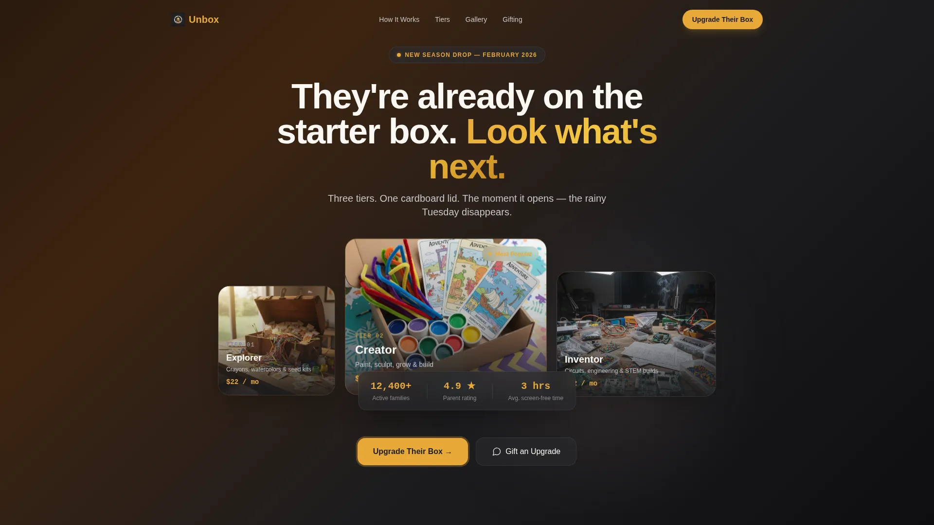
- A staggered three-box bundle header with open-lid styled flat-lay composition
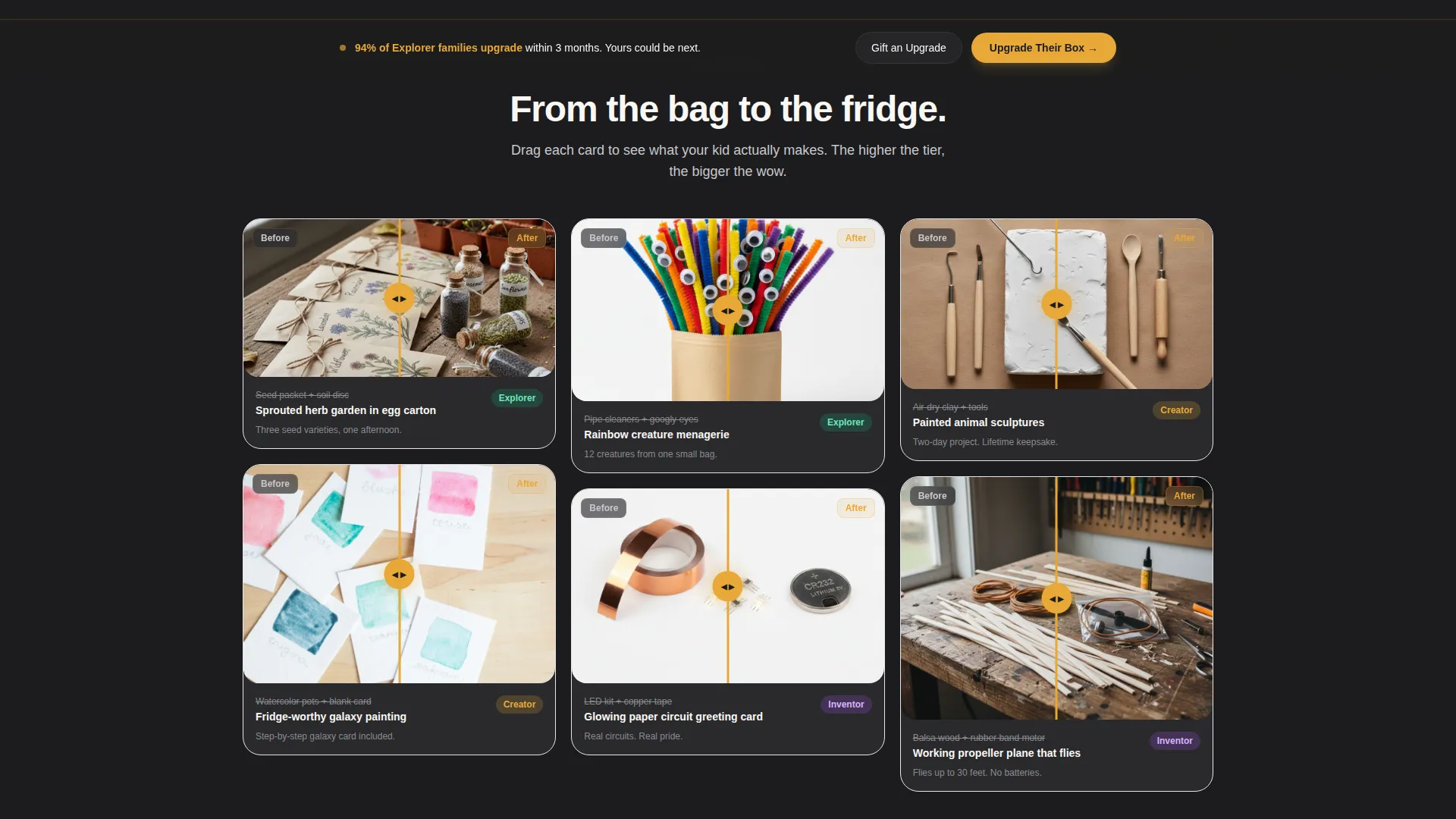
- A masonry Before/After card grid with slider-driven reveal panels
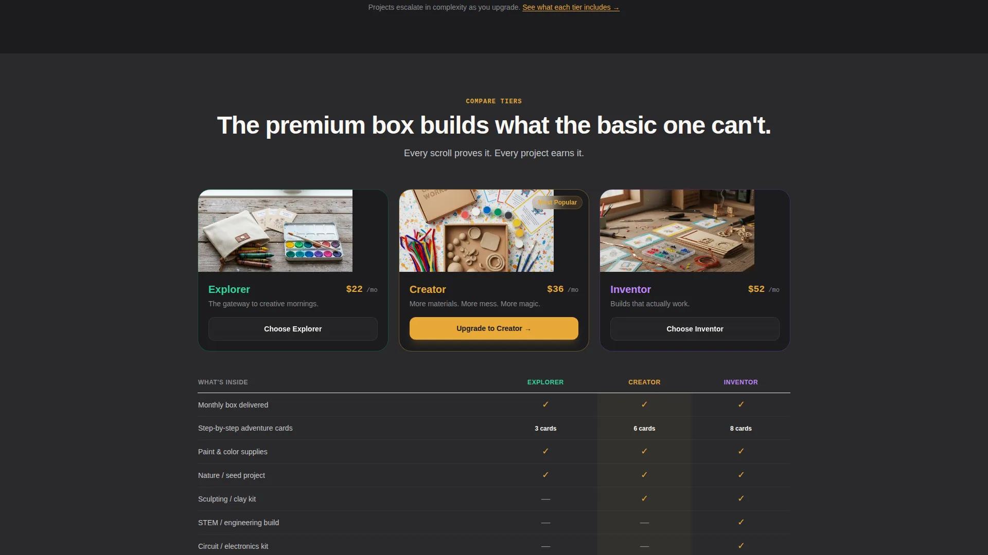
- A floating upgrade call-to-action bar and a three-tier comparison table
Feature list
This template packages several purpose-built components that work together to guide visitors through the upgrade journey naturally and confidently.
Staggered Bundle Hero Header
Three boxes labeled Explorer, Creator, and Inventor are arranged in a half-open staggered stack against a peach-to-gold gradient. Bold hand-lettered type frames the upgrade story from the very first second on the page.
Masonry Before/After Reveal Grid
Each masonry card shows a sealed kit component on one side and a finished child-made project on the other. Visitors drag a slider to reveal the transformation, which makes the value of each tier tangible and emotionally compelling.
Floating Upgrade Call-to-Action Bar
A pinned bar reading "Upgrade Their Box" in honey gold on charcoal appears after the visitor scrolls past the third masonry row. It keeps the primary conversion action visible without interrupting the browsing flow.
Three-Tier Comparison Table
A mid-page table lays out the Explorer, Creator, and Inventor tiers side by side. Each tier includes thumbnail previews of exclusive materials, making the premium tier's output visually undeniable before the visitor reaches the price.
Gift an Upgrade Secondary Path
A secondary call-to-action labeled "Gift an Upgrade" is built into the layout to serve grandparent and occasion-gift traffic. It gives gift buyers a clear, emotionally warm route without competing with the primary subscriber flow.
Page sections overview
| Section | Purpose |
|---|---|
| Bundle hero header | Introduces all three upgrade tiers with a styled open-box flat-lay and headline |
| Before/After grid | Masonry slider cards reveal raw materials transforming into finished projects |
| Upgrade comparison table | Lays out Explorer, Creator, and Inventor side by side with exclusive item previews |
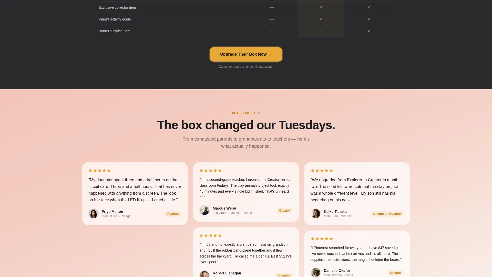
| Testimonial band | Blush-washed section builds trust through real parent and gift-giver social proof |
| Floating upgrade bar | Pinned call-to-action keeps the upgrade prompt visible throughout the scroll |
| Gift an Upgrade section | Secondary conversion path designed for grandparent and occasion-gift visitors |
Design & branding system
The template uses a Soft Gradient visual theme built around a palette that feels like an expensive children's bookshop at golden hour. Every color choice is intentional and serves a specific role in guiding attention.
- Deep charcoal (#1C1C1E) grounds the page like a chalkboard wall and frames all primary content
- Warm honey gold (#E8A838) activates buttons, price tags, and the floating call-to-action bar
- Chalk white (#FAF8F5) creates breathing room between masonry cards
- Muted blush (#F2C4B8) washes behind the testimonial band like watercolor on wet paper
Mobile & speed optimization
The masonry grid and slider components are structured to adapt cleanly to smaller screens so that the visual storytelling holds up whether a parent is browsing on a phone at 9 PM or on a tablet during a school break.
- Masonry card layout reflows naturally for portrait-orientation mobile viewports
- The floating call-to-action bar remains accessible and legible at all screen sizes
- The staggered hero header is proportioned to stay readable without horizontal scrolling
How this template helps you convert
Every section of this layout is sequenced to build desire progressively and reduce the mental effort required to upgrade.
- The open-box bundle header sets the upgrade story immediately, making the basic tier feel like a starting point rather than a destination.
- The Before/After masonry grid escalates in project complexity as the visitor scrolls deeper, mirroring the tier progression and making the premium box feel inevitable.
- The pinned floating bar and mid-page comparison table ensure the upgrade call-to-action is never more than a glance away, regardless of how far down the visitor has scrolled.
Other information about this template
This template is categorized under Retail and E-Commerce, specifically within the Subscription Box and Direct-to-Consumer niche. It is a single-page landing page layout built for visually driven product storytelling.
- The template style follows a masonry and Pinterest-inspired grid layout with a Soft Gradient theme
- The header concept uses a full-bleed styled flat-lay photo composition as its visual anchor
- The layout is suitable for seasonal campaign moments such as holiday gift pushes or back-to-school subscription drives
- The page type is a landing page, meaning all content flows within a single scrollable surface with no separate page navigation
Theme
Soft Gradient
Creative direction
Seasonal/Moment
Color system
Ink & Paper
Style
Bento Grid
Direction
Quiz/Assessment
Page Sections
Staggered Bundle Hero Header
Masonry Before/after Slider Grid
Pinned Floating Upgrade Bar
Three-tier Comparison Table
Gift an Upgrade Conversion Path
Related questions
Can I use this template to sell a single kit instead of a subscription?
How does the Before/After slider work in this template?
Does this template support a gift purchase flow?
What kind of photography works best with this template?
Is the floating call-to-action bar easy to customize?



